Behind the design: Adobe Photoshop modernization
The careful evolution of an iconic application
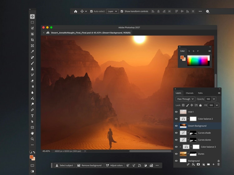
We spoke with Senior Staff Product Designer Ryan Hicks and Staff Experience Designer Prachi Chaudhari about the design challenges behind this work, from refining familiar interface elements to reconciling Photoshop’s existing systems with Spectrum: Adobe’s design system.
What was the primary design goal when you set out to modernize Photoshop?
Ryan Hicks: The investments we’re making now are mainly about ensuring Photoshop can continue to evolve for the next 30 years. To keep that work grounded, everything we’re doing is held to one defining principle: Refine without disruption. It’s a fine balance between preservation and the necessities of progress.
A refreshed Photoshop is exciting. So, what’s new?
Ryan: Moving onto Spectrum is the most visible aspect of a major multi-year architectural overhaul. First, we’ll see updates to current Spectrum components and careful refinements to layouts such as toolbars, dialogs, and panels. Some of Photoshop’s more specialized interfaces are being rebuilt, with clearer treatments, language and labeling. Accessibility improvements are also arriving alongside expanded component states and behaviors that bring more responsiveness to Photoshop’s relatively static interface.
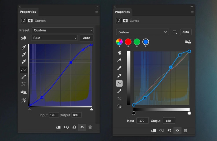
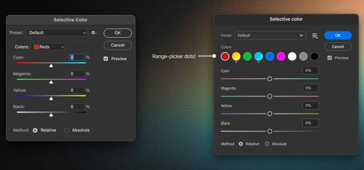
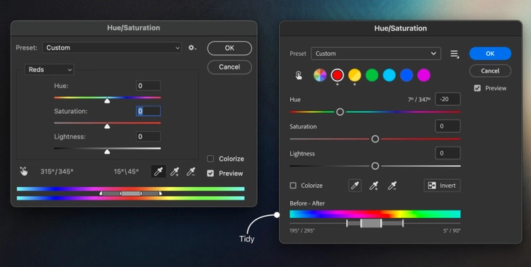
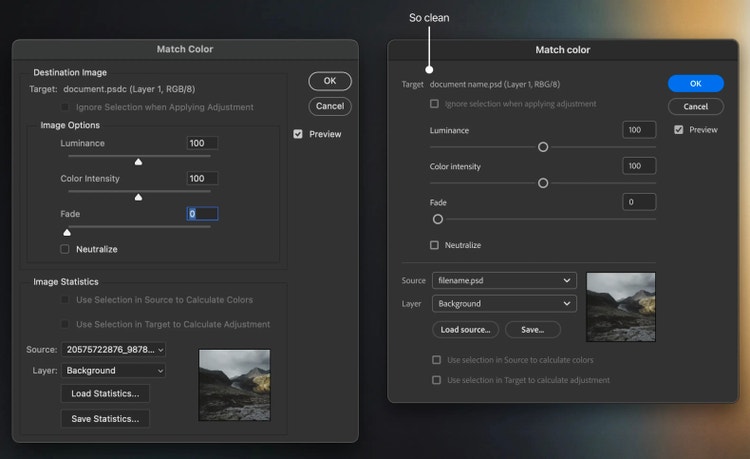
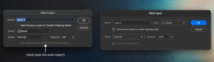
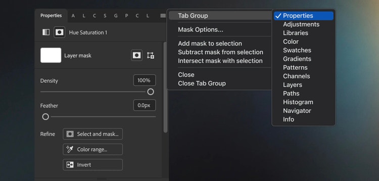
Underneath it all is a significant architectural shift: moving off deprecated frameworks and separating Photoshop’s UI from its underlying functionality. This will remove long-standing constraints so we can unlock new features faster and with better integration. It will also bring stronger alignment across products, now built with common patterns on shared systems. The result will be a stable foundation for future workflows, enhanced accessibility, and richer workspace adaptability.
How did the principle “refine, without disruption” shape the toolbar?
Prachi Chaudhari: The toolbar is one of Photoshop’s most iconic components. It’s often the first place people look and where many creative workflows begin. It’s a thin strip of interface filled with possibilities; which made modernizing it a particularly painstaking process.
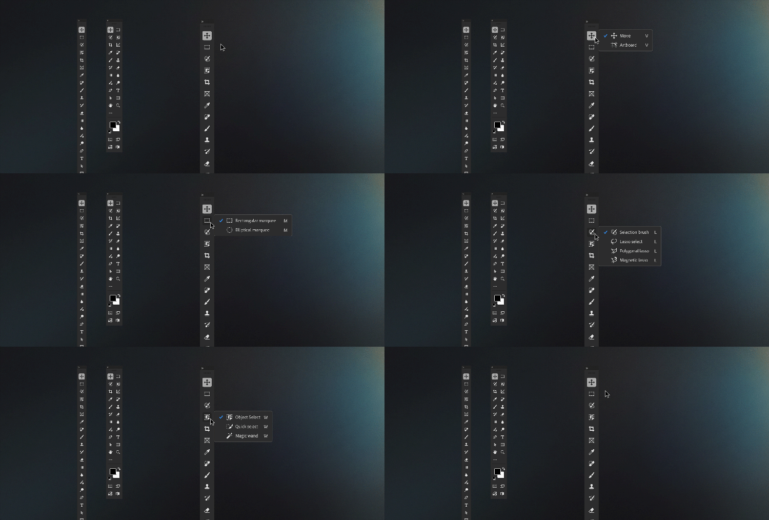
With so many icons in one place, spacing significantly affected legibility. When icons sit too close together, they can feel like an unfamiliar language. We fine-tuned the padding to make each tool easier to distinguish, and the toolbar easier to scan. People can quickly find familiar tools and discover new ones while keeping access to Photoshop’s full range of capabilities. Alternate tools in tool groups convey even more of that depth. They’ve traditionally been available through a long press or right-click, and experienced users can cycle through them with keyboard shortcuts. We are adding access on hover, so pausing over a tool quickly reveals the related tools within it.
These changes bring Photoshop’s capabilities closer to the surface. We often hear from people who didn’t know a tool existed because they’d never encountered the interaction that revealed it. Easier access makes those tools easier to discover and gives people more flexibility to build a compact, personalized toolbar around their workflows.
What’s been the most unique aspect of the design process?
Ryan: What sets this effort apart from glossier “hey we designed this new thing from scratch, that was fun” stories is that none of what we’re working with is a fresh start. Spectrum is a mature design framework with its own assumptions and behaviors. Photoshop contains decades of accumulated architecture and workflows, most of which predate modern components and patterns. Modernization has meant finding ways to bring these independently evolved foundations into alignment without disrupting the workflows built on them.
What was the biggest design hurdle?
Ryan: The upside of working with Spectrum as a system is that there’s a certain inevitability and intention to how common elements should snap together; things like buttons, pickers, checks, spacing, scale, and states are decisions we work with rather than have to make. That said, Spectrum’s not a ready-made Photoshop-specific UI kit. It doesn’t solve the challenge of adapting hundreds of dialogs, panels, toolbars, tool options, and context bars, each with its own function and interface considerations.
The biggest challenges have come from pulling these independent foundations together: getting Spectrum and new frameworks working inside Photoshop, then adapting them to Photoshop’s many unique interfaces. To reconcile their differences, we've had to be archaeologists, understanding how these systems were built and why; curators and interpreters deciding how to translate their intention to Photoshop's needs; and stewards ensuring consistency across the many compromises that surface along the way. Every change requires balancing progress with preservation.
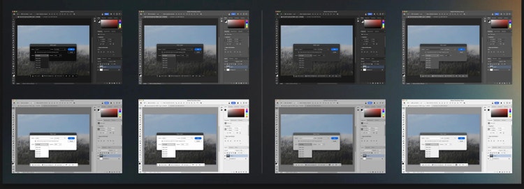
Theming was an early and significant obstacle. Spectrum has three themes primarily focused on accessible web and mobile considerations: effectively black, very dark, and absolutely white, all with very high-contrast states and content-color systems. Photoshop has four themes composed from a radically different contrast philosophy and base value ranges. The two systems were not designed to work together, and their approaches to defining and implementing colors differ significantly. This mattered because legacy and updated interfaces will coexist throughout the multi-year modernization effort.
After a few abandoned approaches, reconciling Photoshop’s various methods of defining colors with Spectrum’s token system was declared to be impossible. They’re too different; tweaking one thing trips over an unpredictable number of others... I had a hunch, though. “Get me access to the tokens, and I’ll handle the rest...” With some raised eyebrows, Bryn on the engineering team set up a clever way to provide the incoming Spectrum token system with a new color map. I worked out how to bring Photoshop’s key interface colors onto Spectrum’s interconnected components, creating a result that feels intentional and harmonizes with the existing Photoshop interface. This took me deep into corners of these systems people were never meant to be wandering around in.
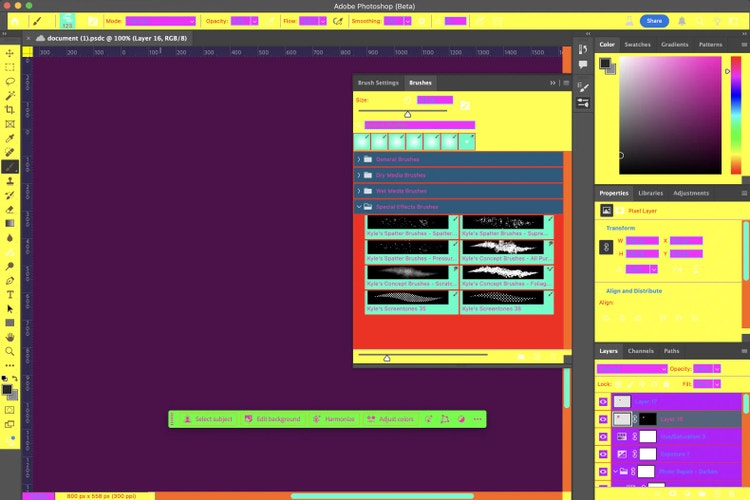
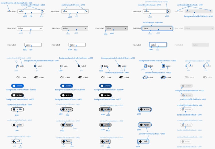
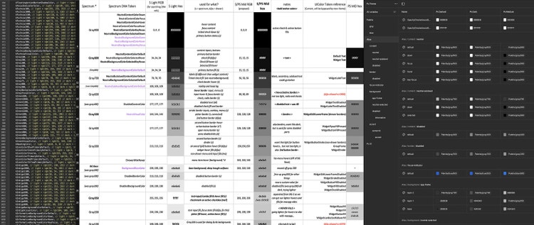
It was a huge amount of work for what’s essentially an interim solution, but it was critical for the project to proceed in alignment with our principle of minimizing disruption. What we’ve gained as a result is an increasingly centralized single point of control over the colors in Photoshop’s UI and the groundwork for new possibilities in adaptability and customization moving forward.
What’s next?
Ryan: The modernized Spectrum-based Photoshop may look familiar initially, but it’s the first sign of an ongoing evolution. We’re bringing together divergent UI patterns to make them consistent, repeatable, and predictable. The underlying framework update will benefit stability and scalability. Once we're fully on Spectrum, we’ll be able to extend controls for scale, density, and contrast to better adapt the interface to different working contexts.
Photoshop’s Prerelease and Beta programs are where this type of work comes to life; check in and give us feedback early and often. It will be a journey, but everything we’re doing moves toward a full renovation where Photoshop can breathe easier about its future. Photoshop has always been defined by its open-endedness—the sense that there’s always more to explore, more to learn, more to make. The modernization effort will give Photoshop itself the capability to further grow and evolve.