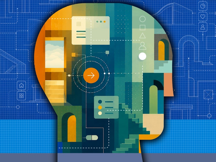
That’s architecture: Design for decisions to disappear.
What initially felt like a career pivot, from architect to product designer, turned out to be recognition—the same job, just a different medium. Movement. Sequence. Threshold. The design decisions I’d made in my previous career now translated effortlessly into this new medium, where I shape what users experience, in what order, and how they interact and move forward.
Designing for arrival
Experiences begin before instruction. A building doesn’t explain. It uses scale, light, proportion, material, and threshold to define the space and direct attention. You don’t just enter a building. You arrive. Gradually.
That distinction matters in digital design because many products launch with onboarding: prompts, tooltips, checklists, permissions, and setup. While useful for explaining complexity and providing clarity, they can make products feel less immersive and increase cognitive load at the very moment someone is trying to get oriented. A welcome screen should help users get situated and onboarding should be used for instruction and not just as a signal to “start.”
Architecture contributed to how I think about that first moment. Designing for physical immersion teaches that presence is crafted, not expected. A person can be oriented before they are instructed. They can be guided before they are told. They can understand where to go because the environment ensures that choices feel natural.
What translated from space to screen
Not long into my new role, I realized that the way architects think about environment, movement, and use was an intrinsic part of the product design process.
Context defines scope
Design never begins from nothing. A building forms from a site with orientation, history, and boundary constraints. The slope of the land, the direction of light, and the climate are not problems to be solved; they are the conditions that eventually define the solution.
Product work is the same. Technical limitations, business requirements, platform constraints, user needs, and user demographics aren’t interruptions to the work. They define the scope of it.
No solution happens in isolation
In architecture, nothing is designed alone. You’re constantly in conversation with clients, civil engineers, contractors, site workers, material suppliers, and fabricators. The final experience depends on many collaborators interpreting, negotiating, and building toward the same intent. But it goes deeper than teamwork: Architecture taught me that everyone in the chain has unique knowledge.
My current work mirrors this. A user experience is shaped across disciplines like product management, engineering, research, legal, and brand. The cast changes, but the dependencies don’t. The designer is not an isolated author, but a participant in a larger system. And the product is only as good as how well everyone's expertise is heard.
That’s knowledge I brought from the start. When an engineer pushes back on an interaction I conceptualized, I listen because I know that our goal is the same: the success of our product.
Attention is designed
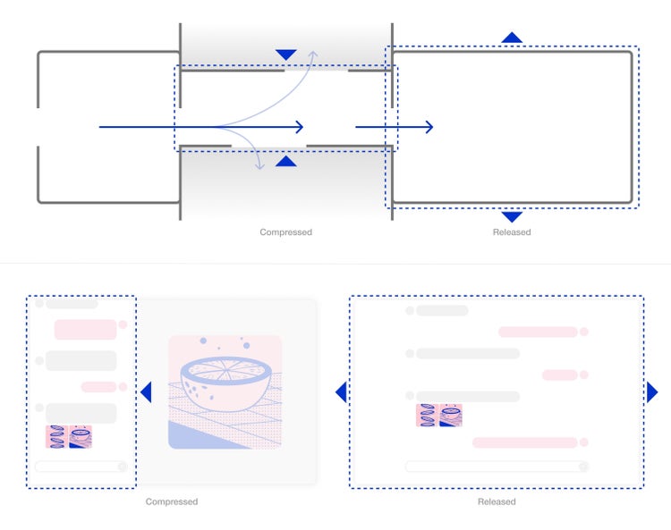
Making your way through a narrow hallway into a larger room, a dim passage opening into light. The space constricts, then releases. That emotional pacing is intentional. It's where architectural thinking feels especially useful in product design. It makes me ask not only whether a user can complete a task, but how their attention is being shaped along the way.
Some generative AI tools open not with a blank canvas, but with a catalogue of what's possible—narrow enough to orient the user in a direction. A prompt field arrives only once the user has a sense of where they are and what they might make. That’s sequencing shaped by architectural thinking: Constrict, then release.
Attention isn’t always shaped by adding more. Sometimes the most important decision is what to withhold.
Form invites action
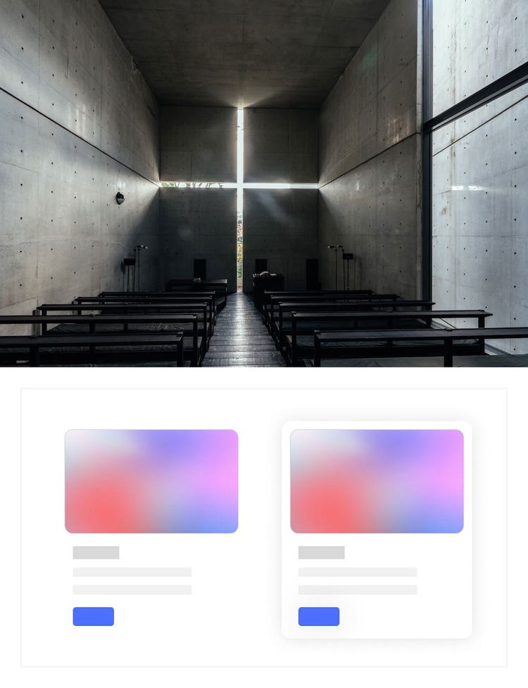
Architecture taught me that every material decision is also a behavioral one. The physical properties of a building complement the surrounding environment and consider the needs of the people who will use it. Light directs where to go. Shadow defines what matters. Depth explains what to touch.
In product design, the logic is similar; the materials just weigh less. A UI card with no shadow is “flat,” present but inert. Add depth and it lifts. It becomes something to instinctively reach for. The eye reads it as separate from the background, the hand follows, and the interaction begins. Shadow isn't decoration. It's the difference between something that exists and something that invites.
Design is for many, not one
Buildings are experienced by many at once, across time, and often in ways that are difficult to see. Architects don’t design for a single ideal occupant; they design for a range of bodies, speeds, and abilities. What use would a building be if 75% of a population couldn't use it?
Ramps aren’t just alternatives to stairs. They’re structural elements that say, “This building is for everyone.” It’s a rationale that applies in product design: When buttons, sliders, and fields can’t be identified by screen readers; when there is no logic to how key presses move people around; and when content hierarchy gives no signal about where to go next, entire groups of people are simply locked out of using an application.
Product designers don't need to shape experiences for as wide a swath of the population as architects, but they do need to consider the full range of people who "might" use an application—people with different vision, motor abilities, literacy, and language.
What an architectural perspective added to my product design practice
Architecture begins with people moving, slowing down, looking around, hesitating, and adapting. That immersion in how we move through spaces shaped how I approached product design in ways I couldn’t help but notice.
Architecture trained me to map information. A building is circulation, thresholds, access, services, constraints, and edge cases layered together. It’s a perspective that translates directly to information architecture. I was able to quickly see how content should be grouped, how navigation should be structured, what hierarchy users needed, and where alternate paths might lead.
Architecture made me faster at thinking through edge cases. With buildings, you can never design solely for an ideal path. Architects must consider different entries, abilities, speeds, and unexpected behaviors. For products, that translates to planning for those realities from the start, rather than waiting for them to be a surprise.
Architecture taught me to care about delight. A reveal, a pause, a shift in light are the moments that make spaces memorable. In products, delight works through micro interactions, thoughtful copywriting, and motion. When designed with care, small moments of ease, responsiveness, and surprise do more than support a product experience; they make it feel worth returning to.
Not everything from architecture translated cleanly
Some habits had to be unlearned or at least understood from a new perspective.
Architecture can be slow. Projects take years. Feedback loops are long. You develop a tolerance for uncertainty because the work leaves no choice. That patience is valuable, but product design compresses time: Teams must first fully and methodically understand a problem, but concepts must also be iterated, tested, and implemented at a faster pace so new knowledge can be adopted into design decisions more quickly.
Architecture can carry a certain attachment to form. You’re trained to defend your work with attention to detail and monumentality. But product design requires that you start loose and move quickly. And the instinct to defend must become a willingness to iterate.
Architecture can exist solely to inspire, impassion, or envelop people in beauty. In product design, beauty alone won’t suffice. If something is elegant but unused, it has failed in a very measurable way. If it doesn’t help someone complete, understand, return, or trust, form cannot defend itself for long. “Form follows function,” coined by architect Louis Sullivan, is a principle followed religiously in product design.
Crossing the threshold
A home doesn’t begin in the living room. It begins at the threshold where the outside world falls away, and you become someone who lives within.
In product design, that threshold is in the moments before action: the pause before a result, the first screen before a task, the transition between asking and making, the instant where a user is not yet doing the work but is in the right frame of mind to begin.
That instinct to focus on the threshold is one I carried from my first career. And it does more than help someone complete a task. It signals arrival.