Making Type: Amy Hood of Hoodzpah
A glimpse at what influences the studio's delightful typefaces and inspiring design work
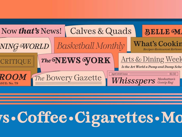
Since 2014, I’ve been helping people find and use fonts across Adobe’s applications and along the way I’ve picked up a lot of tips—from finding the perfect font to laying out designs seamlessly and intelligently. I launched Make type work so I could share some of those tips and (hopefully) help other people feel more confident working with type.
I also have a deep admiration for the people who put in hours behind the scenes to create quality typefaces that bring our designs to life. “Making Type” is a new series in which I celebrate type designers and ask them questions about design, process, and life beyond fonts.
I’m beyond stoked to have interviewed Amy Hood of Hoodzpah for the next installment. Sister duo Amy and Jen, and the rest of the team at Hoodzpah have been making some of the most inspiring design work around, and they also happen to design delightful typefaces.
I’m an unabashed fanboy of the studio and can’t stop buying their merch: bumper stickers, posters, mugs, hats (you get the picture) and fell down a rabbit hole on a personal project a few years back, and ended up buying their mega bundle of fonts. I was so glad when Hoodzpah typefaces became available on Adobe Fonts.
I talked to Amy about her type journey, influences, and life beyond the screen.
What was the initial spark that got you into type design?
Amy Hood: I was always the go-to kid in class who could do amazing lettering. You know at the beginning of the school year when you’d put your name on your desk or your paper covered books? Everyone would ask me to do theirs. It was social currency! Even having had braces for five years, I had a place in the ecosystem thanks to my artistic skills.
Flash forward to the early years of running our brand studio, Hoodzpah and constantly hunting for fonts but not quite finding what I needed. I started Frankensteining fonts—adding serifs, making custom ligatures, drawing my own lettering, and live tracing. That eventually led to fully custom wordmarks, which became the thing most of our brand clients come to us for.
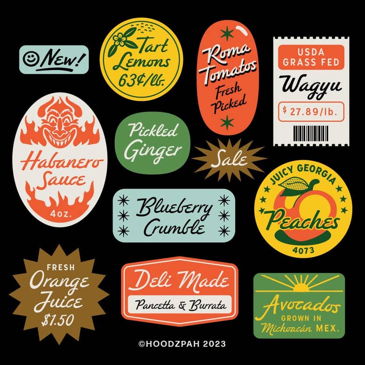
How does your client work influence how you approach making fonts?
Amy: I think being a designer who is also a type designer is a superpower because you don’t think about type in a vacuum, you know the applications and needs innately from your daily design practice. I’m acutely aware of when there’s a gap for a new font, because I spent hours searching for and not finding it. That’s the most amazing thing about type design. Even though fonts are more ubiquitous than ever, there’s still room for more—and nuance. However, that never stops me from having my annual “Do we really need more fonts” crisis of self. LOL.
A lot of your fonts have a very SoCal vibe; do you find inspiration in your surroundings?
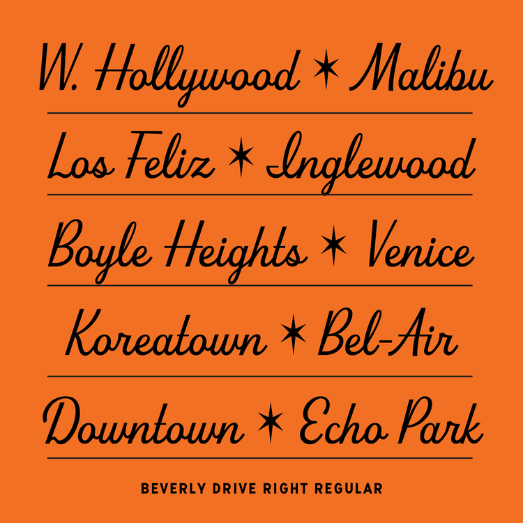
Amy: Always! I love going to Palm Springs and seeing all the midcentury goodness. And all the historic signage on Sunset and Fairfax in Los Angeles, or Sunset Beach, and other communities. Southern California is such a melting pot, so I find it an endless source of inspiration.
You’ve been live streaming some of your font-making process (which is very fun to watch); how do you know when to call a font “finished”?
Amy: That is always the issue! As soon as I think I'm done and I've done language support and all the tedious punctuation, I inevitably get struck with all these ideas for extra ligatures, and “hey, what if I add a full extra style set?” At some point I just have to set a deadline for myself and announce it publicly to stop the madness and just finish. Every font hits that stage where it could be a million different things. It's a superpower to commit to a direction and save all your other great ideas for the next font.
Congrats on the recent app collab with Fort Foundry. Can you give us any hints as to what new fonts you have in the works?
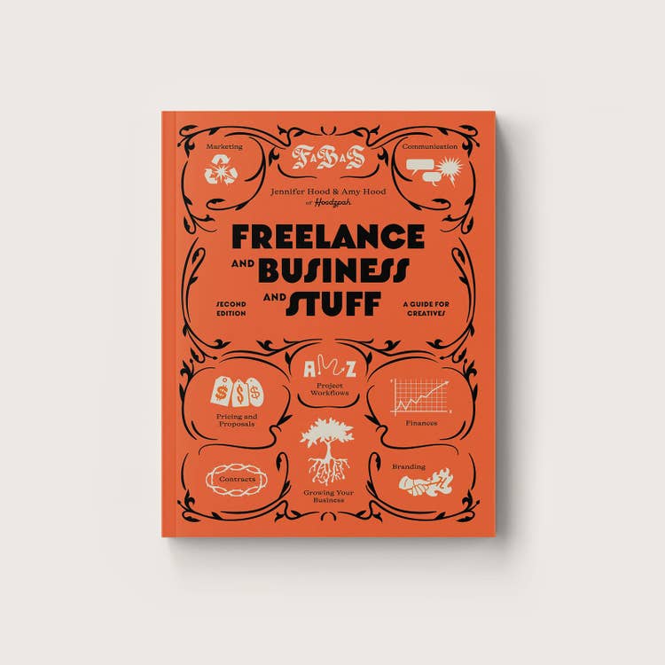
Amy: I’m going to be going hard on script typefaces this year! I have two new scripts coming, plus a super fun personality-rich sans that has the vibe of midcentury Italy. We love it so much we already used it on the cover of our book, Freelance and Business and Stuff! You know you're on the right track when you're already using your own fonts.
I’ve loved watching Hood Fonts grow, and keep spotting them in use. Do you get excited seeing them out in the wild?
Amy: It’s truly the greatest thrill! I love seeing how people apply them and customize them. It's a bit of stolen valor, because I feel in some way I play a part in the beautiful designs people make, even though they did all the heavy lifting, but I always feel proud when I see them out.
How do you stay creatively satisfied?
Amy: I think the key to creative satisfaction is having a rich life outside of making—filling yourself up with friends, experiences, taking in new culture, and hobbies you're not good at. All those things help keep you grounded. I also always take time to celebrate the wins. It’s easy to just go and go and go and then start to feel burnt out. Celebrate that font release. Celebrate seeing that font in the wild. Celebrate the small progress. It’s part of the fun.
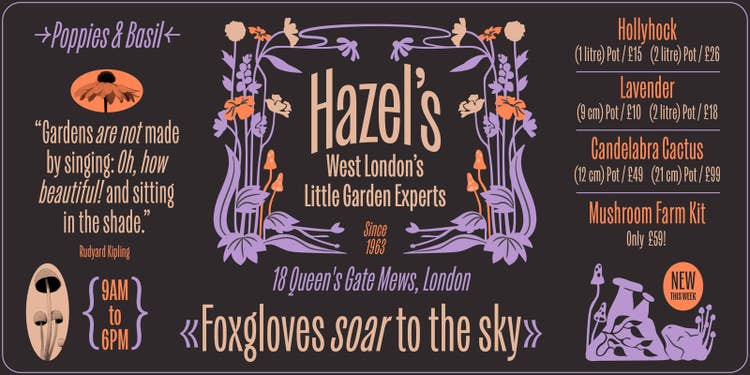
Thanks again Amy for taking the time to answer my questions. You can find Hood Fonts on Adobe Fonts at Hoodzpah, and on their website.
This article first appeared on Jake Giltsoff’s Make type work blog.