Building the Foodicons lexicon
A pro bono collaboration to create a visual language

Adobe's involvement began early on, shortly after Douglas Gayeton, co-founder of The Lexicon and Nathan Shedroff, designer and founder of the Design MBA programs at California College of the Arts (CCA), conceived of a way to aid communication and collaboration between food industry sectors by creating Foodicons, a universal visual language describing food systems.
Through a series of introductions Douglas and Nathan connected with program manager Lisa Pedee, who organizes pro bono collaborations for Adobe Design. A master of pairing the right people with the right projects, she knew exactly who to contact: Senior design manager Sonja Hernandez had not only been a pro bono partner many times prior, she and her team are skilled at creating massive icon libraries (together they create approximately 15,000 icons each year for Adobe products).
It wasn't long before Nayane de Souza Hablitzel and Isabelle Hamlin—experience designers passionate about iconography—had volunteered.
Trading words for pictures
The visual vocabulary Nathan and Douglas imagined would be less likely to get watered down by overuse or misuse. It could be used by farmers, food producers, and retailers and encourage more specific dialogue by unifying and differentiating subtle characteristics of terminology. And it could prevent a word like "irrigation" being used without descriptors, without nuance, instead of more specific terms (like deficit irrigation, scheduled irrigation, reduced irrigation, drip irrigation, precision irrigation, or subsurface irrigation).
They envisioned the language being created by a partnership between food experts and designers.
So they outlined the International Foodicons Challenge, a worldwide call to designers to contribute to an open-source icon system. And through Green Brown Blue, The Lexicon's 501(c)3 accelerator addressing global challenges facing food systems, they called in experts from the food industry to help prioritize a group of terms to create the language's foundation. And finally Nathan began working with CCA instructor Eric Heiman to create a real-world prototyping assignment, with the same food experts as clients, for TBD* (CCA's student-run design studio).
Creating a design system
In March 2020 Nayane and Isabelle began by researching imagery, iconography, and agricultural terminology (not just familiar phrases like "cage-free"and "pasture raised" but more complex concepts like "keystone species" and "soil microbes").
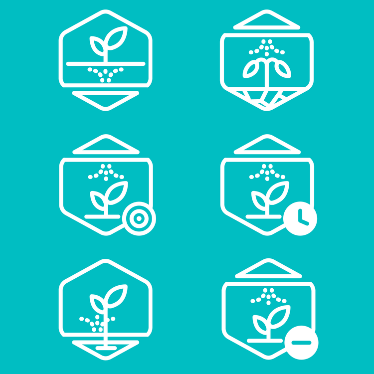
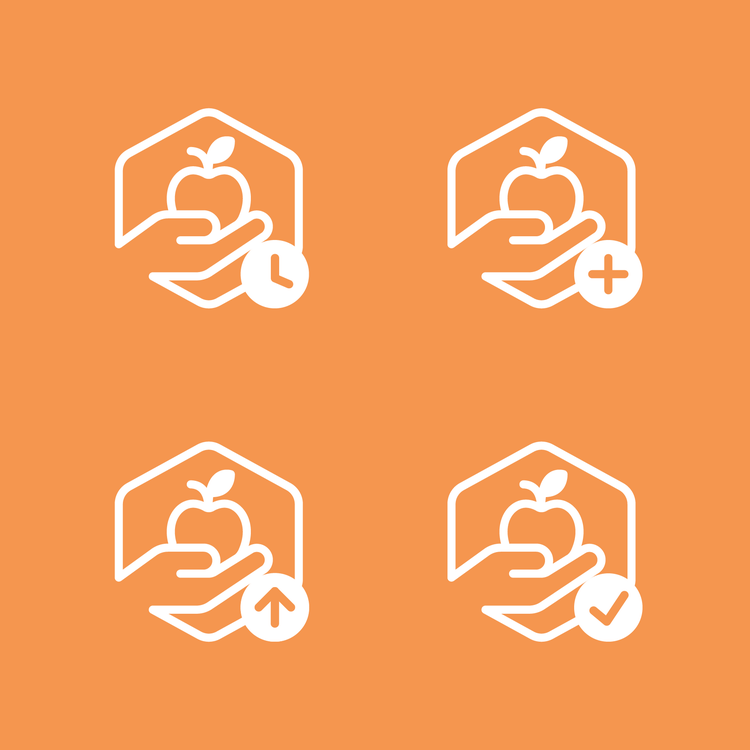
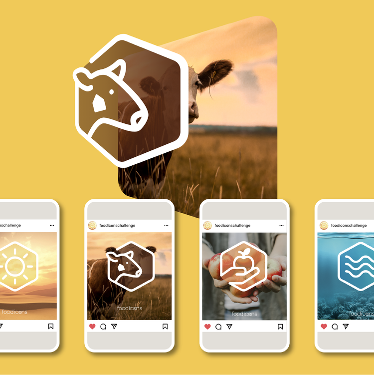
Nathan and Douglas had chosen the hexagonal icon shape as a metaphor for the agricultural world (bees and honeycombs) and the "hive mind" approach to Foodicons. Nayane and Isabelle expanded it: They subtracted corners, left gaps, and added dashed lines, arrows, and fills to provide for different meanings, and began thinking about color to ensure that if it was used, it would be used intentionally. And when they began to develop the library of art that would comprise the language inside the hexagons, they made one of the most significant breakthroughs of Foodicons: a series of modifiers (a clock, plus/minus signs, arrows, a checkmark) that would extend its vocabulary.
Because TBD* had learned so much while prototyping, Nayane and Isabelle moved quickly.
Once they'd developed an approach, their primary considerations during refinement were simplicity and scalability: Gaps, stroke size, the specific placement of interior art, modifiers, and the variety of hexagon styles all had to support every icon being readable and understandable at every size. They eventually compiled all of this information into a set of design guidelines, a modular system of shapes, metaphors, templates, and a library of elements that would make the language consistent no matter how many different designers were contributing to it.
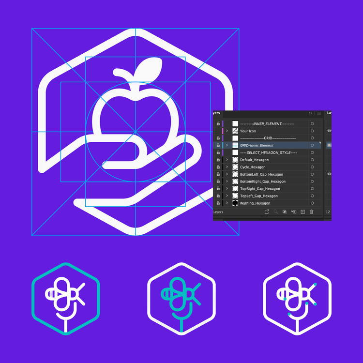
To ensure their design instructions were clear, Nayane and Isabelle tested them by creating icons (imagining they knew nothing more than the information they were supplying to other designers) and then asked their Adobe Design colleagues to do the same. Based on what they learned during these sessions they removed instructions from their guidelines that were too complex or that didn't produce the results they intended.
A challenge unfolds
With that part of their task complete Isabelle and Nayane's attention turned to the design of a website and a set of e-cards. The multipurpose Foodicons site, created in partnership with The Lexicon's digital producer Pier Giorgio Provenzano, would eventually house the entire icon library but its primary purpose at launch was as a gateway for designers to sign up for the challenges and download the templates and guidelines. This final work set in motion the global design invitation that Douglas and Nathan had envisioned.
The first International Foodicons Challenge launched in December 2020.
Contributing designers were asked to detail their process in digital workbooks. So when they started submitting, the work consisted of pages and pages of notes and sketches outlining rough concepts. Initial design reviews were followed by time-intensive design development, where the focus shifted to adherence to guidelines.
Throughout these initial rounds, Nayane and Isabelle (and the rest of the team) carefully considered the feedback they were providing to ensure it would remain consistent throughout the series of challenges. Changes to the design guidelines, the templates, and even the instructions were based on the submissions they saw during these first rounds of the first challenge.
Three more challenges like it would follow. Each was open for two months and no icon was selected unless every judge agreed on its clarity, validity, and... good design.
A global library let loose
The fourth and final challenge ended in early September (2021). At that time more than 600 icons, by 390 designers, from 58 countries had been created.
Since then, the Foodicons library has been uploaded to The Noun Project, the most comprehensive open-source icon collection, and unveiled at the FAO World Food Forum (WFF), a global youth-led movement to transform world food systems.
WFF will continue to add new terms yearly so the crowdsourced and open-sourced project is far from over and Douglas and Nathan will stay on as advisors.
But since the goal for Nayane and Isabelle was to create a system that would result in a library of icons, their work is complete. As is the work of Lisa and Sonja who've worked behind the scenes (judging icons, offering advice, building bridges, making connections, and supporting their team) from the beginning.
The project lasted 18 months and together the group of four invested over 350 hours.
It would have been impossible for any of them to predict the level of commitment they were making, or how much time and effort they would pour into it. But they'd do it all over again. Because what Isabelle and Nayane understand now, and Lisa and Sonja already knew, is that every project like it offers an opportunity to showcase, outside of Adobe Design, the efforts and strengths and talents of a team.
This article originally appeared on the Adobe Blog.