Designing design systems: How to lay the groundwork that drives decision making
A collaboration framework for building or evolving a design system

Graphic by Marco Mueller
It was not, however, a challenge unique to Adobe or to Spectrum. Developing the future direction of a design system involves complex work to create a viable framework for its evolution—behind which are the needs of the people using it, the legacy of a prior version, and a team's future vision for it.
Our approach to that work was threefold: build a community of advisors that can provide feedback, draft documentation that explains decisions and defines where the design is headed, and create principles that will guide current and future decisions. We’re sharing our framework so other teams, tackling their own colossal updates, can apply what we’ve learned to their own work.
Build a community of advisors and lean on it
People naturally feel ownership over things they have a stake in and there’s no better way to give people a stake than to give them a voice. For Spectrum, the best way to give people a voice was to incorporate their points of view into the next version of our design system.
Gathering designers, developers, product managers, content strategists, researchers, engineers—and anyone else with strong opinions about a design system—can help uncover ideas and behaviors that would make it flexible enough for anyone building products to use. Those unique points of view can also help design system teams learn more about how systems are used.
Rally people around themes
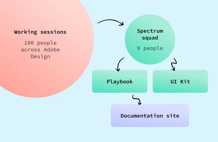
To collaborate with a community, it must first be built. Since workshops can feel performative, stress the importance of contribution, ownership, and self-organization so people feel the weight of their participation. For Spectrum, these early working sessions ended up being the perfect way to bring disparate groups together to begin sharing insights, ideas, and struggles, and to start thinking collectively beyond what felt possible.
Conversations from early working sessions can help evaluate what’s working (and what isn’t) with the current design system. And the feedback that emerges from them can provide a method for creating working groups according to people’s roles and passions. Gathering around a common theme creates a connection point for people with diverse experience and expertise. For Spectrum we ended up with twelve themes (that will vary based on the number of participants and the feedback from the earliest working sessions):
- Brand
- Color
- Content & Editorial
- Data Visualization
- Illustration & Iconography
- Inclusive & Accessible Design
- Motion & Interstitial
- Personalization & Customization
- 3D/AR/VR
- Tone & Voice
- Typography
- Surprise & Delight
Modeled after a class group project, each team was assigned a theme, asked to meet every three weeks, and to use their time generating big questions (like, “Can a design system allow personalization and still maintain consistency?”) that our team could lean on to begin thinking about how to adapt our design system. Group-appointed leaders drove things forward and when it was time to share work, the entire “class” got together.
As groups returned with insights and information, we not only gained a better understanding of where Spectrum might be headed, but the advisory community we’d envisioned was a solid and an ongoing source of feedback.
Learn from the people who’ve used the system
Designing in a silo doesn’t serve anyone—and especially not the people who are using a design system to work on a company’s products. To prevent a design system from becoming something that's created in a vacuum, every piece and part of it must come from decisions based on the feedback—from working groups and the people and teams who’ve used and contributed to the design system. Gather visuals from the teams and people who’ve contributed to the design system, look for broad visions, artifacts, great UX insights, and anything else people find usable.
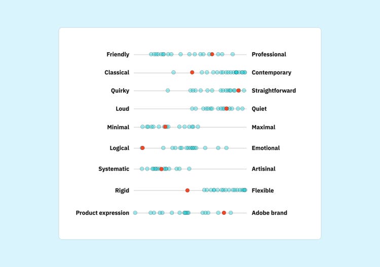
A particularly useful exercise for us was a digital whiteboard where people could include and respond to examples of how Spectrum was being implemented in our products. When teams met, they could drop in ideas—for everything from branding and iconography to color and content—and leave comments and share opinions. Not only was it a great opportunity for everyone to get a good look at what everybody else was working on, and to ask questions and leave praise, but in a short amount of time, it covered the breadth of what Spectrum could become.
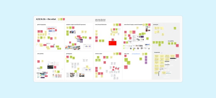
Real in-context examples and share-outs of work and themes can ground the work of a design systems team and keep it connected to what people need and use. We referenced them continuously and later worked side-by-side with product teams to explore them further.
Create a playbook to document and guide design decisions
Unless it’s documented and shared, people can’t know what's beyond the visuals—all the choices and conversations that go into deciding the details of a design system. Rather than just handing people a set of guidelines, educating them brings them along in the process. Playbooks are one way to do that.
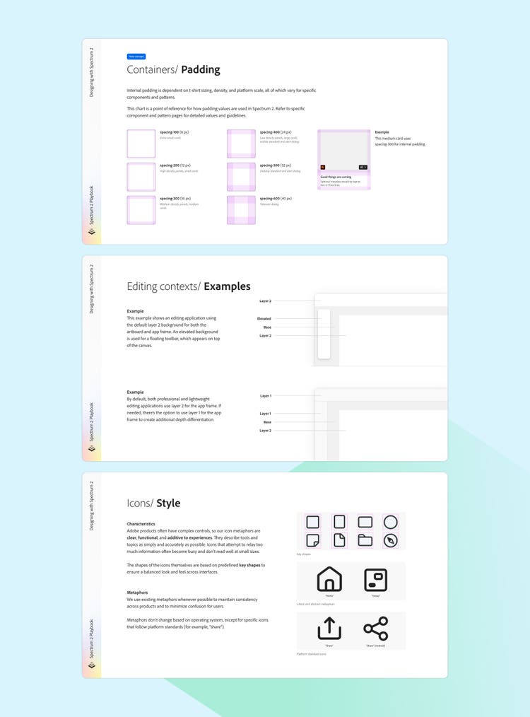
What exactly is a playbook?
Everyone has their own idea of what a “playbook” is. For us, it was readily shareable documentation that functioned as an introduction and guide to understanding how to use our design system, and a first step towards more detailed, researched, and tested usage guidelines. It was our way of becoming intentional about infusing logic and meaning into our visual choices (with every design decision asking not only "How does this look?" but “What is this communicating?"). It was a big step forward in refocusing Spectrum as a complete communication system.
Not only are they a low-barrier way to document and solidify decisions, but when updates (like Spectrum’s) are new to everyone, playbooks are the best way to share information and make decisions more transparent. They help put into words what’s most important in an update. They also offer a place to synthesize community feedback into what changes are being introduced and how those changes will affect the system and the people using it.
Make your best guess and write it down
Playbooks create accountability for teams making decisions about what they’re designing. But there’s a common misconception that ideas should be far along by the time writing begins (you figure out what the thing is, then write the documentation for it). What’s most beneficial is to start writing as early as possible, and approach things with an early-draft-seeking-feedback mindset. Writing things down should make things real, but it shouldn’t make them final.
Documenting design decisions can begin as a high-level, best-guess look at what the next version of a design system will be, distilled into specific concepts and guidelines that can be shared. We organized Spectrum’s playbook into four sections according to the broad ideas gathered from working groups:
- Introduction: Information about the current version of Spectrum, the new version we were working on, a changelog, and information for beta testers
- Fundamentals: Updated concepts and terms, and information about engineering collaboration
- Designing with Spectrum: Details about implementing things like color, typography, object styles, and iconography
- Patterns: Out-of-the-box templates for getting started with testing Spectrum’s new designs
For us, writing equals thinking. And it’s a big part of how our team has worked. What was different about it this time was that we were sharing our work (what we wrote) much earlier. Because we found so much value in it, we're now writing documentation earlier in our design process.
Documenting our design decisions began as a high-level, best-guess look at what the next version of Spectrum would be, based on our knowledge and what we were hearing from our community. The playbook also created accountability for us to make decisions about what we were designing. We had all these broad ideas that we’d gathered from the community and writing them down forced us to distill them into specific concepts and guidelines that we could share.
Visualize and test design changes
Playbooks are also a great place to visualize design changes that are being considered. High-level concepts like foundational updates (color, object styles, icons, typography) can be tested by applying them to a set of core components and styles (frequently used buttons, checkboxes, text fields, popovers, panels). For Spectrum those visualizations also evolved into a UI kit, which we used to ask for feedback from product teams testing in the context of their design work. We also used it during working sessions where we presented updates and asked specific questions (like “What layouts for the card components are missing?”). When used together, the playbook and the UI kit allowed us to continuously test and refine our ideas as we made updates.
Identify, evolve, then solidify your system’s key principles
It can be tempting for teams involved in redesigns or big updates to rush to create a set of principles to communicate about the work they're doing, to rally people to get on board, or to get leadership buy in. But design system principles help identify those things you want to put your energy into immediately and guide future decisions.... teams shouldn't create them before they know what matters to them.
When teams create principles as the first step of an initiative, it usually results in principles that are more aspirational than inspirational. Aspirational principles don't have staying power beyond pitch decks. Inspirational principles influence how you do your work. Principles with staying power are words or phrases you refer to as tools for validating decisions.
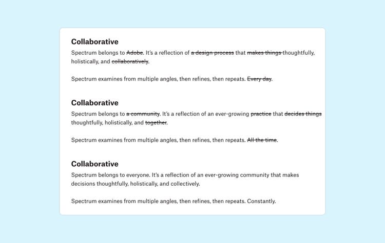
For Spectrum, creating principles wasn’t a step we had to check off a list and it wasn't linear. It was iterative. We revisited and evolved ideas over months (there were three or four different versions over eight months). And because we didn't rush to finish them but rather evolved and solidified them purposefully, as we did the rest of our system, we were more successful.
Be clear about purpose and intent
Given Spectrum's mission to support a large community, it was especially important that we considered our principles as statements of what the design system offers, what we value as a team serving other teams, and the ways we make decisions. As we approached the update to Spectrum’s principles, we were extremely aware of articulated versus actual principles: Words must be backed with action. As an example, if one of your principles is "accessibility" but you treat it as an afterthought, there's a mismatch. For us, "human" as a principle means accessibility is a requirement at every level—from contrast fundamentally built into our color system, to reduced motion considerations in our public-facing website.
Spend time getting clear about your purpose for having principles before trying to brainstorm or write about them. Ask questions:
- Do you need operating principles for how your team works?
- Do you need team principles for what your team values or how you treat each other?
- Do you need design principles for how something should look, sound, or feel?
Keep principles constant, but flexible
Transforming a design system will include conversations about reinventing the principles it’s based on. So, along with every other part of the design system, they will also be in a state of flux. Share them, and don’t be shy about letting people know that they’re early concepts and subject to change. Even when a team has a good idea about what their principles can or should be, transparency will provide the space to continually revisit and refine them.
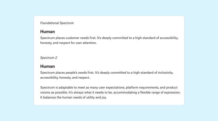
Principles should be broad enough to be interpreted and applied in many ways, from high-level to specific, based on how a team makes decisions. They should also be constant and consistent but flexible enough to adapt to the context people bring to them. We eventually decided to keep Spectrum’s original three principles (rational, human, focused), because they still felt right and resonated, but we added a fourth (collaborative) to reflect how collaborations across Adobe had contributed to Spectrum's growth. Think of them as tools for helping to frame problems and make decisions, as opposed to rigid criteria:
- We always want to be rational, but there's not a single way for that to happen. It may not be possible to conduct user research for each decision, but input from industry experts can help a team make informed decisions.
- We always want to sound, look, feel, and be human, but there's not one single way to be human. “Human-centered language” sounds straightforward and clear, but it can mean different things to different people.
- We always want our designs to be focused and only show the information that needs to be shown at a given time, but what's considered necessary and focused can change depending on the user, the product, and the context.
- We always want to be collaborative and lean on community, but that happens in various levels of fidelity. Encouraging feedback is collaborative even if it's not as hands-on as a working session.
Developing the future direction of a design system is a process that requires a continuous loop of feedback, experimentation, decision-making, and drafting documentation that clearly defines where the design has been and where it’s headed. At the heart of that work is a team mindset that balances being open, iterative, and flexible with making progress and having vision.
Lead designer Lynn Hao, operations manager Angelie Herreria-Tagle, and lead content strategist Jess Sattell wrote about and led this work for Spectrum's comprehensive update. They continue to work with the rest of the Spectrum team to bring the future version of Adobe’s design system to life.