Don't design for your users
There’s a much more intentional way to design and build products
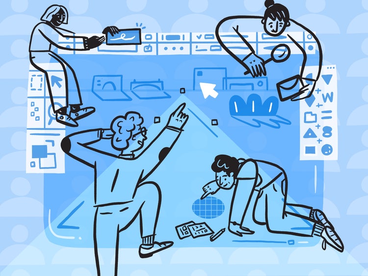
Illustration by Katie Lukes
At that time, we had a group of Photoshop users in our community forums who were super helpful at catching bugs, coaching people, and championing Photoshop. They were mostly photographers and shared a future vision for the application. Also, at the time (before experience design tools), many younger and newer-to-Photoshop users were using it for screen design. The needs of those two groups were so different. How could we possibly prioritize our work if we were building a tool for screen design, photography, compositing, retouching... counting? We needed to decide who we wanted to build the future of Photoshop for.
When designing features, it’s almost reflexive to focus on “your users.” But when we design and build for a current, average, or in any way arbitrary user without giving thought to the long-term goals of the product, we add chaos to the design process. Because existing users are the story of where a product’s been, and not necessarily where it’s headed, design and product teams neglecting to talk about an ideal future can set up cross-functional misalignment. And if engineering, product, and design are misaligned, it doesn’t matter how amazing a designer, team, or process is, the product’s future can’t be defined.
How can individual designers ensure alignment on projects? We can bring focus to them by ensuring stakeholders not only think about users, they also agree on a carefully chosen set of what I call “challenge people.” When features and products are designed for and with these people, there’s a better chance that those features and products will be built with clearly articulated goals and more cohesive experiences.
What are “users”?
Product managers, designers, product marketers, and C-level executives, we all at one time or another have uttered the phrase, “Our users want/do/need ____.” But “users” almost certainly means something different with every utterance and to every person. Furthermore, the wants and desires of existing users aren’t necessarily going to drive your product in the direction you want. Marketing and growth teams often push for features based on driving generalized usage metrics but if teams aren’t careful, they can end up chasing growth numbers and risk losing sight of long-term strategy.
Designing for only a niche group of Photoshop users in our community forums was not the way to design our product for the future. We needed to align our long-term strategy and then we needed to find our challenge people to help us get there.
What are “challenge people”?
Different than personas (often defined by marketing teams to find groups of current users to market to) challenge people are a small number of “real humans,” as opposed to made-up identities, for whom you’d like to build your products. Their needs and “challenge cases” (those things that challenge people want to do now or will want to do in the future) will drive you to create products and features that align with your long-term strategy. Challenge people are:
- Not necessarily among your current users (they could be a competitor’s or simply someone who’s got the need for the product you want to build)
- Probably not the primary target of your marketing (remember, challenge people lead you to build the product you want to market)
- Not always “easy to recruit” for user testing
It’s easy to confuse challenge people with users, so I’ve come up with a set of criteria that will make it easier to identify them. Good challenge people have aspects of at least one of the four categories below; great challenge people may have all four.
- Umbrella challenge people
- Lynchpin challenge people
- Specific challenge people
- Future-leaning challenge people
The tenets or elements of these groupings are based on years of listening to other designers, product folks, marketing folks, and strategists talk about their work and their customers.
Umbrella challenge person
Kat Holmes, Chief Design Officer and EVP at Salesforce, and author of the book Mismatch: How Inclusion Shapes Design talks about identifying the extreme needs of a group in order to highlight the largest group of people possible. I call this an umbrella case. Building for and with people with extreme versions of needs, that also include the needs of other people, will focus and challenge your solution.
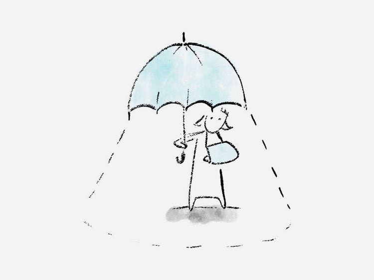
There are a couple of well-known solutions for challenges presented by umbrella challenge groups: The first is what’s known as the “curb-cut effect.” Coined by attorney, civil rights advocate, author Angela Glover Blackwell, the phrase refers to the widespread adoption of sidewalk ramps (graded curbs), that exponentially increase accessibility for people in wheelchairs, because they increase safety and mobility for everyone. The other is OXO Good Grips, designed in 1990 by Sam Farber when he saw his wife, who was arthritic, having difficulty using a potato peeler. He knew that if he designed a peeler that was easier for her to hold and use it would be easier for everyone to hold and use—no matter the shape or size or strength of their hand.
Lynchpin challenge person
As designers, this is one of the first people we think about, even before umbrella challenge people. Often referred to as early adopters or power users—and, on social media, influencers—lynchpins can sway large groups of people. Once they’re on board, other people will be convinced of the value of your product.
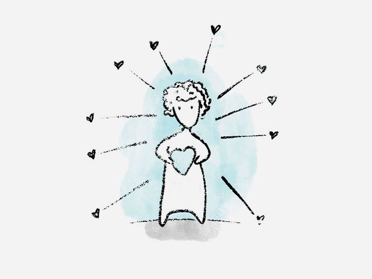
Many of the motion graphics designers who use Adobe After Effects could be considered lynchpin challenge people. It’s professional software. And the people who use it are professionals. If these motion graphics professionals were to stop using, and loving, After Effects many other people who admire them might stop using it too. So, when the After Effects team considers new features for its product, it must consider the needs of this group of professionals to make sure that the product is the first-class tool they expect and need.
Specific challenge person
Most products, experiences, and applications have multiple uses and purposes which means there can be people with completely different roles and jobs each using different areas of a single product. It’s important to challenge those uses and scenarios with challenge people specific to each of them.
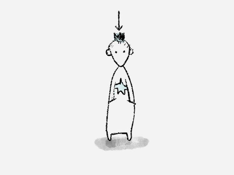
Take for example ride-sharing apps. The major market players have different apps for drivers and riders. Although in their case, the specificity of their challenge people is quite clear because the groups are so distinct, other products might not have such a clear distinction. It's quite common for enterprise software to have a need for specific challenge people (administration panels are designed for the purchaser of the software, not the person using it) but it's also common in most any two-sided ecosystem of contributors and consumers (like a marketplace).
Future-leaning challenge person
When all other challenge bases are covered—Umbrella, Lynchpin, Specific—it’s the needs or experiences of future-leaning challenge people that are going to drive the product toward the future version you envision. It can be difficult to hear from this group but when you do, magic happens!
Poshmark, a commerce site for new and second-hand fashion and home products, was built from the ground up for, and with, Generation Z. Poshmark didn’t set their sights on all customers of other commerce sites, they instead built for the future-leaning people on them, those people with a unique frame of reference and distinct point of view. Because they took a risk with that group and created a hybrid social community/social commerce marketplace, it’s popular also with any age group deeply involved in social media.
Consider carefully who you build for and with
When we choose to talk to specific people, we are also choosing not to talk to others. I have six words of caution about making those choices: Take care to do no harm. When choosing the people you’re going to build and design for and with, set out from the beginning to choose them with care. Be aware of who you’re not talking to and talk openly about what that might mean.
While deciding on your Umbrella, Lynchpin, Specific, and Future-leaning challenge people, remember to look at the diversity of those choices and what groups might have been left out: Are they from a wide range of socioeconomic backgrounds? Are they from a range of intersecting races, ethnicities, and genders? Are they only US based? Make considerations throughout the project about what would happen to your product (and what might happen in the world) if you were to listen only to select groups of people.

Before you start designing—while you’re choosing explicitly who you build for and with—is the best moment to consider the ethics of who you speak with and build for. It’s your best shot at making your product inclusive and accessible. And, after you find these humans, hire them if you can. If that’s not possible, stipend some of them to participate on an advisory board. And if you can’t do that, at least ensure you do extensive contextual inquiry or ethnographic studies.
Align and challenge your team and yourself with challenge people and cases to make better products and a better world.
Adapted from my FITC Spotlight UX talk “You should not design for your users.”