Reinventing Adobe Spectrum’s colors
Our science-backed approach to updating a color system that supports over 100 products
Illustration by Marco Mueller
I'm the Spectrum designer who leads the work on our color system and last month, we released Version 6.0 of our colors. It’s a flexible, science-backed update that will help Adobe’s design teams make color decisions.
The seven-month effort began with an in-house brand analysis to evaluate product color needs and align Spectrum colors with the Adobe brand. After settling on a new system, we rewrote documentation and engineered colors as an adaptive color palette (a systematic approach in which we define the constraints informing color generation rather than create static swatches). The process ended with color updates to our design and engineering resources and documentation.
Over my career I've continued to learn about color and contrast perception. This update to Spectrum's colors was an opportunity to challenge and apply what I know, and to learn more within the context of an elaborate enterprise design system. The complexities of programming color are many, and the enormity of Adobe’s product portfolio added its own challenges, but some of our discoveries and hurdles can benefit other teams working on color systems large and small.
Enhanced gray contrast
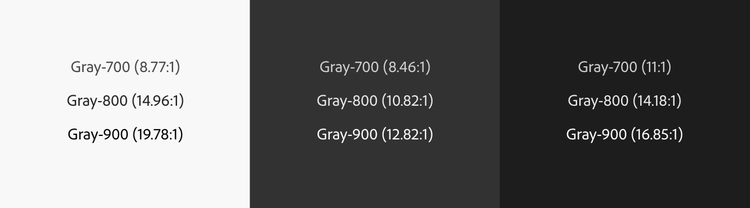
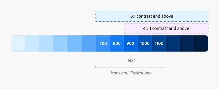
Gray hues in Spectrum are used for backgrounds, borders, text, and icons. Our existing gray system met Web Content Accessibility Guidelines (WCAG)contrast minimums, that inform the visual presentation of text against adjacent colors, but meeting those minimums wasn’t enough. Our text and icons often appeared to be in disabled states (not interactive) or weren’t visually prominent enough for users to discover content and tools.
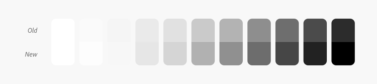
Our new gray system enhances the contrast of text and icons in the UI, gives them clear visibility, and ensures that they create clearer hierarchies in the interface, to guide people toward key content. They’ve also been optimized to have higher contrast for text and icons and less contrast for backgrounds, to make reading easier for people with low vision. Finally, to create an overall brighter appearance for application backgrounds, we lightened the background gray in Spectrum’s light theme.
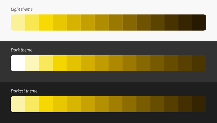
Optimized dark themes
Spectrum has three themes: light, dark, and darkest. Our previous dark themes were an inversion of the light theme with a slight increase in contrast. Over the years we'd learned more about contrast perception and how it affects the appearance of colors in dark themes. We realized that our dark themes needed a more unique approach to implementing colors.
To start, we had to address the fact that the WCAG contrast ratio (the mathematical measure of the difference in brightness of an object and others near it) and perceived contrast (how the difference in brightness between an object and its background is perceived by the human eye) are not the same.

The first thing we addressed was the effect of simultaneous brightness contrast (how a color’s perceived brightness is affected by the brightness of the color surrounding it).
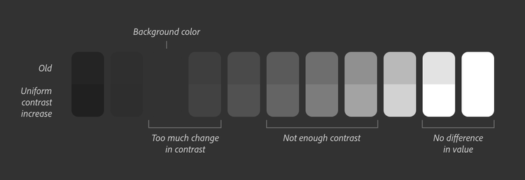
We thought that uniformly increasing contrast in the dark themes would solve the problem, but it didn’t: The change from gray-100 (Spectrum’s default background color) to gray-200 was not as subtle as we’d hoped, contrast was not increased enough in mid-tone grays, and the lightest grays became white and indistinguishable from one another.
Dark themes have the same contrast requirements as light themes: higher for grays used for text and icons and lower for backgrounds. Unfortunately the contrast increases we made to Spectrum’s darkest theme didn’t work for the dark theme. We had to increase contrasts independently to create the correct contrast range for both themes.
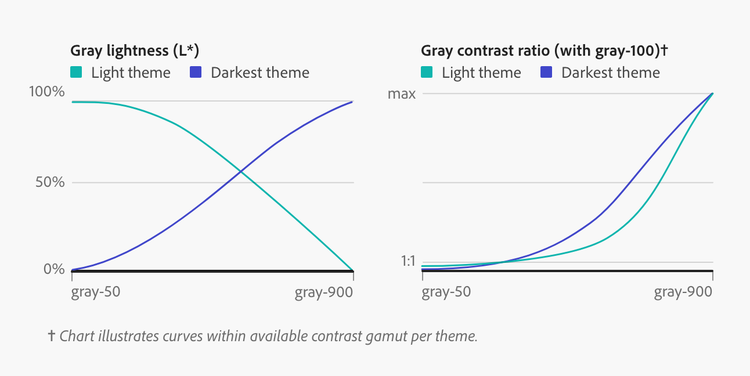
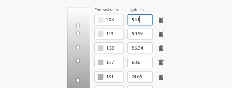
Our solution was to calculate target contrast ratios (the desired contrast ratio between two colors when one is generated by a color tool) as percentages of the available contrast for each theme. By generating contrast as a percentage we ensured that generated colors wouldn’t default to pure black or white, which would happen if multiple colors had target contrast ratios above the available maximum contrast.
Next, we created a single fully adaptive theme from which we could generate additional light, dark, and darkest themes by simply optimizing color and contrast based on the lightness of the background. That way, text and icons would get progressively darker in the light theme and progressively lighter in dark and darkest themes.
Perceptually balanced color
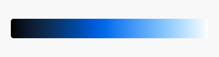
Spectrum’s color system was designed to provide a balanced harmony of hues with options for products needing color for taxonomic or hierarchical information, including categorical color for data visualizations.
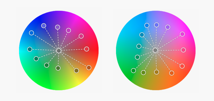
Our original colors were selected by evenly dividing the hues of an HSL color model, an easy-to-understand model that maps RGB (red, green, blue) colors according to hue, saturation, and lightness. It provided balanced hues and multiple options for using them, but as color needs across the company evolved, we wanted to back our color decisions with a more scientific approach.
We evaluated our hues in a perceptually uniform color space (that is, one that relates to how people see color): CIECAM02-UCS (CAM02), a mathematically precise model that enhances the LAB color space for accuracy. LAB was created by the International Commission on Illumination in 1976. It’s a device-independent color space numerically modeled on lightness (L), a red-green channel (A), and a blue-yellow channel (B). Unfortunately LAB has irregularities for certain hues that don't map precisely to human perception of color; CAM02 is a scientific advancement that corrects those irregularities and provides a more accurate model.
Individual colors. Our move to the CAM02 color space meant we needed to evaluate every color for balance and harmony, especially for changes to hue and saturation as colors were made lighter and darker. Rather than look at individual color values for each tint and shade, we created lightness scales for each of Spectrum’s colors to uncover the fullest possible set of values for every color.
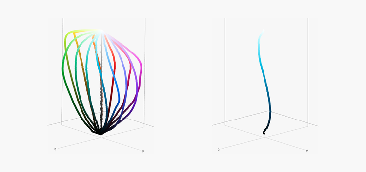
Color models like RGB and HSL are often depicted using simple geometric shapes, like a cube or cylinder, but uniform color spaces like CAM02 can't be depicted in the same way. In addition, color scales created with different color spaces produce different shapes in CAM02. Since Spectrum colors are constrained to the RGB color gamut, it resulted in some unusual shapes. Instead of looking for familiar shapes in the charted color scales, we created every color scale in whichever color space produced the smoothest shape and the best-looking gradient.
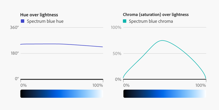
We evaluated each color's lightness scale based on the "shape" (the charted curve) it made in CAM02. Then we made hue and saturation changes in Leonardo (our open source tool for creating color systems based on target contrast ratio) to smooth the color scale's shape. Defining color scales this way enabled us to precisely modify hue and saturation.
Physicality of colored objects. Since Spectrum’s colors are applied to user interface elements (such as buttons, switches, or physical surfaces), which are often interpreted as colored physical objects, we wanted our colors to replicate the physical attributes of reflected light to some degree. The Bezold–Brücke shift (a phenomenon in which a hue shifts toward warmer colors as light intensity on an object increases) is used by artists for creating realistic warm and cool tonal shifts for light and shadows.
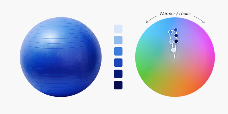
When we applied this shift to our color system and viewed it in an interactive 3D model in CAM02, our colors adapted in a way that was natural, harmonious, and perceptually uniform.
Uniform progression of lightness and contrast
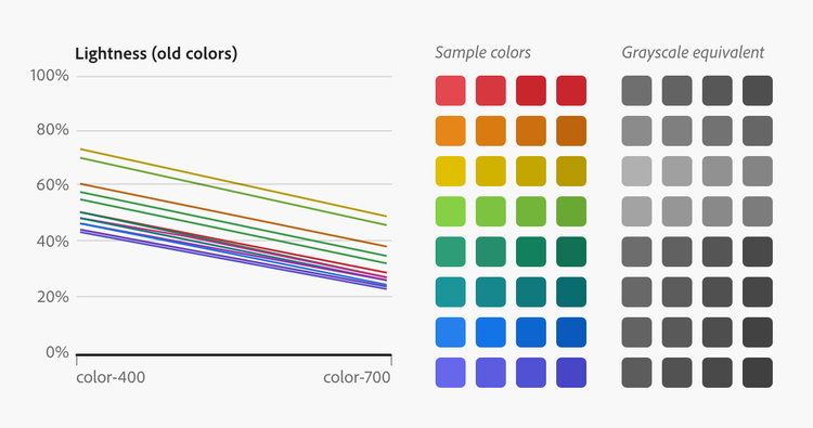
One of the primary ways to create a color system that's intuitive and rational is with a consistent and uniform progression between values of lightness and contrast for every tint and shade. Our existing colors had a unique degree of lightness for each hue (blue was dark, yellow was light) and unique lightness progressions for each tint and shade. These needed to be unified to support the ways we use them in Spectrum.
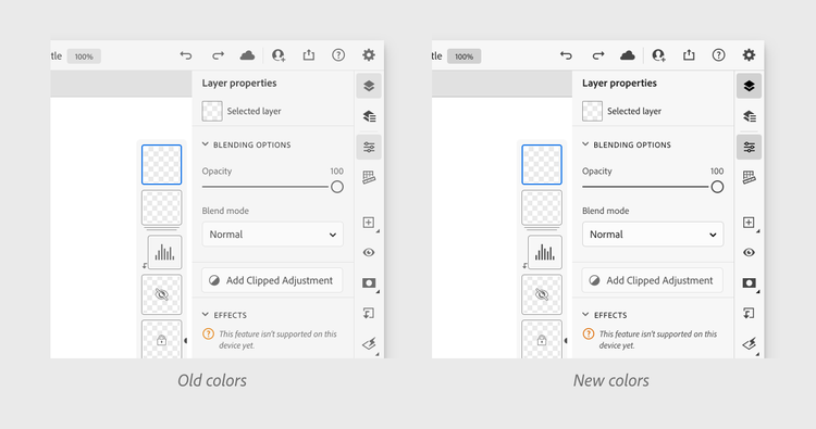
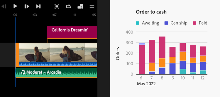
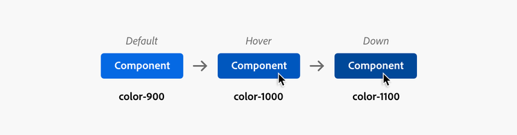
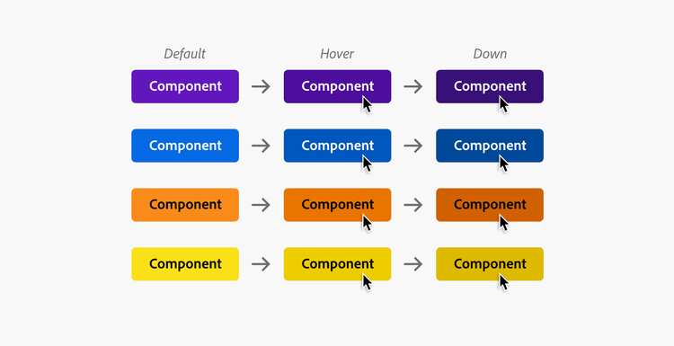
A common way tints and shades are used in Spectrum is for state progression in components: As the image below shows, when a user enters a hover state, the component increases in contrast by one unit. The down (pressed) state increases in contrast by one more unit. This progression should have a uniform change in visual weight between states, regardless of hue.
We noticed that certain colors appear more true-to-themselves at specific degrees of lightness, in other words, yellow is more identifiable when it’s a lighter value and purple is more identifiable when it’s a darker value. The progression between each value must retain a consistent rate of change in visual weight regardless of a color’s lightness.
There are additional uses—such as colors used for highlighting, subtle badges, or quick actions—that require lower-contrast backgrounds, but as we created a linear lightness progression in CAM02, we noticed another problem: No color space, uniform or other, provided a lightness progression that appeared visually balanced. This was especially true with lighter tints.
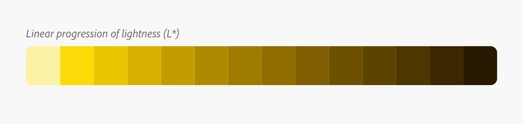
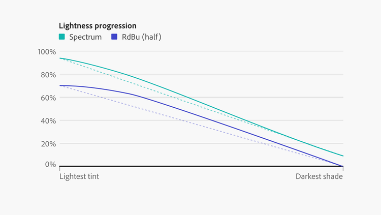
While researching visual perception, we discovered Stevens’ Power Law, a theory that correlates a change in the “actual” magnitude of a stimulus and what people perceive. We observed it in our lightness scales where the progression of numerically even distributions of color didn’t appear equal.
When charted, the cause-and-effect relationship of Stevens’ Power Law follows a curve we’d seen in other color scales with perceptually balanced appearances, such as ColorBrewer’s diverging RdBu palette (used for data visualizations, it equally emphasizes beginning, mid, and ending values). We created a custom polynomial curve for our colors which resulted in a more balanced distribution of lightness for the tints and shades used in our component states.
Satisfied with the progression, lightness was converted into target contrast ratios bound to the available contrast gamut per theme (like our grays). This ensured that the rate of change and output colors were optimized for each theme and provided a way for us to decide, and enforce through code, which color values would meet WCAG contrast minimums across all themes.
Flexibility with clear guardrails
Adobe has more than 100 products, each with a diverse range in user needs. Product teams were already finding ways to use color (such as modifying opacity to create lower contrast colors) that we had no existing solution for. We needed flexibility, but with guardrails that would help teams make accessible color choices.
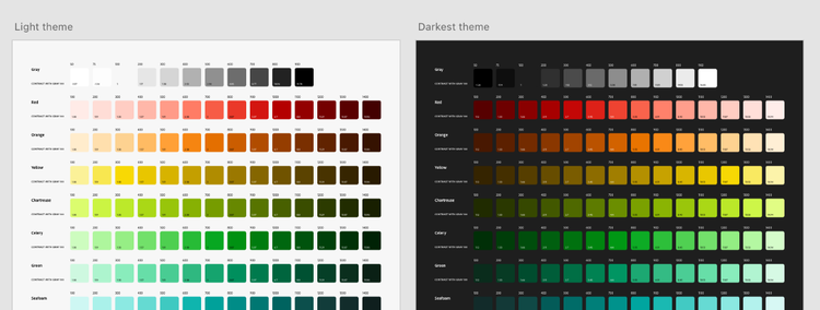
We introduced 14 tints and shades of each color. This gives product teams multiple options, and the lightness progression ensures that any value can be incremented for component state backgrounds.
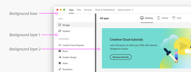
Layering for visual hierarchy
Layering, to create surfaces and depth, is valuable for creating hierarchies of information and drawing attention to specific content like toolbars and panels. Our new system needed a similar mechanism for visually layering regions of the interface.
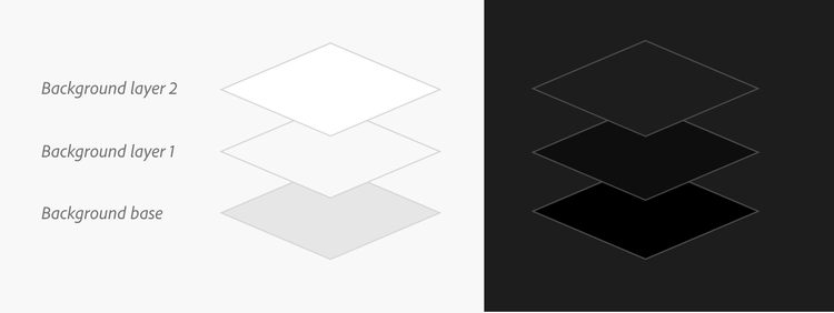
Our solution for Spectrum is understandable, accessible, and appropriately adapted for dark themes: Layers are named progressively “base,” “layer 1,” and “layer 2” to signify a stacking order or visual depth. Base is the furthest surface from the user, therefore the darkest, and layer 2 is the closest to the user, therefore the lightest.
Modern, vibrant, and saturated color options
The original color choices for Spectrum were made back when enterprise software used less saturated colors as a way of conveying trust. Color trends have changed, and vibrant colors no longer have the same connotations they once did. Our colors were dull, outdated, and didn’t align with the current Adobe brand.
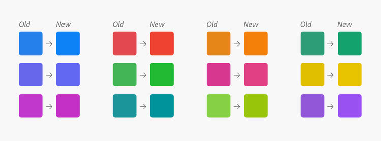
Our re-evaluated colors have higher vibrancy, increased saturation, and feel more cohesive with the other expressions of our brand. Highly saturated colors can also increase hue perceptibility and distinguishability for people who have trouble differentiating between certain colors (commonly known as “color blindness”).
Better color tools
As we began reinventing Spectrum’s color system, we found ourselves up against the constraints of available color tools. As we identified things we needed to evaluate, we simultaneously evolved Leonardo to accommodate them. It provided instant feedback regarding color palette harmony and individual hue and saturation shifts in perceptually uniform color spaces.
In Leonardo we added inputs for lightness stops (the desired lightness for colors) that synchronize with target contrast ratios, and the ability to choose swatches by lightness values, which is much more intuitive than choosing them by target contrast ratio. Since we needed to iterate rapidly, we also added an automatic UI kit generator that creates an SVG file of labeled columns and rows of colored rectangles so we wouldn’t have to manually update our UI kits with every revision.
What’s ahead for Spectrum’s color system
Changing the foundation of an enterprise-level design system is a difficult task, especially when considering varieties of visual acuity, color deficiency, and perceptual balance. That challenge increases with a large, global, and diverse user base and a product portfolio as complex as Adobe’s.
Version 6.0 of Spectrum’s colors is an adaptable system that’s easier to understand, easier to use, and ensures color accessibility. Its modern take on the Adobe brand for user interfaces is enhanced and optimized for every color theme. While this update is complete, Spectrum’s color system will never be “final”: We’re continually thinking and learning about color to provide the best possible solutions.
Among Spectrum’s guiding principles is the belief that our system gets its strength from a community—from a collection of talents, viewpoints, and skills. We’d love to hear from you: Let us know what you think about our color update.