The evolution of five of Adobe’s iconic icons
How time and circumstance have transformed these legendary in-app symbols

The challenge of finding the perfect metaphor—one that’s clear, culturally sensitive, and future-proof—is what makes designing these miniature artifacts so fascinating. Look at any software interface and you’ll find a constellation of them, each trying to say something without saying a word. Early software icons mimicked real-world objects—phones, disks, folders—and as software matured, so did metaphors with stripped details. Reduced to a minimum, they became more abstract and conceptual representations.
Icons evolve for many reasons: Higher resolutions, changing support of file types (from bitmap to scalable vector graphics), switching design tools, touch interfaces, and new user expectations can all mean rethinking everything from line weight to metaphor. Most importantly, there’s the audience: Who are we designing for? Is this icon for professionals? Consumers? Both?
I’ve been designing icons at Adobe for over 20 years. I’m a metaphor hunter, a visual problem-solver, and a passionate advocate for clarity and consistency, but also beauty and joy. Together with my peers on Adobe's Icons team, I define, create, and evolve the icons used across Adobe's extensive product ecosystem. Our work involves everything from brainstorming metaphors to pixel-perfect execution. We collaborate with UI designers, product teams, and engineers. We test icons in context, gather feedback, and fight for designs we believe in. Icons are my language. Finding the best metaphor is one part. The other is shaping the metaphor to design the best interpretation of it. That takes knowledge, skill, and patience. It can be tedious work, and yet... I love every minute of it.
The five icons in this story are iconic, in the truest sense. They’ve been around for decades and have evolved alongside Adobe’s flagship products. They’ve evolved and they’ve endured. And each one tells a story; not just about design, but about how technology, culture, expectations, and needs change over time. But most of all, they reflect the thoughtful, intricate, enchanting icon design process.
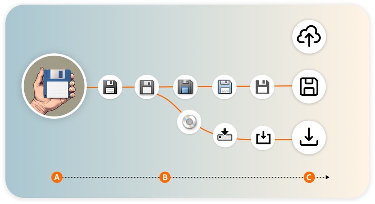
Save
The floppy disk is instantly recognizable, easy to draw, and deeply embedded in user memory. Even when people complained that the metaphor was outdated, user testing showed that even people who’d never used a floppy disk still understood what it meant. We tried replacing it. We explored metaphors like saving to a hard drive or burning to a disk, and with the emergence of cloud storage, we needed an instantly recognizable differentiator between saving to a local hard drive and a third-party server. But none of them resonated like the floppy disk.
The outdated data storage device is more than a metaphor, it’s a symbol, and it doesn’t matter where something is being saved—to a local drive, a cloud, a thumb drive—the floppy disk means “save.” And that’s enough. That’s the power of an iconic icon.
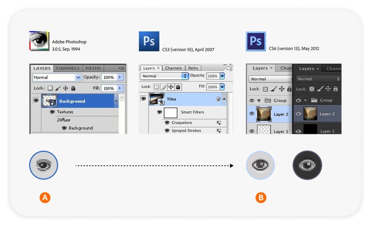
Hide layers
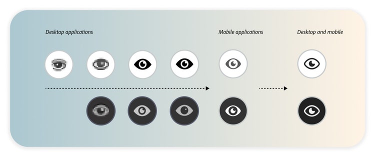
Widely used and instantly understood, the eye icon is a classic metaphor for opposites: show and hide, visible and invisible. But designing it was anything but simple. Early versions were quite realistic—complete with lashes and pupils. But on dark backgrounds, the realistic rendering looked unsettling.
In Japan, users found it uncomfortable to “poke” the eye with a pointed cursor to hide a layer. Since the icon style at the time incorporated gradients, bevels, and drop shadows, we tested different levels of realism, adjusted contrast for dark mode, and consulted with international colleagues to ensure cultural sensitivity. We redesigned it multiple times, each version more abstract than the last. Over time, the eye lost its lashes, its iris, and its realism. Today’s version is minimal and symbolic. It still communicates visibility, but it’s more universal and less disconcerting.
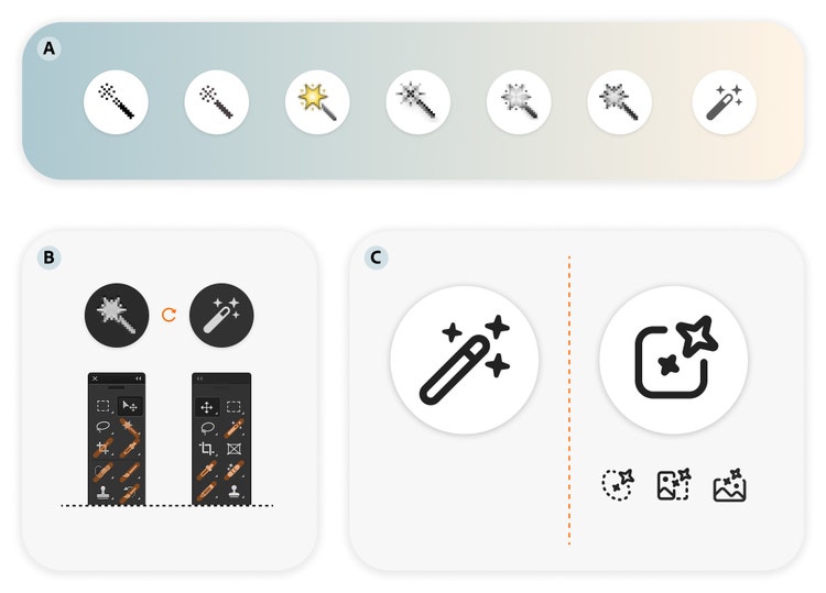
Magic Wand
With its sparkles, the Magic Wand has always promised one-click magic—like selecting similar colors in an image with a single tap. But sparkles recently became our visual shorthand for generative AI features. Suddenly, our wand was in danger of being mistaken for an AI tool. But the wand needs its sparkles too because without them, it’s just a stick.
We reconsidered the sparkles and their placement, size, and rotation to preserve the wand’s identity while distinguishing it from AI icons. In the end, we kept its most recent sparkle style and created a different star-like pattern for our AI icons—larger, paired, rotated, with a designated position, and more “distinctive” than twinkling. The design of the wand remained mostly untouched so it could keep doing its magic.
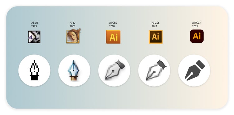
Pen tool
Although a common metaphor by now, the pen icon became synonymous with creating and editing vector paths with the introduction of Adobe Illustrator in 1987. It’s not a pencil (for freehand drawing), or a brush (for painting), it’s a pen (for precision, Bézier curves, and vector art).
The metaphor hasn’t changed since its introduction, but its orientation has. In version 15 of Illustrator, the pen icon was rotated and tilted to better fit the button space and align with the orientation of other tool icons. Users noticed. Some loved it. Some didn’t. But the rotated version gave us more room for detail, and it felt more natural—like a pen in motion. It’s a great example of how small changes can spark big reactions.
Crop tool
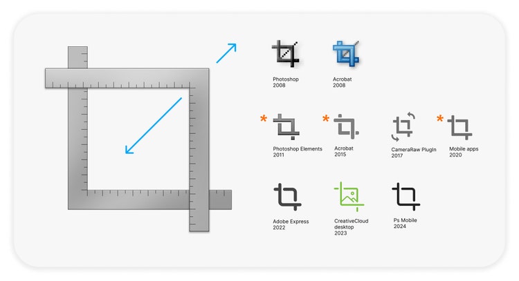
The crop tool has been in Adobe Photoshop since version 1. The metaphor is based on the corner rules of masking frames used in darkrooms. It’s changed subtly over the years, but it’s a symbol that’s stood the test of time.
It’s been simplified and streamlined. We removed the diagonal “guideline” to reduce visual clutter and adjusted the layering of the ruler legs to improve clarity. Then, when mobile editing introduced rotation and straightening, and suddenly cropping wasn’t just about trimming an image, we added arrows to make sure our icon communicated and reflected those new features without losing its core identity. Through it all, people still recognize it.
Icons are living symbols
Icons may be small, but their impact is enormous. They carry meaning, memory, and metaphor packed into a few pixels. And as our tools, users, and platforms evolve, so do the icons that guide them. What these five icons show us is that design is never static. It’s a living process of listening, testing, refining, and sometimes, circling back to what worked all along. Whether it’s the floppy disk that became a timeless symbol, the eye icon gradually simplified to shed its realism, or the sparkles of the magic wand—clearly distinct from the star couplings in our AI tools—each icon reflects a deliberate process of iteration, refinement, and collaboration.
Behind every icon is a team of designers answering questions that will open doors to understanding: Does this work? Is it clear? Is it respectful? Is it future-ready? And behind those questions is a commitment to making tools feel intuitive, inclusive, and magical. So the next time you click on an icon, take a moment to appreciate the tiny image that says it all.