The unique value prototyping brings to the design process
Adobe Design Prototyping: Show don’t tell

Illustration by Kenzo Hamazaki
Books and articles go through multiple drafts before arriving at final versions. The drafts are stepping stones to something better. They give authors permission to be scrappy and incomplete and provide multiple opportunities for revision. Prototypes are drafts of a product, and essentially serve the same purpose: Every iteration is a new draft that gets a team closer to its final version.
Adobe Design Prototyping has built more than 150 high-fidelity prototypes.
They’ve helped our design and product teams prove concepts early and avoid mistakes that might otherwise happen late in the development process. They’ve helped designers uncover new design paths and workflows and aided in design and design research processes. They’ve also helped teams leap communication hurdles with concrete experiences that leave less room for assumptions and misunderstandings. Having a prototype often leads to quicker consensus and, most importantly, fewer meetings.
What is design prototyping and what do prototypers do?
Prototypers, who often have both design and engineering skills, care about the user experience just as much as the technology that brings it to life. Since they aren’t bound by the same constraints as engineering teams—like addressing security and scalability concerns or writing production code—they can build on short timelines, with fast feedback and iteration cycles, and quickly answer questions for design and product partners. They also encourage trial and error, are extremely comfortable writing throwaway code, and restarting from scratch. More than anything though, they’re great partners in early-stage discovery and iteration and readily jump into the design process with the goal of helping designers learn more about the experiences they want to implement.
Prototypes can range from simple hand-sketched paper prototypes and low-fidelity user flow wireframe prototypes to high-fidelity working prototypes written in code. All are early samples of a product or feature, built to test a concept, or hypothesis. Because they’re working versions of designs, high-fidelity prototypes can uncover one-off corner cases that may occur as part of special workflows, and shed light on technical hurdles that could make features tricky to build. They address how something should look, feel, work or, even more fundamentally, what role a feature or product will play in a workflow, and whether the design for it is appropriate. One example of how we explored many of these questions in a single prototype was Project Cooper.
Learning content created by product teams can become difficult to maintain, and a bottleneck to scaling. Project Cooper, which started as a web prototype, was an exploration of crowdsourced learning content that would help Adobe Lightroom users grow and improve as photographers. It leveraged Lightroom’s active and knowledgeable user community to create tutorials: Users could edit their own photos in Lightroom and publish them to a Lightroom community where others could easily learn the process. Each post included a quick animation of the editing process along with all the values used to create it. Users could also create tutorials capturing the edits along with short explanations, so others could follow the creator’s step-by-step process.
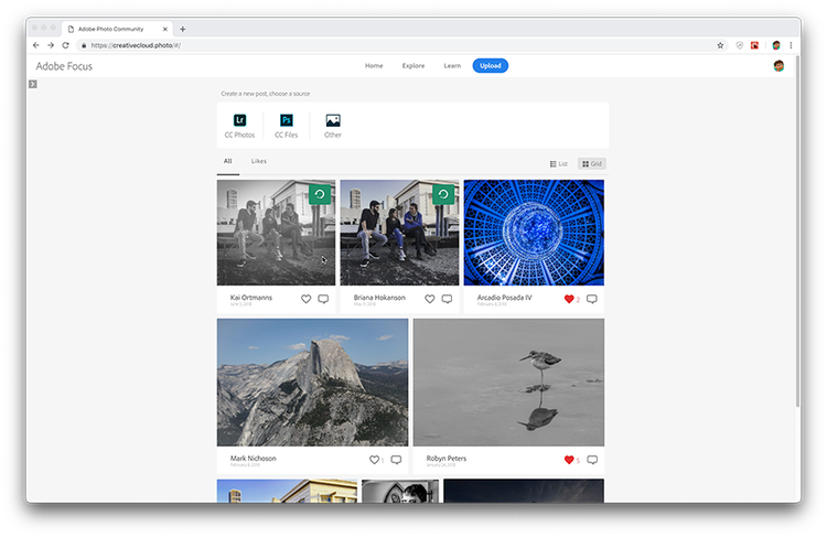
Community feed: The prototype was for a stand-alone website with a community feed of images.
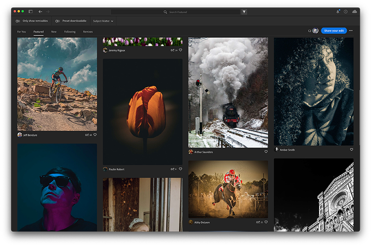
Community feed: In Lightroom the community feed of images is in the Discover section.
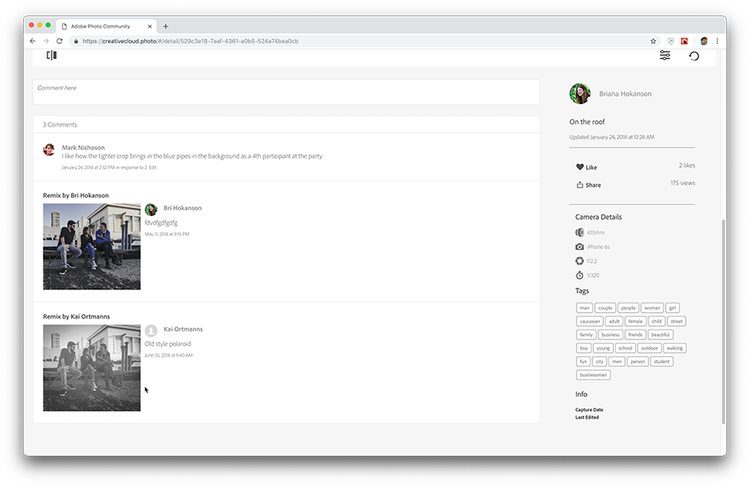
Remixing: In the prototype any published image could be remixed by anyone in the community and shared in the comment thread.
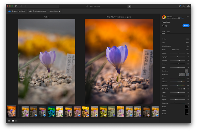
Remixing: The feature in Lightroom shows every remixed variation of the image alongside the original.
We not only built a prototype to envision what the experience would look like, we also built prototypes for the tutorial maker and for posting, remixing, and commenting on photos (which the team used for feedback during testing). Multiple concepts were tested and iterated on or discarded during the process. One of the comments during a testing session even managed to sum up the entire purpose of our approach: “I’m always looking at someone’s photos and wondering, ‘How did they do that?’ and want them to show me how they did it step by step. That’s what this is, this is fantastic!”
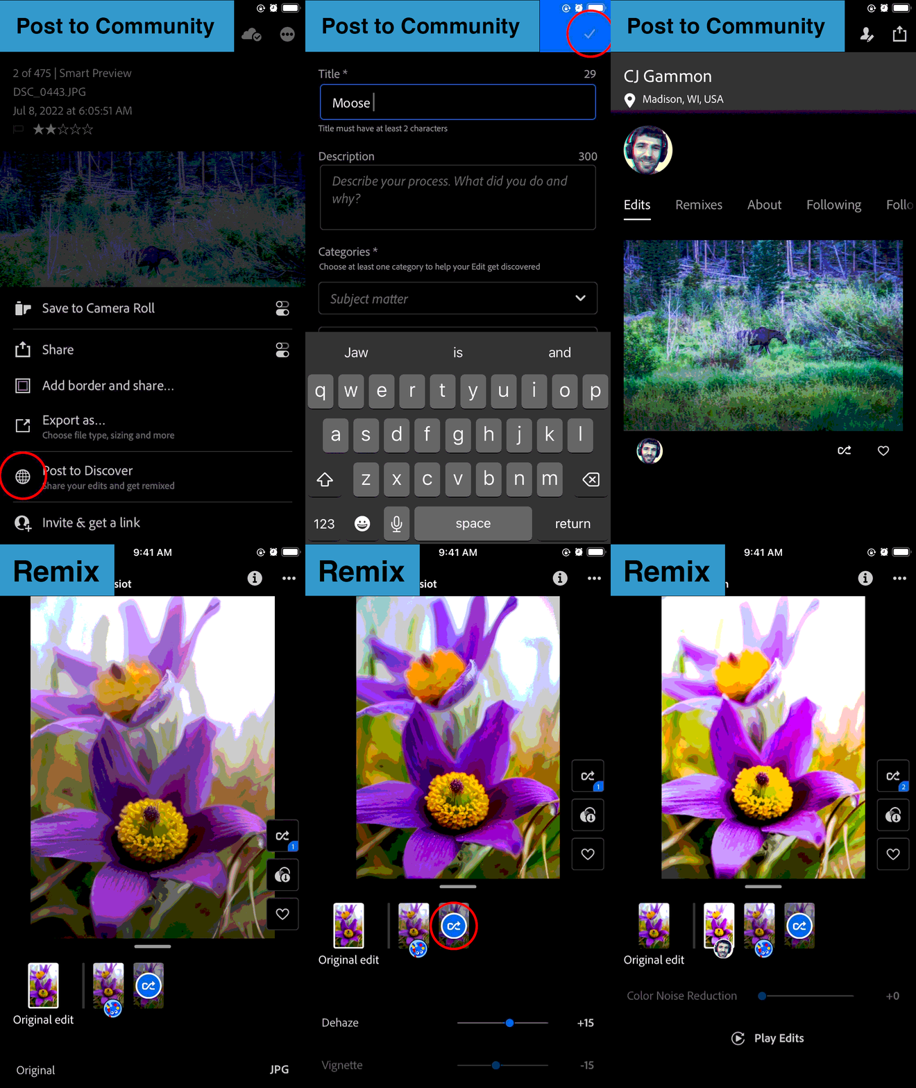
Originally intended as a stand-alone website, in the end Project Cooper was incorporated into Lightroom’s Home experience. Released to the public in a 2020 update, it has increased engagement and retention for Lightroom, and built a vibrant community of photographers.
How our prototyping team works across Adobe Design
We have more than two dozen design engineers and managers on our team supporting products across Adobe. There are many reasons designers might engage us:
- When they need a space to explore and learn. Prototyping gives designers the time and space to innovate and deliver more cohesive designs to product teams, to discover whether their designs address all needs and edge cases, and to uncover any technical hurdles to implementing the designs.
- When they’ve reached the limits of their design tools. While a good number of workflows can be expressed in design drawings, it can be cumbersome to express complex ideas—even when using multiple artboards.
- When they need help bringing designs or exploratory ideas to life. Prototypes breathe life into static representations of user interactions. The same is true for product, feature, and workflow explorations.
- When they want to learn before building. Prototypers work with designers to bring designs to life so design researchers can test with them to uncover user needs. This gives designers a better idea of how to better match their designs to user needs and expectations.
Our involvement in the design process always begins with a conversation about what the designer is trying to learn. After that first conversation, the prototyper will usually build a rough first version of the prototype. We often think of prototypers as “User Zero” because they’re the first to use designs after bringing them to life, but the magic happens the moment the designer sits in the user seat to test it.
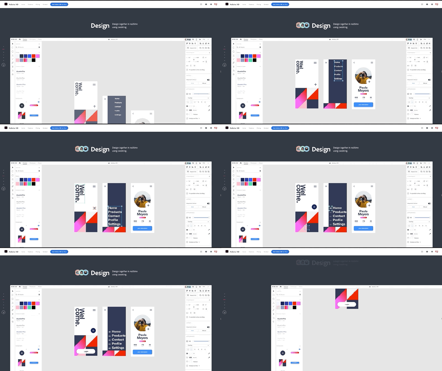
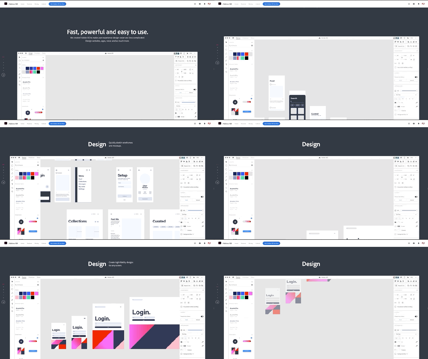
Together the designer and prototyper will uncover most usability issues and from those insights, future iterations of the prototype are built. Once it’s put in front of users, a feedback-iteration-feedback process begins (from the feedback, designers make the necessary design changes, and those changes are incorporated into a new build). Each round of testing with users, in partnership with our user research team, helps highlight design gaps or answer specific questions about whether the design addresses a user pain point. Each iteration adds design and product polish and gets the team closer to understanding user needs. The most important concept we can impart to our design teams is to leave time for this process of exploration and discovery.
People might think that factoring in time to prototype and iterate will slow them down, but prototypes are completed on much smaller time scales than actual products, and often save time and resources in the long run. That said, timing is key:
- It's too early (or not useful) to prototype if there are faster ways to learn through other prototypes, design documents, or existing research.
- It’s too late to prototype if there’s no time to act on what’s been learned. If designs are being handed off to an engineering team in two weeks, it doesn’t leave time to build a prototype, test it, and implement changes.
Prototyping should be part of the design process, not an afterthought
Adobe has world-class talent on its engineering teams who build products in the best way possible (often on tight deadlines). But releasing a product or a feature, only to find out later that it doesn’t work, can mean rebuilding and course-correcting, which leads to delays and excess costs.
Instead of building in isolation, releasing to customers, then learning which parts are successful and which aren't, building prototypes early in the design process carves out time for a discovery phase to explore and test product and user experience hypotheses before significant time is spent building the product. It’s a controlled period where customers can provide candid feedback that will be factored into the next iteration of the prototype (a cycle that's repeated until planned features are resonating with users).
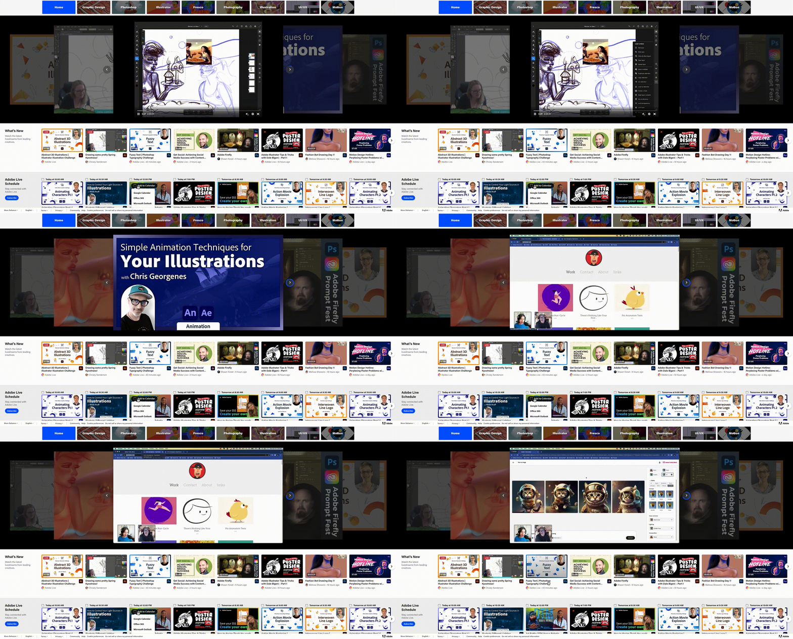
When the Behance team was considering the addition of a carousel to the livestreaming home page (so users could scroll through streams instead of watching a single video play) they had some questions that were easily answered by building and testing a prototype:
- Should the carousel auto-scroll or only scroll when activated? (Auto-scroll)
- How many seconds should there be between auto-advances? (Fifteen)
- Is the blue “timer” outline around the arrow understandable? (People overwhelmingly liked the timer outline; some said it was their favorite feature)
- Should the title/info be visible always or only on hover? (Only visible on hover)
Prototypes are powerful testing and researching tools for designers and design researchers, but there are two reminders we impart early and often:
- Even though prototypes often look polished enough to be products, it’s important to remember that they’re not.
- We do give product teams access to our code base because solutions to problems we've discovered during prototyping can save their engineers time and effort. But our code, optimized for speed and efficiency, is not production-ready and shouldn’t be dropped as-is into products.
Design prototypes allow teams to fail fast, learn from mistakes, and course correct. Our users deserve intuitive and delightful experiences, and prototypes help maximize the odds of delivering them.