A thoughtful content strategy helped Adobe Substance 3D better represent human diversity
How we built a more equitable product by rethinking how we name skin tones

Illustration by Beatrix Hatcher
Adobe Substance 3D is a suite of apps that provides a variety of approaches to creating, editing, and styling 3D shapes and the 2D images (the textures and materials) “painted” onto their surfaces. These tools can be used to build assets from scratch and to tweak what designers have created. Adobe Substance 3D Assets is like a stock photography library for the components of 3D world-building. Included in these component libraries are untextured 3D models, light sources to fine-tune highlights and shadows, and materials to apply to their surfaces—including physical human attributes like hair and skin.
As content strategists, we were asked to address a critical question raised by the Substance 3D design team: How might more descriptive language for skin tones in our 3D Assets library help our users more easily access the wide range of skin tones that exist in the real world?
How our work began
We learned that the materials in the 3D Assets library were created using a 3D scanner to capture high-resolution renderings. The resulting materials and textures are fully parametric, meaning they are customizable and can be any color when downloaded. However, the previews used the same light skin tone—in part because using a single tone makes it easier to distinguish variations in texture, but also because all the original scans were of white skin.

To address the visual aspect, Adobe’s Product Equity team suggested adopting an emoji-inspired neutral yellow for previews as a first step. Over the long term, they recommended selecting and scanning a wider variety of images to sample a more diverse range of skin tones and incorporating them into the system to better convey details with darker hues.
With a plan in place to use the emoji neutral yellow to create a more equitable visual experience, it was time to make sure the language was guided by the descriptive language patterns documented in Spectrum, Adobe’s design system.
Researching foundational guidelines
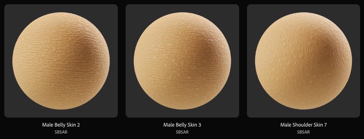
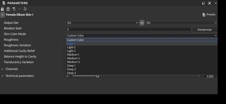
We first questioned the label “Skin Color Mode” for the Preset picker: The menu is used to change the preview's base color, but since ”mode” often suggests deeper changes (like switching between color models), we suggested dropping it for clarity. We also noticed that the Presets thumbnails in the Web player—examples of material settings wrapped around spheres—had ambiguous labels like “Male Shoulder Skin 4 – Deep Skin Tone.”
In these instances, it was unclear whether “color” and “tone” were synonyms or distinct technical terms. We considered the social implications of using one phrase over another.
To begin, we looked for established guidelines on how to describe skin tones in a respectful and inclusive way. The most comprehensive resource we found was Colette Aburime’s “Words for Skin Tones” from the Writing with Color blog, which provides resources on inclusive representation. And, since we’d already taken inspiration from emoji, we also researched Unicode skin color modifiers which are based on the Fitzpatrick scale—a system for classifying skin color based on sensitivity to ultraviolet light. While these resources were helpful, they didn’t answer key questions about whether to use “tone” or “color” or provide a clear system for naming.
Lacking standardized terms, our first step was to develop working definitions based on more extensive research and expand from there. We looked at how various industries—from cosmetics and gaming to consumer goods—address skin tone. Their approaches ranged from detailed to suggestive:
- Crayon shades paired modifiers like “light,” “medium,” and “deep” with fundamental “almond,” “golden,” and “rose” colors to make, for example, “very deep almond.”
- A cosmetics company used a number alongside a descriptive phrase for its long-wear foundation shades, producing strings like “470 - Deep with warm golden undertones” and “105 - Light with warm yellow undertones.”
- A game company offered swatches for picking skin tones but didn’t include written names or descriptions of them.
The language decisions that backed our rationale and recommendations
Our research showed that there was no systematic distinction between “skin color ” and “skin tone.” While the phrases aren’t completely interchangeable, their differences are often contextual. However, since “color” and “tone” were often used to describe the same attribute, as a first step toward developing a strategy, we explored the subtle nuances and connotations of each term and outlined the concepts typically associated with them.
- Skin color: defined, bounded, objective, constructed, rigid
- Skin tone: approximate, fluid, subjective, perceptual, variable
Based on this exercise, “skin tone” seemed qualitative and subjective—ranging from fair to deep, it's what you perceive when looking at yourself and others. On the other hand, “skin color” seemed to refer more specifically to the overall hue shaped by factors like melanin, sun exposure, and genetics. We identified skin tone as the broader, more scientific term that includes identifiable elements such as surface color and undertones, both of which exist on a continuum.
Since the range of human skin colors relative to the visible spectrum is limited and “tone” underlined that we’re looking at different intensities of the same substance, it seemed a better fit. We recommended changing “Skin color” to “Skin tone” to equitably frame the preset-browsing experience, but we still needed to find our approach to the more subtle question of how to handle naming variations. We had three options:
- Descriptive: Current strings like “Light 3” and “Deep 1” could be improved simply by replacing the numerical modifiers “1,” “2,” and “3” with “Cool,” “Neutral,” and “Warm.”
- Metaphorical: The crayon approach was expressive but ran the risk of creating difficulties for non-native English speakers and machine translation. It also faintly echoed the practice of identifying people’s skin tones with commodities like brown sugar and caramel.
- Technical: The Monk Skin Tone (MST) Scale—a ten-tone scale developed as a more inclusive alternative to the Fitzpatrick Scale for machine learning—seemed to meet many of our needs. But the shades’ names, “MST 1–10,” weren’t self-descriptive. We could match the presets to the scale’s tones or, alternatively, identify the tones we were using by their HSL values, but we’d need to either link to documentation or include a legend to show the correspondence between tones and numbers.
Putting the work into practice
There was a sense of safety in avoiding adjectives (Descriptive) and aligning with an industry standard that uses numbers instead (Technical). But using figures that didn’t stand on their own made for a less self-contained experience and raised concerns about accessibility for the visually impaired.
When we settled on “the Descriptive” approach, we expected challenges since it resulted in longer strings, but it turned out to be a nonissue: There was enough space in the product interface to accommodate them, and Substance’s audience is accustomed to wordy interfaces due to 3D’s technical nature. We also wondered whether people would feel that the references to undertones were clear enough. Once our recommendations were in the mock-ups, we saw that it was easy to infer what cool, neutral, and warm undertones looked like by switching between presets.

The resulting changes were slight, but they stood on a scaffolding of research and thinking that reframed the issue so that our task went from trying to address every imaginable criticism to producing explanations of what makes certain wordings equitable. Beyond the string changes, this project has been a reference point for our work on other product equity topics related to naming assets, such as 3D models of hairstyles representing different ethnicities.
A brief retrospective of our work
Addressing skin tone in response to a tactical question was a small but meaningful step in improving one part of a broader experience. While it’s not a comprehensive solution, it became the foundation for guidance being integrated into content tagging efforts for other Adobe apps and services, with the goal of delivering a user experience that more accurately and justly reflects the diverse world we live in.
Throughout this work, and in our conversations with close and extended colleagues, we saw real shifts in perspective. The discussions encouraged all of us to reflect on how we describe ourselves and others, our responsibility to remain neutral and descriptive when depicting the real world in language and images, and the deep and complex influence of history on that work.