Crafting effective notifications
How to design messaging that informs and empowers users

By Kenzo Hamazaki
Consider the story of David, a busy professional relying on a project management tool. As his workload increases and multiple projects demand his attention, he experiences notification overload within the tool. Daily, he faces an influx of notifications for task assignments, updates, comments, file uploads, and team messages. The constant stream of alerts disrupts his focus and makes it a challenge to effectively prioritize tasks. Instead of feeling informed and empowered, David is overwhelmed, struggling to navigate the noise of notifications.
David’s story highlights the significance of thoughtful notification design—crafting messages that provide timely information while captivating and empowering users.
Notifications serve as a valuable channel for delivering essential updates, reminders, and alerts. Well-crafted notifications cut through the noise, offering users concise and meaningful information. Striking the right balance between relevant details and avoiding overwhelming content is crucial: Clear and concise headlines instantly inform users about the message, while the body provides additional context or required actions. When they prioritize essential information, notifications are powerful tools.
The anatomy of a notification
Addressing the challenges of notification overload requires adopting a design-thinking approach. In most cases, a notification consists of three fundamental parts:
- Headline (what happened): clearly state what happened in a concise and informative manner
- Body (the underlying cause): provide additional details or context about the notification
- Call to action (how to fix it): clearly instruct the user on how to proceed
![A sample in-app notification with detail about what should be included. At the top: What happened [Your file could not be saved!]. In the body: The underlying cause [There was an error in connecting to the server, so this file was not saved to your cloud documents ] and How to fix it or become unblocked [Please wait a few seconds and try saving the file again. If the problem continues, let us know.]](./media_1a2ee2030cae2c9525b572d4c948ad07689f18746.jpeg?width=750&format=jpeg&optimize=medium)
Avoid forcing messaging into a rigid design without understanding the user's objective or goal. Instead, prepare the message, consider the audience and situation, and then decide which components to include and how best to present them. Additionally, try to consider what the user's current activities and mindset might have been leading up to the messaging to create a human-centered experience that aligns with their expectations.
Now that we've explored the anatomy of a notification let's learn a bit about creating a user-centric message. The chart below outlines a simple yet effective framework for choosing the proper components based on audience, situation, and a user's objective or goal.

It’s a framework that considers the user’s needs and the notification’s context and aligns the messaging to expectations. By following this user-centered approach, you can tailor notifications to be concise, relevant, and actionable—maximizing user engagement and minimizing notification overload.
Notification types and considerations
Designing effective notifications is essential to ensuring a seamless and engaging user experience and each notification style—toast messages, alert sheets, banner messages, inline notifications, and the notification center—has a distinct context, a unique purpose, and specific strengths.
Toast messages: A beloved and reliable favorite
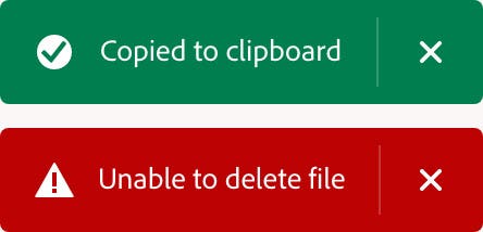
Like a friendly tap on the shoulder, toast messages appear discreetly at the top or bottom of a screen to deliver quick updates or alerts. These unassuming pop-ups are preferred for their simplicity and non-intrusiveness, providing users with bite-sized information that doesn't disrupt their workflow. Whether it's alerting someone to an error or a completed action, they make their presence known without stealing the spotlight.

Toast messages provide an effortless and effective way to keep users informed without taking up too much space within the interface but if you’re using this component for an error message, ensure to include a clear call to action and/or the necessary information to resolve the error. Keep in mind that when multiple toast messages appear at once, they should stack based on timing and urgency.
Alert sheets: grabbing attention respectfully
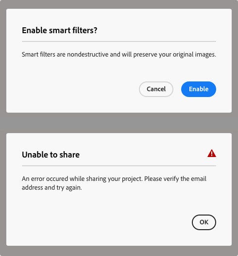
Alert sheets are a useful tool for conveying important information to users. These overlays (or modal dialog boxes) are designed to grab attention and deliver critical updates. They have a bold appearance that ensures important messages are not missed. Flexible enough to deliver essential updates while respecting a user’s workflow, they strike a balance between delivering crucial information and allowing someone to continue their work uninterrupted.

It’s important to be mindful of common mistakes that can diminish the effectiveness of alert sheets: Those can include overwhelming users with excessive information, neglecting visual consistency, and not including clear call-to-action buttons. Avoiding those pitfalls will maximize the impact of alert sheets.
Banner messages: subtle yet impactful
Banner messages are unobtrusive alerts positioned at the top or bottom of the screen. They aim to seamlessly integrate into the user's workflow without causing distractions or stealing focus from critical tasks. With a balanced coexistence of relevance and subtlety, banner messages effectively convey important information while allowing users to concentrate on their tasks.

Pitfalls to avoid include overcrowding the banner with excessive content or forgetting to include a clear call to action—without them, it’s easy to overwhelm users and dilute the key message. Steer clear of them to ensure that your banner messages keep their subtle yet impactful nature.
Inline notifications: timely feedback, right where you need it
Quick and relevant feedback that appears within the user interface, these notifications are tailored to a user's actions, such as confirming task completion or alerting someone to missed form fields. They effortlessly blend into any interface, take up minimal screen space, and disappear quickly. While they may not demand immediate attention, they provide quiet guidance and prompt feedback to empower someone to navigate with confidence and ease.
![An in-app inline notification with a gray background and black type in white fields. The notification is titled Payment and at the top it reads, "Unable to process payment!. There was an error processing your payment. Please check that your credit card information is correct, then try again." Below it are four fields each with an exclamation poing in them: Available payment methods [Credit or debit card]; Expriation month [February]; Expiration year [2020]; Name as it appears on your card [Johnny Appleseed]. The second title is Billing address. Below it are four fields: Street address [1234 Spectrum Way]; City [San Francisco]; Zip code [94114]; Country [US]](./media_111229aa23473c53a50531a83104887769a1ccb1c.jpeg?width=750&format=jpeg&optimize=medium)
Inline notifications are essential for enhancing various user interactions and providing unassuming and contextual relevance. When choosing to use an inline notification, make sure to time it appropriately so it's relevant to a specific action and appears when it's most meaningful and useful.
Notification center: personalization, customization, and control
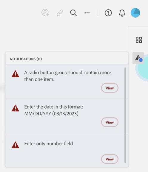
The notification center is a convenient and personalized hub for managing notifications. It’s a feature within apps and operating systems that displays all notifications in one place. Users can easily manage, review, and respond to different types of notifications—from system alerts and app updates to social media interactions and reminders. One key advantage of notification centers is that users can customize their settings and choose how notifications appear on their screen to suit their preferences.

Even when using a notification center, it's possible to overwhelm people with excessive notifications. The only way to ensure that users receive only the most relevant and essential alerts is through educated decision-making and careful management of notification types.
Envisioning a more streamlined notification experience
Exciting opportunities and innovations are coming to notification design: Technological advancements are making them more intuitive, interactive, and visually appealing. Artificial Intelligence and Machine Learning will improve relevance and timing, predict user needs, adapt to preferences and seamlessly guide people through their digital journeys.
Let’s revisit David’s story and envision what an enhanced notification experience could look like: A “notification dashboard” that adapts to his preferences and work patterns could be implemented to address his notification overload. It would serve as a centralized hub, allowing David to customize notification settings according to his specific needs. Through a user-friendly interface, he could choose the types of notifications he wants to receive, set the frequency of updates, and even specify the projects or teams he wants to prioritize.
You might wonder about the urgent actions and alerts that are integral to David’s workflow. With the notification dashboard, urgent notifications wouldn’t be drowned out in a sea of updates but would still appear prominently, while other less critical notifications would be neatly organized and easily accessible. This integration would ensure that important reminders, and critical alerts stand out, adding to the comprehensiveness of his notification stream.
The intent of human-centered design is to allow busy professionals like David to regain control over their digital landscape, enabling them to accomplish more with ease. Although hypothetical, this scenario offers a glimpse into a future where technology works for us rather than overwhelming us.
Thoughtful design will always be essential to creating engaging, efficient, and personalized human-centered experiences because the art of notification design goes beyond providing information; it aims to inform, engage, and empower users during their digital experiences. By adopting a thoughtful approach and implementing the recommendations outlined above, organizations can create valuable, non-intrusive notifications tailored to user needs.
Let's embrace this art and leverage its potential to positively impact people’s digital journeys.