The untapped potential of system thinking in modern design
Creating a solid design foundation that won’t crumble as a product evolves

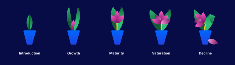
An important construct that steers product development and is often missing in design thinking is planning for the full Product Life Cycle (PLC). Based on a formula developed by economist Raymond Vernon, it proposes that all products have five stages:
- Introduction of the product to the market
- Growth in product demand and profitability, which generates competitors
- Maturity of the product is well-known and demand and sales start to plateau
- Saturation in the market requires continued innovation or competitors may start to gain market share
- Decline in the potential of the product after it has peaked
Realistically, with the speed at which some products are built, once they enter maturity, they often lack enough flexibility to be added to easily and end up facing fates that involve full from-scratch rewrites or complete pivots. The products that best evolve and adapt to new needs are those with solid foundations—like a house, a product built on a sturdy foundation will have longevity and be far easier to renovate. In product design, system thinking provides that foundation.
What is system thinking in design?
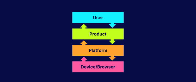
Experience design is tactical, linear, and intrinsically tied to user success. Alternatively, system thinking is a nonlinear way of working that requires mapping all product dependencies you know to be true. System thinking has nothing to do with immediate user success; it focuses on understanding all the root causes of a problem, to plan for several possible solutions.
As an example, Adobe Lightroom is more than a single program on the desktop, it's an entire cloud-centric ecosystem that offers multiple surfaces on which to view and edit photos. It spans multiple devices (computers, phones, and tablets) and platforms, and changes automatically reflect across all surfaces while remaining non-destructive to the original image. By anticipating the need for scaling, the team designed a system of shared libraries that allows the ecosystem to adapt and evolve with minimal refactoring.
To think in a system is to preemptively plan for all scenarios, understand everything you possibly can, and create artifacts that can answer near and future questions. It’s based on the idea that every version of a product builds on equity inherited from an earlier version—that’s been mapped out ahead of time—rather than starting from scratch each time a new feature or functionality needs to be added. It’s big picture thinking and that can be especially daunting since it requires stakeholder alignment, research, and some degree of predicting what’s next.
The four components of integrating system thinking into a workflow
Normally engineers and architects do the non-visual part of system thinking: They make decisions and implement guidelines based on the requirements and capabilities of a product’s underlying technology. Those guidelines are inherited by designers who match the right UX to the UI to create experiences that are consistent, trustworthy, and able to scale with environment and user needs. But the best experiences are only possible when both the current needs and the future needs of users are considered. There are four components to this:
1. A central platform
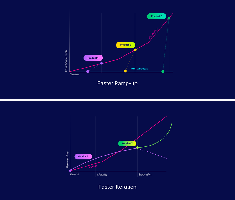
Establishing a dedicated and centralized platform and team is critical since it serves the purpose of being a starting point for all new technologies that can grow independently of the product roadmap. This guarantees an early investment in the future and the ability to scale in all scenarios.
A platform is a service that prevents the need to build technology from scratch each time. It’s a well-defined and reusable system that enables faster development and time to market, allowing for more iteration cycles and testing opportunities. A robust platform predicts and accommodates current and future needs, as well as any last-minute incoming requirements from products. Because a platform is only as successful as the information it’s built on, this value is only possible with a direct pipeline and a clear set of priorities between products and platform teams.
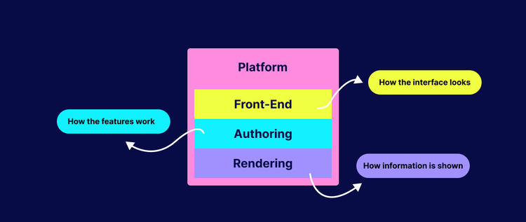
As an example, a modern-day web platform may be composed of up to three parts:
- Rendering. How technology displays and visualizes information
- Authoring. How technology behaves and interprets information
- Front-end. How a user engages with the technology
Designers are usually appointed to front end since the dependencies are visual and tied to the interface, but by understanding how features work and are interpreted on multiple devices, designers can offer unique insights and help forecast the potential for a specific technology.
2. A set of frameworks and patterns
Patterns and frameworks are meant to be universal starting points with enough flexibility to be adjusted or extended. This means if a group of designers all reference the same framework, even if their designs are different, their core experience is the same (a UI doesn't have to look the same to behave the same).
Often when a design team oversees creating shared components, the deliverables manifest in the form of high-fidelity mockups with a reusable component library. It's next-to-impossible to try to meet the needs of several different partners with a single UI solution, and it’s not fair to partners to impose a solution on them that may have no context or consideration for their unique needs.
Proposing a solution that addresses multiple problem statements and provides logic in addition to the interface is the most effective method. That way, partners are more likely to align on the same UI solution not because they must, but because it addresses their needs. Creating a flexible framework as a starting point also leads to natural consistency since it reaches the core problem rather than generalizing.
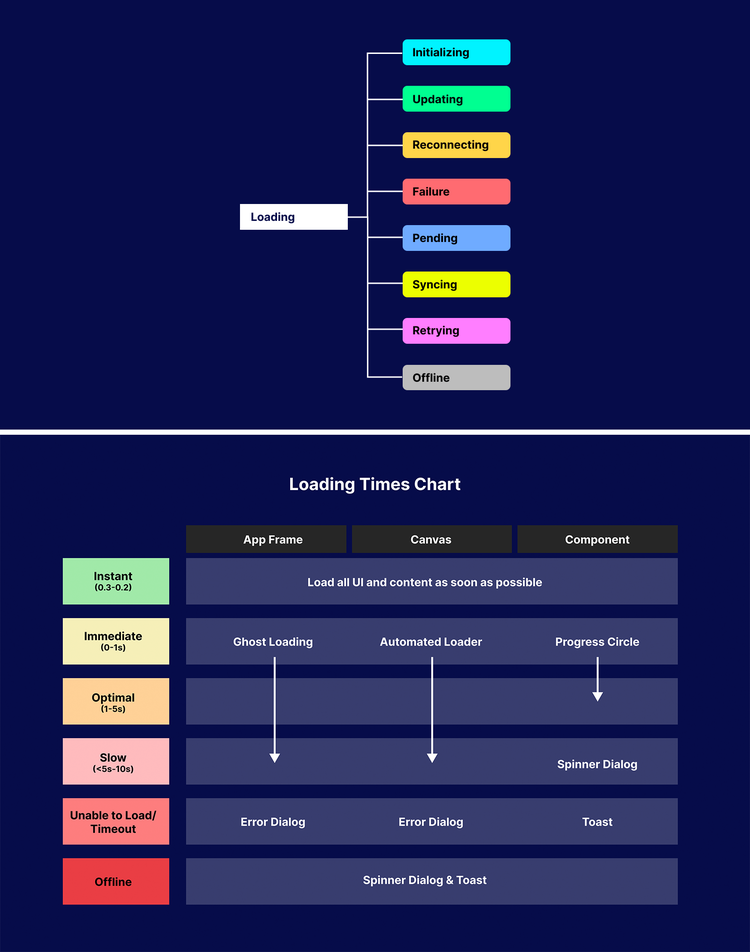
Take for example a reusable system for loading experiences on the web. The reality is that no matter how performant and perfect a web app may be, there is no guarantee that a device’s performance or its connection to the Internet will be perfect. System thinking predicts all scenarios that can affect the usability of a product. For "loading," it helps generalize a variety of unique states, but rather than providing a one-size-fits-all solution, it presents causes and actions and clear guidelines for creating a consistent experience depending on the factors affecting performance.
3. UI libraries for designers and engineers
Libraries need engineering parity, otherwise they fragment and eventually fail to serve the value of a system. Designing and building a central and single source of truth for the reuse of interface components is paramount to ensure visual consistency.
Components that teams share across an ecosystem must be built and live within a central repository that anyone can access. But when a single design element (for instance, a header) is shared across teams, and each team must incorporate it according to the priorities of their UI, it can lead to a lack of cohesion across products. There are added risks that come with not centralizing the development of core UI:
- The iteration cycle is instantly cut off, making it difficult to update the component with any new information that emerges
- The value of the component is cheapened because it won’t update synchronously
- To be effective, a system must be built with an active investment in its centralization, meaning that it must live in single spot where it's easy to add to and update
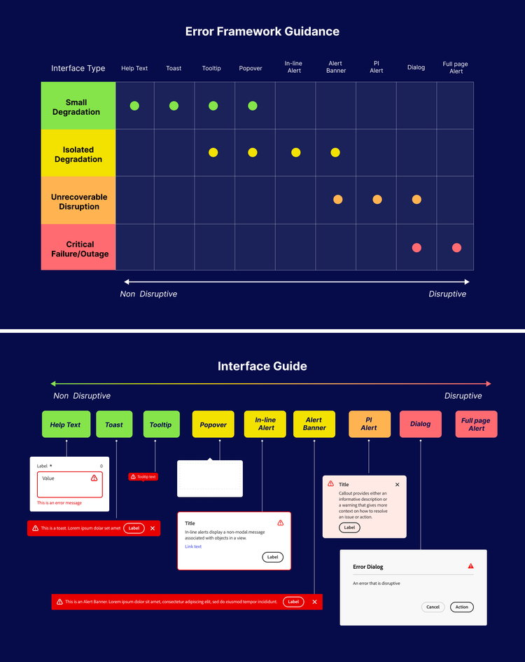
Error states in interfaces are a good example. The best error state is no error state and a seamless end-to-end experience. But when tackling complex technologies, bugs or problems are bound to arise. There are many visual ways to respond to an error, but the secret to consistency is to always have a UI behave the same within a common instance. The most effective way to create consistency is to create a guide or rubric that explains the best circumstances for each scenario. This ensures that regardless of which designer or engineer implements an error state, there will always be natural cohesion across a group of contributors since they share the same central logic framework.
4. System processes and checks
All product processes and requirements must account for the system in some form to ensure that it’s followed or updated regularly, or it will be next-to-impossible to ensure its adoption and viability.
System designers and product designers must work synchronously as part of a single centralized team to drive consistency in the design and development process. Although these two groups will always have conflicting priorities and roadmaps, the collaboration can be extremely productive when they align on those elements that affect device dependencies and user requirements.
A great example of natural collaboration between a system designer and product designer is when designing for a native platform like iOS. Apple has created a platform and basic set of interface elements that are reliable and have system thinking inherently built in, which means that any designer building with iOS guidelines is doing so with an understanding that their work will evolve along with the evolution of the system. That way, if new hardware or technological capability is unlocked, its integration will be far more natural than if it had been built independently of the system.
System thinking has a place in modern design practice that won't disrupt the design and development process. It ensures accountability, an honest approach to building over time, and product adaptability over time. Since it involves intentional and active decisions that are scoped and properly resourced, building a product at scale while also perfecting it for the future isn’t something that comes without extensive upfront work. It’s critical that teams and leadership have a point of view on its priority and are conscious of near- and long-term tradeoffs.
Special thanks to Amun Ra, Miruna Stoicescu, Stefan Chitu, and Eric Crissman for all the work behind the insights in this story, and to Andy LeMay, for his insights about Adobe Lightroom.