Why UX designers should create object maps (and how to start)
Object-oriented design can help designers align products with how people use them
Illustration by Patricia Doria
When someone opens an application with the purpose of completing a task (cropping a photo, sending an email, listening to a song), they have a mental model for how they’re going to perform it. When that mental model aligns with the way the product is structured, completing a task is a great experience, but when it doesn’t, it can make the product so difficult to use that they give up.
As designers, one of our jobs is to structure products so they align with how people want to use them. Reducing the distance between how a product functions and how people work creates better user experiences, period. It’s a daunting task, but the best way to start is by understanding the objects that users create, edit, and use within a product. It’s a bit abstract, but by creating a map of these objects you can help your team define new products or features, identify problems in an existing product, communicate complicated information, and aid in the decision-making process. This process is called object-oriented design (OOUX).
Understanding objects, attributes, relationships, and actions
Object maps can grow to become quite complicated, but they’re made up of a simple set of components and principles that are easy to understand. Let’s dive into the basics by building out a map for a hypothetical music streaming app.
Objects
“What is an object?” is a good place to start. There are two criteria to follow when deciding whether something is an object:
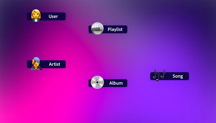
- Is it a noun or a verb? Objects are usually nouns (people, places, or things). It’s rare for objects to be referred to with a verb (an action or state). Our music app will need users, artists, albums, playlists, and songs. All nouns, so we include them in our map as objects. Our app users will also need to perform searches and control volume, but these are verbs—not nouns—so we don’t include them.
- Can users create or manipulate it? Objects are usually controlled by your users. In our music player, users will create playlists using songs, and each song will be associated with an album and artists. These are all objects the user can create, delete, use, and otherwise manipulate.
One final note about objects: Much of an application’s UI is devoted to controls that allow users to manipulate or change their view of objects. These are super important, but they’re not objects. We’ll capture these later when we discuss “actions.”
Attributes
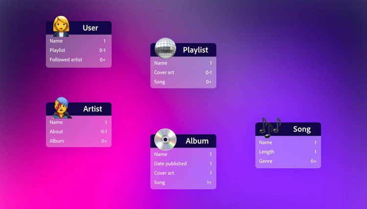
Attributes capture the essence of an object. They are the things users can change to make the object useful. In our example, an album has one name, a published date, cover art, and one or more songs. The discussions required to capture this information will help stakeholders align on fundamental definitions without getting hung up on UI, technology, or ownership. Deciding on the number of songs an album can have and identifying features like cover art for playlists, before design work begins, will reduce churn later.
Relationships
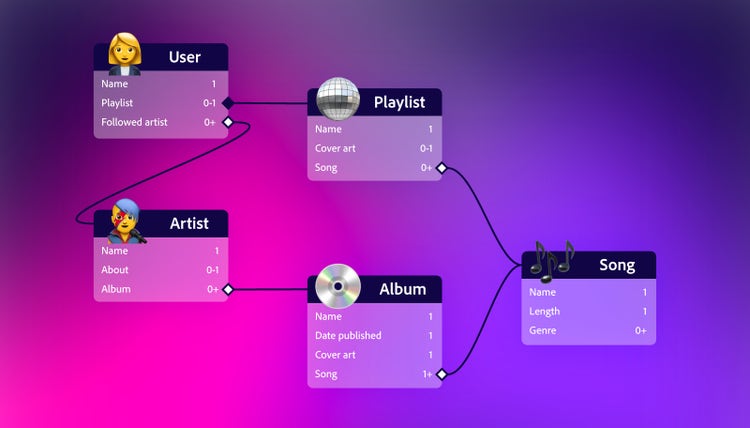
You’ve probably noticed that some of our attributes are the same as some of our objects. This is where relationships enter the picture. Relationships are formed when one object, such as a playlist, contains another object (songs, in our example). Here we can have more useful conversations with stakeholders. Do artists have albums or do albums have artists? Getting clarity on relationships and the nature of those relationships will make future conversations and decisions about the user experience easier. There are two types of relationships:
- Nested relationships (closed diamond) are when one object contains another as an attribute. In our example, a playlist is nested because playlists cannot exist without a user to own them. In many ways, a nested object is simply a group of additional attributes.
- Linked relationships (open diamond) are for independent objects. Playlists can have songs, so can albums. But songs don’t depend on either to exist—they can live all on their own.
Actions
The last things to capture are the actions that users can perform on an object. Most objects will have actions like create, delete, and edit, though you might need more actions like export, print, duplicate, or share. Some objects (like albums) aren’t controlled by the user and won’t have any actions. Actions will often manifest as buttons in the user interface, so knowing what actions you have and what objects they pertain to will make it easier to do other design work like creating mocks.
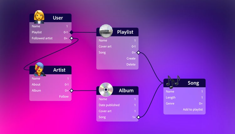
Creating object maps
Getting started is the most difficult part of creating an object map. I've found it helpful to follow these steps:
- Know the job. Jobs-to-be-done (JTBD) is a framework used to understand the motivations behind why people use a product. It originated from the work of Clayton Christensen and his colleagues at Harvard Business School and it’s a great way to summarize user research. The core concept of JTBD is that people "hire" products or services to get a job done in their lives. Jobs can be functional, emotional, or social in nature. Understanding the job gives you a huge advantage when creating an object map.
- List the objects. Work with engineering and product management counterparts to list objects. Sophia V. Prater, founder of Rewired UX and chief evangelist for OOUX, calls this step “noun foraging.” Find nouns (objects) by talking to users, reading creative briefs, researching competitor’s products, and studying Wikipedia articles about the problem space. Try not to get bogged down by details. Instead, focus on generating a list of relevant objects.
- Decide on a mapping tool. I built my first map in Adobe Illustrator, but other design and whiteboarding applications work just as well. Find a tool that makes collaboration and iteration easy. The most important feature you’re looking for is the ability to move things around without losing relationship connections.
- Create a map. With a list in hand, you can begin mapping. Sort the objects from the attributes and actions to create a basic list. Add relationships and attributes to give objects clarity and details. Your map won't be perfect on the first pass, but it will take shape over time. The goal is to create scaffolding that you can improve with iteration.
- Test and refine. Don’t stop talking to users. Work with them to bring the object map into alignment with their mental models. Refine your map as you understand the objects, attributes, relationships, and actions that will make your product most effective.
- Add the finishing touches. The map-making process often results in messy, difficult-to-read maps. Take time to untangle and organize the information. Arrange objects so that relationships flow in one direction. You can also color-code objects and their relationships to make complex maps easier to read. Just be careful not to have too many colors (six or fewer is best).
- Use the map. Having an object-oriented abstraction of the user experience will help you and your team sort through all types of difficult UX problems. Use it early and often in the design process to improve understanding and alignment—especially as your product evolves.
Whether it’s for a new product, a new feature, or a feature adjustment, there’s value in having a map of your product to figure out what changes should be made to user-facing objects. All this makes the work that comes later—workflows, mock-ups, and prototypes—easier to create and much higher in quality.