From mind to canvas
Creating art with synesthesia

“Synesthesia,” he said, “is the union of senses otherwise unconnected in a ‘normal’ brain.” He described Albert Einstein using shapes instead of numbers to complete mathematical algorithms and briefly scoffed at the absurd idea of colored letters.
This was a revelation to me: Could it be that none of my classmates saw our teacher’s name in purple with flecks of sandy brown? Was the letter A not inherently fire truck red, nor Z metallic gray? Did not everyone find it efficient to memorize phone numbers according to their color palettes?
I immediately began to read every article I could find on this mysterious “disorder,” “disease,” “condition,” or “superpower.” It seemed that even researchers didn’t know how to classify my sixth sense.
As it turns out, every day of my life, I’ve been wearing rainbow-colored glasses without realizing it. Cemented to my eyes like irremovable contact lenses, they turn letters into colors, music into tastes, and time into space. As soon as I got home that afternoon, I began interrogating my parents to find out if they too saw the letter B as indigo or K as lavender. They stared at me, dumbfounded, undoubtedly questioning my sanity. It was in that moment—a blue hour and an orange minute—that I made the decision to discover why A is red, why rap music is salty, and why my perception of the world around me is invariably tinted by my beloved rainbow-colored glasses.

Perceptual research
Fast forward a few years to when I began working in a university laboratory studying human perception, attention, and cognition. Of course, my first project focused on synesthesia: I set out to deduce a correlation between certain letters and their association with certain colors. After that, I was hooked. To me, the human brain felt like our generation’s western frontier. We know so little about how we perceive the world around us, except that it is often hugely inaccurate—allowing wild fluctuations in attention, misconceived interactions, and sensory illusions galore.
Toward the end of my cognitive neuropsychology degree, I began to study one of the most difficult human perspectives to pin down, one often avoided by cognitive scientists: that of artists and designers. How do you quantify creativity and harness artistry?
For the past two-and-a-half years, I’ve worked at Adobe as a user experience researcher, studying users’ perceptions of, and interactions with, creative software. In particular, I’ve been researching our newest suite of iPad apps. It’s certainly been an interesting experiential conundrum to pack decades’ worth of the cockpit-like functionality of desktop tools into nimble, streamlined, multi-touch interfaces. However, these streamlined interfaces—while perhaps difficult to construct—do make the creative experience more approachable and intuitive.
Exploring creativity
For years, art has been a passion of mine: My friends tease me that the first place I go on arriving in a new location is always the local art museum. I’ve engaged in numerous art-based research projects. I’ve gone to academic conferences on artistic creativity. I’ve even been on the committees of several community art projects. But I did all of that without ever creating any art or thinking of myself as a member of the artistic community.
During the early days of the shelter-in-place order in the Bay Area, I felt desperate for a distraction from the dark anxiety of the external world. When my only roommate decided to leave town, I needed a ritual to seek solace in. I plopped down on my sofa with my iPad and Apple Pencil, launched Adobe Fresco, a digital painting and drawing app, and stared at the blank canvas in my lap.
For inspiration, I turned to my most readily-available prompt: My synesthesia. Actually, many synesthetes are composers, visual artists, musicians, and writers. Learning about them now, it seems as if I’d been suppressing my own artistic inclinations.
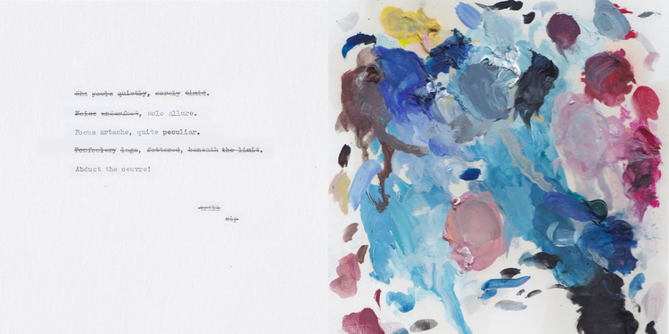
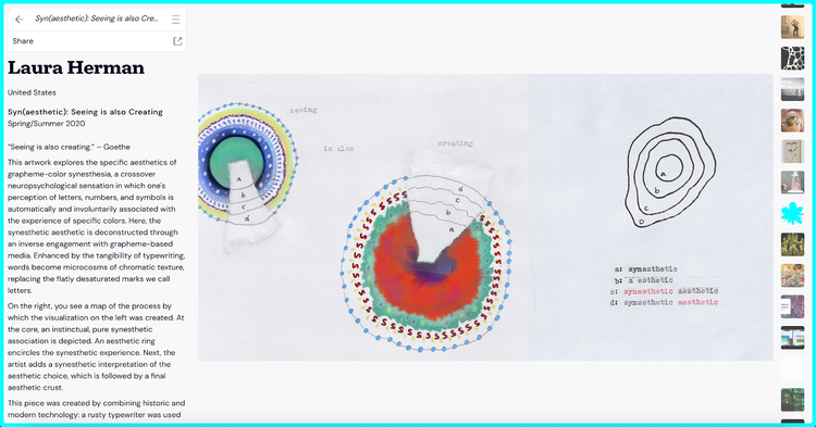
For my first project, I used the live oil brushes to transpose found words—poems, lyrics, phrases, etc.—into droplets of color. I even snuck in a few strokes with the mesmerizing watercolor brushes. Words became microcosms of chromatic texture instead of the simple lines we call letters.


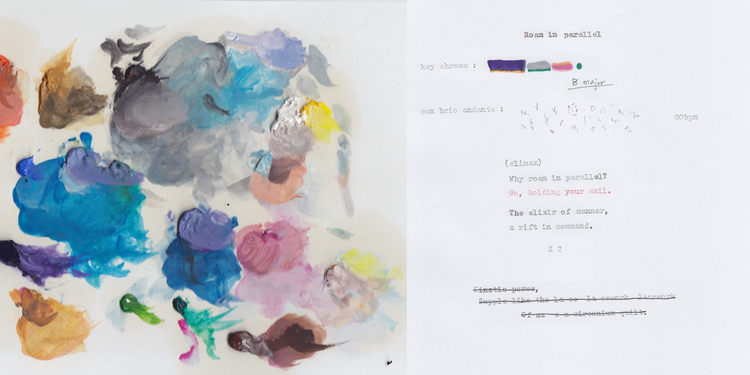
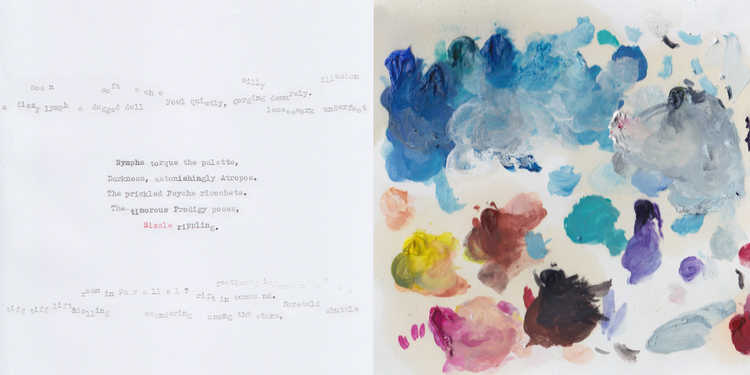
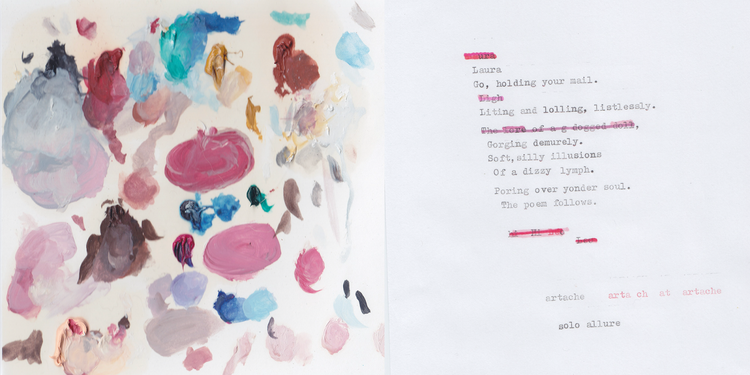
For my second project, I used the discarded color palettes of an artist friend as inspiration. Using both Fresco and Adobe Photoshop on the iPad, I created compositions of discarded palettes and the poetics they provoked. I forced myself outside of my comfort zone by translating colors into words. (Typically, only words become colors.)
Each brushstroke in a palette contains a multitude of shades—similarly, each word contains a collection of hues in my synesthetic experience. I pored over dictionaries, searching for the lone entry that perfectly matched a given brushstroke. After each brushstroke had been paired with its semantic counterpart, I recombined the words into visual poetry. There were some pretty surprising poetic word-neighbors that came out of this creative process: an “abducted oeuvre,” a “torquing nymph,” and even some “lagging tomfoolery.”
Owning your creativity
Still, this remained just a passion project—a way to stave off quarantine blues (or, more accurately, quarantine’s indigo hue). I had not thought much about potential next steps, until a friend—pursuing her own quarantine creativity by making music—encouraged me to share my work more broadly. I didn’t even know how to begin, but I eventually found a few virtual art shows and digital magazines that were accepting work.
One of my all-time favorite art venues, Austria-based Ars Electronica, had converted an arm of its traditionally in-person celebration of technology-based art into a virtual gallery format, with the help of ART domains. Well past midnight one evening, I chuckled as I submitted one of my pieces to their open call, never expecting it to be selected. My self-view as a non-artist was completely shaken when a short time later I received an acceptance letter.
None of us should wait for external validation from the supposed “art world” to view ourselves as true creatives, but, for better or worse, that’s what it took for me. Over the course of the month that my piece was exhibited virtually, I found such joy in visiting the “showings” of the digital creativity of fellow artists.
Since then, several other pieces from these projects have found their place in zines, websites, and even private collections. I am finally able to say without a shrug or a self-deprecating laugh—that I’m a creative. And you can be too. Why not plop down on your couch, grab a creative tool, and let your unique perceptual reality guide you?
This article originally appeared on the Adobe Blog.