Megaverbs and the making of a modern Adobe Acrobat
The challenges of redesigning the PDF app used daily by 100 million people

Every year in Adobe Document Cloud, more than 300 billion PDFs are opened, and more than 8 billion digital signatures are processed. Designing Adobe Acrobat, an application so ubiquitous that it's used by more than 100 million people each day, presents unique challenges.
Even the simplest of changes can have an enormous impact on a wide range of people taking on everyday tasks.
So why change anything, especially when Document Cloud business is growing year over year? The reason was a compelling challenge for our design team: Customers were having difficulty finding and using the tools in Acrobat's viewer (the PDF experience that opens upon launch), the most-visited and most-essential part of Acrobat.
Identifying our design challenges
For years we’d been focused on adding and updating features and functionality, but we hadn't revisited or redesigned Acrobat's foundation in quite some time. There were five design challenges ahead of us:
-
Discoverability and fluidity. We needed to showcase the features people didn't know existed and help them uncover the features they couldn't find. Most importantly, the friction between tasks had to be removed so people could effortlessly move between them (for example, someone viewing comments in a PDF should also be able to easily edit the text of it without interrupting their workflow).
-
Differentiation. Since PDF is an open-standard and widely adopted format, multiple applications from multiple vendors are used to view it. Asking ourselves “What makes Acrobat unique?” helped us think beyond our application’s existing features and functions to improving people’s relationships with PDFs. Exploring how to harness Adobe’s artificial intelligence capabilities helped us consider how to unlock more value and make Acrobat even smarter.
-
Purpose. Many people don't know that Acrobat is a PDF reader and an editor. Over the years we'd developed new editing features for Acrobat, but because we hadn’t surfaced them in the viewer, anyone bypassing Acrobat's home screen for a one-time need (say, to compress a PDF) were missing out on some of the app’s most powerful capabilities.
-
Value. Many people using the free version of Acrobat convert through in-app purchases (for example, someone viewing a document might pay to edit it). This purchase process was not as effective or smooth as it could be. We needed to present the full value of the features waiting on the other side of the paywall before asking people to pay for them.
-
Continuity. Acrobat is everywhere (desktop, web, tablet, and phone) but an inconsistent experience across platforms meant that people had to constantly reorient themselves whenever they opened the app somewhere new.
We knew the scope of the redesign was monumental. Above all else, Adobe Design emphasizes exceptional experiences: To create a cohesive experience and a flexible framework in a product like Acrobat, we'd have to consider every platform, at every size, for every tool, right from the start.
Uniting platform teams
Historically each Acrobat platform (desktop, web, tablet, and phone) had its own team composed of design, engineering, and product staff addressing its own set of problems and creating its own set of solutions. It meant multiple groups worked simultaneously, but separately, on the product that consumers think of as a unified Acrobat. Because Acrobat lacked a common framework, each platform team was struggling with the same basic issues of how to make workflows smoother and tools more discoverable.
The solution was to unify as a single team with a common goal. Together, we identified problems we'd encountered on our respective platforms and worked toward platform-agnostic design solutions.
We already had an overwhelming amount of user behavioral data and qualitative research so our goal was to narrow those down with a clear direction and style. Four designers, each a delegate from a different platform team, moonlighted for three months to unearth cross-platform problems. We began with extensive audits (all the way back to Acrobat 2003) to understand Acrobat's evolution, its existing problems, and its feature gaps.
The audits were supplemented by a three-day brainstorming session during which every action, tool, and topic in Acrobat was listed. Our designers began by looking at what people came to Acrobat to do and organized those actions into key workflows (for example, “commenting and editing,” “signatures and signing,” “organizing and combining”) then listed tasks under each of them.
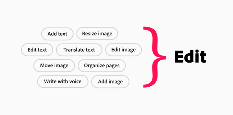
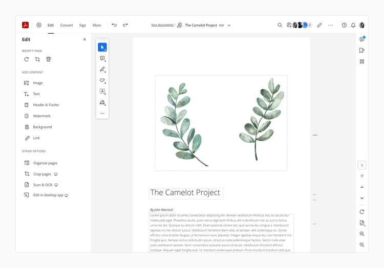
The workflows, which we called “megaverbs,” changed our design approach from one focused on multiple individual tasks (like “organizing pages,” “editing text,” and “adding images”) to one focused on an entire workflow (like “edit” or “sign”).
Prototyping and research
Although there would still be key differences between platforms, we wanted the tools to be easy to access and use and for people launching Acrobat on any platform, to at once understand what they could do. We focused on a basic structure that was simple but flexible, knowing that we'd eventually need to consider more tools once we achieved a solid framework.
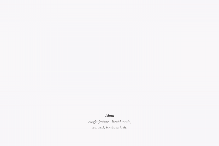
Conversations about scalability across platforms, eventually led us to adopt the “atomic design” methodology created by Brad Frost. In this model, atoms were single features, molecules were the natural groupings of those features (such as page navigation as a group), and organisms were how those molecules were rearranged to create different experiences on various screen sizes. The metaphor supplied a way for us to visualize and discuss how our design framework would translate to various screen sizes.
For months, we debated everything from structure to detailed interaction with our design team and our product partners. Some decisions were made through design rationalizing, some with research findings and business insights, and others were just a gut call. Eventually two navigation paths emerged:
Path A: A highly contextual approach with a few icons and buttons on the screen and features that appeared only when needed.
Path B: A highly discoverable approach where capabilities were presented up front as megaverbs (like Edit, Convert, Sign).

Next, we took advantage of our full stack design team to get early feedback from customers. Our prototyper created two simple Adobe XD prototypes for both large screens and small screens, and our researchers put the designs in front of customers on each platform to get a qualitative assessment of the framework, discoverability, and general preferences for each interface.
Although we'd been focused on Paths A and B, during research, a Path C emerged. It blended the contextual features of A and the megaverbs of B so features were easy to access, but people launching the app for the first time could understand all the tools available to them.
Implementing our design vision
The vastness of the undertaking meant slicing the work into meaningful chunks that helped us stay true to our core design principles: fluid workflows, aesthetic approachability, and cross-platform coherence. What started as a four-person design team quickly expanded into a much larger number of cross-functional teams across platforms.
Once we had a solid framework in place, we began defining those parts of the UI that were fixed and those that were flexible for each platform to change. Having these definitions and debates early in the process helped reduce the inconsistencies that popped up later, as each platform team went heads-down on implementing the designs.
Adobe's Spectrum design system unites the interfaces for all of Adobe’s products so we began by looking at its components through a lens of aesthetic approachability and familiarity. In the end we created a variation of icon styles (that we could contribute back to Spectrum for other teams to use) that felt more modern, approachable, and consistent while staying true to our Spectrum DNA.

To prove the scalability of the framework we'd built, we did an exercise for small screens to add touch points for possible (but not yet built) features. This scalability exercise helped develop and fine-tune usage patterns, but it also helped our partners visualize how the framework might grow and where it could end up down the road. In conjunction with bug bashes, that helped us unearth any unknown issues, and internal “experience-athons” that helped us confirm the quality and execution of our design, we ended up learning valuable lessons about how to evaluate design quality at various stages of product development.
Introducing the modernized Acrobat
The beta of Acrobat for the web is the start of a multi-year journey to implement our design vision on multiple platforms and in third-party apps. We're excited by the prospect of having a positive impact on the way millions of people work with documents. Come work with us as we continue designing the future of Acrobat.
