Behind the design: Adobe Firefly Boards
The challenges and rewards of designing a product, for the nonlinear start of the creative process, from scratch

That vision inspired Adobe Firefly Boards, a modern concepting application with an infinite canvas and multi-creator collaboration that transforms the start of every creative project with unparalleled creative control and direction. It helps people rapidly explore a range of artistic directions, transform regions of assets, and remix styles and ingredients.
Danielle Morimoto, group design manager for generative AI on the Machine Intelligence & New Technology team has led the design team for Firefly Boards since its early incubation. She discusses the challenges of designing a product, for the nonlinear start of the creative process, from scratch.
What was the primary design goal when you set out to design Firefly Boards?
Danielle Morimoto: One of the first things that any creative typically does in their process is gather—pull together bits of inspiration to help add definition to their ideas. It’s a euphoric stage where anything goes if it can be squeezed into the (usually) constrained amount of time allotted for concepting.
Our primary goal when starting Boards was to design a UI that would enable the two thought processes that people move in and out of throughout the early stage of the creative process : divergent thinking, the process of coming up with many ideas to explore possibilities, and convergent thinking, which requires honing in on ideas to find a solution. When we first began thinking about key concepts, two ideas kept rising to the top. Our challenge was to build an intuitive and simple product experience that supported both.
Exploration. Divergent thinking requires variety. During the creative process there are times when a user may not know exactly what they’re looking for, so they’re open to spontaneity as it may lead to a totally new idea or thread of thought. We wanted to infuse into our product that idea of “I’m feeling lucky” or “surprise me” to offer moments where someone can discover something delightfully unexpected. By selecting multiple assets, and remixing them, the technology combines elements from each selection, so it doesn't require explicitly defining an idea but instead leads people to variations they may not have considered.
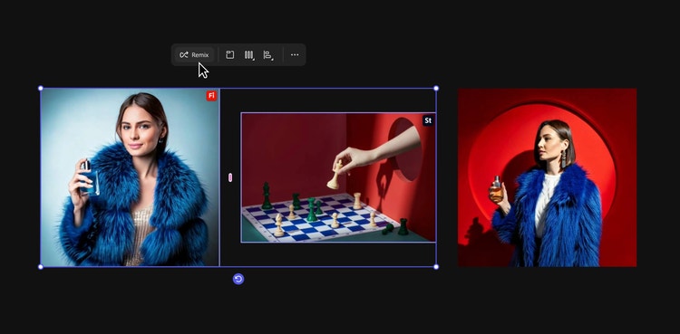
Precision. Convergent thinking requires control. Users want the ability to remove, add, and change parts of an asset with a high level of precision and predictability, and to perform these editing actions in the context of their workflows, without leaving the application. Boards enables a basic level of editing (adding a style or composition reference to influence generation) but since there are times when people want to do production-level refinement there are also easy pathways to open them in Adobe’s pro tools.
What user insights did you leverage to help inform the design solution?
Danielle: This was a new product, and there’s a design-prototype-research-design loop that was integral. A lot of the time, the user feedback that our research partners Victoria Hollis and Rob Adams brought back to the team from this loop, was highlighting where people were struggling. One feature that changed significantly because of user testing sessions was the Eyedropper.
We were aware of a shift from the prompting era to the controls era. The prompting era was powerful because it was an intuitive way for people to get started. The UI for typing a prompt into a text bar was as familiar as starting a web search or writing a text message. But since every model requires a different way of “speaking” to generate output, learning to craft those instructions can be like learning a new language. In the controls era people want to get quality outputs that match their expectations without having to know how to write prompts.
During a team offsite in New York, we put a prototype of Boards in front of creatives and realized we’d gone too far with text prompting versus visual prompting. People wanted more gestural on canvas interactions. For example, they wanted to be able to pull aspects from images and apply them to others—and they wanted to do that without ever having to type a prompt. It was when the team first began exploring using an eyedropper tool to sample elements of assets.
What was the most unique aspect of the design process?
Danielle: The early stage of the creative process is messy. It’s not a straight line but a wild squiggle. And AI operates within a fine line between predictability and unpredictability. Our team needed to find ways to support both divergent thinking and convergent thinking and enable these two very different creation processes to live simultaneously on a single canvas.
There are times during the creative process where visual surprises can lead to new ideas or threads of thought. Other times, people are pursuing a concept and need a level of precision and control. We needed to build a product that supported both these moments of serendipity and predictability—all in an intuitive and simple experience—so to get started we separated our work into five pillars:
- Start and explore: Onboarding and demonstrating early on the fast and delightful experience for exercising artistic direction
- Canvas core: Creating a foundation to support the messy, nonlinear creative process
- Remix and variations: Enabling the endless exploration of different and often unexpected ideas
- Editing: Providing precision tools to help users refine and express concepts and to help them move back-and-forth between exploration and refinement
- Creative workflow: Exporting, presenting, and seamlessly integrating into broader creative workflows across Adobe applications.
We broke everyone into smaller squads (each combining a variety of stakeholders like an engineer, designer, prototyper, researcher) to sort through the key questions and problems we’d need to solve within each of these different areas. As an example, the Canvas core squad addressed questions about the application’s overall framework and canvas organization:
App framework: Can a simple chrome UI communicate the core value of the app? Can we empower people right away with a “wow” moment? How do we maintain clear navigation so people always know where they are, how they got there, and how to return? How might we be context-aware, showing people the right things at the right time in-flow? How do we progressively show complexity? What should we consider supporting with future generative AI?
Canvas organization: How do we organize the various “states” of content (active, archived, ephemeral)? To what extent should an asset’s history be surfaced and editable? How do we allow for chaos while also helping users contain it? What tools should we provide to group content and visualize larger concepts?
What was the biggest design hurdle?
Danielle: Starting a product from scratch under such a short time constraint. We came together as a team less than one year ago. There are so many different choices, the technology is complicated and the decisions you make at the start around the foundation of the application will affect what you can do later.
For example, during early versions of the application, we realized our navigation was getting cluttered and covered too much of the canvas space. Since it was the area where users were most often viewing and working with content, it needed as much room as we could give it. We decided to iterate, and the result was a big UI shift, led by Jeremy Joachim and Kyeung sub Yeom, where they reassessed the application framework while simultaneously making room for new technologies and design paradigms.
In the beginning finding a way forward through ambiguity and large problems can be challenging, but by adapting and iterating we created a foundation for the app (navigation, tooling, generative history, canvas primitives) that we could put in front of users for feedback and continue to refine. I’m proud of the team for working through challenges under short time constraints, listening to our users, and always holding a high bar for quality.
How did the solution improve the in-product experience?
Danielle: Besides the shift in the overall app framework, there are two capabilities that either drastically changed or were added in the experience.
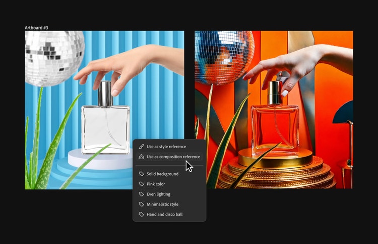
The Eyedropper. We knew that users wanted to incorporate different aspects of images into their ideas. But with a lot of these new technologies designers aren’t necessarily going to nail the experiences and interactions right away—they need to be tested and iterated on. This proved true for the Eyedropper. After Victoria Hollis completed a few rounds of user research it became clear that there was confusion around how to use the parameters of the existing UX. In addition, we heard that people wanted more gestural on-canvas interactions—like being able to sample aspects of certain images and apply them to others. Jeremy Joachim, Effie Jia, and Veronica Peitong Chen reimagined the same technology but with new UX based on these user insights, which resulted in the Eyedropper design we have now.
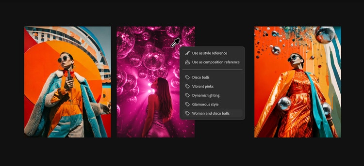
If you’ve used the color picker in Adobe Photoshop or Adobe Illustrator it’s similar, but instead of sampling color users sample visual attributes of an image (ex: as a style reference), or an entire artboard (ex: as a composition reference). By simplifying the UI into something that was familiar, we’ve started to see more user understanding of the value of this capability.
Organization. When you start the creative process, you want to bring in inspiration from everywhere to a single place. We quickly realized there would be a lot of content on the canvas and we’d need to provide an easy way for people to go from a cluttered mess to perfect alignment, without it being tedious. To address that, we revisited one of our pillar questions: How do we allow for chaos while also helping users contain it?
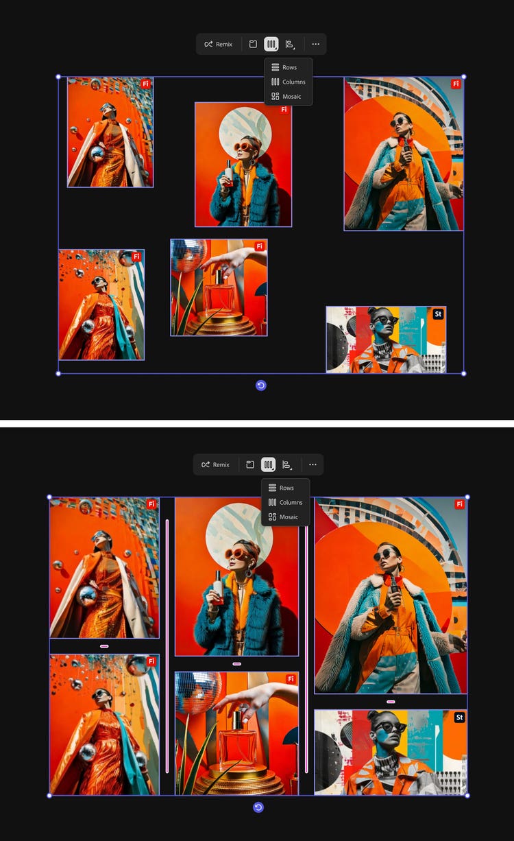
The team also recognized that how and when people want to organize differs, so in addition to foundational tools like padding, alignment, and snapping to grids the team thought about new methods for organization and tidying up. For this Kelly Hurlburt partnered directly with our amazing engineering partners to come up with a solution that allows users to “Collect items” in a single click so they can easily get started with their boards. Users can also select multiple assets scattered across the canvas and arrange them by row, column, or mosaic. It’s extremely satisfying to see the canvas decluttered in less than a second.
What did you learn from this design process?
Danielle: What’s been interesting about this project, and with generative AI in general, is that we’re constantly designing new paradigms for interaction. With all this new technology, and all the ways we’re constantly pushing new experiences forward, more than ever this is an iterative loop of designing, prototyping, testing. Designers need to keep a systems mind as they navigate the unknown with flexibility. Thinking holistically and not forgetting about the larger vision we’re designing for—how each piece has an implication on other aspects of the design and experience—helps make sure we create cohesive and seamless experiences.
What’s next for Firefly Boards?
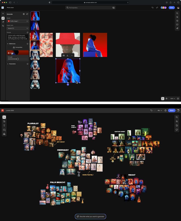
Danielle: Three weeks ago, at MAX London we announced Project Concept was going from incubation to a private beta as Firefly Boards. Next, we’re looking to open it up to everyone with general availability so we’re continuing to build out improvements with fit and finish, new feature capabilities, and a focus on four main pillars:
- Professional creative surface: Onboarding and getting started, expanded media types, presentation tooling, and advanced commenting and collaboration needs
- Fast, tactile, art-directed AI surface: Additional generation controls
- Connected workflows: Further connecting Boards with Adobe’s product ecosystem. Madeline Hsia is working on capabilities like linked documents, CC Libraries, and file management
- Technical foundation: Overall performance, quality, and stability improvements
Overall, we’ll continue iterating and partnering closely with research to listen to our users and what they’re looking for from a tool that supports and enables their creative ideation.
A special thanks to Anumeha Bansal, Evan Shimizu, Ross McKegney, Joe Reisinger, Karthik Shanmugasundaram, and so many others, without whom building this product would not have been possible.