Behind the Design: Adobe Photoshop on iPhone
Designing for in-your-hands, pro-level creative control without pro-level complexity
While watching video is effortless, creating it, especially at a professional level, can be anything but. Professional editing software can be complex and difficult to learn. What if a pro-level video editor was fast, intuitive, precise—and could fit in your pocket? What if you could achieve studio-quality results with a swipe and a tap? That was our vision when we began designing Adobe Premiere on iOS.
Premiere brings the power of professional editing to your fingertips, literally. It's fast, precise, intuitive, and built on a framework that supports everything from first cut to final export. The result is a balance of efficiency and reduced cognitive load that accommodates essential tools and workflows in a touchscreen interface without obstructing content. It proves that powerful tools don’t have to be hard to learn—or hard to love.
Christopher Azar, Group Design Manager for Adobe Video, explains how his team built a fast, intelligent, and approachable professional video editing app.
What was the primary goal when you set out to design Premiere on iOS?
Christopher Azar: Our goal was to design a professional-grade product that carried the powerful, precise spirit of Premiere while feeling modern, approachable, and even fun. We call our vision “intuitive precision”: a high-performance, intelligent tool powered by cutting-edge AI that enables creators to work how and where they want—in the field, experimenting, and honing their storytelling craft.
That meant making this editing power available to a broader creative community. Desktop software has traditionally been built for professionals with large budgets. Our goal was not only to make a professional tool easier to use, but to make it available to more people than ever before. I would have wanted to use this app when I was coming up as a creative, so I’m excited we’re providing high-quality software for everyone who wants it—without a big investment in time or money.
Not only are Premiere’s core editing features free in the mobile app, but we also built bridges to our desktop apps so creators can grow seamlessly. Premiere connects to the broader Adobe ecosystem—Premiere Pro for advanced editing, Firefly and Adobe Stock for content, and Adobe Lightroom for color. Whether someone’s moving fast or working adjacent to pro workflows, the app will scale.
Finally, we don’t see any contradiction between being forward-thinking, growth-minded, detail-oriented—and having fun in the process. We wanted that spirit to shine through every part of the experience.
What user insights did you leverage to help inform the design solution?
Christopher: In beta, we collected loads of feedback and suggestions, but there were a couple of things that, in hindsight, seem obvious, but that we couldn’t have predicted:
- Performance comes first. Building Premiere Rush, we put a jet engine (the Premiere Pro effects engine) on a phone, and the hardware just couldn’t handle it. The app didn’t run on low-powered devices and couldn’t keep up with the pace of an editor’s workflow. So, we started from scratch. Built from the ground up, this app can handle infinite tracks, has a small download size, starts up and exports fast, and is buttery-smooth scrolling and playing back video. But we hope people will never notice the app and just have fun creating.
- People didn’t want a simplified version of Premiere Pro. They want something that's easy to learn, but also powerful, precise, and feature-rich—even on the go. Our goal was to honor the customer and deliver the best experience on mobile. While we know we have a lot more to build, we have a stronger vision to create something approachable, fast, precise, and powerful.
Today’s creators are discerning and imaginative, and many start and finish projects solely on their phones. We built Premiere from scratch to empower them.
What was the most unique aspect of the design process?
Christopher: Our design philosophy came to life through close, real-time collaboration and a deeply intertwined process between design and engineering. We worked alongside our incredibly talented engineering partners, continuously reviewing and iterating. Everything happened simultaneously—there were no distinct handoff phases—so we simply stayed available to answer questions, refine specs, and evolve ideas.
Product management also played a unique role, setting priorities while engineering translated them into tickets using their own nomenclature. This approach enabled rapid progress, with engineering leadership applying a product mindset to organize tasks efficiently, and making it easy for engineers to digest, review with design, and move forward.
Ultimately, a shared determination fueled the team. When we hit challenges, we didn’t quit until we figured them out. The unpredictable journey fostered humility and camaraderie and made the process challenging and fun.
What was the biggest design hurdle?
Christopher: The design framework supports an array of features from concept to export. That meant approaching the product as a system, considering edge cases and constraints first—busy timelines, vertical and horizontal video formats, and balancing diverse needs.
Onboarding
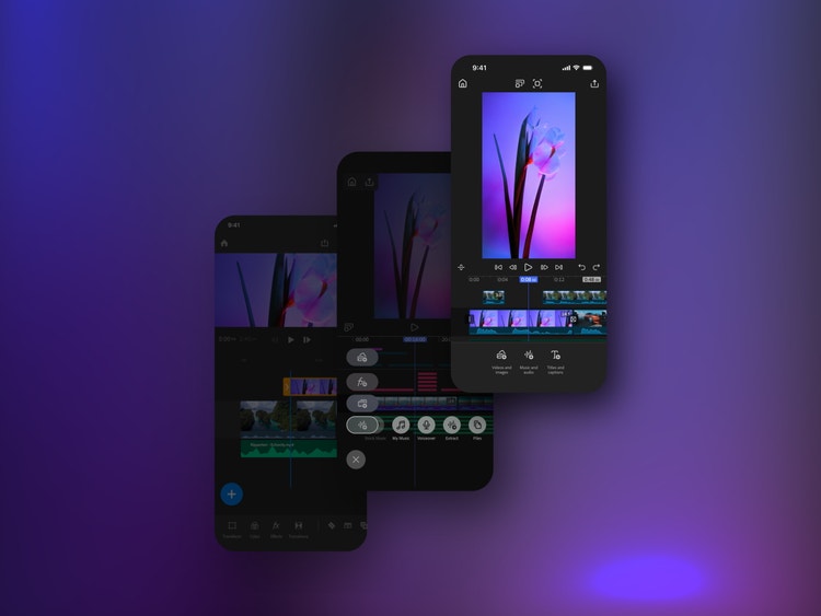
“Intuitive precision” meant aiming for a professional-grade product that didn’t require onboarding. End-to-end user testing confirmed that our UX framework, which entailed clear labels for all functions in the bottom toolbar, didn’t require additional training. Creators and editors understood it at once. A single welcome card was all that was needed.
Progressive disclosure
We designed an experience that prioritizes efficiency without overloading the interface. Powerful functionality that's always within reach and revealed through progressive disclosure, minimizes taps and maximizes clarity. Our goal: a design that feels inevitable.
The inspector hierarchy is thoughtfully structured, surfacing the next best action based on every prior interaction in the creative flow. The video (or program monitor) anchors the interface, with on-screen menus that appear as elements in the timeline that can be selected along the bottom and expanded as more editing tools are needed without ever obscuring the video content. A single ribbon concentrates information and can flex up to three times its height. There’s also a manual control to maximize the monitor as needed.
Users are never dropped into an empty timeline unless they choose to be. Each project begins with media, and when tapped in the timeline or monitor, AI analyzes the clip, tags its content type, and reveals relevant editing tools. For example, if the clip has dialogue, it’s automatically tagged: “Enhance Speech” appears in the toolbar, and once started, transcription and captioning begin quietly in the background. These subtle, behind-the-scenes decisions make the app feel light, fast, and intuitive—despite supporting a dozen simultaneous workflows.
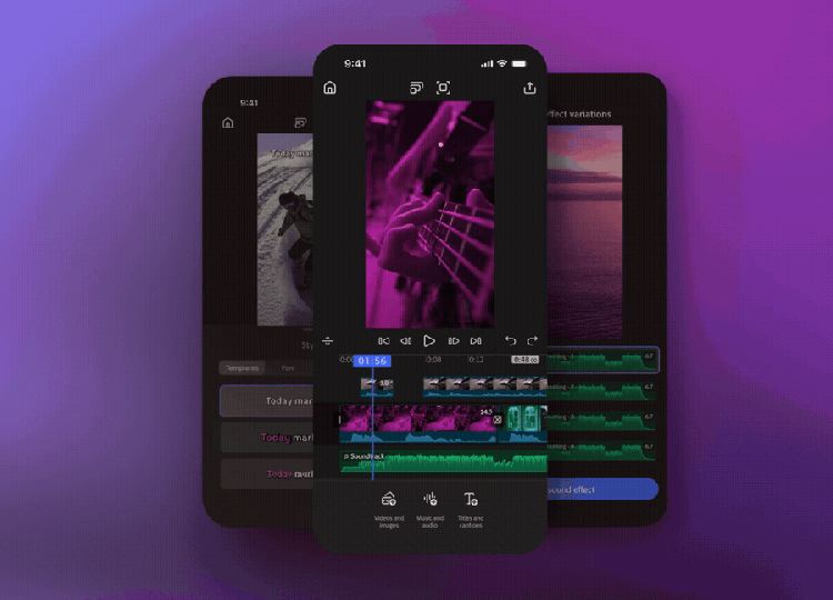
Timeline
Public beta feedback led to a complete timeline redesign. The core is a multi-track reflow timeline that’s consistent with Premiere across platforms. It’s powered by Open Timeline I/O which is more robust than other interchange apps—like Hollywood color grading software. The editing experience is simpler and more powerful than earlier iterations, and the look-and-feel is now consistent across platforms.
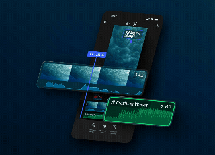
Essential editing operations include frame-accurate trimming, split, reorder, duplicate, and zoom. On mobile, the magnetic timeline allows clips to move and adjust dynamically, with “gravity” connecting them. Drawing inspiration from Adobe Photoshop’s infinite layers, Premiere’s performance is also fine-tuned for infinite video, audio, and caption layers.
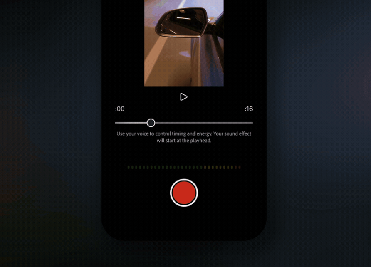
Generative sound effects
Generative sound effects start with a prompt and enable users to supplement content with their own voice, so the app can use the intensity and cadence to generate output. Designed for brevity and creativity, it’s as simple as speaking into the microphone. Since it’s a unique experience to talk or sing into the microphone, we designed and prototyped a variety of experiences and ended up going with one of the simpler versions. We’re excited to see what people make as they get the hang of it.
What did you learn from this design process?
Christopher: We know that design isn’t just good looks. Design is solving the right problem, how the solution works, and how it feels. We learned through this process that even though they would share a name, we weren’t solving Premiere for phones; we were solving the future of editing.
Adobe Rush focused on bringing Premiere’s greatest hits to people’s pockets. This time we set out to design what Premiere has always promised: the best possible app for video editing. We knew the ideal app would combine a modern take on core workflows with a focus on performance, so that it would solve real customer problems by streamlining precision, speed, and ease. It would also consider the needs of both the next generation and the world’s best creators and honor the folks using the app for a few minutes or hours at a time.
We're almost ten years into this mobile video editing journey. We wanted to build a strong team culture and a platform that we could build together for the next 30 years. In other words, we learned to take inspiration from the aspirations of our heroes and predecessors, to build with a sense of urgency, to put our own spin on the work, and to have fun.
What’s next for Premiere?
Christopher: We’re excited to expand the Premiere family with a product worthy of its name, but we’re just getting started. People have high expectations of Adobe (as they should), so after launch what's next is to listen and iterate.
Up first, we hear you (and we love you) Android users! We need to finish up the Android app and get it into the world. We’re also excited to level up core workflows across the application, and add more Adobe magic, too. We can’t share any specifics beyond that yet, but we will have some fun announcements coming soon.
Building software is a massive team effort. I’m honored to talk a little about the behind-the-scenes work we did, but countless people and years of work have contributed to this launch. A big shout out to our amazing teams—those that came before and those working now—because without everyone this app would not have been possible.