Behind the design: Adobe’s updated app icons
How a wordmark inspired our mnemonic system refresh
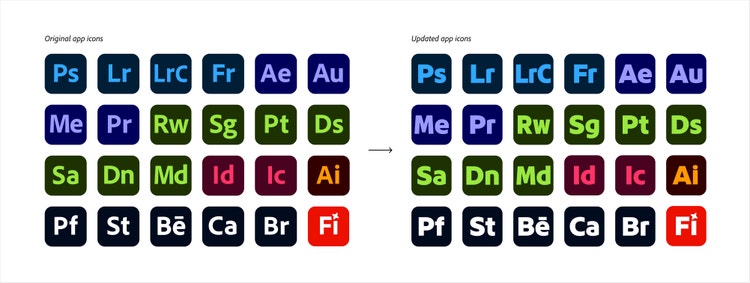
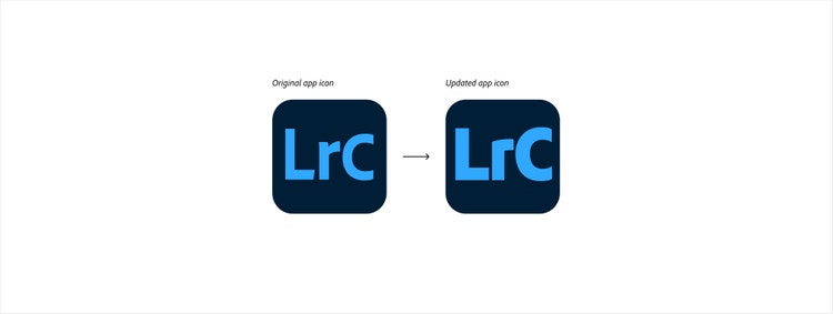
It’s a system that evolves to stay in step with Adobe’s refreshed brand identity. So, when Adobe’s Studio and Brand Strategy teams updated the corporate wordmark—the stylized version of the company name that now integrates the Adobe logo—Adobe Design’s Brand & Icons team jumped in to lead a comprehensive redesign of Adobe’s mnemonics. The goal: to ensure the system aligned with the updated wordmark and reflected Adobe’s refreshed branding.
Updating them was a design challenge that called for close cross-team coordination.
Senior Design Director Shawn Cheris and Design Director Sonja Hernandez led the art direction for the new icons and worked with the Brand Strategy team to ensure their design vision matched Adobe’s updated brand. Staff Designer Alex Fernald led the icon redesign—alongside Designer Emma Gustafson, Senior Experience Designer Doroteea Ionascu Ispas, Staff Designer Marco Mueller, and Design Program Manager Ray McDonnell-Horita.
The redesigned icons began rolling out at Adobe MAX 2025, our annual creativity conference, as part of a broader push to modernize Adobe’s visual systems. From product branding to user experience, this refresh marks a new chapter in how Adobe shows up across every touchpoint.
We spoke with Alex about the work of bringing this system to life.
What was the primary design goal when you set out to update the mnemonic system?
Alex Fernald: We wanted the new icons to feel like they belonged with Adobe’s updated branding—while keeping the scalable foundation that’s able to grow and change as Adobe does and still allowing each product’s personality to shine through. That meant redesigning the product icon system so it would work seamlessly with Adobe’s updated identity to create a cohesive and recognizable experience for the people who use our applications.


What was the most unique aspect of the design process?
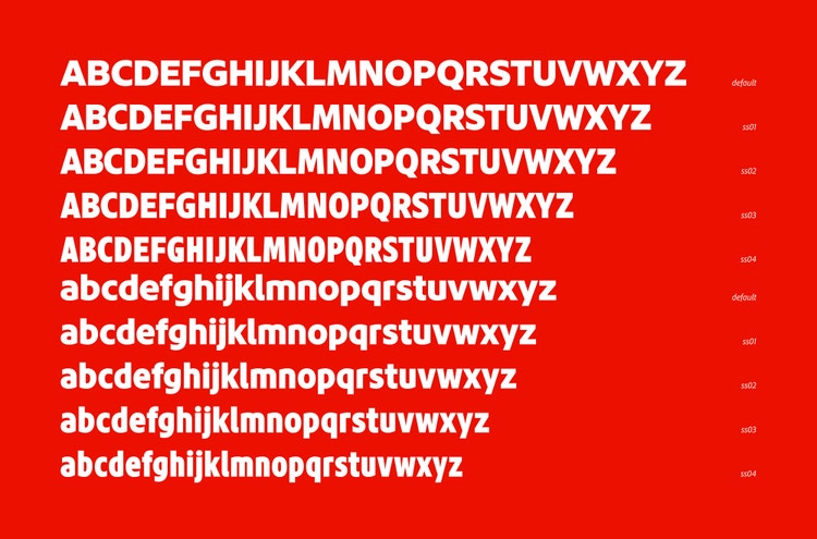
Alex: We needed the icons to work for both two- and three-letter mnemonics, which required flexibility. To make that possible, we teamed up with Frank Grieẞhammer and Jean Kuwamoto from the Adobe Fonts team to create Adobe Clean Display Mnemonic, a custom font evolved from Adobe Clean Display Black, with four widths for each glyph. The flexibility that this font offered became the backbone of the system.
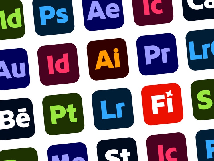
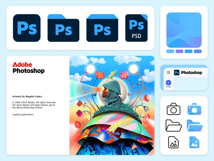
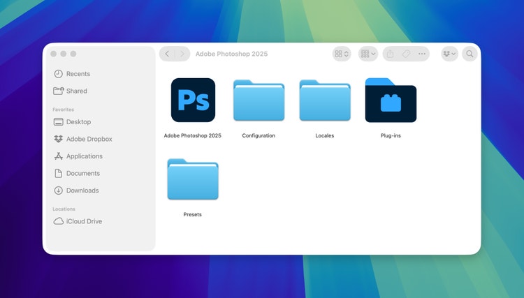
We leaned on AI and automation to handle the repetitive work of producing 38 product icons and nearly 15,000 assets (that number included app icons, folder and installer icons, primary and secondary file type icons, and splash screens for each of Adobe’s products). The technology gave us more time to focus on higher-level creative decisions while maintaining quality and consistency across a massive volume of assets.
What was the biggest design hurdle?
Alex: With so many teams and moving parts, one of our biggest jobs was keeping everyone aligned. We had to juggle deadlines, asset needs, and platform guidelines, all while making sure everything looked consistent. Ray McDonnell-Horita was a communication wizard, making sure nothing slipped through the cracks. In the end, the scale of the project made us become even stronger collaborators.
How does the solution better align Adobe customer experiences?
Alex: The mnemonics have always been a key part of Adobe’s visual identity, but now they feel even more intentional and connected to the rest of the Adobe brand experience. The refreshed icons are bolder, more refined, and fit seamlessly with the updated wordmark and the latest version of Spectrum, Adobe’s design system.
What’s most rewarding is how flexible and scalable the new system is—it works everywhere. Whether you’re opening an app, saving a file, or switching devices, the icons maintain clarity and consistency. That adaptability means Adobe’s brand feels unified and familiar, no matter where someone first experiences it.
What did you learn from this design process?
Alex: I learned how powerful clear communication and alignment can be in cross-team collaborations. Product, marketing, and design had to move in sync, so that updates would roll out smoothly. We were fortunate that with every team we found ways to work that set up the project for the greatest impact.
What’s next?
Alex: While we’re celebrating all the design-led updates coming to life at MAX, we’ll also be looking forward to seeing our updated product icons start making their way into the tools people use every day.