Behind the design: Redesigning Adobe Premiere Elements
Designing a video editing experience that grows with users

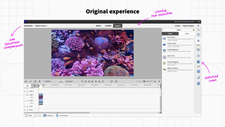
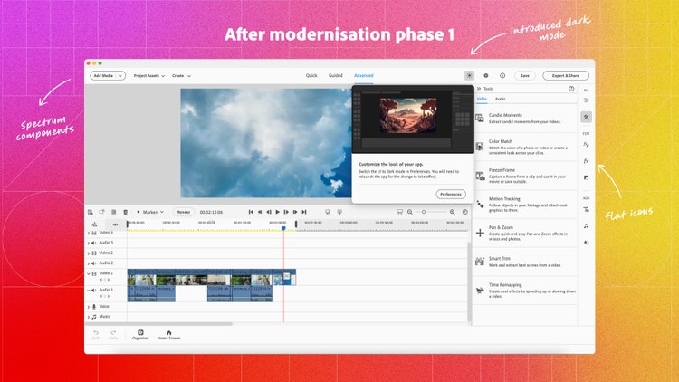
But after nearly 12 years without a major redesign, the UI needed to follow more modern guidelines. The ambitious design project was led by experience designer Akshita Mishra and executed in two phases: Phase 1 focused on visual design and UI updates which included adding a new dark theme and more than 200 custom icons to the Spectrum library to replace icons not meeting accessibility guidelines. Phase 2 focused on UX enhancements like timeline simplification and defining a framework for in-app panels.
Akshita discusses the redesign effort behind PrE’s new user experience, how it’s tailored to meet the different skill levels and editing needs of users, and how a code merge between three of Adobe’s video tools made it possible.
What was the primary goal when you set out to redesign Premiere Elements?
Akshita Mishra: It had been over a decade since the app had a significant UI update. Our user base had grown significantly in skill level and so had their expectations—what had once served people well was no longer meeting their needs. As an example, the basic experience for editing hue, saturation, and brightness hadn’t changed since the app was introduced. At the time, digital editing experiences for consumers weren’t widespread and the goal was simply to help users visualize the effects of changing these parameters (which was accomplished through a 9 x 9 grid of preview thumbnails with increasing saturation values). However, as editing these values became more commonplace across creative apps, the outdated UI only confused users.
The primary goal of the modernization was to create a more seamless user experience which meant upgrading to UI design patterns that users had become accustomed to like using sliders for adjusting hue, saturation, and brightness. The updates would also allow us to include table stakes experiences such as timeline upgrades, micro-animations, and Adobe Stock integrations that users felt were missing from PrE. We also wanted to introduce a scalable framework and an adaptable design language that could easily accommodate future opportunities.
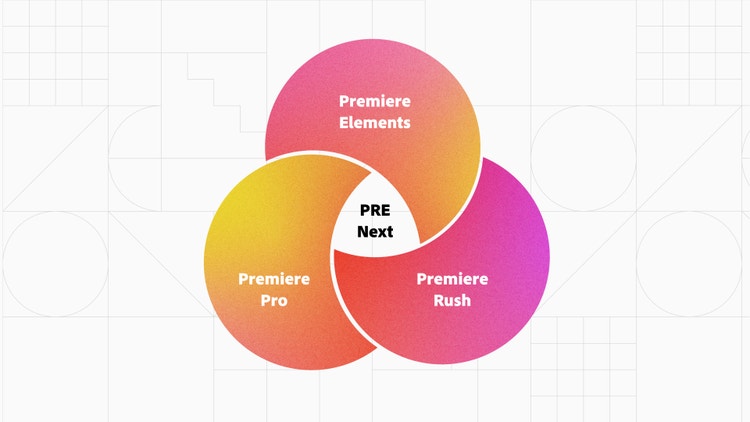
Since the design changes were ambitious, it was important to determine their engineering feasibility. Many of the suggested enhancements, such as introducing contextual in-app guidance and timeline micro-interactions, were simply not supported by our legacy code. The team realized that leveraging the DVA codebase, which included Adobe Premiere Pro and Adobe Premiere Rush, would help us update our legacy code and incorporate more advanced features in the app. This approach of utilizing the components from the DVA products to support the redesign proved to be faster and more efficient than making extensive changes to PrE’s existing codebase—which would've required tremendous effort.
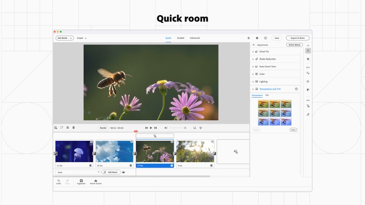
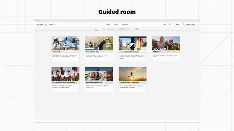
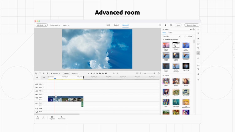
Finally, a core aspect of Premiere Elements is what we refer to as its “three rooms”: Quick, Guided, and Advanced. The rooms cater to the editing needs of the people who use the app by providing tailored experiences and the level of control people need at different skill levels. We knew that we wanted to retain the structure in the redesigned version so there wouldn’t be changes to what users expected from those workspaces.
What user insights did you leverage to help inform the design solution?
Akshita: PrE has an active community of users who’ve provided valuable insights, and helped shape the app’s features and improvements. Having a broad range of user types and insights to work with really helped us put our users at the center of every design decision and set a clear vision for the redesign.
We discovered that they wanted an editing experience that could grow with them—beginner-friendly workflows that gradually helped them transition into using more advanced tools. Over the years, our users have grown to value PrE’s guided edits and tutorials that help them ramp up their editing workflows, so there was also a huge opportunity to improve the discoverability of commonly used workflows and add in-app guidance so users wouldn’t have to rely on external tutorial content.
With an audience that identifies as older adults, we also found many requests for improving the app's accessibility, especially when it came to the newly introduced dark theme. The color contrast between icons, text, and backgrounds, wasn’t bright enough for a sizeable chunk of our users, and it needed to be addressed. We also found that users wanted to be able to customize editing workspaces to suit their needs and to be able to move quickly between workspaces saved for different editing functions (audio, video, effects). Additionally, we found that users who leaned more towards intermediate proficiency, and had invested significantly in their systems, cared more about smoother performance than new features or effects.
What was the most unique aspect of the design process?
Akshita: It was the second phase of PrE’s modernization, centering around UX enhancement, that was enabled through the code merge activity with DVA products. Because we were repurposing components from three varied and well-established products, that best suited their individual target audiences, we had to ensure that PrE didn’t feel like a patchwork of mismatched UI. That meant blending distinct patterns of the three products, merging established workflows and UI paradigms, and ensuring that PrE maintained its own cohesive identity while still evolving to meet our user needs.
While redesigning the panels across the app, we based the redesign of the music panel on Premiere Rush and the text panel on Premiere Pro, but the graphic stickers panel remained largely unchanged from the previous version of PrE. Since each panel had varying navigation patterns and visual complexity, it was necessary to address their fundamental differences to avoid inconsistent patterns when defining the framework for all panels. This unique theme ran across most design stories and was a core part of our redesign. It’s when I put some design principles in place to keep me focused on our goal:
- Keep PrE simple and efficient and avoid adding unnecessary complexity
- Retain PrE’s core functionality while adding meaningful upgrades to preexisting workflows
- Ensure the redesign doesn’t diminish PrE’s core identity and continues to feel like part of the Elements family
What was the biggest design hurdle?
Akshita: Since we were using design components from three different apps, the biggest challenge was learning how to strike a balance between fusion and cohesion while staying true to the needs of our core audience. PrE has always had an audience that extends across creative consumers and creative professionals—one that broadly identifies as “video enthusiasts.” I had to fully understand our target audience so we didn't lose sight of what would work best for our users and didn’t oversimplify or overcomplicate the application.
Using Premiere Pro and Rush as sources of inspiration and opportunity, we often took questions to our prerelease users to validate our design decisions early and use the creative community that had grown with PrE as a sounding board.
In one specific instance, as we worked to redefine the app's architecture, we turned to Rush and Premiere Pro for inspiration. While Rush and PrE offered users fixed panels and timeline areas, panels in Premiere Pro were customizable to suit individual needs. To better understand whether this was a feature our users would value (customization over a familiar and more rigid structure), we took the question to our prerelease forum. We found that both our novice and more experienced users wanted something in the middle—the ability to customize a few regularly used panels, without being overwhelmed by an extreme lack of structure in the entire app. This also validated PrE’s product positioning as somewhere between Rush and Premiere Pro.
How did the solution improve the in-product experience?
Akshita: I divided the design process into three major chunks:
- A bird's eye view to define the broader app architecture and layout
- A clear framework for how information would fit into panels
- Feature-specific workspaces that couldn't be integrated into a larger framework
Some of the design highlights from that work included:
Spectrum icons. In the previous version of PrE, icons of varying sizes, colors, and visual details were spread across panels, footers, timelines, and other creative workflows. Many of them also lacked contrast to the background (grey icons with white strokes were placed on lighter grey) so didn’t meet accessibility guidelines. This lack of cohesive iconography left a huge gap in the overall visual design.
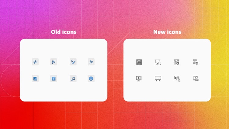
We replaced the previous set of icons with Spectrum icons. But since PrE used a lot of niche icons that weren’t covered in Spectrum’s default icon list, we designed what we needed according to Spectrum guidelines and vetted them with Spectrum designers. The process only further emphasized that design systems don’t impose rigidity on design processes; rather, they can adapt and expand to grow alongside design requirements to meet the unique needs of product teams.
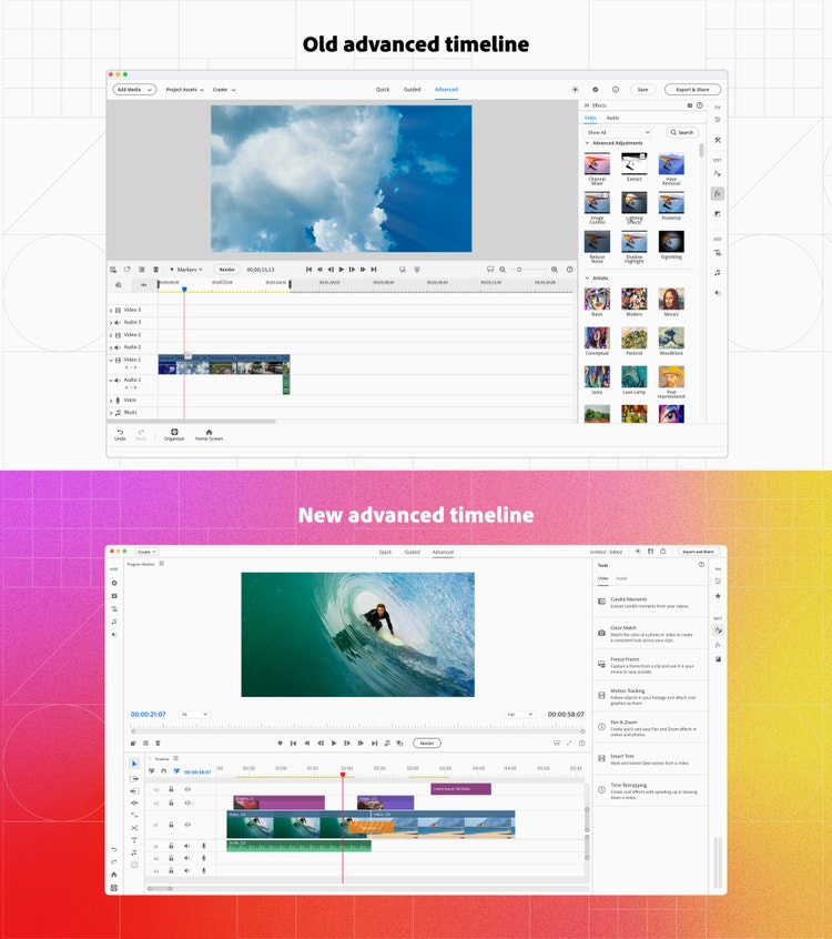
Workspace architecture. The overall app structure for PrE had remained largely unchanged over the years. With three tabs in the title bar (to switch between the Quick, Guided, and Advanced rooms), a single right panel, and a footer, it wasn’t designed for scalability and some of the elements had become redundant. With the opportunity to utilize the DVA codebase, we had a chance to rethink the layout of the workspace and update the navigation patterns.
A singular right panel made it challenging to use related workflows simultaneously. We added a left panel so users could access associated actions (such as browsing through title templates and properties) simultaneously. Barring the addition of a few actions, such as quick export, the header of the three workspaces remained largely unchanged as it had grown to become a part of PrE’s core identity.
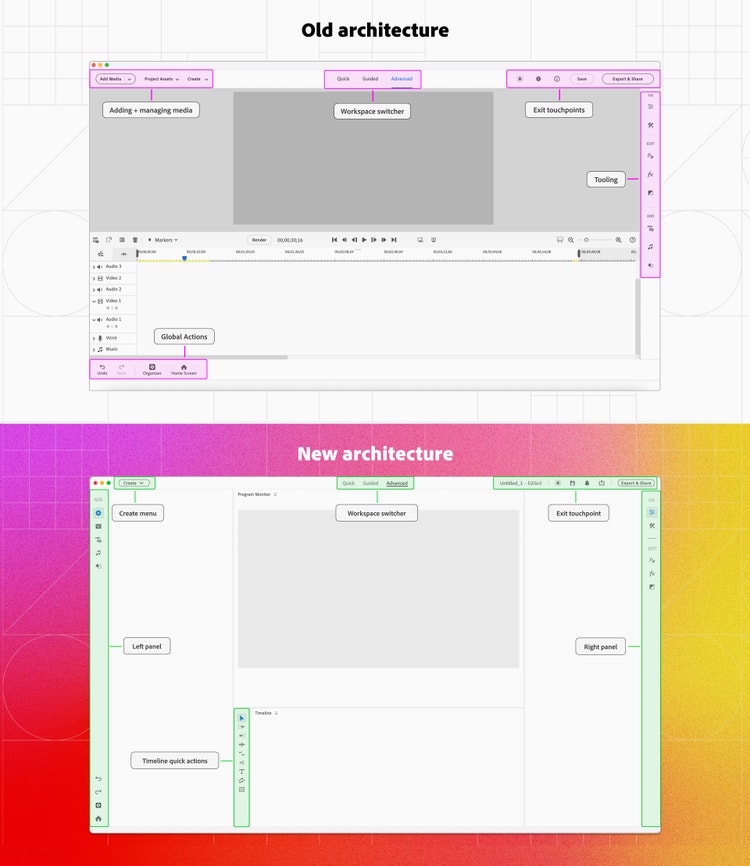
We also gave people the ability to partially customize their workspace—allowing them to add panels and dock them in certain sections of the app. The partial nature of the customization offered choices to our broad range of users without throwing them into a sea of possibilities.
Timeline enhancements. With the new architecture in place, we were able to make significant changes to the timeline, the graphic representation of a project where users can view, rearrange, and edit their clips, effects, and audio. The previous timeline layout in the Advanced room clubbed related audio and video tracks together, but with this update, we moved closer to the standard timeline layout with all the video tracks and audio tracks grouped separately. We also added table stakes features that were missing from the previous versions due to technical constraints, like the ability to lock tracks, switch to a visual thumbnail view, snap media on the timeline, and more visual representation of applied transitions. These significantly increased the quality of the timeline and supported a wider range of use cases that weren’t possible before.
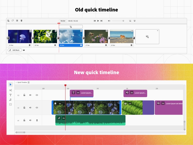
The quick timeline, designed for beginners who want to do simple video editing, has limited tracks and functionality. It underwent a complete makeover as we moved to a time-varying timeline, where media and applied effects are represented dynamically over time, unlike the previous static version, which made it difficult to visualize the duration of assets with respect to the entire duration of the sequence.
In addition to only allowing single-track editing, the previous version also had several non-standard design components (like an undiscoverable text addition button and a confusing empty state) that made it tricky for a first-time user to understand. With this update, we added three default tracks making it easier for users to perform multi-track editing, action buttons that create visual similarity with the Advanced timeline, and brought back UI details from previous timelines, like video duration labels, and media type icons that were known to add value to workflows.
Color grading. Color grading is the process of adjusting a video's colors, tones, and hues to enhance its visual appearance. It’s often used as a creative tool to add artistic effects and create visual consistency across multiple clips. The previous experience had excessive segmentation of actions that ideally should have been grouped together and a non-intuitive color matrix that complicated the workflow (color options were spread across multiple sections so users had to switch between them frequently). These non-standard design patterns had worked well in the past but were creating confusion among our present audience.
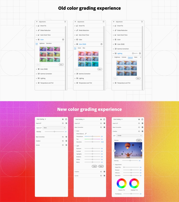
We consolidated the entire color grading experience in a single panel and added tabs to bifurcate between different types of actions to cater to PrE user needs. We also unified the color experience with Spectrum recommendations and introduced the use of sliders for editing visual parameters such as hue, exposure, and saturation (a standard experience across most Adobe products).
What did you learn from this design process?
Akshita: As the sole designer working on redesigning an entire app, modernizing PrE was challenging and exciting. The entire design process reinforced the importance of making the right trade-offs. While we identified many exciting opportunity areas, ambitious goals often come with tight timelines.
Instead of striving for one massive overhaul, we focused on achieving the ideal experience through incremental and planned improvements. This approach ensured steady progress and created space for iteration, user feedback, and refinement, leading to a more polished final product. The phased design overhaul (that happened over a two-year period) also allowed users to gradually adapt to changes in an interface that had remained essentially unchanged for over a decade. Users could adjust more comfortably rather than facing an overwhelming transformation all at once. The result was a smoother transition, with minimal friction and maximum familiarity.
What's next?
Akshita: While many users are enjoying the upgrades and appreciate the new additions and improvements to the editing experience, some users are still seeking more: they want to create better videos faster and want more straightforward variations of existing workflows that are detailed and technical.
We’ve already begun brainstorming ways to make the product more approachable by simplifying and optimizing existing workflows with contextual aid, surfacing more content via stock integrations, and enhancing editing options for text. We'll continue empowering hobbyists and memory keepers to share their stories with creativity and ease!
Special thanks to Varun Chawla, Himanshu Seth, Abhishek Majumder, Amit Chowdhury, Rishi Ranjan Sinha, and the entire Adobe Elements team for their invaluable contributions throughout this whole project!