Bringing Creative Cloud Libraries to Adobe XD
Two powerhouses and one central, unified creative system

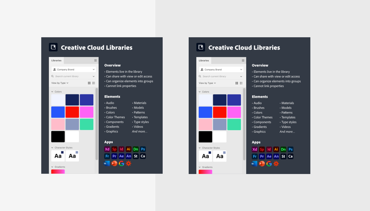
Teams need a creative system, a central platform where all disciplines can bring together creative elements, add guidelines, and stay up-to-date.
As a senior designer on the Creative Cloud Services team, I spearheaded the effort to reinvent Creative Cloud Libraries as Adobe’s platform for creative systems. This article discusses how we combined the power of XD Design Systems and Libraries into a single, unified platform.

Creative Cloud Libraries, reinvented
In the latest release of Adobe XD, you can now publish Creative Cloud Libraries directly from your XD cloud documents. When a library is published, it will stay connected 1:1 with the original document; teammates can use the library in Adobe Photoshop, Adobe Illustrator, or any other Adobe tool while UX designers can continue pushing updates from XD. 🎉
Sharing a library
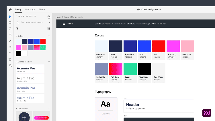
From the new Libraries panel (⇧⌘Y), you can collect colors, character styles, and components from your canvas in Document Assets.
Once you’re ready to share, click the Share icon in the top right of the panel to open the Library Manager. In the manager, click the blue Publish button to publish your Document Assets as a library. Now you’re ready to share with your team.
Updating library elements
With the new publish model, you’re in control of updates. You can continue to make changes in your XD document, and publish them when you're ready.
XD will message you once you have updates available to share. You can choose to publish instantly from this message or publish later from the Library Manager.
Using libraries in your work
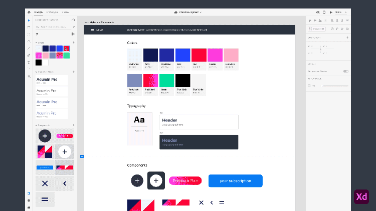
In the root level of the Libraries panel, you can switch between Document Assets and Libraries. To keep your workspace focused, you can control which libraries are visible in XD using the Library Manager.
To open the manager, click the plus icon in the top right. You can now switch libraries on-and-off. Your preferences will stay the same across documents.
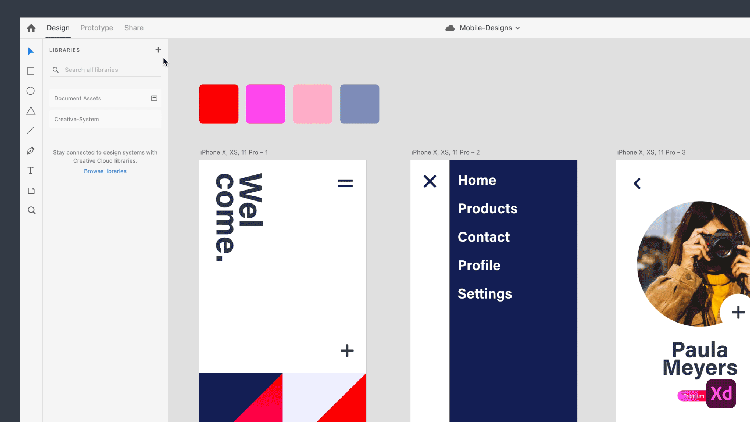
Each time you use a library element, it will be automatically added to your Document Assets as linked from the library. The library will always display the most up-to-date version of the element, while Document Assets will display the version you are currently using in your document.
When updates are available, the Link icon in Document Assets will turn blue. Hover the icon to preview the changes on canvas, then click the icon to accept those changes.
Where we started: A recap
At the onset of this project, XD Design Systems and Creative Cloud Libraries were two separate solutions for creative consistency. Each solution had its own panel in Adobe XD.
XD Design Systems
Teams shared elements by linking one XD cloud document to another. The main version of a component lived in the original document. To update an element, the designer returned to the original document to edit the main version. Because XD Design Systems relied on XD cloud documents, they were limited to four element types and could not be used in other applications.
Creative Cloud Libraries
Libraries were independent of any one app or file format. Teams could contribute and use a wide range of elements from any Adobe tool. The main version of the element lived directly in the library; to make updates, people edited individual elements in isolation—either from a property window or within a temporary file.
Since Libraries were already integrated in the rest of the Creative Cloud ecosystem, it was the natural base for us to build the creative systems platform. To incorporate XD Design Systems with Libraries, we asked ourselves: How could we evolve Libraries to support the unique needs of UX designers without disrupting the value for other creative disciplines?
Finding the gaps
To start, we reviewed XD Design Systems to identify areas of strength and opportunities for improvement. We determined three core challenges that Libraries needed to address in order for creative systems to support UX designers:
1: Maintain context
Teams typically laid out their components in a series of artboards with usage descriptions. By building their system in a single document, designers were able to link components with style properties and easily make bulk changes. Since Libraries were independent from a document, they didn’t support this crucial workflow.
The challenge: To safely iterate and share, designers needed control over sharing and updates.
2: Give control
To collaborate at scale, designers needed the power to decide who could edit the system and when to share updates. XD cloud documents did not offer this level of control. When sharing a document, the only available option was to edit permission. In addition, all changes to styles and components were live. As soon as the document was auto-saved, updates were automatically pushed to linked documents.
The challenge: To safely iterate and share, designers needed control over sharing and updates.
3: Enable efficiency
To use XD Design Systems, designers had to manually link their documents to the Asset panel each time they created a new document. When a document was linked, all of its styles and components were added to Document Assets. The Asset panel inevitably became flooded with dozens of irrelevant elements, making it difficult to navigate and browse.
The challenge: Designers needed a focused workspace that let them quickly get to the elements they needed.
Defining the “source of truth”
Our first design task was aligning on the source of truth—the single place where the main version of an element is defined and maintained. As described earlier, the source of truth for an XD design system was the original document. In contrast, the source of truth for a library was the library itself. We explored four possible models:
Direction 1: Library as the source of truth
Our first exploration was a slight adjustment to the existing Libraries model. While the library would remain the source of truth, it would now keep track of where elements came from. This would give people the option to edit elements in their original documents.

Evaluation: While this solution was the simplest change, the option of where to edit provided many opportunities for collaborators to make mistakes.
✖ Easy to get out of sync. Although design teams would plan to maintain elements in their original document, nothing would prevent collaborators from accidentally editing an element directly from the library. In this scenario, the library would automatically reflect the updated version but the original document would not. It would become difficult to keep track of whether the version in the library or the version in the document was the “correct” one.
✖ Can’t keep style properties linked. In XD, the document tracks whether components are built with other components or styles. Library elements on their own are not aware of these connections. If a designer edited an element outside of the document, these connections would be lost and any cascading styles set up in the original XD document would be broken.
Direction 2: Document as the source of truth
With this option each time an element was added to a library, it was linked from its original source. All changes had to be made in the source document, and elements could no longer be edited in isolation.

Evaluation: While this would have worked for people creating design systems, this option did not support creatives more broadly.
✖ Source document not always relevant. In many creative workflows, the original source document simply isn’t relevant. It doesn’t contain any important information or functionality that you want to carry forward. It makes more sense to add the element directly to the library as a self-contained asset.
✖ Permission conflicts. In the original permission structure, edit access to the library included all of its elements. In this new model, it was likely that collaborators would have edit access to the library but not to every source document. As a result, collaborators would be able to modify some portions of the library but not others; it would be more complex for teams to manage.
✖ Document Assets only in XD. The majority of Creative Cloud apps did not have the concept of Document Assets and their documents did not contain discrete main elements that we could link to libraries.
Direction 3: The choice to link
After exploring our second option, it became clear that we still needed to allow people to add elements directly to libraries. So Direction 3 gave people the option upfront to add elements as self-contained or linked.

Evaluation: We rejected this option for reasons similar to Direction 2.
✖ Permission conflicts. Collaborators would likely end up with editing access to some parts of the library but not others. This added unnecessary complexity to the existing permission structure.
✖ Document Assets only in XD. Since XD was the only app capable of supporting linked elements we believed this would be confusing to teammates trying to edit libraries in other Adobe tools.
Final direction: Library connected 1:1 with document
In our final exploration, we allowed people to create libraries in two different ways: People could continue to create self-contained libraries in the traditional way, or they could choose to publish a library directly from an XD cloud document. The second option meant the library would be linked 1:1 with the document as a whole and people would have to return to the original document to edit the elements.

Evaluation: This conservative approach scaled for both UX designers and the rest of the Creative Cloud ecosystem.
✔ Flexible options. By publishing libraries from XD, designers could use their original document as the source of truth. At the same time, creatives in other apps could continue to make self-contained libraries. No workflow was interrupted.
✔ Simple permissions. By tying a library to a single document, editing and permissions were clear. There would only be one source for editing main elements.
✔ Gated updates. Because the source document and the published library were two different entities, changes to elements would no longer be live. Designers could use the document as a place to draft changes and choose to push those updates to the library when ready.
Connecting one document to one library is the first step in setting up the platform for creative systems. In the future, we would like to revisit how teams might intuitively link elements to a library from multiple documents.
Creating a unified panel
Once a source of truth model was established, we needed to resolve the existing two panels. A new, unified panel had to allow people to use libraries and publish the assets from their document. We explored four different UI patterns to merge these workflows:
Direction 1: All inline
First, we explored an option with one view of the panel. Document Assets and Libraries were shown on top of each other in a single, collapsible asset tree (it was the same UI found in a competitor app).
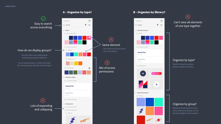
Evaluation: While this option did offer great searching across all sources, it was experientially complex.
✖ Mixed permissions. For each library in the tree, a user might have edit or view access. In some portions of the tree, people would be able to add, reorder, and organize elements. In others, actions would be locked. These differences were confusing when all elements were inline.
✖ Multiple versions of elements. In XD, every library element that’s used is automatically added as a linked element in Document Assets. This allows you to gate updates to your document. When all elements were inline, people would see the same element twice... once in the library and once in Document Assets. They would even see two different versions if the document hadn’t accepted library updates.
✖ Overwhelming to navigate. When all of the elements you might need are loaded into a single tree, the panel becomes cumbersome and difficult to browse. (We’d already identified this as a weakness with XD’s existing panel design.)
Direction 2: Tabs
Next we divided the panel into two separate tabs for Document Assets and Libraries.
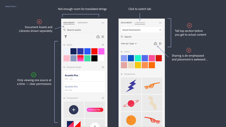
Evaluation: While this design allowed people to easily switch between Document Assets and Libraries, it didn’t fit the overall strategy and UI philosophy.
✖ Wrong paradigm. In essence, Document Assets are a library that designers can choose to keep private or share for broader use. Showing Document Assets and Libraries as distinct and separate tabs did not communicate this view.
✖ Legacy UI. In modern Adobe applications, like XD, our designers are consciously trying to keep the UI framework more streamlined than our flagship programs; tabbed panels are a pattern we are generally trying to avoid.
Direction 3: Top scroll
In our third exploration we returned to a single panel, but added a list to switch between sources. The source selected on top controlled the elements displayed below (a UI solution found in two competitor apps).
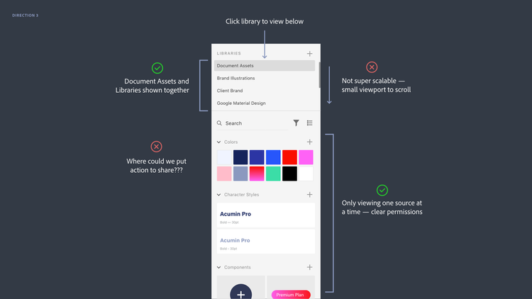
Evaluation: This solution supported the correct paradigm and allowed users to easily switch between sources in a single click... but it wasn’t scalable for many libraries.
✔ Right paradigm. Document Assets and Libraries were represented together as part of the same system.
✔ One source at a time. Unlike Direction 1, people would only see elements from one source at a time. This approach avoided the confusion of mixed permissions and multiple versions of an element.
✖ Not scalable. If someone had more than a couple of libraries, switching sources became more difficult and people had to scroll long lists back-and-forth in a small space.
Final Direction: Drill in, drill out
In our final exploration, people could drill in and out of a root level listing Document Assets and Libraries. This was the direction that we ultimately pursued.
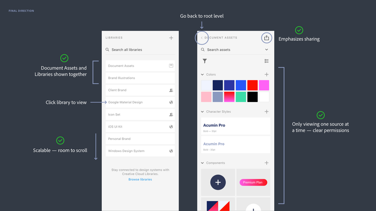
Evaluation: This solution had many of the same benefits as Direction 3, but was also scalable for more libraries.
✔ Right paradigm. Like Direction 3, Document Assets and Libraries are displayed as one cohesive system.
✔ One source at a time. By drilling in and out, people would see elements from one source at a time and they could easily switch between sources with straightforward organization and permissions.
✔ Scalable. Unlike the top scroll, the root level was scalable for listing more than three or four libraries. When people turned Libraries on and off in the Library Manager, the effect was obvious at the root level.
Looking ahead
By unifying XD Design Systems with Libraries, Adobe is laying the foundation for a creative systems solution that empowers all creative disciplines to work together. But this is just the beginning!
In the coming year, we’ll be improving the organization of elements, allowing people to add guidelines, and strengthening our integrations in Adobe’s 3D and video tools.
This article originally appeared on Medium with the title "Designing for creative systems: An inside look at bringing Creative Cloud Libraries to Adobe XD."