Defining experience quality in large language models
A look at the design strategy behind Adobe Acrobat’s newest generative AI features

Digital image by Karan Singh
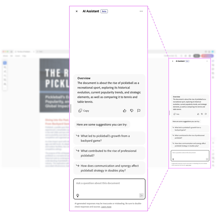
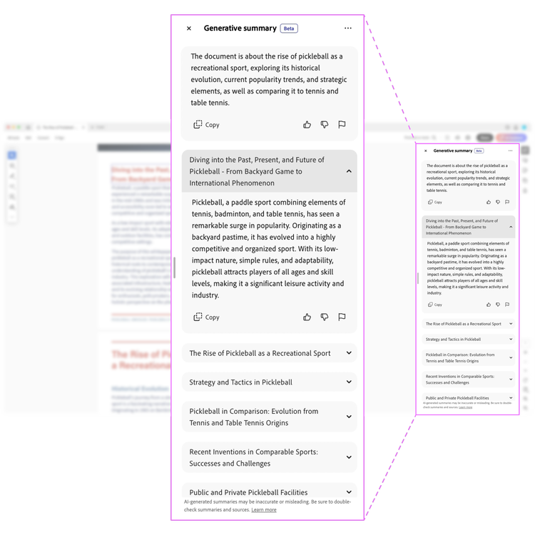
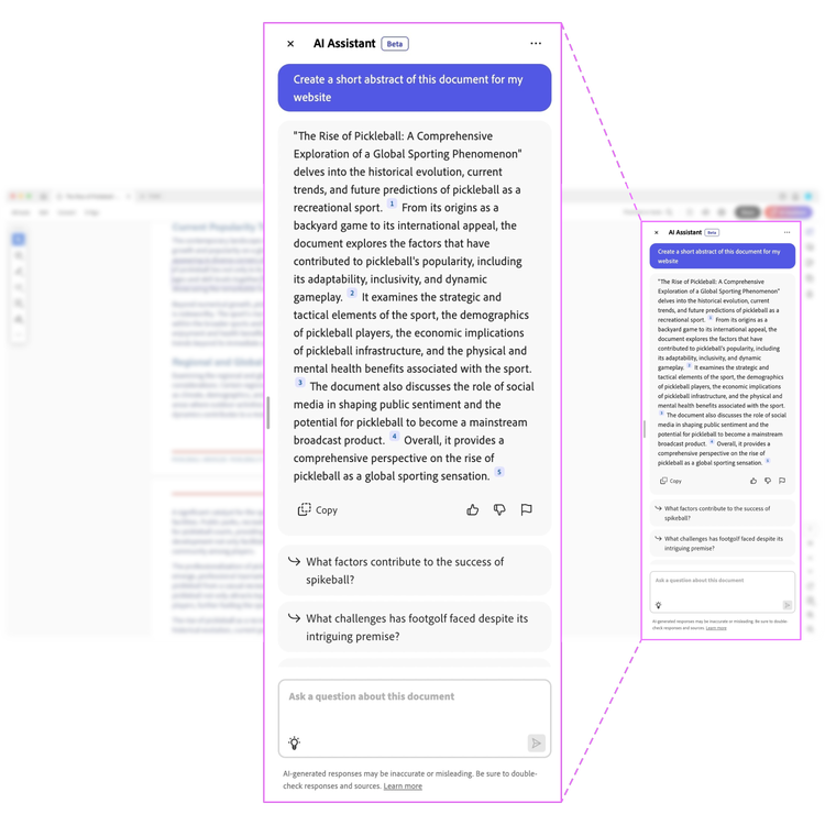
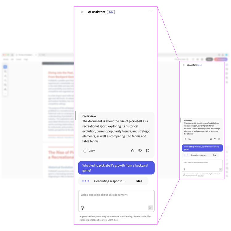
Even before the popularity of Large Language Models (LLMs), the Document Cloud Design team had been exploring concepts—such as allowing users to simplify a document’s vocabulary—that would democratize access to knowledge by making it easier for people to read. Then last year, with the increased presence of LLMs, our vision and commitment to reading and comprehension was accelerated and enhanced. Generative AI provided the technology for two new features in Adobe Acrobat and Adobe Acrobat Reader to unlock information in PDFs: AI Assistant, answers questions about documents to help people understand the information, get insights quickly, and instantly generate content for deliverables. It’s supported by Generative summary, a capability of AI Assistant, that builds a one-click summary of a document's key sections.


As we began developing our design strategy for the experience of these features, there was a lot to consider, particularly the sheer volume of information processed in Acrobat—in 2023, more than 400 billion documents were opened in the app. We focused on one question: How might generative AI features make it easier for people to comprehend and act on documents? Answering that question would help us define (and then evaluate) what quality means for an LLM experience.
Establish theses, involve research, and confirm user needs
As we began work on designing and defining the quality of the experience, we also focused on how we would help users discover the features, meaningfully interact with them, and want to return to use them. As our designers began to consider how these experiences would be used in the real world, we laid out a set of theses:
- AI Assistant, a conversational side panel—with questions, key takeaways, and insights in natural language to help people easily comprehend documents—would establish trust through attributions tied to the document. It could eventually span beyond a single document to an omnipresent feature throughout the app.
- Generative summary, a single function, single selection construct would help people easily get the gist of documents and dive deeper into individual sections. Designed with ready pathways to AI Assistant it would make it easy for people to get answers to other questions.
- Pre-generated prompts, both generic and specific to the document, would reduce the cognitive load for people and could evolve as the AI understood what people were wanting to know.
Adobe Design Research & Strategy began external concept testing to collect early feedback about how people were using the features and the value they saw in them, and to gather insights on key design elements.
Then, through an internal beta, we turned to our employees who were using AI Assistant to read and navigate information in long PDFs and to synthesize and generate insights from documents to use in other types of communication like reports and email. Generative summary was being used to quickly understand a document and decide if reading further was necessary. As an internal audience helped us test our theories, they also helped us shape the features for Acrobat’s hundreds of millions of monthly active users.

As part of that internal beta process, researchers also set up an Employee Advisory Board of nearly 80 employees that represented a diverse set of roles including finance, legal, human resources, marketing, strategy, research, and sales. Since every job has a unique set of use cases, needs, and behaviors that impacted how they used the beta, the specific job functions helped us uncover usability issues that might occur for people trying to use the features for specific needs.
Define quality by building a framework
With Adobe Design Research & Strategy, we began to measure the quality of features using a holistic assessment of how people perceived their overall experience, how the features met their needs, and how it aligned with their expectations. We also turned to the Adobe Firefly team to learn how they were measuring quality and kept a watchful eye on the market landscape so we could better understand the needs that generative AI fulfills and learn which tools were most valuable to people.
That information, and the qualitative research, led to a quality framework that would keep us honest about whether we were meeting people's needs. It was based on three parameters:
- Is it useful? Are the features effective and valuable in helping people achieve their goals?
- Is it usable? Are the interfaces easy to understand and use and do the features aid in comprehension and engagement?
- Is it responsible? Are people protected from stereotypes, bias, profanity, violent or sexual content, and harmful references and can they trust the features? Are the limitations and capabilities of the features clear? Is it easy for people to report feedback?
Use the quality framework to drive decisions and meet user needs
Informed by research and landscape analysis, this framework was extremely helpful when trying to align cross-functional teams on the dimensions of quality we were aiming for.
Adobe Design Research & Strategy used it to benchmark and measure the quality of the experience in interviews and surveys. Our designers used it to evaluate the experience through dogfooding (testing the features ourselves through real-world usage) and end-to-end audits, as a framework to prioritize the design bugs found for engineering teams, and as a framework for landscape analysis, so we could better understand how Acrobat compared to other products. All these activities ultimately contributed to a star rating that was used to inform our release readiness. It also created a set of heuristics that simplified decision-making because it made it easy for everyone to understand and align on the why behind the experience improvements we wanted to make. We could simply say “XYZ capability is needed to improve usability” and it would help drive the backlog and roadmap for features. Examples of how that changed parts of the experience:
- Upfront overview: Initially, as soon as a document was processed, AI Assistant would provide suggested questions. But we learned from research that people needed something to orient themselves to the document to help make sense of the suggested questions. Immediately providing a short summary (document overview) helped provide that context.
- Suggested question structure: Originally suggested questions were highly specific to the document, which was a good thing, but the compound questions were also complex. It was jarring the first time the document loaded. We worked with prompt engineering to restructure and simplify the initial suggested questions and to hard code questions that seemed more common when opening a document such as "provide top five key takeaways."

The road ahead for generative AI in Acrobat and Acrobat Reader
This public beta is Acrobat’s first foray into using generative AI to fulfill Adobe’s commitment to the democratization of knowledge. As the design team kept its focus on designing a quality experience, our internal customers offered their insights, preferences, and needs about how these features should work. We have a deep and rich feature roadmap ahead but as we go, we’ll continue to focus on making the experience a quality one. Try the new generative AI features in Acrobat.