Designing Adobe Illustrator’s rich tooltips
Relatable visual stories that surprise, delight, and guide user outcomes

For the past few years, Creative Cloud onboarding has been transforming how users learn to do things in our applications. Tooltips that at one time simply revealed a tool’s label, are now textual and visual descriptors of how to apply them.
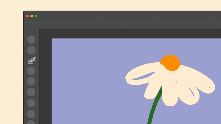
In Adobe Illustrator these content-rich tips—the most straightforward application of the tool played out in short, fun, relatable animations—demonstrate an individual tool at its peak moment of shine within larger, implied workflows. Invoked by holding the cursor over a tool in the toolbar, the utilitarian but playful visual metaphors are the building blocks, no matter someone’s experience level, for learning how to do things in the app.
But what exactly does designing and illustrating tooltips look like in practice? As designers our daily lives and our memories are represented everywhere—including in rich tooltips. Through the lens of telling relatable visual stories, I help our users get started in our apps with these playful onboarding experiences; there are some tricks to doing that well: focus on the most basic function of the tool, take inspiration from the everyday, use what you know, and follow a process that works for you.
Focus on the most basic function of the tool
One might assume these imaginative animations are easy to produce, but underneath their simplicity is a layer of complexity that unveils a tool’s value, motivates users to learn, and guides with a clear intent.
To translate the outcome of each tool visually, a designer must first understand it, then bring it to life with illustrations and animations—all while keeping in mind that the simplest function of each tool is what gives tooltips their visual focus. Mood boards and quick sketches help me to ideate designs and sharing progress (and getting feedback) with the Illustrator product team, and other subject matter experts, early and often helps me fine-tune my approach. I also try to put myself into new users’ shoes to achieve the most useful demo without losing sight of the goal of keeping them inventive and playful.
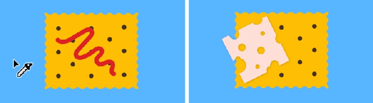
During this process, explorative sketching helps to distill tools to one key function so I can start to uncover the best metaphor. As an example, the first design version of the Knife tool was a squiggly line of jelly on top of a cracker, but the Instructional Design team thought it might read as an open path, and the Knife tool only works on closed paths. Further feedback and ideas from other subject matter experts resulted in a pivot toward a slice of cheese instead of jelly.
In these very short animations we want users to understand the information without feeling fatigued or frustrated and for the tools to not seem overly technical or complicated. When it comes to animation, storyboarding the workflow from start to end in less than 12 frames presents the tool in a clear and digestible way. It’s important at this point to pay attention to details in the UI; small tweaks that may seem inconsequential—like not using the correct cursor for a specific tool or the right color for the bounding box—can break the experience and confuse people.
Tooltips are most important to new users exploring the app for the first time and to users looking for a specific answer to unblock their creative process. Keeping a focus on outcomes is essential. In the end we want any app user to know exactly how to use them in their own projects because a single tool, used well, can unlock huge potential in creative work.
Take inspiration from the everyday
A designer’s job is to dig into a web of ideas to find a single concept that explains not just how a tool works, in as few steps and as little time as possible... and to make it eye-catching and relatable. For example, the Shaper tool transforms two loose drawing gestures into vector shapes and a perfectly shaped ice cream cone. The key is keeping things familiar. Once I understand what a tool does and what it needs to convey, I anchor my ideas in the real world by looking at and thinking about those things that are closest: communities, people, objects, and foods.

I was born and raised in Romania, moved to France to study, then to the Czech Republic for work, and finally ended up in Atlanta, Georgia. Traveling the world and experiencing different cultures has informed my visual vocabulary and much of what I express through my work. Every day, elementary objects bring familiarity to unfamiliar territory for people adopting new skills and inject some humor and delight: a slice of pizza that morphs into a delicious melting moment for the Warp tool; carving Swiss cheese on a cracker when hovering over the Knife tool; or a heart shape and the word “love” written in several languages (including my native Romanian) for the Area Type tool.

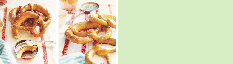
In my latest set of Illustrator rich tooltips, I drew from these experiences, and rooted some of the ideas in my childhood memories: In Romania covrigi (pretzels) are a popular snack food. They also seemed like the perfect use case to show how to use the Blob Brush. With this tool, a childhood doodle can become the perfect filled shape of a pretzel.
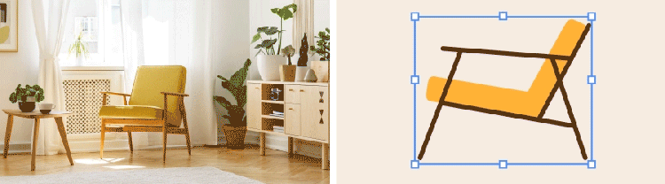
Similarly, I used a 1960s Henryk Lis armchair, that my grandparents had in their home, for the Free Transform tool animation. It was one of the most produced and popular armchairs of the Communist period, so the image had stuck with me. I took an inventive and playful approach to illustrate this iconic design and coupled it with this popular tool to show how an armchair can become a lounge chair with a single click-and-drag (transforming or distorting objects comes in handy when an illustration needs to be adjusted).
We all have fixed ideas about what a tool can do, but we can challenge and simplify those ideas through exploration. Look holistically at your experiences, at memories, at the things you’ve seen recently, and the things you love, because they can all influence the visual metaphors you design (like the love of cooking expressed in the culinary thread of my onboarding experiences). Consciously curating that input will expand your horizon, help you overcome creative blocks, and inspire you to create work that you love. And remember: Sometimes inspiration comes easy and sometimes it needs to be unlocked. For those times when it requires some urging, turn to mood boards, quick sketches, and the advice of the subject matter experts you work alongside.
Make it personal: Use what you know
My background is in photography, where I celebrated the beautiful and the mundane moments of life through grand compositions: I would carefully consider props, colors, styling, light, and angles to capture fleeting moments. This exploration of image-making is translated in my design work.

When I joined the Learn Content Design team, Illustrator was several releases in to using rich tooltips. Jumping in to work on the next set, the established visual system helped me focus my explorations. In contrast to my visually complex photographs, these rich tooltips required an economical approach to visual storytelling, like focusing on the uncomplicated shape of an open envelope to show how to remove an anchor point so it could be sealed.

Follow a design process
Lived experiences, everyday objects, and a “less is more” approach that doesn’t try too hard were the creative inspiration behind this work. But it was working together with people with unique skills and responsibilities that helped me create truly delightful tooltips that unlock Illustrator’s value and motivate users to learn to use it.

Design processes are unique and personal for every designer, but these simple tips help me daily to design with intent and play and to use instantly recognizable objects to surprise, delight, and make our users’ journeys more productive:
- Start with an idea and combine quick sketches to communicate it, to see where problems might occur, then evolve them into concrete solutions
- Storyboard low-fidelity narratives of concepts to unlock additional thoughts and ideas
- Invite others to supply feedback about the work, then reflect and begin creating again
- Be ready to commit to, and move forward with, the ideas you believe are best