How accessibility bluelines shaped Adobe Fresco
Designing the details for a more inclusive application
Fresco, Adobe's drawing and painting app, was among them. For Fresco, the audit revealed an illogical wayfinding structure and a need for a methodical approach to keyboard navigation order (whereby key presses are used to move around inside the app). Not long after, experience designer Jinjin Sun set out to make Fresco navigable by screen readers and keyboards so it would be useful and usable for as many people as possible.
Her task was to create of a sensible wayfinding structure and to document it for Fresco's engineers.
Accessibility bluelines are the design specifications that define and describe an application's wayfinding (focus order, keyboard shortcuts, content structure and annotations) so it can be engineered for assistive technology (screen readers, keyboards). For designers just beginning to think about and create them, the process that Jinjin and her colleagues followed shed light on the less visible requirements of doing that work.
A solid foundation
When an app's buttons and sliders and menus aren't labeled (so they can be identified by screen readers); when there is no logic to the way key presses move people around inside it (so keyboard navigation is easy and comprehensible); and when there is no identifiable content structure (so hierarchy is evident), it can prevent entire groups of people from using it.
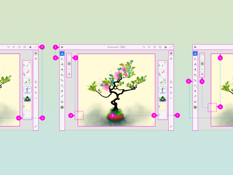
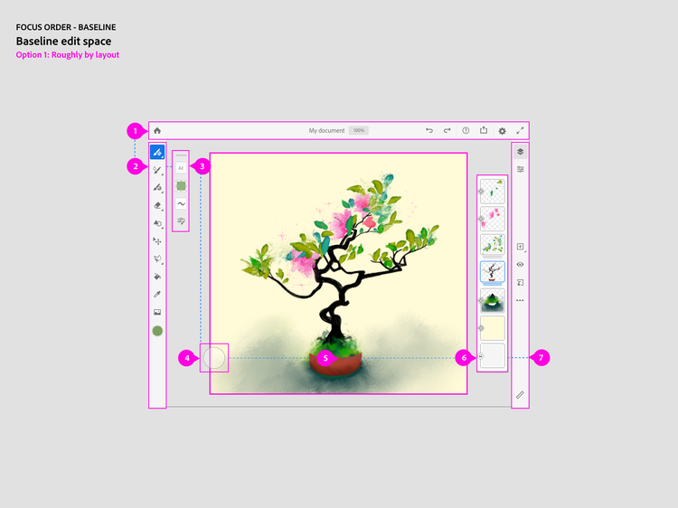
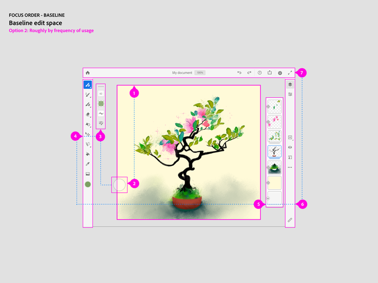
Jinjin began by considering two structural approaches for Fresco's keyboard navigation order: The first a more common top-down-left-to-right (by layout) approach; the second, a less methodical frequency-of-use approach that put the canvas and most-often-used tools, first.
An artist herself, she thought a frequency-of-use model would be best, but because it would be the foundation on which her bluelines were built, an educated guess wasn't good enough. She called in Adobe Design's researchers.
Questions and answers
Since good keyboard navigation alone can exponentially alter an in-app experience, it was the focus for inclusive design researcher Molly Bloom and Fresco researcher Mary Holland.
For Molly its importance was obvious: "Products that are usable only when accompanied by a trackpad, mouse, or stylus, don't support people with visual or motor impairments or those with overuse conditions. If we're building creativity for all, if we want to live up to our corporate mission, we need to think about the ways products are and are not usable."
To facilitate the research, developers Cameron Cundiff and Westbrook Johnson created a prototype. Their hybrid canvas, with tools borrowed from multiple applications, supported screen readers and enabled any action to be completed using a keyboard and keyboard shortcuts.
Mary and Molly used two versions of the prototype each with one of the navigation structures Jinjin was considering. They spoke to ten people with varying degrees of visual and motor impairments (and different needs for assistive technology) and varying levels of creative output (from hobbyists to students and creative pros).


They documented their complete findings in Bloom & Smith (2020). Accessibility in the Semantic Canvas but what they learned about keyboard navigation and a coherent focus order (the order in which a screen reader makes its way through a UI) is that they provide an alternative way for everyone to work:
- Even when people don't require assistive technology, keyboard navigation affords a respite from a trackpad or mouse.
- People using screen readers often use headings to get to where they want to go.
- And, most importantly, for the purpose of Jinjin's work, they found that people using the top-down-left-to-right model found it predictable and intuitive, while those given the frequency-of-use order felt as if they had to guess where focus might go next.
Naming and context
The first step in blueline creation is labeling everything in the app. Not just assigning names to every button, panel, and tool, but also to their roles, states, and properties so their purpose and associated actions can be known immediately to someone using a screen reader. (Because it documents naming for every tool and action in an app, labeling is useful when creating tutorial content.)
Jinjin named every element in the UI. She also created what's referred to as "screen reader-only content," short descriptions that provide clarity by doubling down on naming. As an example, the image below contains a "Static Text" label in the Settings panel; without context it wouldn't mean much, so Jinjin included "Document size [xx] x [xx] [units]" to signal that dimensions and units of measure could be modified.
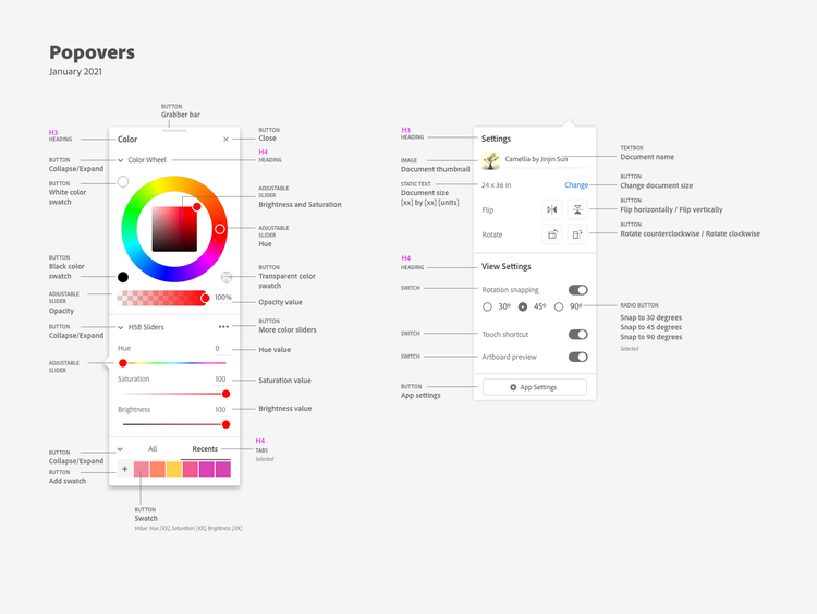
Because most of these labels aren't visible (like "Collapse/Expand" for buttons or "Adjustable" for sliders), anyone using Fresco without a screen reader wouldn't see them; but diagramming this content for developers is important so they can know what a screen reader would read.
Top-down-left-to-right
Next, Jinjin and Fresco experience designer Elissa Welsh set their sights on focus order. Key to these diagrams was creating a logical progression through the UI so people would know "where they are," especially when using keyboard shortcuts to skip around. Jinjin began with Fresco's home page, its main editing space, and its panels and pop-up menus.
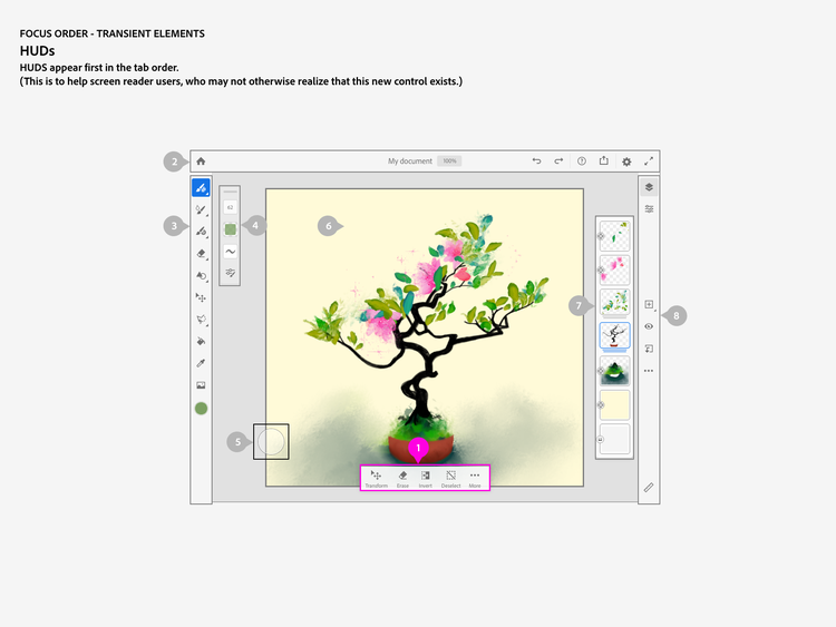
Most of this work was straightforward but because panels and other temporary displays could affect screen reader focus, she created a list of exceptions:
- focus would go first to any open/active tool panels
- if no panels were open, any temporary displays (like toasts) would appear first so people would know they were on the screen
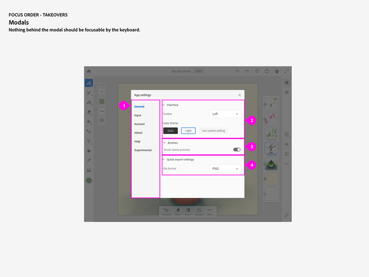
- modal pop-ups (dialog boxes for in-app alerts or launching the App Settings panel) that take over the screen and make anything behind them inactive
- displays for additional tool options in contextual toolbars
- when top-to-bottom or left-to-right wasn't explicit, or when numbering a button first wasn't productive
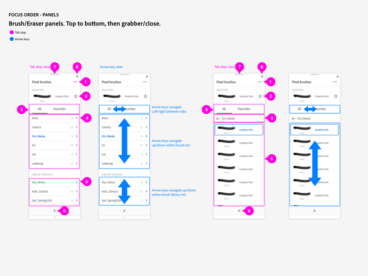
Panels, a wayfinding compromise
Panels in Fresco are many and varied. And since it's still a relatively new app, features and functionality (and panels) are added often. Key to this work was not only creating a logical tabbing focus order for them but designating how arrow keys would be used for expandable lists and navigating between tabs.
The image below shows one of Jinjin's deviations from left-to-right constraints to keep focus on the features of the Pixel Brushes panel (note that the first button from the left is the panel grabber and next to it the close button).
For panels like Fresco's Precision panel, which houses the tools for precisely placing content and for drawing in perspective, the complexities of focus order multiplied because along with a boatload of functionality is an unfolding system of options and menus and checkboxes and sliders. Once expanded, they reveal additional informational headers, buttons, and directional arrows for sliders that dive into different tool states.
Elissa's files give Fresco's developers a step-by-step guide to how a screen reader would navigate by calling out focus order and the naming and context for features, functions, and settings:
- header content (green) enables people to orient themselves hierarchically
- numbering (pink) signifies clickable content
- screen reader-only notation (burgundy) for buttons, dropdowns, and sliders
- arrow key controls (blue) for sliders and menus

The next two images show a more advanced type of documentation that required Elissa to create the focus order for changing perspective, or moving/adjusting a drawing aid (shape) placed on the canvas. Key to these diagrams are the bounding box handles (top) for adjusting shapes and the vanishing points (bottom) for modifying perspective. Because of the complexity of the panels and the tasks, the canvas is treated separately and has its own focus order.


The end of a beginning
What began with an audit ended with an accomplishment.
Creativity for all is a formidable goal. And as it pertains to accessibility, when every accomplishment is followed by a list of things yet to be done (for Fresco, those might be showing the location of content on the canvas or providing a way to draw without a stylus, mouse, or trackpad), it can seem unreachable.
But every step is progress.
The sentiment is summed up by Matt May, head of inclusive design at Adobe, who sees this work as an exemplar of the capabilities of Adobe Design: "Fresco is a way for us to plant our flag, to prove that we can do this, that it enables a lot more people, and that we have the skills to work our way into the heart of our product portfolio."