How generative AI streamlined my creative process
What happened when I turned to a completely generative workflow to design a poster
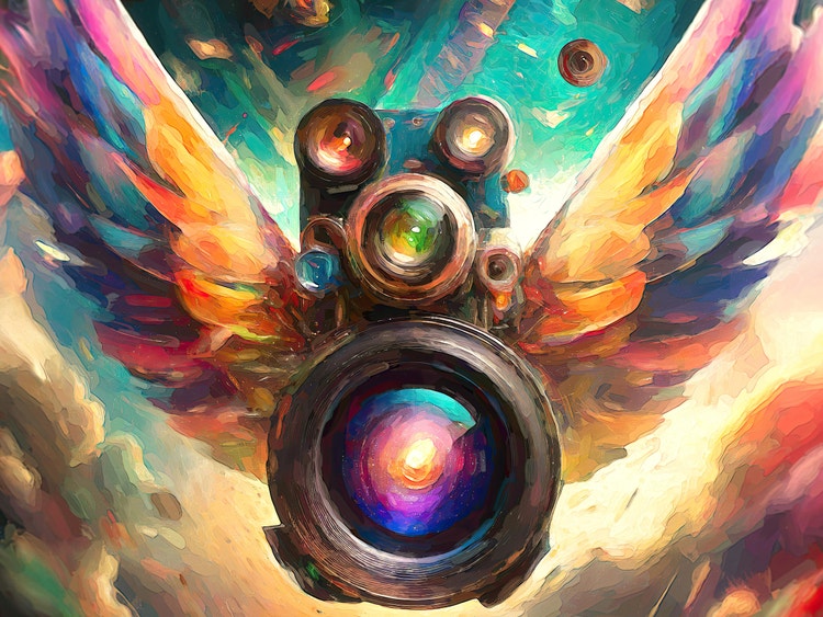
Illustration by Tomasz Opasinski in Adobe Firefly
But as part of Adobe's Machine Intelligence & New Technology team, it’s my job to explore new technologies and creative approaches to help shape the future of innovative tools and solutions. So, when I was commissioned to design a poster for the 22nd Kinoteka Polish Film Festival I opted to switch up my process and rely on Adobe Firefly, Adobe’s family of creative generative AI models designed for safe commercial use, and a generative workflow. Kinoteka is a dream client that encourages experimentation and the exploration of new technologies, so they were open to me bringing generative AI into my design process. Incorporating it streamlined my ideation, client approval, and production phases, provided a fresh perspective, and shortened the time from concept to completion.
For anyone wondering how generative AI as a core tool can transform their workflow, here’s how it affected each step of my creative process.
Step 1: Exploration and ideation (where prompting replaces sketching)
As most projects do, this one began with a creative brief: The upcoming edition will celebrate Polish culture, aiming for inclusivity and unity. Poland is experiencing a resurgence, emerging as an inspirational nation once more. With Kinoteka, we aspire to inspire all individuals. This edition embraces the future while honoring the past, it takes a deep breath of fresh air and moves forward, infused with innovation—including events centered around AI and cutting-edge technologies.
Creative briefs allow for innovative solutions by including dueling assumptions (like “embraces the future while honoring the past”) and part of our job as designers is to bring creativity and artistry to our interpretation of them. After reading a brief, my first step is to immediately begin sketching, but for this project I went straight to Firefly to explore concepts. To mimic the process of sketching, as I began interpreting the brief, I tried to stay as loose as possible with prompting: “a multi-lens camera that looks ahead to the present and back to the past,” “a camera that observes and takes notes,” “a camera with multiple lenses and simultaneous focus,” and “thematically Polish industrial and agricultural compositions,” “filmmaking,” “the future,” and “metallics.”
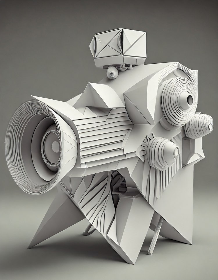
At one point, while trying to avoid a more common representation of the future, I focused my prompting on different combinations of “detail,” “retro,” “human” and, because it represents the presence of all colors in the spectrum, “white” for neutrality. Those modifications eventually resulted in an origami-like camera that I couldn’t have predicted—something futuristic yet so well known.
One of the challenges of incorporating a generative process into the explorative phase is that it requires using a prompt to convey to the model what I have in mind—and that’s not always an easy task. The main goal of prompting is guidance: Generative models must be directed so they can fill in the gaps between human imagination and computer output. When I first began using generative AI, my prompts would stay unchanged for 20 –30 rounds of ideation, but the more I’ve used it, the easier it is for me to “speak Firefly.”
Now I adjust my prompts every three to four rounds. That adjustment can include replacing words with their synonyms and using the words “more” or “less,” to altering angles, lighting, or aspect ratio and moving the position of words in a prompt. I also challenge myself by asking questions like, “What if the lighting was different?” or "What if I see more of this and less of that?” to try to figure out whether I would be happy with the results.
Modifying prompts is a lot like refining the creative brief over and over until the output matches what's in your head. But it’s always a balancing act. Although most of an image might be just as you’d imagined, other parts of it might not be, and that will vary with every output. It’s at this step that creative ability is key: If an image is 75% of the way there, a creative professional can manually adjust it until it’s exactly what they had in mind.
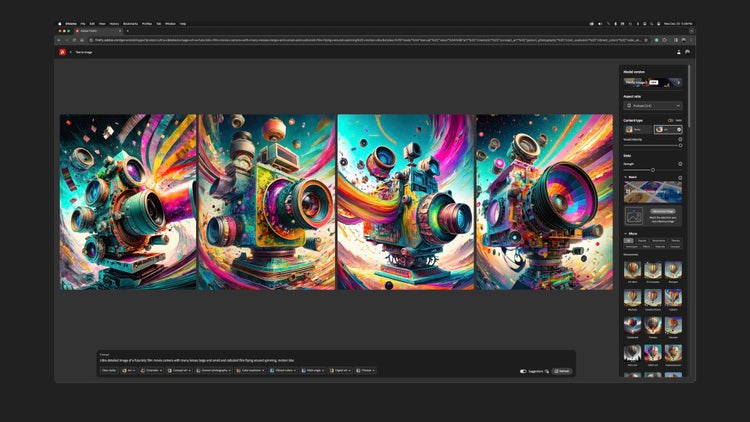
In the end, six hours of prompt exploration resulted in hundreds of images. Had I been sketching by hand, I might have spent ten hours illustrating cameras with various details... then there would have been revisions and possibly revisions to revisions, so the time savings was significant. One final note: Now that I’ve used generative output to replace sketching, I won’t go back.
Step 2: Pre-production (from approval to experimentation)
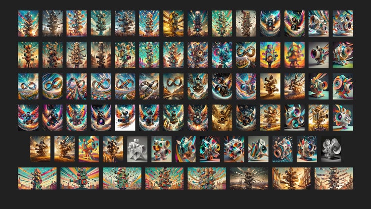
Since not every image represented what I had in mind, and not every image can be a poster, from those hundreds of images, I eventually chose 77 to share with the client. The number was about triple what I might normally have presented (for a project like this, I probably would have submitted 20).
Since I’m used to building composites for concepts, replacing typing with sketching seemed odd at first. In the past I’d only had to verbalize a concept when sketches couldn’t fully communicate the idea. But with generative outputs, I was able to submit for approval very specific images that didn’t need to be accompanied by written descriptions of what the art would look like finished. In client feedback, some themes emerged that dove deeper into philosophical ideas not originally described in the brief: a mobius strip that formed an endless cycle of film, multiple lenses creating multiple frames of reference, freedom of exploration expressed in cameras wings, and lenses simulating the iris of an eye.
For poster design, it’s common to “stretch” images vertically so they look taller—like stretching clouds horizontally to make a sky look more expansive—so I did several explorations to experiment with how images would look at different aspect ratios for web advertising, books, and outdoor boards. Since Firefly’s aspect ratio is square and I needed to know what the composition would look in a vertical format, my next step was expansion. I turned to Generative Expand in Adobe Photoshop to perform quick explorations filling in pixels to build the “life beyond the boundaries of the poster.” I also experimented with what the image would look like at a higher resolution (250 or 300 DPI as opposed to 72) for print applications (designing as large as possible then cropping to different dimensions).
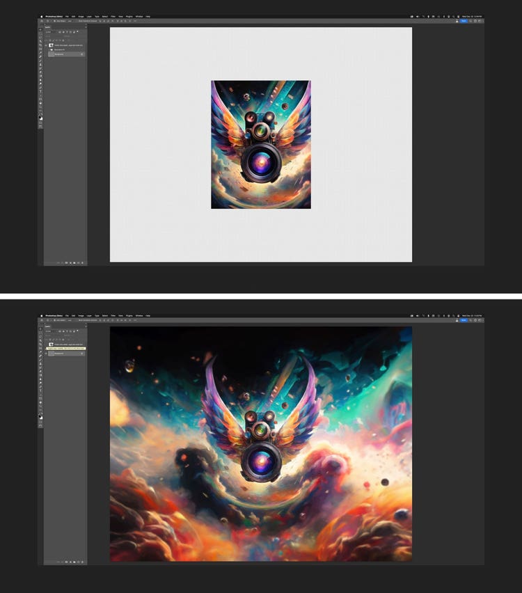
Since the client supplied the typography, that was design work that I didn’t have to do. I used the time to experiment with typographic placement and to prepare the assets for production (size, resolution, and any other details that I didn't want to fix later) so my final file could be a source of truth. It was also a good point in the process to begin applying painterly filters and other image effects.
Step 3: Production, visualization, and validation
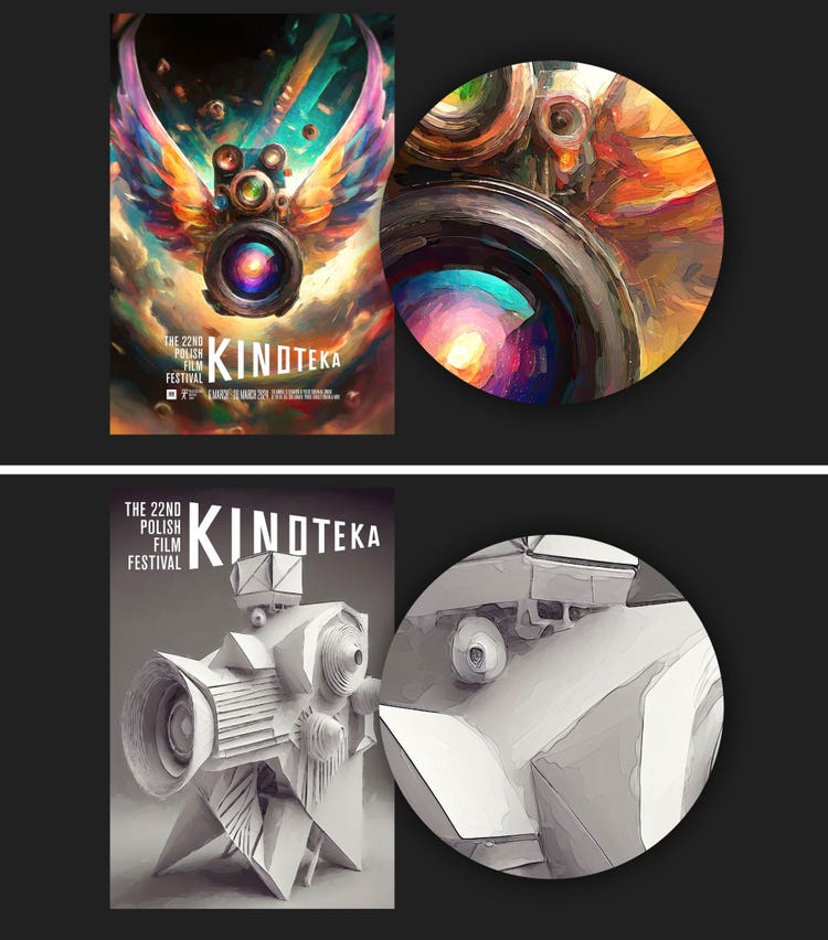
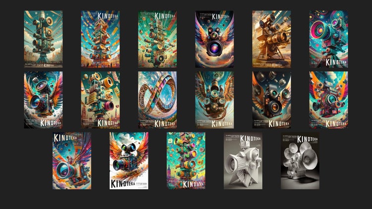
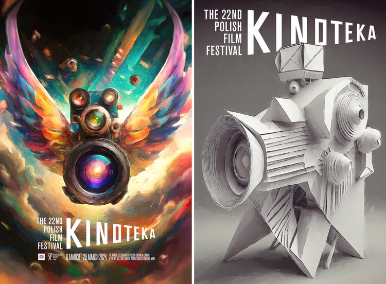
Where normally I might have mocked-up three or four images, I designed posters for 17 of the images and sent them to the client. Surprisingly, they chose two of the designs: The flying camera with its multiple lenses and camera angles was perfect to express the past and the future of the event in poster form, and the white-on-white origami camera had a museum quality that was perfect for invitations.
Once landing on these final sketches, I began raw color compositing in Photoshop to tweak, shift, add, or remove parts of the image. Since the focus at this point is creating production-ready art, generative AI didn’t change this part of my workflow much, but there are some considerations to keep in mind:
- Objects in AI-generated images are not on individual layers which requires masking and filling in missing pixels during the editing process
- Images generated with specific aspect ratios can require manual modifications to better convey a story or to tell a different one (the same prompt, with image output in a square aspect ratio will be different than one output in widescreen)
- When an AI-generated image is too close or too far from reality, it can require manual retouching or blending to achieve the quality a designer is looking for
- A more traditional workflow might have required me to render the camera in 3D to change the angle
- Generated images require upscaling to achieve the highest desired resolution for print (normally I would create art at the size and resolution needed for final print files)
Once Kinoteka approved the key art, I began creating hypothetical derivatives (an internal test of variously sized images). I pulled type and image into a Photoshop template to preview how the final art would behave at different sizes and on different canvases. I also created quick mockups to show what the art would look like on a book cover or printed on T-shirts—and in this case as a framed poster, to ensure the art wouldn’t be cut too close to the frame. This is always the final opportunity to fix any problems with the key art. I have enough experience that I can, with a high degree of certainty, know whether something will or won’t work in a particular context, but since design is a continuous learning process, I’m sometimes surprised.
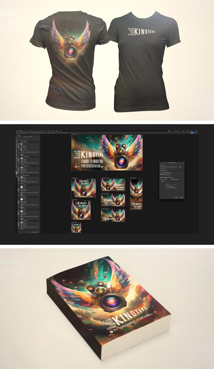
One of the joys of design is drawing, moving, adding, swapping, and filling to convey my ideas. While it might seem counterintuitive to abandon that process and rely on one that uses language for ideation, generative AI allowed me to explore more ideas in less time, and still be surprised and inspired by the results.
(Editor’s note: The Firefly generative AI models were trained on licensed content, such as Adobe Stock, and public domain content where copyright has expired. Firefly models are designed to be safe for commercial use, and Adobe offers businesses the opportunity to obtain IP indemnification.)