Rebranding Frame.io
A filmic redesign for Adobe’s video collaboration platform
Photography by Eric Ogden
We arrived at Adobe with product and brand designers, interactive and motion designers, producers, researchers, a user insight team, and a commitment to set a new, higher standard for design. Just over a year later, we launched an updated brand identity and a new website. The foundation of that evolution is a logo, a typeface, and a color story.
Examining our identity and exploring a new relationship
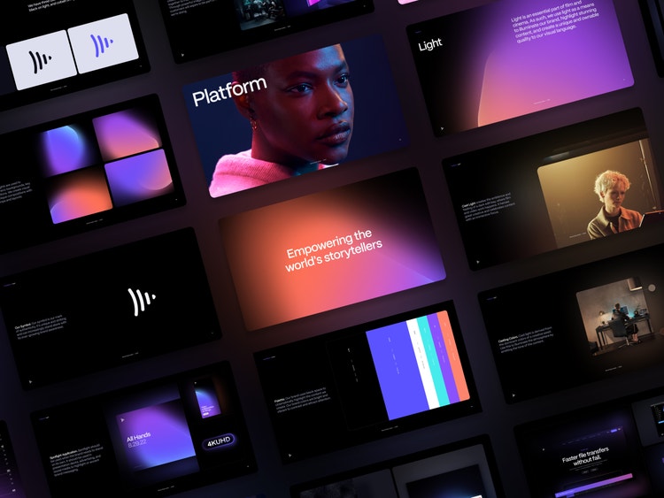
Frame.io brings full-featured collaboration into non-linear editing systems that allows editors to upload videos and discuss exact moments inside them, which means that they never have to leave their editing tool to collaborate with their teams. Of course it's seamless with Adobe Premiere Pro and Adobe After Effects, but it also works with Final Cut Pro and Avid—or any other video tools and camera integrations our customers might be using—so we intentionally kept some independence from the Adobe brand.
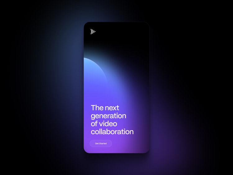
Ever-growing brand awareness means that our play button symbol can increasingly stand alone.
For communications and situations with less instant brand recognition, we use our wordmark.
We updated our play button icon with spatial margins and balanced contours to ensure a strong presence when the symbol stands alone; created a more formal wordmark to be used in conjunction with the symbol in situations where the brand might not be instantly recognizable; and created a version with “An Adobe Company” lock-up to clearly convey Frame.io’s relationship with Creative Cloud and Adobe.
A bespoke typeface that’s uniquely Frame.io
The decision to create a custom typeface provided us with an opportunity to build on an identity that we owned completely. We interviewed 20 different type houses, including the Adobe Fonts team, who guided us, supported us, and introduced us to a foundry with deep expertise: Monotype.
We were fortunate to work with a very talented team through a process that was exciting and exacting. Everything went through a filter of high design and craft: from Bezier curve shifts, and stem length to negative space, taper widths, and ink traps. Frame Gothic is the result. It’s a modernist, variable-weight, sans serif, for which we created four preset weights to use across all forms of communication.
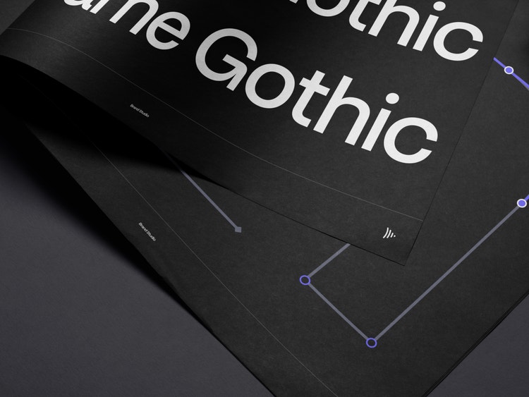
Frame Gothic, our modern sans serif typeface, is used in all forms of Frame.io communication.
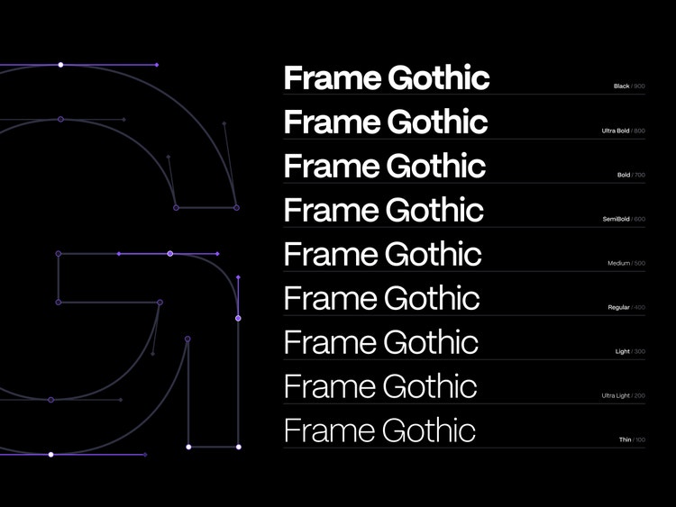
The variable-weight typeface with four preset weights lends confidence and clarity to our voice.
This typeface makes all of us very proud. It's unique and it's confident; the family is quirky without trying too hard, but also sophisticated. And the work continues... italics are coming soon.
A color palette inspired by film
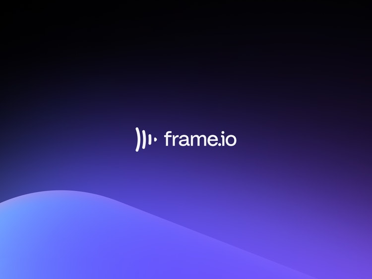
The importance of color and lighting spans every part of this rebrand. Even the mark, which is very obviously a play button, also looks like rays of light emanating from a single source. It captures the ambience of a windowless edit bay or darkened soundstage, where the walls are awash with the hues of the film.
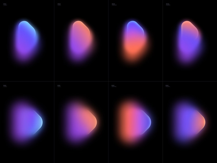
Spotlight shapes echo the Frame.io brand mark and can stand on their own in decks, advertising, and social media.
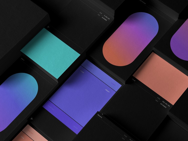
Black is used for contrast and attention in conjunction with a bright and vibrant color palette and gradients.
To ensure consistency across the user experience, the primary palette is derived from Frame.io’s interface. We combined the colors to create gradients that feel cinematic, with an elegant play between warm and cool. They are vibrant, bright, and in contrast to the dark aesthetic of a filmic workspace.
We also created an extended palette for increased accessibility and contrast, and a greyscale palette to enable soft and hard contrasts in dark and light applications.
Two years ago we began conceptualizing our redesign and it was, admittedly, a challenge to maintain a pixel-perfect commitment to design and craft. But by scrutinizing every detail not only did we succeed in elevating our brand, we also cemented our place as part of a new product family, created a modern identity that will take us into the future, and solidified our place as a world-class brand with a world-class product.