Rethinking Adobe Illustrator
Redesigning and reinventing our iconic software for the iPad

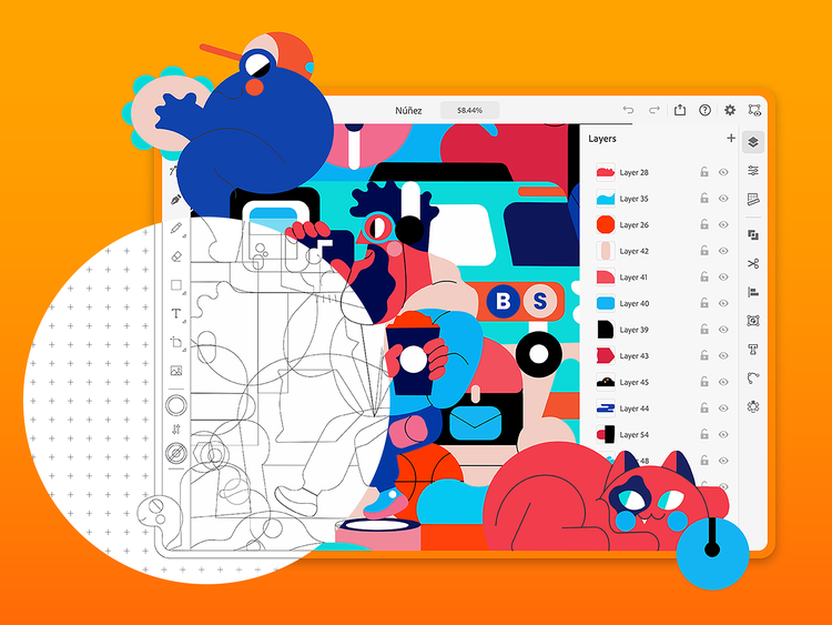
Illustration by Jhonny Núñez
The iPad and similar devices are an opportunity for us to experiment and push boundaries in UX design. We get to rethink workflows and features in ways that we can’t for the desktop. But we knew we’d only have one chance to get it right: What we do matters to people’s productivity, artistry, and livelihood. So, we explored many directions and did our due diligence, complete with user research, testing, and prototyping to maximize this chance to create something incredible.
To tackle this complex challenge, our team was given a staggering amount of leeway and time to deconstruct workflows, tools, and even the ethos of the product. We weren’t associated with any product team and essentially started with a blank slate, which also meant we could address user feedback about the desktop version from the ground up. When a company puts that kind of trust in you, it sharpens your work and provides a huge reason to do your best.
Streamlining a compact and focused toolset
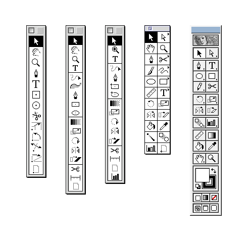
I’ve heard it said that looking at a complete feature list is like looking at the rings of a tree stump—it’s possible to see the whole history of a product. New features are awesome but users also want stability, performance, and continuity. They don’t need us to bring in every obscure feature that was put into Illustrator over the last 30 years (Illustrator on the desktop has around 87 tools and more than 150 panels; that’s untenable for a small screen).

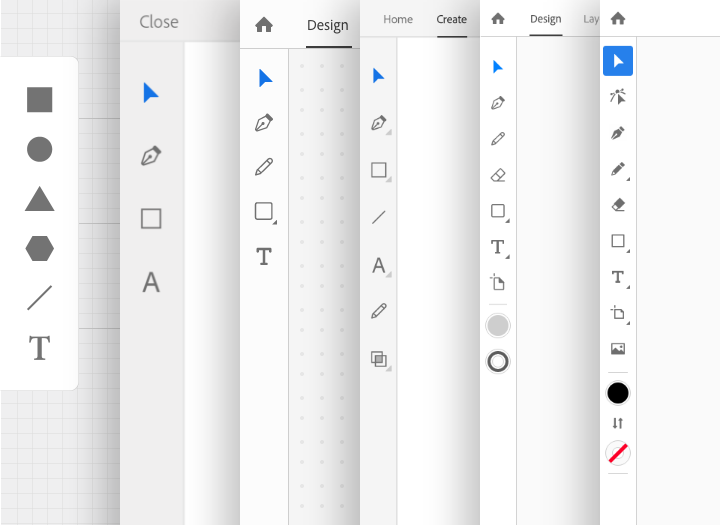
Instead, our challenge was to completely rethink Illustrator—the workflows, the UI, the interaction models—to ensure that the iPad version would be streamlined, and as focused as possible on vector creation. Early comps of the Illustrator toolbar, for example, had just three or four tools. It became accepted that Illustrator on the iPad was going to have a very compact and focused toolset. Only through this would we be able to accomplish our goal of creating an iPad tool that is as useful as it is easy to use.
Our mantra from day one was, “80 percent of the functionality with 20 percent of the tools.”
We made sure that we weren’t just removing tools for the sake of simplicity or aesthetics, instead we analyzed every tool and asked ourselves if it was a tool, an action, or a mode, then refactored the UI accordingly. This required a very strict definition of what constitutes a tool: If it didn’t put something on the canvas or allow you to select items on the canvas, then it wasn’t really a tool and needed to go somewhere else. (As an example, the Shape Builder tool on the desktop is more of an action that’s performed on selected objects.) This process allowed us to simplify the toolbar and make it more direct and easy to understand.

Designing more directly, naturally, and expressively
Of course, desktop and iPad experiences have vastly different interaction patterns. A major obstacle we had to overcome in adapting Illustrator for iPad was the lack of a hover state for the cursor. (Only very recently has Apple started supporting a hover state on iPad with the Magic Keyboard and trackpads so it remains a major use case to solve for.) On desktop, hover states are incredibly informative; not only do cursors change states depending on what’s been moused over, but there are tooltips and even line projections that are constantly feeding information back to the designer. To lose all that on the iPad was a huge obstacle to overcome.
We had to find a way to make it work, so we had to get creative.
Luckily, there are a few advantages to the iPad that help make up for it. First, our research showed that users are more likely to explore and play on the iPad than they are on the desktop (where the fear of failure is elevated). Second, direct manipulation is so natural on touch devices that fewer rules need to be communicated to users for them to be successful. The iPad really excels at reducing cognitive load. A simple example would be moving an object: On the desktop, when mousing over an object the hover state changes to an icon (like a hand or grabber) that indicates you can click and drag the object to move it. That kind of feedback isn’t required in the real world so drawing may not feel as natural as you’d like. On the iPad, you can work directly on the object so it very much mimics pen and paper. There’s no abstraction at all. You don’t have to use a tool to move an object on the canvas, you just grab it and move it.
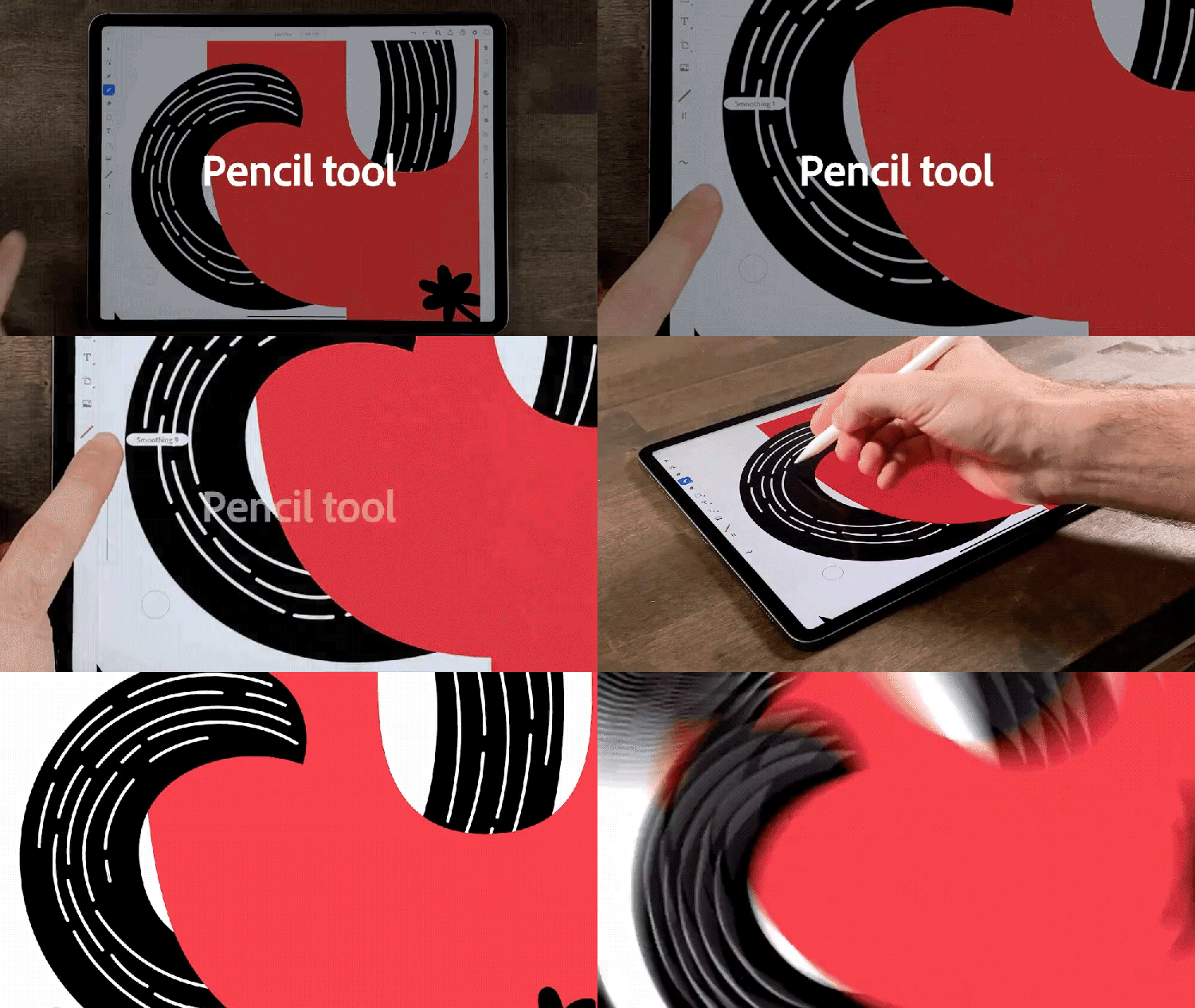
Illustrator on the iPad works intuitively with Apple Pencil, which allows for an incredible combination of natural strokes and precision vectors. It opens up new avenues of expression for everyone, whether someone is an Illustrator pro or just starting out; in essence, the iPad becomes a sketchbook and we wanted to create tools that took advantage of that association. There is so much power and control in Bézier curves and tweaking handles, but using them is a learned and honed skill. We challenged ourselves to (re)invent a Pencil tool that enables people to draw expressively and naturally on the canvas but still have a beautiful vector path with minimal points.

Another area where we’ve been able to innovate is the common actions menu. This is a small menu of icons that appears below a selected object and gives the user quick access to common tasks like duplicate and delete. We always knew it was going to be important to make these tasks easy for users to find and perform, but it wasn’t until someone told us they felt like they were drawing the golden arches all the time, moving their hand back and forth over the iPad, that we felt we had permission to solve the problem is a unique way. Placing this menu right below the object, instead of in a corner of the screen, gives it prominence without interference. The proximity allows users to focus on their artwork and not be distracted by opening panels or menus. They can get into that wonderful state of flow that’s unencumbered by technology. (We knew we’d created something unique and useful when users began asking for more actions and a customizable menu.)
Complementing desktop workflows
It’s amazing to see what our beta users are already creating with Illustrator on the iPad (we’ve even had one designer who, amid a power outage at home, was still able to finish a client presentation on the iPad version). Its value lies overwhelmingly in its convenience; Illustrator on the iPad complements other workflows, so you can choose which tool is most appropriate for what you’re trying to create. We always envisioned people going back-and-forth between the desktop and iPad versions, the trick was to avoid making the switch a chore.
Already, the iPad and desktop versions work really well together. Documents are stored in Adobe’s cloud and they sync automatically, which means they can be accessed online or offline directly from within Illustrator. You don’t have to do anything to get your iPad documents on the desktop, and vice versa, the work just follows you, so the latest version of your files can be accessed on any of your devices. This freedom allows for inspiration to hit anytime... just pick up your iPad and create (or finish) work wherever you are.
The 1.0 release is just the beginning. Our team is hugely excited to engage with more and more users and together build something truly transformative—a new way to look at the world and our own creativity. It’s the next major step in the evolution of Illustrator, and I can’t wait to see what, and how, people design with it in the future.
This article originally appeared on the Adobe Blog with the title "Behind the scenes of redesigning Adobe Illustrator for the iPad."