The unconventional inspiration behind simplifying a workflow in Adobe After Effects
How envisioning the experience as a bus route helped untangle a complex design challenge

Illustration by Patricia Doria
For Adobe After Effects (Adobe’s visual effects, motion graphics, and video compositing software), there was one thing both pros and beginners agreed on: The controls they needed for common animation tasks were difficult to get to and it was slowing down their work. Finding a solution seemed like a rare opportunity to improve the experience for everyone.
We knew that a contextual properties panel could speed up workflows for professionals, help beginners find what they need, and make the interface more familiar to designers accustomed to properties panels in other applications. But designing a simple solution isn’t always simple. Sometimes the core problem isn't obvious from the outset, and success depends on rethinking a workflow, reframing the design challenge, and uncovering an unexpected solution that maps effortlessly to the problem. Here’s what that process looked like when we set out to design a faster, smoother workflow for editing and animating properties in After Effects.
Understand the workflow you’re trying to simplify
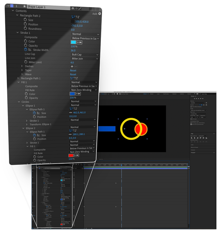
Because of the multitude of properties, options, and commands that people need for full creative control of their animation, it’s common in motion graphics software for some of those controls to be difficult to find and reach. In After Effects, reaching a layer’s properties required clicking a disclosure arrow on a layer in the timeline and “twirling it open” to expose the properties nested inside it. This was particularly cumbersome for shape layers (containers for the vector artwork essential for motion graphics). Unlike other layer types, where one layer equals one object, each shape layer can hold a sprawling hierarchy of nested artwork made up of small building blocks (like individual paths, strokes, and fills).

It’s a modular system that gives people tremendous power to build and animate vector artwork, but it results in many nested submenus that need to be twirled open and scanned to find the correct property to edit. Too much of people’s time was spent navigating these complicated hierarchies trying to reach the control for a specific property.
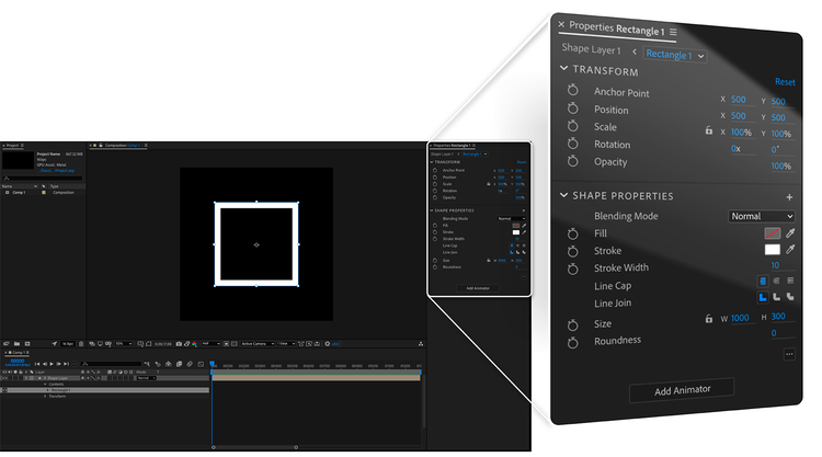
A single contextual hub (a properties panel) for surfacing controls had the potential to be a powerful timesaver. It could streamline workflows for all layer types, but its biggest opportunity for impact was the time-consuming shape layer workflow, where a shortcut was desperately needed. We set out to prototype this new contextual panel and test it with people who work with shape layers.
Prototyping and research
Our first properties panel design worked (as they do in other applications) by displaying the properties of whatever object in the composition was selected. To account for shape layers containing multiple objects, a label in the panel specified which object in the layer was selected, and clicking it would open a modal where the selection could be changed. But when we tested this design, instead of using the properties panel for the shape layer tasks they were asked to perform (like changing a fill color or animating a position), study participants reverted to time-consuming twirling.

The panel didn’t have the workflow impact we hoped it would, but since none of the participants complained about it or could identify anything it was missing, it wasn’t immediately obvious what was wrong with the design. It wasn’t until we began reviewing the research recordings that we uncovered some important clues.
When participants first twirled open a shape layer, they’d sometimes mention wanting to “see how it’s structured.” They’d reveal the hierarchy, look it over, then carefully navigate through each level until they reached the desired property. We realized that all the twirling, slow and painful as it was, was serving an important purpose: Since the hierarchy inside a shape layer can be infinitely complex and contain many separate instances of the same property, each affecting different content, people needed the context of the hierarchy to feel confident that they were editing the right property. Twirling wasn’t just a means to expose a property, it was a journey to find and arrive at the correct one.
The journey was burdensome because of the time it took, the number of steps it involved, and the mental load it required to interpret many similar-looking options to find a path forward... but the journey itself was essential. With this insight, it was beginning to feel like a transportation problem.
Reframing the design problem
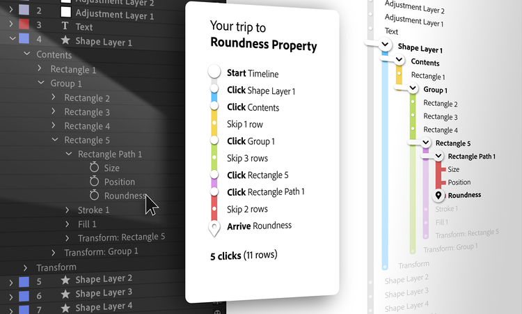
Once we began looking at the design problem through this lens, it revealed that what people really needed was a faster and easier journey that bypassed all the timeline twirls, told them where they were, and helped them get to where they needed to go. To design this better journey we needed to fully understand the problems with the existing one. Imagining the twirling workflow as a bus route helped us understand why it was so painful:
- Each twirl was like transferring to a different bus line, with a new list of stops to read and understand.
- Many properties in the hierarchy had the same name—there could be a dozen identical “Position” properties visible at once. Like scanning a bus map for the “Main Street” stop and noticing several of them spread across the map, determining the correct one required carefully studying the surrounding context.
- The UI changed drastically as various parts of the hierarchy were expanded and collapsed, so properties that were once 5 rows apart could end up 30 rows apart a moment later. Imagine a bus driver impulsively adding or removing stops from the route, and the destination that was once the fifth stop is now the thirtieth.

In a shape layer, users needed to traverse anywhere from three to fifteen forks in the road to get to the correct property. To be successful, the properties panel would need to offer a more efficient transportation system for getting through the layer's hierarchy to the correct property.
With a better understanding of each of the pain points in the twirling-based journey we set out to offer an easier way for people to get to their destinations. Since the first step in this workflow was to peek inside the shape layer to understand its structure, the properties panel could help by offering this information as soon as a layer was selected. We had to completely rethink the panel concept to include a prominent, obvious navigation system for understanding the contents of a layer and making a selection.
The simplest solution is the one that maps effortlessly to the problem
An important part of our redesign process was the discovery that the simplest experience doesn’t always mean the simplest UI. What’s more important is that a UI anticipates and supports a person’s next action, mapping simply to their workflow. For After Effects, that meant including a way to navigate each shape layer.
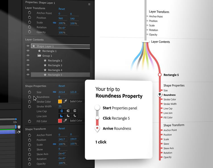
As soon as a shape layer is selected, the redesigned properties panel displays a prominent “layer contents” section that’s obvious and intuitive enough to overcome people’s instinct to twirl. The highlighted layer name at the top of the stack is redundant (since the layer name is also in the panel header) but it’s there so people can immediately identify this view as an analog of a twirled-open layer.
Underneath the name of the layer is the same structure of shapes as in the timeline, but with no disclosure arrows (to convey that the panel is a place to select, not twirl). Properties are listed in a consistent order, and the space between them no longer changes from menus being twirled open and closed, paving the way for people to use muscle memory to get to their destinations without breaking their creative flow.

The new design may look complex compared to properties panels in other applications but even though our original design looked a lot simpler, people were struggling with it. Devoting so much space to a control for object selection—something that happens in most apps before a properties panel even enters the workflow—makes it unconventional, but it allows people to reach the basic properties of any shape group with a single click.
After Effects is a powerful and nuanced professional application, but now anyone can access and easily animate layer properties. Although the design process wasn't as straightforward as we’d expected, the new properties panel succeeds at offering a simpler way for people to work. Since its release, it's being used by about 75% of users who edit layer properties. And feedback shows that it’s working just as we hoped: speeding up professional workflows, helping beginners more easily understand After Effects, and making the UI more familiar to designers coming from other applications.