An updated illustration style for Document Cloud
Untying the trefoil knot icon to create a visual language of continuous motion
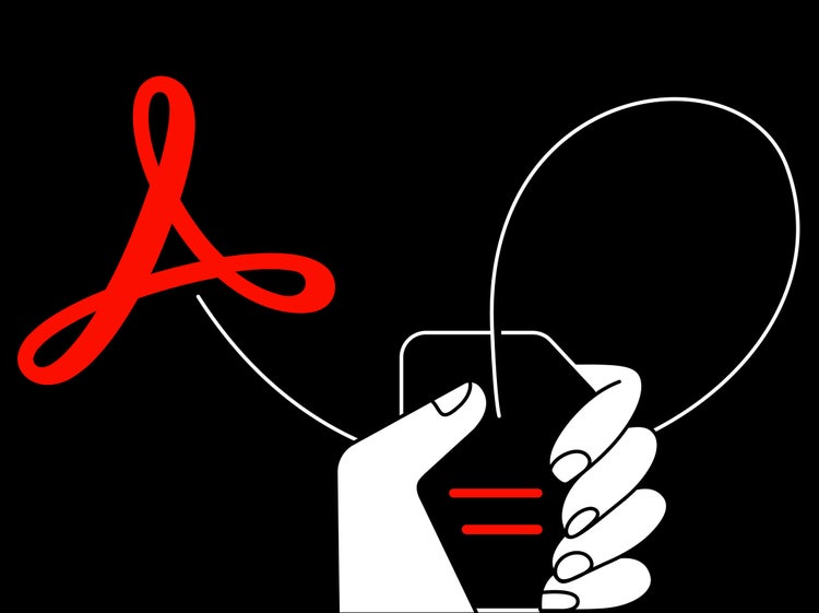
All illustrations by Joslyn Reid
For years, in-app communications, tutorial content, and product marketing each had their own distinct illustrative approach. The visual inconsistencies made it difficult for customers to see the disparate content as connected in any way. A unified visual language would help people make better connections between our products and our messaging platforms. We launched a three-team partnership—between the Brand & Experience, Learn & Help, and Document Cloud teams—to create a new visual language for desktop, web, and mobile.
We found our inspiration for the visible throughline, between the apps and the platforms where they’re supported, in the looping lines of Document Cloud’s trefoil knot icon.
Three elements supply the necessary visual throughline
Our illustrative approach relies on three basic elements: a continuous line and loop, a hand, and Acrobat’s workflow icons.
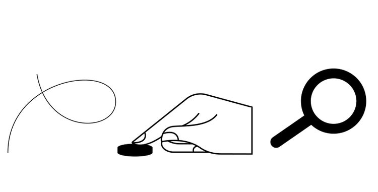
The versatility of the elements—the ability to change the shapes and lengths of the lines, the positions of the hands, and the placement of the icons—creates possibilities for us to illustrate a range of topics across in-product, marketing, and learn content.
To create a consistent thread between Document Cloud and Adobe’s other product families, a simple linear style was borrowed from Creative Cloud. Also implemented, in response to the need to satisfy multiple uses across multiple platforms, was a loud and quiet duality carried out by filling and outlining.

Bold colors and filled illustrations live out loud for banner ads and key in-app notifications while much quieter outline representations are used for tutorials, marketing, and anywhere else that the illustrations need to be silent supporters to other copy and content.
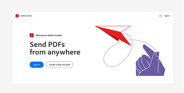
The hero of the visual story: the continuous line and loop
The continuous line—the basic part of all composition—supplies balance to layouts, visible threads between workflow icons and the hand, and background support that doesn’t distract from important copy. And, when used between and across touchpoints (product sections and features, Document Cloud products, and marketing and help content) it provides an identifiable and literal throughline for this well-known product group.

With weights that are always balanced and proportional, the line is the leader on a journey through horizontal and vertical layouts, backgrounds and foregrounds, and instructional and expressive content. More importantly, it’s the thread connecting Document Cloud’s story and history, its products and features, and its presence on multiple platforms.

The line works in tandem with a loop inspired by Document Cloud’s trefoil knot. Never overpowering or replacing the familiar icon, it’s used judiciously to capture the icon’s essence and to create space, dimension, and direction in the composition.
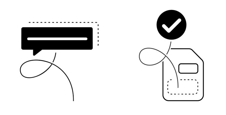
Loops can be precise and formal (for small linear illustrations) or more casual and organic (for backgrounds). They can fit both horizontal and vertical space. They can be cropped to create foundation and balance at the base of a composition, or float above it as if the wind is taking them. Loops always follow a circular form, are never without the continuous line, and are defined by an overlapping cutout—a negative space that’s always the exact width of the stroke.
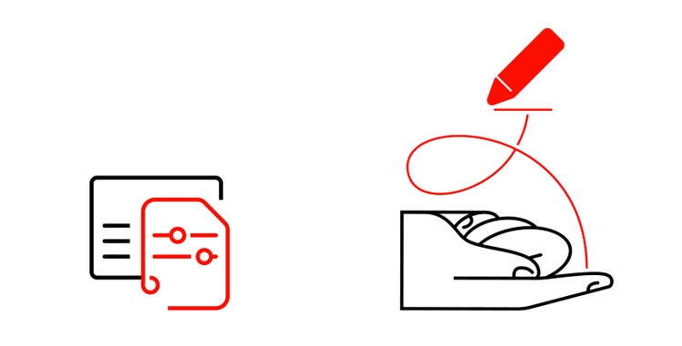
From basic shapes and lines... a hand
A human element was so removed from Document Cloud’s illustration language that the software felt perfunctory and unexpressive. The hand is at once a guide, a helper, and the human part in this visual story, and sits on the baseline of compositions to supply the weight and stability of a flat base.
Hands—made up of 27 bones, 27 joints, 34 muscles, more than 100 tendons and ligaments—have complex anatomy and complex movement and those intricacies required a crash course in study and experimentation. The familiar form was created by combining simple lines and geometric shapes. Later, more defined features were created by subtracting unnecessary elements from the composition while being careful to maintain proper proportions. The illustration was completed by connecting the lines and adding solid filled elements for support.

Changing the hand position and swapping workflow icons makes it possible to illustrate a range of topics and propositions despite there being only four hand styles—tapping, releasing, pointing, holding. The plan is to eventually create a library of hands, each useful in multiple narratives, and being exacting with how we build hand styles will help us scale the language without making it overly complicated or cumbersome.

Using familiar workflow icons to build compositions
If the line is the thread, and the hand is the guide, the familiarity of the workflow icons (the checkmark, exclamation point, and settings gear) supply the visual connection to the products. Pulled from across Document Cloud, and used in both outline and filled styles, they are uniform and intentional at any size and in any location and can communicate multiple messages.
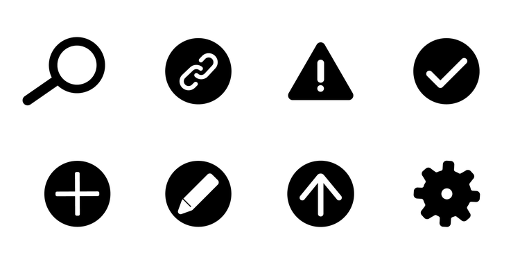
In large sizes (for uses like banners) the workflow icons are prominent and expressive and, since intent is communicated through the elements in each composition, they are never without the line and loop creating a connection between the hand and icon. When used at a small scale (on download pages), they’re accompanied only by the continuous line and loop.
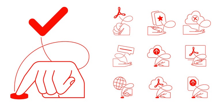
The goal is for our illustration system to evolve so we end up with a library of elements that can be consistently scaled and expanded so it will always feel fresh and current.
Adding color to compositions
Colors were pulled from the Document Cloud product palette and broadened by tints from the new Spectrum color system. Leading with the vibrant red of Document Cloud—and the icon colors of Adobe Acrobat, Adobe Sign, and Adobe Scan—they can be mixed and matched to bring the brand to life while tethering information and visuals across product and marketing.
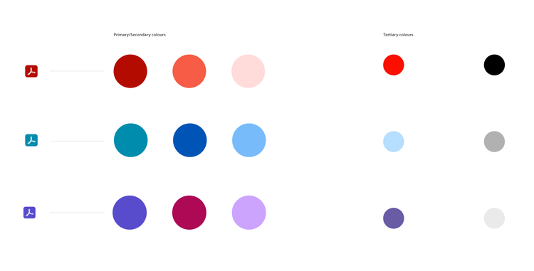
Intended to be paired with the primary colors, secondary tints are derived from each app’s primary color and the light secondary red. Tertiary colors are a blend of the Adobe Acrobat, Adobe Sign, and Adobe Scan primary colors with Document Cloud red. Primary colors are used for brand app icons and other brand-specific assets; secondary colors can be paired with any of the three products; tertiary colors should only be used with their associated products.

While the execution of Acrobat’s new illustration style is designed to vary in the app, on help pages, and in product marketing, all will be tethered by a unified system that relies on the flexibility of three simple components: a line and loop, hands, and workflow icons. It’s a graceful, versatile solution all made possible by an untying of Document Cloud’s iconic trefoil knot.
This project would not have been possible without the collaboration of Kyeung sub Yeom (senior experience designer, Document Cloud) whose extensive product knowledge and first draft of the concept identified the design problem and how it might be solved, and Julia Vaca (senior visual content designer, Learn & Help, Document Cloud) who helped design the foundation, and build out the details, of this unified system.