Designing design systems: A framework for names, terms, and definitions
Establishing a standardized design system lexicon

Graphic by James Provenza
I wrote it in the middle of a graduate school design critique, while we were giving one of our classmates feedback about a book design project. It was a collection of conflicting choices in typography, artwork, and layout: Many distinct thoughts, but not one clear message. Our professor calmly said, “Think about what the most important thing is to say, then say it. Say what you mean.”
It was a pivotal moment in my own design training, and I still draw on that advice for everything I make for Spectrum, Adobe’s design system. In a design system, every concept has, and must express, a meaning, what something is, and why it matters. To begin the work of creating meaning and clarity—for everything from components, object styles, and core constants like typography and color—teams must make decisions about names (what things are called), terms (how common words are used in the context of the system), and definitions (a written, shared understanding of what things are).
As a person responsible for decisions about how we communicate design intention through language (and beyond the written word) there’s a meaning-making framework I use to inform decisions about names, terms, and definitions, so I can be confident that we, as a design system team, are agreeing on and saying what we mean.
A framework for identifying, creating, and deciding on meaning
A design system where everything has a meaning, and that meaning is readily apparent to both the users of the design system, and the end users who encounter the design system in product UIs, comes from taking time for observation and reflection. Teams must get comfortable asking existential questions like, “What does this thing represent, compared to this one?” or “What does this mean?” or “Where does this exist in the context of everything?” When we take the time to craft meanings for our decisions, it pushes us to think about why a design looks or behaves the way it does.
Because everything communicates, not just text, when we were laying the groundwork for Spectrum 2, we pushed for visual and interaction design choices to be approached as communication choices. In work sessions and reviews, it was not uncommon for us to ask questions like, “What does this color mean here?” or “What does the shape of this button have to do with the call to action we’re using for the label?” If we didn’t have the answers, we worked to figure them out so that behind every decision, there’d be a solid meaning and layers of information about intention, history, usage, and context to inform it.
Many questions that come up with design systems have the potential to become existential explorations with many possible solutions. And in many organizations, spending too long on divergent thinking can come at a risk of loss of trust from your customers (you must deliver what you say you will). Providing a structure for wandering and philosophizing makes it easier to know when it’s time to move forward.
There’s a framework I’ve come to rely on for making existentially challenging decisions about Spectrum because it helps turn topics with infinite possibilities and theories into focused, actionable directions:
- Observe. Attend crits, shareouts, reviews, and stay up to date on async conversations (on Slack or in comment threads in files) to gather context and get a feel for the thing-to-solve, and how it relates to other things-to-solve. Communicate any high-level observations to the rest of your collaborators so they’re aware of what your mind is percolating on.
- Discuss. Openly share your observations and hypotheses. Ask for feedback on what others think about your ideas. Make space for both casual work sessions for iteration and formal opportunities for refinement. Encourage your collaborators to share what things mean to them, and why.
- Philosophize. Gather everything you’ve observed, and everything you’ve discussed with your collaborators, and sort through it. This can take the form of handwritten notes, stream-of-thought electronic documents, sketching, auditing, and organizing. Muse on insights, patterns, and themes. At this stage, there’s always a moment where things will just “click”—it can’t be forced, it just happens naturally.
- Summarize. Take all your freeform philosophizing and pare it down to a clear statement that you can give to others to respond to. Explain briefly how and why you arrived at it.
- Decide. After listening to feedback, refine your statement, and consider it a decision: “This is what we’ll do.” or “This is what we’ll say.” or “This is what we’ll make.”
- Communicate (out). Once a decision’s made, make it known that it’s a thing the design system is doing, offering, or wants input on from partners. This can be a shareout presentation, documentation, or a memo/announcement (sometimes it’s all three, or more).
- Extend. Always be on the lookout for opportunities to apply and extend what you’ve created. Accept that you’ll revisit your creation again later, as new information emerges.
This framework can be used when trying to make sense out of complexities in unfamiliar problem spaces, and when a group needs guided philosophizing to make a decision. It also helps build a time limit around dedicated thinking towards a problem by helping to create the space to rigorously analyze something, but with a plan to present potential solutions.
Implementing this meaning-making framework
This framework can be applied when your team is working in any of the design phases—abstract (when shaping ideas and possibilities into a tangible vision), strategic (implementing a vision through resources, process, and partnerships with other teams), or tactical (expanding the scope and constantly refining it as you respond to changing customer needs). It’s also helpful for creating shared meaning when moving between design phases, as happened when we worked to define attention hierarchy and initial typographic terms for Spectrum 2.
1. Abstract to strategic: The “attention hierarchy” concept
There’s always a turning point in vision-focused work when you recognize you’re moving out of an abstract phase of generating ideas and into a strategic phase of how to apply them. It happened when we were exploring attention hierarchy—essentially the ratio of signal-to-noise in a view or part of a workflow.
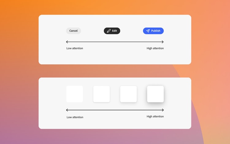
There should only be a handful of “higher attention” (louder) elements in a design, and the majority should be “lower attention” (quieter) elements. In addition to the more straightforward application of layout, attention hierarchy also applies to everything that communicates within the UI:
- Color: A “high attention” blue vs. a “low attention” grey
- Illustrations: Colorful illustrations draw more attention while linear and monochrome illustrations draw less
- Object styles: Rounded corners are softer and more friendly and draw more attention than square corners. The deeper the shadow, the more attention it draws.

We’d reframed and refreshed the ideas behind visual hierarchy to specifically address designing for user attention. Now, we wanted to use this method to guide the strategy and offer it as a tool (a philosophy, a way to think, and a thing to adapt, apply, and be inspired by) to the people who would be using Spectrum 2 to design and build products. But before we could use the phrase “attention hierarchy,” we had to identify what it was and how we were going to use it as way to bring meaning to our decisions. To do that, we applied the meaning-making framework:
Observe. Design systems teams must often describe when and why to use one kind of component, style, or option over the other, but can have trouble finding the right framing to communicate their intent. In work sessions, people can often explain easily why one thing would be used over another, but they often struggle to describe the logic behind their decisions.
Discuss. As part of a design systems practice for so long, a concept like attention hierarchy could be understood “too well” and using it could become second nature, but concepts that are second nature can be difficult to clearly explain to someone encountering them for the first time.
During discussions, it’s important for everyone to take a step back and break down, step-by-step, their individual thought processes. Generalized, single-statement explanations like, “It’s just the right color here.” or “It always needs a drop shadow.” or “It’s the right word.” should be avoided. More specific responses should be encouraged like, “This color needs to be brighter than the others because it’s showing the main action.” or “Since it’s in a drag state, you’d want to visually communicate the change in elevation.” or “The word ‘panel’ comes from a metaphor for an analog ‘control panel.’” During discussions for Spectrum 2, I quickly noticed how often we used the word “attention” as in, “this draws attention,” “it screams attention,” “this is giving too much attention to something that a user doesn’t really care about.”
Philosophize. As a professional communicator, the phrase “respectful of user attention” has always resonated with me. Once I started to think about “user attention” as a messaging hierarchy on a scale of signal and noise, everything clicked: I realized that the foundational design concept of “typographic hierarchy” was a clear extension of what we were circling around. Hierarchy is a classic part of typography used to structure information in ways that enable readers to readily distinguish between broad and important information and detailed and nice-to-know information. Because all UI communicates, the idea of hierarchy beyond text can be extended to all the ways communication happens—visual, linguistic, motion.
Summarize. When sharing a proposal with your team, keep statements clear and explain why you arrived at your decisions. My notes on attention hierarchy:
- Attention hierarchy is a scale ranging from high attention to low attention. You could also think about this as a signal-to-noise ratio of presenting information. Giving people too many noisy things at once makes it harder for them to pick out the actual message you’re trying to convey.
- Things like object styles, typography, and component options all draw different levels of attention and communicate different meanings. High attention elements are the primary area of focus and communicate a timely and action-oriented meaning. Low attention elements blend into the background and communicate a general, lower priority meaning.
- Too many high attention elements on a page can get disorienting and unfocused. For example, both high contrast colors and elevation communicate emphasis, and they should be used sparingly. Generally, only one element or group of elements should have high attention on a page, to help ensure users can focus.
Decide. If the team resonates with your summary, it’s time to test your theories by applying them. To see how it resonated with our audiences (the people who would be using this design system update first) we created diagrams and example screens and presented them at an “awareness tour,” during the early days of building Spectrum 2. When people responded well to it, the term and the framework were adopted. If your audience doesn’t respond well to what you’re proposing, note their feedback and any noticeable points of confusion or contention, then reassess and adapt your theory to test again.
Communicate (out). Publish the summary, guidelines, and any examples in your design system documentation, and task early adopters (for us, that was leadership and the core Spectrum team) with leading by example to teach others about new terms and concepts.
Extend. Always be on the lookout for new ways to extend your concepts, to see how far they can be pushed. We constantly reinforce and refer to the concept of attention hierarchy in both our documentation and our work sessions with partner teams and we often hear designers say things like “What level of attention does this need to have?”
2. Strategic to tactical: Terminology for Spectrum 2’s typography system
The meaning-making framework also works when moving from implementing a vision into specifically applying ideas and theories. A great example was when we used it to define the initial information hierarchy terms for Spectrum 2’s typography system, the complex cornerstone of our design system.
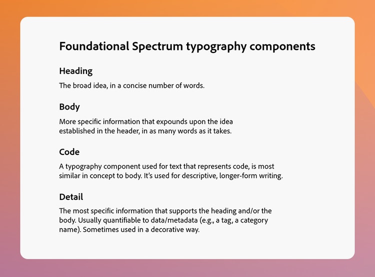
Observe. A designer leading the work for Spectrum 2 typography asked for my take on the foundational terms we were using for our typography system, what was working and what wasn’t. I noticed we both kept pausing on a single typography component: detail. The point of friction for detail is that it’s intended to be used for very specific information in a messaging hierarchy, such as tags or category names, but design system users will often apply it for text communicating high-level information, like titles and section headers.
Discuss. Typography terminology can be notoriously inconsistent across platforms, products, and the digital communication industry. The best approach for dealing with those situations is to pull together a terminology audit. Keeping audits low fidelity allows conversations to move quickly and creates an approachable artifact that collaborators can respond to.

Philosophize. In general, typography terms are words that describe either the nature of a message, the style of the text by which the message is conveyed, or the hierarchy of the text in relation to other text. They rarely describe all three at the same time. It becomes even more complex because the meaning of text, and the order in which messages are communicated, is highly contextual: What constitutes a “headline” in one case may be a “title” in another, depending on what an author is intending to communicate.
While gathering and auditing terms, I noticed that although the terms represented different concepts (styles, containers, applications) we were using them interchangeably because of our own subjective experiences with the words. We needed to decide on meanings and use them intentionally.
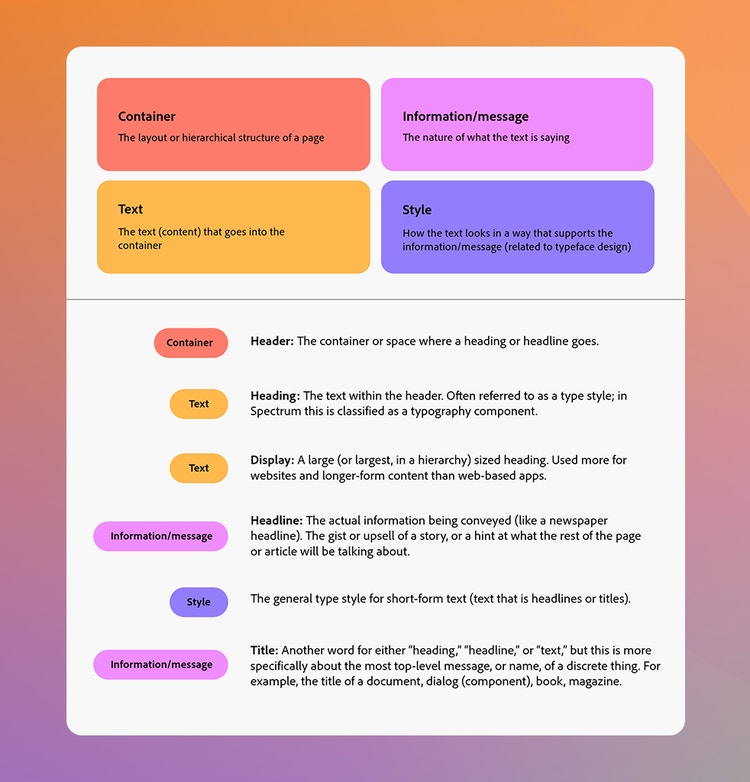
Summarize. By assigning each typography term to a “concept category” and grouping the terms from the audit into four of these categories, it’s easier to see how they relate to each other:
- Container: The layout of hierarchical structure of a page
- Text: The text that goes into the container
- Information/message: The nature of what the text is saying
- Style: How the text visually appears, in a way that supports the effect of the information/message
I placed the “detail” typography component in the Text category but noted that it also overlapped with the Style category since, for Spectrum, “detail” has all-caps styling. This overlap seemed to be the reason the term wasn’t clearly communicating Spectrum’s specific intention for its usage.
I also noticed during the audit that I kept pausing on the word “title,” which fell into the Information/message category. Often used interchangeably with words like “heading” or “headline,” in Spectrum title refers to the name of a unique, specific thing, such as the title of a UI dialog. The title embodies the message, which conveys the information. I encouraged the team to consider introducing a “title” option into the hierarchy in addition to maintaining “detail” to test how far we could go with it. For Spectrum 2, we were planning to change detail’s all-caps styling to regular styling (sentence case) for several reasons—including better support for accessibility and localization, and the need for a more modern design language—so it felt like an opportunity for a terminology reset to match the style reset.
My hypothesis for introducing “title” as a new concept and term into the information hierarchy was that having intentional language would clarify the intended usage: Detail could be used for supportive elements like smaller labels and metadata, while title could be used for text that would be essential to the overall message, such as information about wayfinding or context-setting for what would be on a page.

Decide. Introducing a new term or concept can open opportunities for new ideas and the framing of those ideas to emerge. Advocating for adding the word “title” for one particular part of the overall typography system helped me to build a case for framing the way we could talk about Spectrum 2 typography in terms of traditional type hierarchy and user education: By purposefully choosing the system’s terminology, we could also help the users of that system more intentionally consider the message first, then choose the correct option for it. We decided to test this approach for Spectrum 2’s type system, with the intention of refining and changing it based on design system user feedback.
Communicate (out). Any new terminology should be documented alongside existing terms in typography guidelines, and typography styles should be built into the components and design tokens that comprise your design system. There should also be a plan to increase user education about how to work with typography in ways that are straightforward and practical.
Extend. As teams adopt a design system, they’re actively testing new meanings and guidelines, and suggesting improvements. Especially with something as complicated as typography, design system teams should always be looking for ways to show how to work with it, rather than just pointing to what’s available. It's not uncommon to return to a term again, to ensure that it's still being used consistently, or even to decide that the agreed-on term isn’t working anymore (and that’s OK!)
Meaning provides the intention and structure for design systems. Creating meaning requires having reflective, philosophical conversations and taking get-lost-in-the-weeds time to process ideas and build logic, agreement, and shared meaning into your design decisions. When you have a repeatable framework for doing that, it keeps you, your team, and your design system moving forward.
Special thanks to Lynn Hao, Matt Knorr, and Allison Shaw for their insights on this topic, and for the encouragement to put words to my skills of guided philosophizing. And thank you to the entire Spectrum team for your steadfast willingness to explore existential questions, and for inspiring me to ask more.