Designing design systems: Supporting implementation and adoption
Encouraging proper use of a design system—and knowing when it needs to flex

Graphic by James Provenza
Since very few people are poring over design system fundamentals, unless they need them for specific use cases, design system designers must take on the job of librarians, evangelists, and advisors. They catalog, organize, and maintain libraries of guidelines, documentation, and assets, but also actively motivate, support, and guide the design and product teams that use the system.
Spectrum, Adobe’s design system, serves more than 100 unique applications and a multidisciplinary team of more than 600 people worldwide in Adobe Design alone. In addition to the work of maintaining and updating our system, as we rolled out our comprehensive Spectrum 2 update, our challenge was to guide its proper use.

Since every design system is in a “living” state of constant iteration, understanding the best ways to help others implement it takes time and experience. From documentation and communicating updates to encouraging collaboration and triaging feedback, we’ve built practices for supporting ongoing usage across design teams and navigating the inevitable challenges that arise from real-world use cases.
Create an infrastructure for capturing ongoing documentation
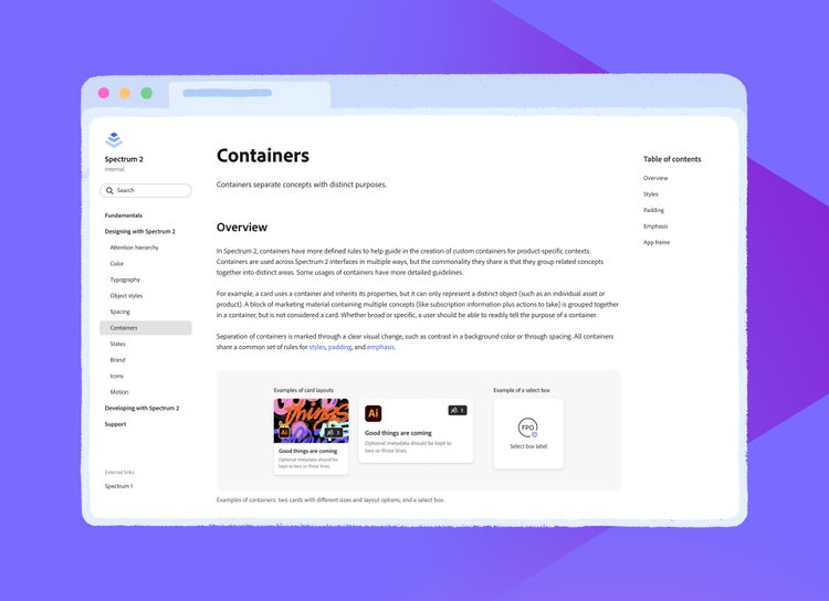
Documentation for the Spectrum 2 update began as a playbook, a place for us to document and guide design decisions to share with internal beta testers. The content from that playbook was eventually adapted into an internal site, which serves as our primary source of documentation. As opposed to individual documents or design files, websites provide stability and officiality to information.

They’re also the most scalable way for systems designers to share information (like guidelines for button text wrapping behavior or a table of font sizes) and promote good design practices. Design documentation will vary depending on team needs, but should ideally include:
- Fundamentals: An introduction to the design system that explores its history, principles, and goals and provides a thorough understanding of the system and the foundation on which it’s built.
- Information for designers: Detailed guidelines and examples about how the design system approaches concepts like attention hierarchy, assets like icons and illustrations, color, typography, spacing, and motion.
- Information for developers: Guidelines for integrating a design system on a variety of platforms (web, mobile, desktop), how to adapt a design system for a new platform, and how customizations can be impacted by design system updates.
- Support: FAQs about how to get started using the design system, tips for migrating designs and code bases to the new system, and links to resources like design libraries and contact information that steer questions in the right direction based on roles (for example, designers, engineers, and product managers).
We supplement our website documentation in two ways:
Key screen explorations are a useful form of design documentation that demonstrate concrete ways to flex a system. Crafted and iterated upon alongside product design teams, they apply foundational concepts to be relevant to in-product needs. They consist of no more than one or two screens from a product flow that show a design challenge and suggested solutions.
For Spectrum 2, we’d pushed an idea of removing dividers (visual lines used to separate groups of semantically related content) in favor of using spacing, color, shadows, or typography to group content. The approach provided a fresh visual style but was sometimes misinterpreted: We wanted teams to remove dividers when unnecessary, but not in cases where the hierarchy would be unclear without them. The best way for us to show our intended usage was to share key screen explorations. By pointing out small tweaks we’d made to the spacing and providing options for dividing and grouping content, we helped make general examples and guidance more readily understandable and relevant.
One word of caution: Key screens should be used as tools to inspire. Be careful of getting stuck creating product-specific flows on behalf of product design teams. It’s important to learn when to toss ideas back to product designers to flesh out, instead of going too far on your own (since they know their products best, redesigning entire flows for them can be an ineffective use of your time).

Workflow specific guidance. When we set out to define Spectrum 2, the primary goal of our documentation was to provide high-level guidelines alongside system-level thinking about how we arrived at them. Our theory was that the guidelines would cover multiple use cases and give designers autonomy to confidently make decisions. What we found is that product teams respond best to a combination of high-level guidance alongside specific examples applied to real-world applications—and as system designers help with the interpretation of guidelines for specific product needs, those focused examples can supplement future documentation.
Spectrum has a lengthy backlog of topics that we’d like to build guidance for, and we often begin that work from existing solutions for complex use cases. For example, our guidelines for a “table” component are informed by complex needs in our Experience Cloud products (like Adobe Workfront and Adobe Analytics), which require displaying many types of data—from people to dates to controls. Before system-wide guidance is ready, pointing teams to existing guidelines from other teams promotes early alignment, and provides a starting point to develop broader guidance for more use cases.
Supplementing documentation will evolve as design and design system team sizes require, but there are some added ways to ensure that people have the information they need, when and where they need it:
- Have a place for sharing links to existing standards (like WCAG accessibility guidelines) from outside the system. It’s easy to assume that teams are aware of these standards and reference them often, but that's not always the case.
- Consider the different ways people learn: Look for fresh ways to make engaging and informative methods of onboarding—from creating hands-on exercises that showcase new functionality in design tool libraries, to bite-size videos introducing important foundational topics.
- Work with engineering to create prototypes that can help design teams visualize abstract guidelines. Not only are they a great supplement to written documentation, they're also an opportunity to showcase best practices for accessibility and localization.
Communicate updates to ensure teams stay current
Design systems are in a constant state of evolution. While documentation sets teams up for a thorough understanding of a design system, communicating updates ensures continued success.
In addition to more generalized, structured announcements for updates (like bug fixes and changes to components), the same platform used for announcements (our design team prefers Slack) can also be used to collect examples of updated components that are live in-product or used in design explorations (these examples can be used later to inform design system updates that will scale to a wider range of use cases).
Since updates to internal websites and component libraries can give teams a better idea about how a system update will impact their work, announcements should correspond with updates to those resources. If, for example, a component is deprecated, teams will have detailed information about what specifically changed—and can go into their libraries and make necessary adjustments.
During the early stages of Spectrum 2 development, we shared updates along the way so product teams could begin explorations. Since then, we’ve continued sharing in-progress updates, before they’re officially “ready,” with different groups of small audiences—each with varying product needs and use cases. Asking teams to implement ideas in their designs is not only a great way to share potential updates, but also to vet them. Small group conversations can help solidify guidelines as they’re adapted for new use cases.
Provide a means for feedback, collaboration, and ongoing support
As teams grow and a design system evolves, it’s important to provide ongoing support for questions, guidance, and requests. Creating an infrastructure for fielding and responding to queries ensures that teams feel supported and will continue to look to the design system for guidance.
Communication channels range from personal to impersonal but the best formats for capturing and responding to feedback are going to depend on the size of the team using a design system and the number of people available to respond to them. We primarily use three:
- One-on-one support provides the most personal form of feedback and is great for unstructured discussions. This type of support will vary depending on team size but can include: assigned designers to collaborate with specific teams, office hours, and one-off meetings (that result from other forms of support). When there are complex problems that don’t have direct solutions, setting aside time to be a sounding board is not only helpful, it also fosters shared ownership of the system. Probably a quarter of my office hours with other designers are spent brainstorming and offering ideas rather than providing concrete solutions.
- Slack is great for targeted feedback and questions that are solvable in three to five messages. Always remember to ask for examples in context of product workflows. People will often share partial screenshots, of little more than the precise component they have a question about, but a complete picture of what someone’s asking requires viewing it in the context of the UI.
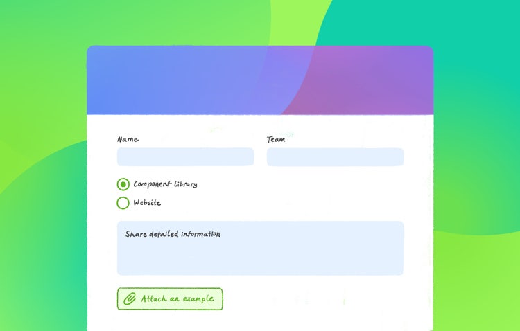
- Feedback forms are impersonal but can be a good way for smaller design system teams to handle more straightforward queries, like bug reports and functionality requests. Simple instructions save a lot of time: Make sure to ask upfront for people to include screenshots and detailed information.

System designers must be the experts on the components and guidelines to actualize what design systems promise: consistency and continuity. No matter the maturity of a design system, when people need guidance or training, there are ways to be a strong collaborator:
- Share your unique perspective as a design system expert. You don’t need to have all the answers to be helpful. Your in-depth knowledge of how the system is designed to work, why the design system team made certain decisions, and how other teams have resolved challenges make you uniquely qualified to help.
- Give general feedback with a fresh perspective. Product designers are experts on the products they work on but are often deep in the trenches of solving complex workflows and balancing team and user needs. Since we don’t have a specific product focus, we often have an “outside” perspective that’s appreciated and useful.
- Provide supportive, not directive, feedback. Teams often come to design system teams looking for direct solutions to design problems, and even design approval. Transactional requests like these reduce communication to a list of items to check off and the design system can begin to feel restrictive and exhausting—as opposed to flexible and supportive. For a design system to succeed, there must be two-way communication between system designers, working to serve product team needs, and product teams looking for guidance about how to use it.
- Don’t be afraid to share a strong opinion. System designers must be opinionated to maintain coherency across products—and adhere to good design practices. If a product team proposes a design that uses colors from outside the design system, or requests that a component be named in a specific way, the design system provides the direction that will best scale across product needs. In cases where solutions are not what a team was hoping for, explaining rationale thoughtfully and offering alternate solutions goes a long way.
- Be a connector across teams. A unique benefit of being on a design systems team is that we're plugged in to the work of many different teams. Your expansive perspective and insight are incredibly useful. Pointing to a good example from another team helps to connect groups of people to start creating alignment early in the process, even if your system doesn’t yet have polished resources to share on specific topics.
When sharing feedback with teams, set the context by acknowledging product expertise and then provide ideas in a constructive way. Acknowledge what you don’t know but be firm about what you do know. Even if something is obviously “wrong” to you (our team has seen our fair share), keep in mind that you’re working towards a shared goal: the best design solution for a given problem. Shared trust and an openness to being wrong helps to create a more collaborative atmosphere—and that’s critical to the success of a design system.
Because design systems cover a wide range of users across products, from design to marketing, they sometimes only directly support the broadest use cases. When designers are looking for solutions to problems that are specific to a narrow user segment, there may be times when a design system can’t fulfill the request. In cases where you’re not directly building solutions, work with teams to support them in creating their own solutions that still fit the broader ecosystem.
Additionally, design systems can’t (and shouldn’t) reinvent the wheel every time a need arises. When a specific request doesn’t align with system principles or foundations, explain why, then spend time providing alternate solutions. Be as transparent as possible about your team’s decision-making process. For Spectrum we have guidelines about what we will consider for updates and what we won’t, so it’s easier to provide rationale for our decisions:
What we will add
- Bug fixes. This includes things like bugs in component libraries and on websites, typically with known solutions, which means time can be spent exploring fixes to achieve an output (rather than in design exploration).
- Requests that many teams have asked for, or we predict many teams will eventually need, like making certain components more flexible for more uses. The key is to be able to identify when similar requests convey a potential gap in the system.
- Component improvement requests supported by strong rationale, proven in-product usage, or through user testing (make it a habit to ask for this background information when requests come in).
What we won’t add
- Requests that don’t meet Spectrum standards, for areas like accessibility. In these cases, we offer alternate solutions that do.
- Requests that are specific to a single product (like a card for a specific workflow that only one product needs). In these cases, we guide teams in building a solution that still fits broader system guidance.
It’s impossible to talk about ongoing support without stressing the importance of asking the right questions. To understand whether a request is viable, how it might impact the design system, or even to suggest a scalable solution, systems designers must understand, not just what someone wants, but why they want it. Clarifying questions (like where it will be used, what its purpose is, and why an alternative isn’t working) will help uncover the reasoning behind a request even when it seems straightforward.
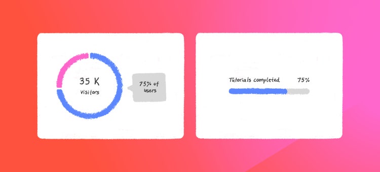
After digging deeper into a recent request for a donut chart component (a specific type of chart that displays data in segments of a circle) that wasn’t yet included in Spectrum resources, we found that what the team was really looking for was a circular meter. It turned out that the linear meter offered in Spectrum would work just as well. By not taking the request at face value, and better understanding the request, it was easier to offer alternative solutions that fit an underlying need.

It takes time and experience to learn the ins-and-outs of a design system and the best ways to help others implement it. Whether a design system is large or small, the best way to ensure its adoption is by making information available in a way that's useful and guides proper usage. Over time, I've learned that the best way to do that is by fostering shared ownership of the system through documentation, communication, and collaboration.
Special thanks to PJ Buddhari, Stefan Chitu, Angelie Herreria, Matt Knorr, Jess Sattell, Allison Shaw, and Deanna Smith for their insights behind the work in this story. And thank you to the entire Spectrum core design team—our librarians, evangelists, and advisors.