Behind the design of the new Adobe Express experience
How our team shaped the major features in the app’s latest release

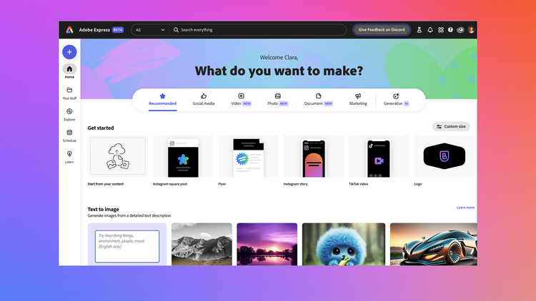
As the beta version of Express for desktop launched, we spoke with the Adobe Design team to explore which aspects of the new experience they were most excited about, and how they approached them.
Adobe Design’s approach to this tool is unorthodox: “One of the unique ways we build new authoring capabilities in Express is by defining and visualizing the user’s desired output—not the features. We ask ourselves, ‘What do users aspire to create?’ and ‘How might they create it?’” says Ben Matthews, Senior Director of Design for Express. “We knew video and motion would be new key capabilities, along with generative AI and interoperability with other Adobe applications.”
The scope of the new Express experience was massive, given the number of new features, and so were the design challenges. Matthews shared that consistency of UX/UI was paramount for the team as they considered how to connect disparate elements of the experience, including templates, video editing, and generative AI.
Here's how some of those solutions were designed.
Reinventing Express templates
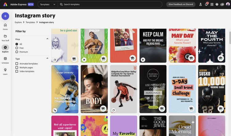
Since many people using Express are looking for inspiration and guidance, a core part of the experience is the rich library of templates that provide a jumping-off point for their design projects. Director of Design Amanda Rose Fetterly leads the team responsible for Express templates and with this update, reinvented the approach in response to usage metrics and Adobe Design research. “Our new strategy constrained and focused the template program in two key ways,” explains Fetterly.

1. Increasing creative confidence for new creators when remixing templates: “Templates are only successful if creators can confidently get the result they want and have fun in the process,” says Fetterly. The design team added constraints to templates that improved their usability including fewer font combinations, clearer layout hierarchies, and a focus on template designs with easy-to-edit hero type.
2. Codifying a visual style framework for templates: “In partnership with Adobe Design researchers Teruko Mitsuhara and Mika Nakamura, we embarked on the first global longitudinal creator style study,” Fetterly shares. The team tested 30 style archetypes (from modern to grunge) to see what would resonate with creators and help them trust that they would get the visual outcomes they wanted. “Mika helped us to take those style classifications global—a style called ‘Organic’ in North America is called ‘Wa’ in Japan.”
Fetterly and her team also brought more dynamism to templates, including video clips and animation. “Templates went from something static to something that moves,” says Fetterly, “and for anyone in the world of creating content, that’s a game-changer for keeping the attention of your audience.” There are also seamless integrations that bring in assets from Adobe Stock and our generative AI tool Adobe Firefly, typefaces from Adobe Fonts are at users’ fingertips, and, adds Fetterly, “you can take that project into other Creative Cloud apps like Adobe Photoshop and Adobe Illustrator to do more, which is huge.”
Making professional-level video editing easier to harness
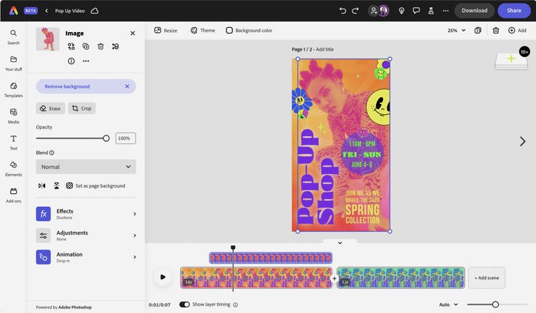
Video is a major way stories are shared across platforms by all kinds of users. In approaching a new video editor experience for Express, Senior Experience Designer Rahul Pandey and his collaborators had a lot to consider: “If you look through all the amazing Express templates, you can see the wide variety of use cases we had to account for in building our experience.”
Pandey and his UX design colleagues partnered with Adobe Design’s prototyping and research teams on a significant video editing offering in the new Express that could cater to a range of projects without overwhelming users. “Video editing can be intimidating to novices, but,” says Pandey, “the simplified Express experience should quell those fears. I’m excited to see users not previously familiar with video editing try it out.”

“We gathered valuable insights by conducting a study where we asked a set of users to recreate a video using both a traditional and scene-based timeline,” says Pandey of the design approach. A key difference between professional tools and Express lies in how the UI is exposed. While Adobe After Effects and Adobe Premiere Pro expose all the assets and controls to cater to pro-users, Express presents them contextually. “We created a design prototype of a simplified timeline,” explains Pandey, “grouping all assets within timed containers called ‘scenes’ and then exposed them based on the user's intent as they select the asset on the canvas.”
Seamlessly bringing generative AI features into workflows
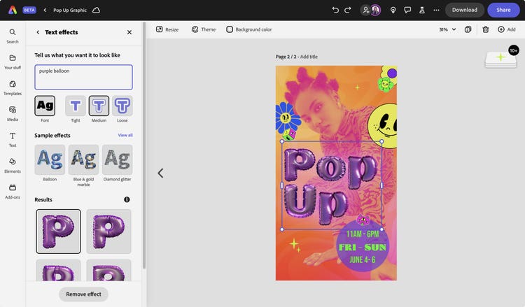
The Adobe Design team that shaped the Adobe Firefly generative AI experience also worked on integrating the technology into Express workflows—with text-to-image and text effects features built right into the Express editor.

Concurrent with their work on the successful launch of the Firefly beta earlier this year and the integration of generative AI into Photoshop and Illustrator, the design team was also thinking about how to bring generative features into Express. “We needed to understand the value Firefly would bring to Express users, and surface it in a way that maximized its potential,” says Veronica Peitong Chen, Experience Designer, Machine Intelligence & New Technologies. They considered how people working in Express might use generative features, at what point they’d want them available, and what level of creative control they’d want to exercise. The text-to-image feature is easily discoverable in the app’s media panel and property inspector and generates multiple options in response to text prompts, and allows for easy manipulation of the images.
It not only saves time on projects that users might otherwise spend hunting for the perfect ready-to-use asset, it also opens new possibilities. According to Chen, “We wanted to offer users the freedom to experiment, iterate, and unlock their full creative potential.”
What’s next for Express? “While we’re all very proud of the release, there is so much more we want to do,” says Matthews. “But the exciting part is that we now have an entirely new foundation to build from, whereby we can iterate and deliver new value faster to a broader set of users.”