How to design effective icons, Part 1
Create a cohesive visual language that’s beautiful and meaningful
My grandmother did eventually meet her great granddaughter, in person, but the experience taught me that it's impossible to open any application or website on any device without having to use, understand, and interact with iconography—which means that demand is limitless and being able to design icons that are consistent and look good is a valuable skill.
Over the years I’ve established a consistent set of guidelines and practices that have been critical to the success of my work as an icon designer at Adobe. I created this guide to aid creative pros, engineers, and designers new to this area of work. Here, in Part 1, I’ll discuss the prep work necessary to create icons that are beautiful, consistent, and tell the right story. In Part 2, I’ll discuss the design considerations that will ensure they're balanced, understandable, and easy to export and maintain.
Necessary prep work
First things first: Set up your workstation. I won't go into too much detail because workstation set-up involves many personal decisions, but I will say that icon design is time-intensive, so software and ergonomics are key. To ease wrist strain and more closely mimic the natural feeling of drawing, I use a Wacom tablet with a stylus, but a mouse will do.
You'll also need vector software... There are many apps, but for me nothing works like Adobe Illustrator coupled with a collaborative design tool for creating, maintaining, and sharing icon libraries.
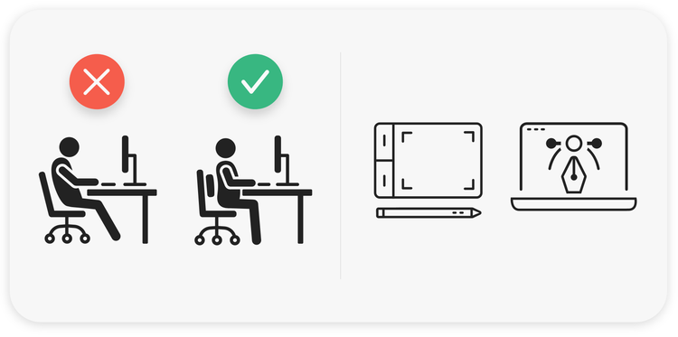
....and a good chair. Sit about an arm’s length from your screen to avoid bad posture and turtling or craning your neck (which is easy to do when looking closely at your icons). Details matter in icon design but it’s important to not strain your neck while working on them. Use shortcuts to zoom in and out of the canvas: zoom in to 3200% when editing vector shapes and zoom out to 100% to see if you're satisfied with the result. It also works to open a second window in Illustrator (Ai > Menu > Window > New Window) with the 100% representation of your icon so you can move easily between 3200% and 100%.
Know your icon types
Icons in applications and digital interfaces usually fall into one of three categories:
- App icons. These application logos or brand assets come in assorted sizes and formats. When creating them it's crucial to follow iOS or Android guidelines so they aren't upscaled or rejected during the store submission process.
- System icons. Each platform has its own set for things like navigation bars and panels. Since users are familiar with the shapes and metaphors of each platform, it's best not to reinvent them.
- Workflow icons. Located inside an application—toolbars, option bars, and panels—these reduce the need for words. They prevent text crowding and help maintain a consistent appearance as content is localized.
Find the right metaphor: Learned meaning and understanding
To imbue an icon with meaning, you must first understand how it will help a user successfully complete a task, then translate that action to a visual entity—a metaphor. Finding the right metaphor for an icon is a process guided by research and completed by imagination and inspiration.
Imagine looking for specific functionality in an interface and not being able to find it because an icon is poorly drawn, or the metaphor is so off base or abstract that it can’t be associated with an action. Icons should always be familiar and straightforward, so people aren't left guessing.
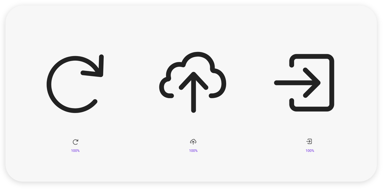
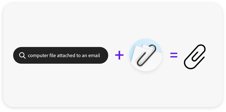
As an example, arrows in icons gained popularity with the introduction of cloud storage, which distinguished where content was being stored. But arrows (and chevrons) are also universal shapes that communicate basic direction and computable transitions like file exporting. Their distinct shape makes them distinguishable at small sizes, and because different directions of arrows can show relationships between things to be connected, selected, downloaded, or shared, they can quickly communicate predictable outcomes.
Remember the goal of an icon is to communicate as fully as possible, so combine them carefully to build up a knowledge base to support the way that people understand and use them. Take care to use metaphors that people understand and to not use familiar metaphors (like arrows) in unfamiliar ways. Icon metaphors need to be learned and people don't want to learn them when they're in a hurry to get something done.
Finally, do your research: Make it as easy as possible for your audience to understand your icon by exploring your options and checking metaphors for meaning on websites like Noun Project, Iconfinder, or Google Images.
Badges (and modifiers) add supplemental meaning
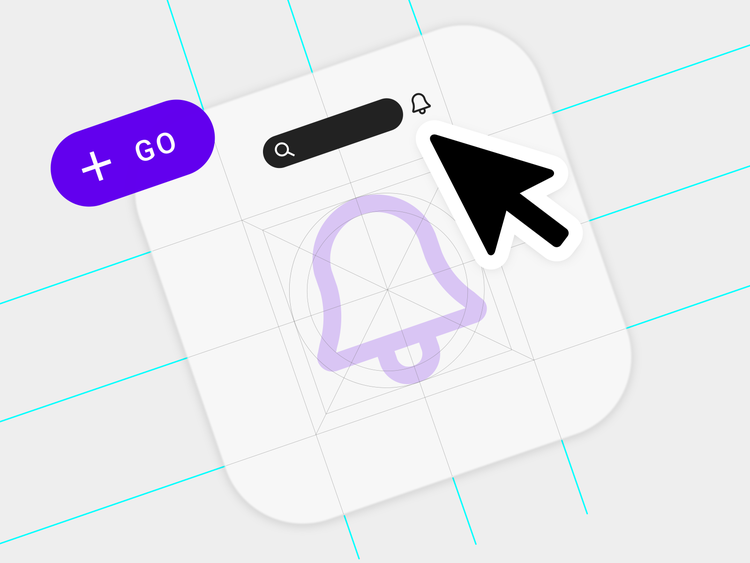
When designing, try to think about the long-term use of icons. Most will show one primary element but planning for badges—familiar symbols usually added to icons for in-app notifications—will help you manage the set as more complex features are added.
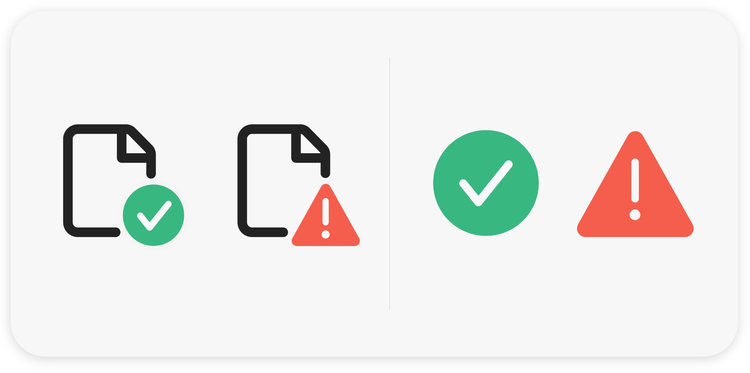
When thinking about badges, less is more. Give primary consideration to where they'll be placed and be consistent with that placement throughout the set. Define the space, like a circle cutout, and remember that icons can quickly become unreadable, and their meanings unclear, at small sizes. Color contrast between the cutout and the symbol inside it, and providing enough space to ensure readability, is crucial.
One last thing to know about badges: This same supplemental content being placed in a colored circle or triangle, can also be used as a modifier. Placed in tooltips and tool panels, modifiers usually call attention to the status of assets, files, or operating systems. These alerts need to stand out, so simplicity is key.
Form and beauty (yes, icons must look good)
Constructing and building a production-ready icon includes complex pathfinder operations (to combine, add, and subtract the shapes that comprise it) and rigorous anchor point snapping (for alignment) and it can be quite easy to underestimate how long those things take—especially for multiple icons.
To save time when constructing the first iterations of icon shapes, I use a “fake it till you make it,” or scrapbook approach: I draw and build the shapes by masking any areas that will require pathfinder cutouts. They look like final versions but are really shapes overlaid by other shapes. Not only do they help get the look-and-feel right before spending time constructing a final version, but they can also make it easier to incorporate client feedback.

A word of advice about natural shapes: It's no secret that forms found in nature are pleasing but recreating natural shapes in vector form can be challenging and take longer than expected. Shapes like drops are difficult because they combine curved and straight strokes that require a seamless connection, for the visual transition to be smooth. Finding the right proportions can easily add hours to initial design time (even without adding complex cutouts to the mix).
Don't give up. Keep iterating and make duplicates of your shape evolutions as you go because an early iteration may end up being the best of the bunch.
Visual consistency
Maintaining consistency in icon sets is important and thinking about a few things in advance will help:
- Define your icon style early. Adding characteristics like corner radius, size, color, stroke weight, and stroke end caps will help define your icon style, but also be sure to consider modifiers and proportions inside the icon canvas.
- Account for complex shapes. Add a one- or two-pixel safe space around the icons by default. This will make your icon set visually consistent even when simple and complex shapes are placed next to each other.
- Reuse shapes. Reuse what you have (arrows, rectangles, plus signs) instead of creating new shapes that vary only slightly.
Up next, “How to design effective icons, Part 2: Refine your work, and style, and stay (really) organized.”