How to design effective icons, Part 2
Refine your work and style, and stay (really) organized
Over the years I’ve designed thousands of icons that have guided millions of people through interfaces; during that time, I’ve followed a consistent set of guidelines and practices that have been helpful in my work. In Part 1, I focused on the prep work—from posture and software to form, beauty, and supplemental meaning—necessary to create the foundation for icon design work to begin. Here, in Part 2, I’ll discuss where to focus your attention as that design process begins.
Design considerations
Before starting any vector work consider icon size, alignment, and style. If you don’t manage these details first, it will be difficult to create balanced icon sets.
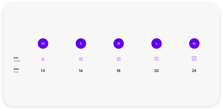
Size. Standard icon sizes for dense layouts are 16 x 16px, 18 x 18px, 20 x 20px, or 24 x 24px. So, icons are easier to align horizontally and vertically think about them in sizes that can be divided by four and centered on a rectangular canvas.
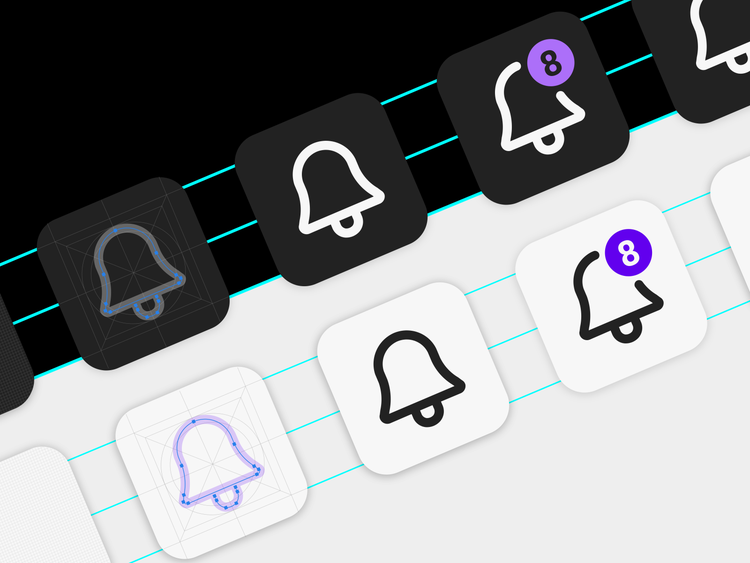
When choosing a size, start with a square and view it at 100% to get an accurate picture of how reduced your artwork will need to be to fit inside it. Remember that the smaller the icon the harder it will be to add badges or convey complex meaning.
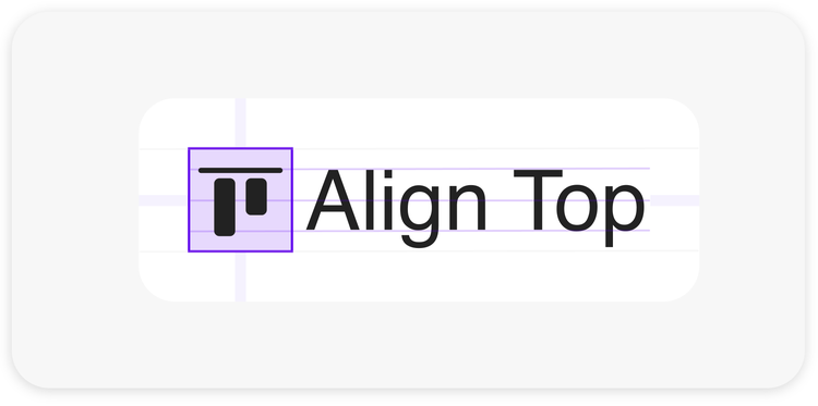
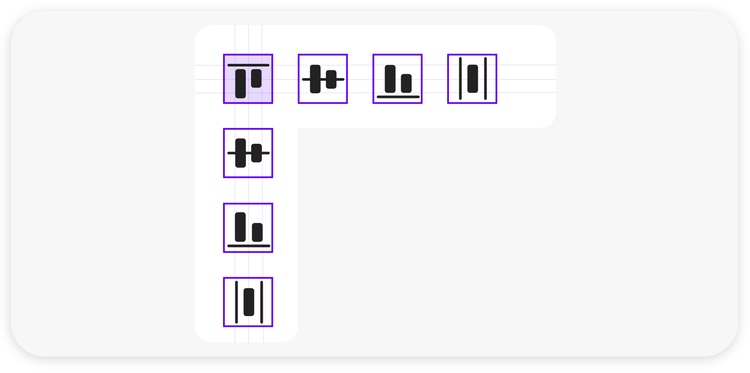
Alignment. Symmetry and balance will make your icons cleaner, clearer, and more consistent, and the result will be icon shapes that can be reused when adding to your set. When complete, icon forms should be aligned inside a pixel grid and not overlap the boundaries of the artboard. Pushing the points of a vector shape for perfect alignment takes some patience but putting time into these details at an early stage will benefit your design in the long run.
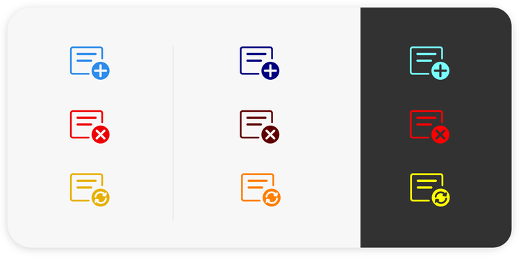
Style. Most icons are outlined or filled. Outline styles work well in interfaces that are lightweight, minimalistic, and modern. Filled, or duotone, icons are used most often in complex icon sets that require refined differentiation between icons. They can add depth, weight, focus, and contrast, so they can be especially beneficial on dark backgrounds.
When using filled icons, experiment using a transparency of the main color or an extra tone that matches the transparent shade; I’ll often place icons in a row with different transparency percentages to evaluate which value fits best). Finally, a mix of outline and filled styles can convey an action, using the outline style as default state and filled as the selected state.
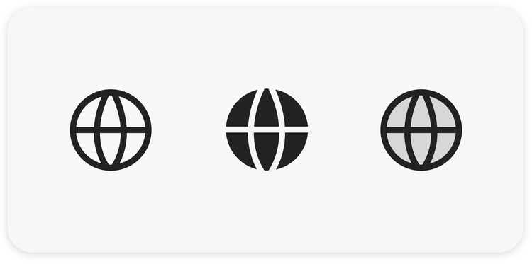
Each style direction has its pros and cons so it's best to test them by putting them into a UI to see which best suits the color theme, type choices, and contrast. Not all icons work well filled and outlined icons might look “frail,” so experiment by applying different styles to your icons and viewing them within the context of the theme of the interface to help find the best option.
Keyshapes
Just as the letters a, e, g, n, and o can define the personality of a typeface before working on the rest of the font family, there are certain shapes that define the proportions of icon styles. Circles, rectangles, squares, and triangles are the core shapes that define an icon's size and vertical, horizontal, and diagonal lines. Since they define the baselines fundamental to icon sets, determining the relationships between them, and your typeface, is a crucial step before designing any other shapes.
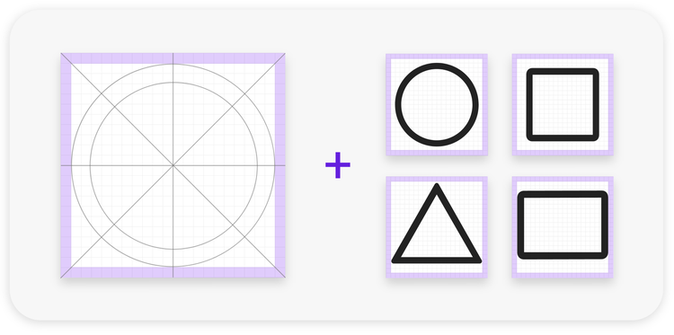
Due to visual rather than numerical balance, circles will always appear more prominent in dimension than rectangles. Visual balance is as important as numerical precision when creating icon shapes; resize circles so the proportions appear correct when placed next to or below rectangles.
A quick reminder about shapes: Aim for shapes that can be recognized in seconds at a small size. This means choosing shapes that are simple and familiar; shapes that are complex will be difficult to scan and understand. You can test how a shape translates by scaling it down and quickly looking away and back again. If you find yourself staring at it for too long, it's a sign that others could have difficulty deciphering its meaning. Always remember that searching for the correct icon in a UI can lead to frustration. Push for clarity and use metaphors that are easy to recognize.
Anchor points
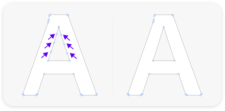
Anchor points are the connectors of a vector shape, and the goal is to have as few as possible. Vector shapes can become cluttered with unnecessary points that make scaling and cutouts through pathfinder operations a pain.
Clean forms are what you want: They scale well, have fewer rounding errors after export (too many anchor points can interfere with decimal precision), and look more professional when handing them off to another designer. Reduce and remove unused and redundant vector points wherever possible while preserving the original shape. Editing anchor points takes practice. The good news is that there are plenty of vector exercises on the web to practice creating perfect curves with as few anchor points as possible.
Corner radius
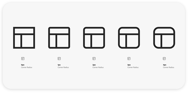
The rounder the corner, the “friendlier” the icon. Corner rounding can range from 0px–4px for regular workflow icons. Experiment with different icon shapes and different degrees of roundness to see which best fits your style. Exercise caution: Radius not only affects overall look and feel but readability.
Stroke weights, borders, and caps
There are simple and subtle ways to influence the appearance, aesthetic, and character of an icon. The appearance of a vector stroke is reliant on the shape’s visible outline, which can be altered by weight (the thickness of the line), by setting the border stroke to centered, inside, or outside the path (to experiment with the optical size), or by defining how a stroke will look when it ends (cap options).
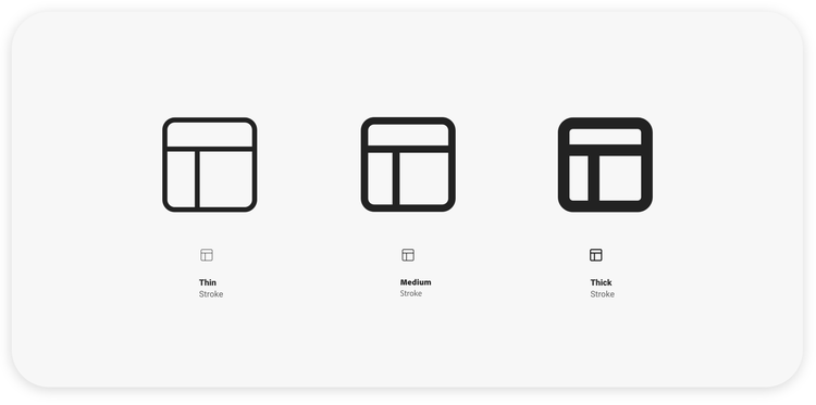
Stroke weight. Icon size usually informs stroke weight but there is some flexibility based on the look of the icon: A heavier and bolder icon style will usually require a 2px stroke weight; in contrast, a minimalistic and reduced icon will benefit from a thinner stroke weight of 1px or 1.5px. However, since the UI, icons, and fonts should form an aesthetically pleasing unit, and support focus on the content, the best thing to do is place them in the UI and experiment. Looking at the icons in conjunction with fonts and buttons will tell you whether they’re balanced.
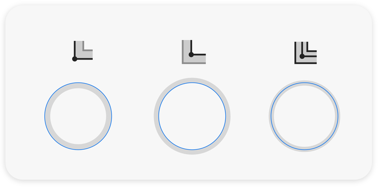
Stroke border. The stroke border functions as a sort of wire around which the "insulation" of the stroke is aligned, and it can subtly alter an icon's appearance. Once vector strokes are drawn on your grid, use Illustrator's Stroke options (Window > Stroke) to modify their alignment (inside, outside, or centered). Your icon should appear more or less crisp depending on your choice: Round and natural shapes are easier to draw using a centered stroke and squares and rectangles benefit from inside or outside alignment.
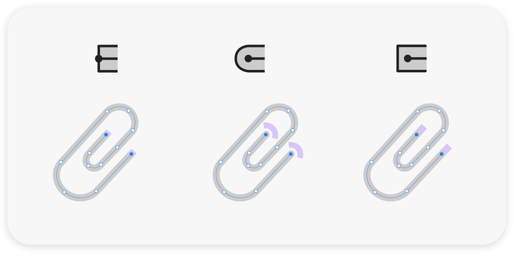
Stroke cap. Defining the appearance of the ends of a vector path is another way to change an icon's aesthetic: Use a round cap to create a friendly look and feel; a butt cap cuts the stroke off at a right angle, which can make icons look more precise and formal; and a projecting cap extends the end of the stroke by half of the stroke weight, which can smooth the formality of a butt cap.
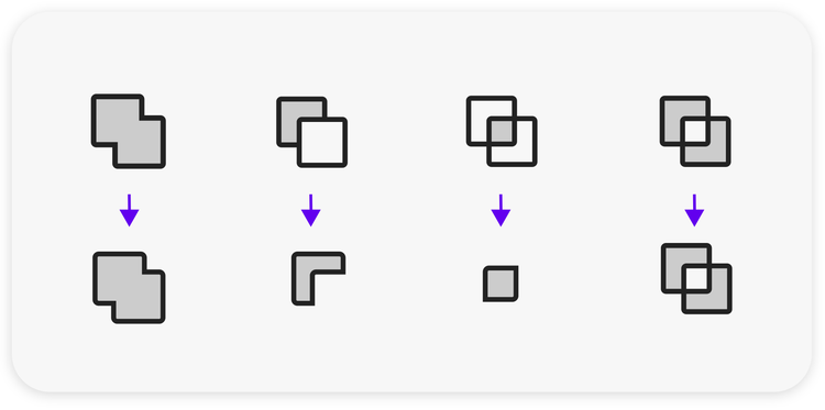
Illustrator’s Pathfinder tool
Once you're happy with the vector stroke version of your icon, make a copy of it and turn that copied version into an expanded shape or outline stroke (the term will vary depending on software). Strokes that are not turned into expanded shapes can cause rendering issues, in browsers and render engines, that will change the visual appearance of an icon.
Essential for finalizing icon shapes before starting the export process, the Pathfinder tool merges all the parts used to construct the icon, subtracts the necessary cutouts, and leaves one intact shape with a single or compound path. This will be the version of your icon that's exported for implementation. Since the Pathfinder tool is a shortcut to a complex editing process the best way to understand what happens when it’s used is to apply it to simple icon shapes.
Important: Keep a version of each icon with its vector stroke intact. It will allow you to more easily scale the size, adjust the stroke weight, or make any other modifications when reusing shapes. Take my word, it is a pain to do it after you’ve expanded your strokes.
Contrast and accessibility
There is so much to say about accessibility in software, but of primary concern in icon design is color contrast. Matt May, principal designer on Adobe’s Product Equity team, recommends using Adobe Color's Contrast Checker to help identify accessibility and contrast issues early on and create a full set of colors that don't collide—not only for icons but also for text. Do not rely on your perception; many people have mild vision impairments beyond low vision and color blindness.
One last comment about icon accessibility: Naming your icons and supplementing them with screen reader-only content can make an enormous difference to people navigating your app or website using screen readers.
Export, filing, and sharing
Establishing a sustainable design system for saving, updating, and sharing icons, for yourself and your team, can not only bring you peace of mind, it can also save hours of work. That process will vary from team to team but there are a few things to keep in mind when you first start the process.
Export options: SVG, PDF, PNG. After you’ve finalized your icon(s), the next step is to export it into the production process. The best rule to follow when exporting is to check which format is needed with the person implementing the icons so you can deliver the asset type that will guarantee the best performance. SVG and PDF are scalable vector formats used often for web and mobile applications. PNGs are flat bitmaps that support transparency but must be exported at sizes scaled specifically to a screen’s density (older frameworks tend to use PNGs but they are also fallbacks if a browser cannot render the SVG).
Naming files. Some icon sets I work on contain more than 1,000 icons. There are some specific challenges for documentation and maintenance of large icon sets but of primary importance is creating a file-naming structure that supports search and share.
I rely on a joint image and text search but I still name my files as precisely as possible (with icon function, size, and state) so I can search with specific terms. As an example, instead of using the title “save," use “save_file_to_cloud” so you can search using save, cloud, or file. Meaningful icon naming can also improve screen reader outcomes. As an example, Apple’s VoiceOver would read the above file name as “save underscore file underscore to underscore cloud” so someone using a screen reader would know how to type the file name.
Know where files are stored. It’s essential to know the location of the icon repository, and who has access to it. And, since sharing and updating larger icon sets on teams can get tricky, make sure to create design guidelines for how to consistently modify or add to icon sets. And consider using solutions like Creative Cloud Libraries to make your icons more sharable, to automatically sync them every time icons are added, and to make copies accessible to selected team members. When teams are iterating quickly, this way of sharing can help save a lot of time because vector shapes and other graphic elements automatically update whenever libraries are refreshed.
Production icons. Double check the icon implementation with the developer to make sure the appearance is not scaled or altered and has the right color and behavior on default, hover, and selected states. Then create specs and documentation for how the icon should look when implemented with the UI.
Icon design is more relevant than ever
Because images are perceived and understood faster than words, apps and websites that successfully couple text and iconography to explain why something matters, will improve their connection with their audiences. Their experiences will also be delightful, streamlined, and coherent.
Until you discover a design method that works for you most of the time, be patient, continue creating and iterating, and remember:
- The simplest shapes are often the most difficult.
- Establish key metaphors early on to create consistency.
- Reuse shapes as often as possible to save time and achieve a coherent look and feel.
- There is unspoken beauty in the perfection of a Bezier curve.
- While designing a basic icon set, remember that icons tend to get more complex as projects expand, so plan space for badges so your set will be balanced down the road.
- Don't give up and enjoy yourself, and the satisfaction that comes from designing beautiful icons!