Behind the design: Adobe Acrobat Sign’s new recipient experience
A look at the user-first approach to signing that’s streamlining business

As the creators of PDF, Adobe wanted to modernize the Acrobat signing experience to be powerful, trustworthy, and inclusive for everyone, no matter their skill level or what platform they were on. They also wanted to ensure it looked and felt like the rest of Acrobat, which hundreds of millions of people are familiar with and use every day.
Acrobat senior experience designer, Steven Kramer, offers a look at the newly designed in-product signing experience and the design challenges, user insights, and radical simplification that informed the solution.
What was the primary goal when you set out to update the recipient experience?
Steven Kramer: Our goal was to increase the rate that agreements are completed while decreasing the time it took to complete them. In other words, we wanted more people to successfully fill and sign their agreements in less time. We started by looking closely at the signature process—how someone consumes, comprehends, and completes an agreement—to ensure it was as simple as possible at each stage.
We quickly realized that the process was cumbersome—especially for people who use assistive technology, such as screen readers. For those users, reading the document required finding a specific setting to open the agreement on a new page. They then had to navigate back to complete the signing process. While we weren’t the only leading e-signature provider with these accessibility challenges, it was non-negotiable that the Acrobat experience had to be better: signing must be easy for everyone. As we rebuilt the experience, we did so with those users at the forefront, and incorporated extensive testing to ensure our product was as accessible as possible.
What user insights did you leverage to help inform your design solution?
Steven: The previous version of the recipient experience had been live for many years, which meant we had a lot of quantitative data and qualitative insights, from both sender and signer perspectives. Surprisingly, we discovered that the largest pain point was getting into the experience. There were two key issues: email notifications and the initial landing page.
Open rates showed that notification emails were getting lost in the recipient’s email, which meant either the recipient didn’t see it or didn’t open it. Addressing the first issue was straightforward: If recipients aren’t opening emails, let’s allow senders to request signatures via text message.
The second issue was more nuanced. Let’s say Sammy Sender is requesting a signature from Rayna Recipient. Sammy’s email request sends with the subject “Adobe Sign on behalf of Sammy Sender.” If Rayna views the email on her computer, she can read the full subject. But Rayna conducts most of her business from her phone, and in her email app she only sees “Adobe Sign on behalf of…” Our research showed that unless Sammy explicitly told Rayna to expect an email from Adobe Sign, Rayna would ignore it because she was expecting a request from Sammy, not Adobe Sign.
Since more recipients sign from their phones, the story of Sammy and Rayna has become increasingly common. It was time for us to make the experience more mobile-friendly—by literally putting the customer before ourselves. By rewriting the email subject lines to “Sammy Sender via Adobe Sign,” recipients like Rayna could see the name they recognized in the email preview, no matter what device they were on.
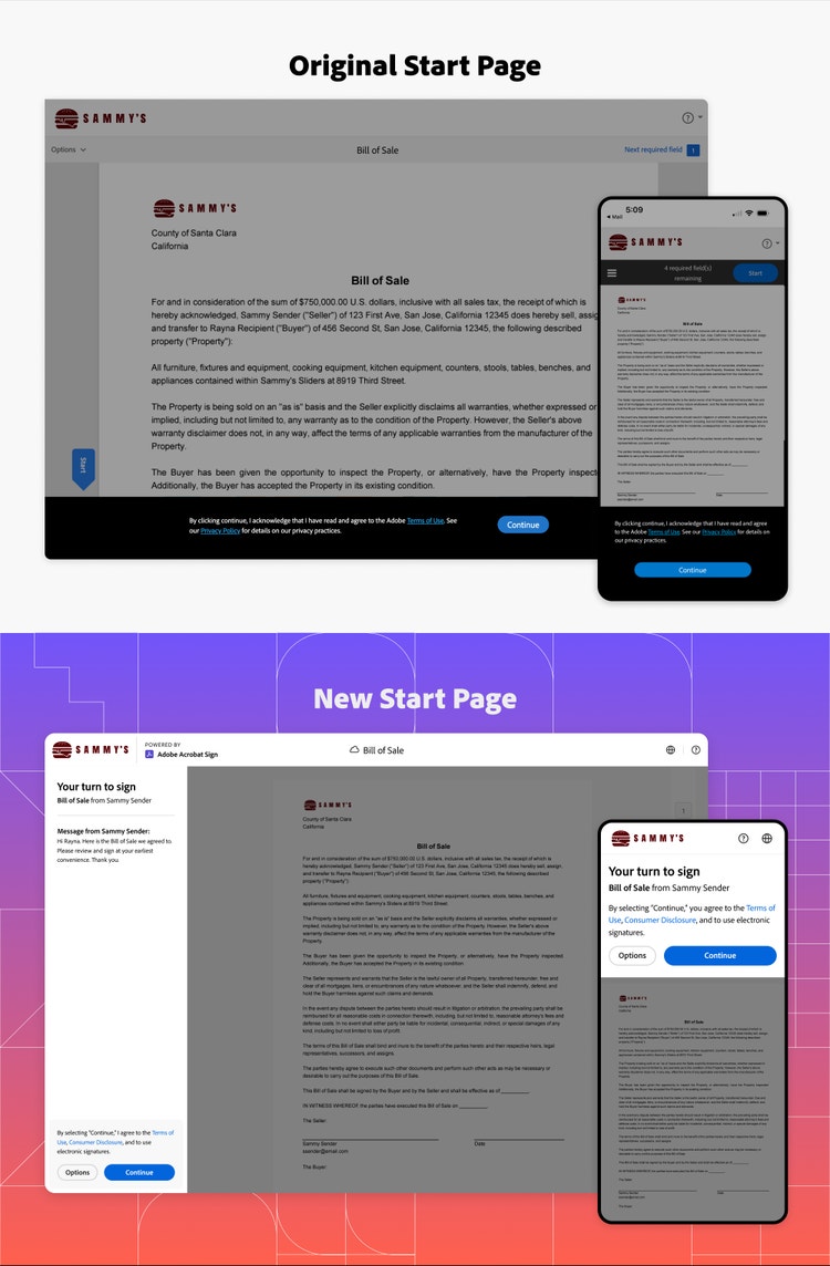
The second barrier to entry was the landing screen, which we call the gate because it gates the signing experience behind legal notices which the recipient must agree to before continuing. This gate is required for legal reasons, and some enterprise customers even include additional custom disclosures. By looking at recordings of people who had trouble signing, we saw it wasn’t the legalese that was adding friction, but the page layout itself. The black banner at the bottom, which contained the Continue button, was often missed because of the low contrast against the background grey overlay, and because it was often mistaken for the cookie-tracking popups people have become conditioned to ignore. Clicking on the background grey did nothing, so users thought the experience was broken.
The solution is an adaptation of a pattern we’d used in Acrobat: The existing header shows the sender’s logo, and the left panel can be used for a custom message and terms agreement. It also provides a preview of the document but with a grey overlay to establish that the document cannot be interacted with until the Terms of Use are accepted. The white of the header and panel created more contrast against the grey overlay, and we removed the customer message on mobile so more of the document was visible. These changes provided recipients with the assurance that they were signing the right document and a clear way to proceed.

What was the most unique aspect of the design process?
Steven: The intersection between Acrobat Sign and Acrobat, and between our customers and their customers. Our solution needed to have the enterprise power of Acrobat Sign with the general simplicity and accessibility of Acrobat. It needed to represent our customers’ brand but also be driven by Adobe’s best-in-class PDF experience.
There are so many intricacies in the world of e-signatures: legal consent, agreement types, field types, and backend product nuances that need to be accounted for. Agreements can be anything from a simple gym waiver or photo release, to a medical form or a multi-million-dollar company sale. And often those agreements needed a specific signature type or a specific entry in a specific field, or the whole document would be void.
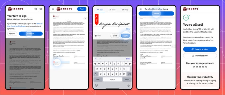
But the recipient doesn’t care about those nuances, they just want to fill the document quickly and accurately (initial here, sign there, date, and click submit). Whatever we built needed to be that simple.
I took on the role of an ambassador between the Acrobat Sign and Acrobat teams, advocating for the needs of both sets of users. I was adapting the simplicity of Acrobat’s Modern Viewer framework to scale up for all the unique enterprise cases of Sign and to account for different types of branding (whether the Acrobat Sign icon, the customer’s logo, or no logo). I also had to balance displaying Acrobat’s viewing tools (Find in, Read Out Loud, and Pagination) with Acrobat Sign’s sender message, private message, and recipient actions (Decline, Delegate, Print, etc.). In addition, the experience had to work for two different types of gate page experience, four different flavors of legal terms, and both registered and unregistered users.
Before long, we had a solution that worked. Working closely with the product manager, I tracked each case and ranked it by how often it occurred, so I could design for the most common cases without forgetting about the edge cases. It allowed the recipient to focus on completing the agreement. We prioritized tools that would increase comprehension so customers could sign faster, while keeping additional actions such as Decline and Delegate just a single click away. It was a solution we all felt confident in. At the end of the journey, I was the subject matter expert, the glue between the teams, and an advocate for both sets of users.
What was the biggest design hurdle?
Steven: Designing the experience for mobile web browsers really took this unique cross-team project to a new level. Acrobat’s mobile web was not as developed as its large screen counterpart, so there were fewer established patterns to rely on. It stress-tested our prioritization and journey mapping and required us to make tough calls about what was important for the sender and recipient compared to the way it was done previously.
We continued designing not until there was nothing left to add, but until there was nothing left to take away. We removed the double header and redundant guidance text. All tools moved into an overflow hamburger menu, so only the menu, logo, and navigation remained in the top bar. The menu kept those additional tools just one click away and provided a scalable pattern to accommodate future tools. This provided the largest view of the document and guided the recipient to their primary goals of agreement comprehension and completion. This radical simplification of the experience allows documents to be signed as fast as a recipient’s mobile lifestyle requires—and will eventually help us further simplify the large screen experience.

How did the solution change the in-product experience?
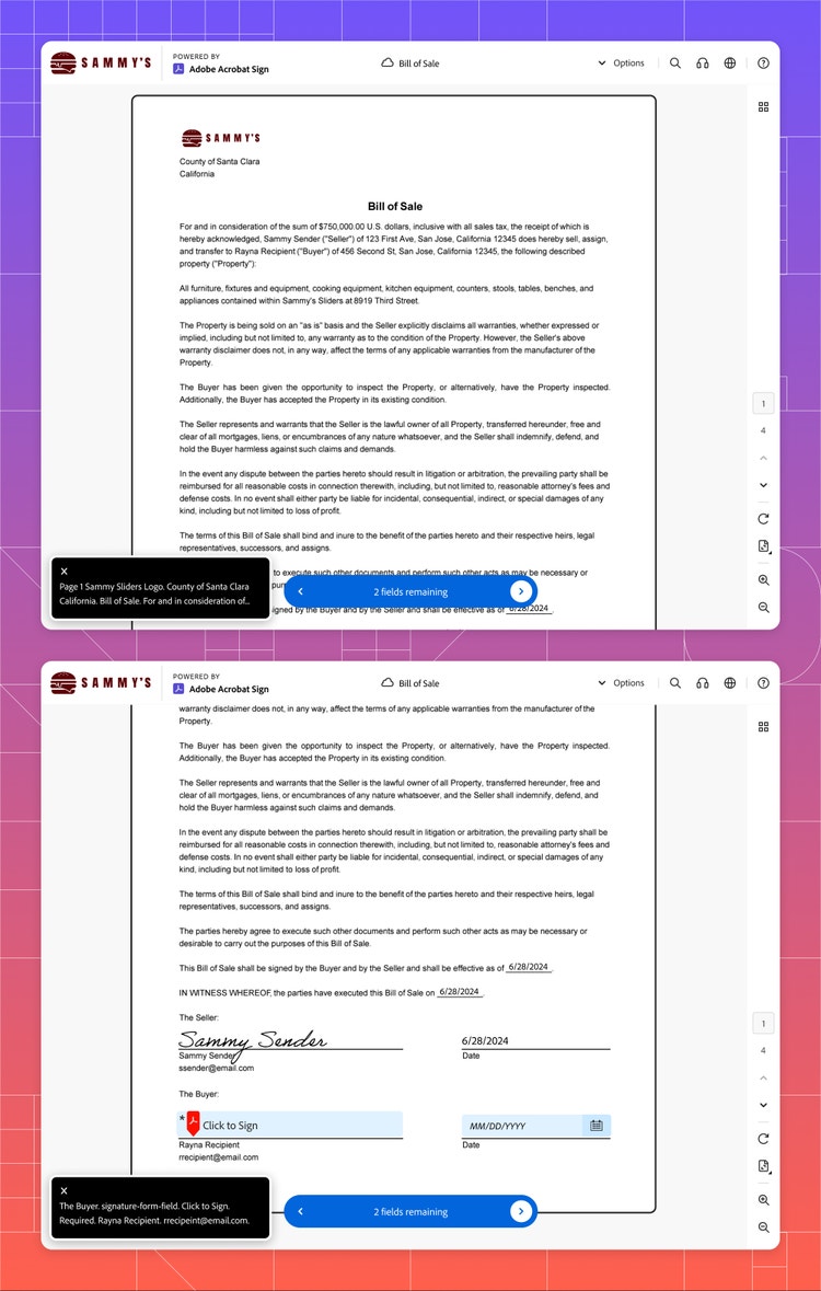
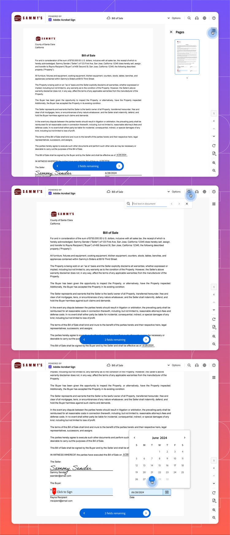
Steven: The new recipient experience is the largest change to Acrobat Sign in many years and reflects what Acrobat users are used to. It includes many of the same features as Acrobat, such as Read Out Loud, the ability to search for specific text, and dark mode. There are also upgrades such as improved field navigation, better zooming on mobile, and a date picker. Redundant text and actions have been removed, and legal text has been fine-tuned to be as user friendly as possible.
In addition to the new interface and experience, the team did a lot of work on the backend about how the agreement was read and processed by the Acrobat Sign platform. As creators of the PDF file format, we have the special ability to render the PDF in its original form, rather than as an image. The most important benefit of this is that a screen reader can now read the actual agreement, and fields are read in line with content (previously the recipient needed to open a new view to have the document read then navigate back to sign). Other solutions read the whole document, then read all the fields—which can create confusion if all fields aren’t at the end. With Acrobat, recipients can consume, comprehend, and complete the agreement in the way the agreement was intended.

What did you learn from this design process?
Steven: Curiosity and resilience. With so many edge cases, it was impossible to know them all going in. Since no single person on the team knew every intricacy, it was a great opportunity for all of us to learn something new and to understand more stories about how people use our product. Asking key questions about those cases pushed the experience to be better, helped us make tough decisions, and helped us simplify the product for the vast majority. But above all, it helped us develop deep empathy for our customers and their customers.

What’s next?
Steven: I heard someone say once that the launch of a product means that it’s 1% complete—and with this project that feels accurate. While a monumental step forward, we aren’t finished. We’re getting data and insights now that show how much this effort has helped our customers and their recipients, but we are also getting great feedback about what else we can improve. It’s those refinements that can help the experience be even better. And then there are larger improvements we can make: How might we make this truly a world-class experience? How might we further improve readability on mobile, or integrate Acrobat AI Assistant? There are so many possibilities. The design is never done. The design is never perfect…and that’s the fun of it all.