Behind the Design: Adobe Photoshop on iPhone
The “select-and-do" design strategy behind Photoshop's new mobile presence

Adobe Photoshop on iPhone provides the opportunity to reach creative professionals who create wherever and whenever inspiration strikes. The design is a rethinking of Adobe Photoshop that combines the power and precision the application is known for, with ease of creation. It brings Photoshop's iconic image creation and design capabilities to new and experienced creators so they can create on the go—from the palm of their hands.
Principal designer Bradee Evans, who’s spent most of her career designing tools for professional creatives, revisits the design vision and strategy powering Photoshop on iPhone.
What was the primary goal when you set out to design Photoshop on iPhone?
Bradee Evans: So many creative professionals got their start playing around with Photoshop on desktop computers. But today's creatives frequently begin work on their phones. We wanted to ensure that when they did, they had access to Photoshop’s powerful open-ended image creation. We set out to design a version of Photoshop that would foster the curiosity, creativity, and imagination of creatives new to Photoshop while still giving professional users access to the depth of its rich, open-ended image editing.
What user insights did you leverage to help inform the design solution?
Bradee: Photoshop's been in market for 35 years. It pioneered expressive image creation and editing and the creatives who’ve been using it for years on desktop have evolved to use it in ways that are unique to each individual. Many would say they play Photoshop almost like an instrument—as an extension of themselves that they hardly have to think about. Our challenge was to incorporate what we know helps put professional creators into that type of instrument-playing creative flow-state without losing sight of designing an intuitive first launch experience based on user testing.
Because there are so many tools in Photoshop, and so many uniquely individual ways to use them, we needed a design framework that would organize them in a learnable fashion. Our shorthand for this approach is select-and-do, a tool-based approach that helps focus the UX around tools and actions. Our hypothesis was, if people can learn to select and do one thing, they can learn to select and do many things.
In this tool-based (select, quick select brush, lasso) approach users select actions (mask, delete, fill, adjust) as opposed to command-based intents like “lighten sky” or “blur background.” Our goal was to create an environment where new users aren't only completing quick tasks, they're also learning skills they can use in the future. It's like having a coloring book versus a desk filled with paper, canvas, paints, graphite pencils, markers, and scissors: With the first you can color pictures envisioned by the author, with the other you can create whatever you want.

We’re already seeing this approach help users who have, after years of using Photoshop, never understood what a mask is... actually get it! Not only that, but they’re also learning why a mask is the best way to create non-destructively. The beauty is that learning what a mask is isn’t just transferable to desktop Photoshop, it’s also a powerful feature present in pro video, animation, and 3D software. If this type of learning continues, we’ll have helped jumpstart a new generation of professional creatives.
I’ve been designing professional creative software for most of my career, and a lot of what we’re talking about here is instinct and building a consistent learnable set of interactions so new users can get up and running quickly and still have room to learn and pursue mastery. Building that new approach meant not only looking deeply at Photoshop research but at what phone-based creators have access to today (not just other image editing tools but editors native to the device and inside social media platforms) and intuiting and testing what we should leverage, and where, given those baseline expectations.
What was the most unique aspect of the design process?
Bradee: I think one of the most unique parts was that the entire cross-functional team (engineering, product, research, product marketing, learn team, content team and product design) aligned early on about what success would look and sound like—before we designed a single screen. With a product as established and broad as Photoshop, it really helped streamline decision-making about which parts of Photoshop needed to be put up front to create an approachable experience while still encouraging and facilitating interest in ongoing learning.
The Spectrum team provided design guidance for all the basic controls, color, contrast ratios, sizing, spacing and icon system. Using Spectrum, Adobe’s design system gave us a huge leg up because it allowed us to focus on how the app worked without worrying as much about how it would look.
We aligned around a couple of challenge flows (the paths through the app we knew needed to be magical) so we could focus on any problem areas. With this base we designed and worked with principal engineer Winsha Chen on an app framework that could scale both experientially and programmatically to support more tools and more complex features. With our select-and-do hypothesis and our challenge flows defined, senior researcher Carrie Leschak designed and ran experiments that tested our new framework with our challenge users (the types of people we knew needed to love the app).
The other unique aspect was that we were able to keep the team very small early on, but with the right blend of experience and contributions. Senior staff designer, Johannes Eckert, who for years was the lead designer on Lightroom for mobile, brought in a breadth of mobile creative editing experience which perfectly complemented my deep understanding of Photoshop’s superpowers. Ramla Ali, an established systems thinker and designer, joined the team early and worked on areas of the application, like its communications system, while the framework was still evolving.
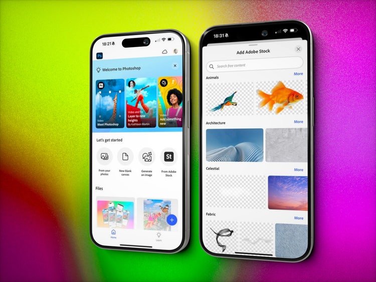
Once all the major editing features came together in the new experience, we were able to start using the app. As testing progressed, we knew we’d need onboarding and tutorial content. In an app as deep as Photoshop there was no way the UX alone could teach people what they would need to know—especially for a first launch where the Photoshop community hadn’t yet started creating learn content. Amanda Dowd’s team added in first-run nudges and designed and built tutorials. Furthermore, Shanti Sparrow, a visual content designer on Amanda’s team, helped us organize and integrate the free Adobe Stock catalog in an extremely elegant and unique-to-Photoshop way that celebrates the exploration of blending and layering.
Finally, marketing essentially owns the pre-first-launch user experience—what users hear about the product sets their expectations for what happens when they open the app for the first time—so having product marketing manager, Gauri Pendse there from the beginning led to what I feel was an unprecedented alignment in messaging. The combination of expertise we had on the team led to what I feel was the most successful culmination of early alignment across all disciplines—and enabled us to move quickly and independently.
What was the biggest design hurdle?
Bradee: Balancing first launch success with the need for a learnable, predictable UX—that we knew we’d need for deep open-ended creative play. Before landing on select-and-do, we tried an approach where the entire toolbar, the layers panel, and tool options were all open on the tiny screen. It tested very poorly for new to Photoshop users. Select-and-do was our answer to how to pour the ocean of Photoshop into five Dixie cups and still have Photoshop on iPhone be the place where creatives hang out and play when they have 20 minutes of down time.
The professional creative vocabulary that Photoshop defined 35 years ago is required learning for creative careers, but we needed new users to feel inspired, not intimidated, and to have early success. When concepts like masking, adjustment layers, clipping, and blend modes are new to someone, how might we introduce them in ways that feel natural, and also help new users learn what they mean? That was the driving force behind select-and-do.

The design framework nestles these new concepts inside of the select-and-do flow so potentially new powerful concepts sit alongside more familiar actions. Someone who starts with a selection (thanks in part to onboarding) sees “Fill area” and “Delete area” and in between those two familiar choices is the curious “Mask area.” Our hope is that users will intuit that this is an interesting action and give it a try—thereby learning by experimentation. So far testing and beta usage is revealing quicker understanding of what mask means. And that’s huge!
How did the solution improve the in-product experience?
Bradee: Now anyone, anywhere, with an iPhone will be able to create a PSD, with hundreds of layers, using all the main concepts in Photoshop (blending, masking, painting, clipping). Nothing beats hearing or seeing the delight of a new Photoshop on iPhone user when they learn something new—then watching as they reapply that knowledge in new and creative ways.
We had an internal Slack channel called “made-with-psphone" long before the public saw the application. Our design program manager Ciara Kosai (who also happens to be a young creative) was one of the first to post there. Seeing what and how she used the application, in ways we never could have predicted, was one of the early signals that we were on the right track.
Similarly, experience designer Alex Rojo, and visual content designer Gabriela Iancu-Mihai started making videos of the time they spent in the application so we could see how the approach worked for those who weren’t involved in designing the UX. Again, their creations were totally unique and created in totally unique ways. This is exactly what we wanted to see happen in the wild. This is Photoshop, and every creator can have a unique process to share. (New users can watch Gabriela and Alex’s creation process in the app’s Learn tab!) We’re really hoping that more and more creative people fall in love with the joy of creating and learning and that it ultimately leads to more creative career seekers.
What did you learn from this design process?
Bradee: So many things. Among them:
- Constraints are wonderful. We all know this but setting up the constraints you know you need up front helps things move faster and more smoothly. We did this with challenge users, challenge flows, and design hypotheses. Make sure your entire team is all aligned on those before you start drawing or designing anything.
- It’s possible to balance the needs of a first-run experience and the depth needed for pro software by leveraging onboarding and creating a scalable learnable system.
- Teaching stakeholders about your complicated pro product is imperative. It’s also fun for everyone involved. Seeing executive stakeholders make incredible creations using Photoshop on iPhone wasn’t only rewarding, it helped build internal empathy for the product user experience.
- An ultra-small team of the right motivated people, aligned around an agreed upon success state, can quickly move mountains.
What’s next?
Bradee: Photoshop on Android is launching later this year with the help of new additions to the design team, Arumani Muthu J M, and Prateek Verma. That’s a huge deal, considering that most of the world uses Android devices. Regarding the design system, Johannes Eckert, staff designer Olivia Haroldon, and design manager Alyssa Wood, are going to be very busy in the coming months leading the future of that project.
For Photoshop on iPhone, this is just the beginning. As with any 1.0 we hope the framework we’ve designed will scale as it evolves and grows. The team has plans for refinements they want to make and plans for where future features will settle in. But what I personally want to see is a new generation of creatives learning and creating with Photoshop now that it's in their reach. I hope they teach each other (and me) new ways of making.
Ultimately, I can’t wait to see what deep foundational concepts new creators learn in Photoshop that enable them to create. I hope to be in my rocking chair, having long since retired, talking to a 25-year-old creative professional telling me how Photoshop on iPhone sparked their curiosity and started them on their creative journey.