Behind the design: Adobe’s new splash screens
A dive into the redesign of the dynamic introductions to our desktop apps

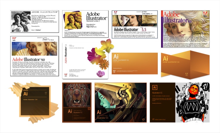
These splash screens have evolved alongside the company. After Adobe Design ushered in a sweeping update to Spectrum, our design system that extends across all our tools and experiences, Alex Fernald and Gleren Meneghin, staff designers on the Brand team refreshed these iconic introductions to our desktop software. Guided by Spectrum, the modern, cohesive design reflects the Adobe brand while it fosters a sense of creativity and community.
What was the primary goal when you set out to update the splash screens?
Alex Fernald and Gleren Meneghin: Splash screens are an opportunity to provide a brand experience as the application loads. The main intent is to delight and inspire customers, but they also showcase and promote the artists who use our products. Adobe’s had many versions of them over the years and our goal was to craft a design that was a nod to the splash screens of the past, while preserving the creativity and community they’ve provided in more recent years.

What user insights did you leverage to help inform your design solution?
Alex and Gleren: Historically, we’ve had great feedback from users who’ve said they appreciate seeing commissioned artwork in the apps (it’s why we wanted to put even more focus on the artist and art), so our design focus was creating a proper container for it. We sent a survey to the product teams asking the product managers and engineers for feedback that addressed the loading process, implementation challenges, and any other areas that need improvement. That survey uncovered a common concern across teams: ensuring that our design solution didn’t delay launch time.
What was the most unique aspect of the design process?
Alex and Gleren: Highlighting an artist’s work felt particularly important because of what these splash screens mean to the creative community. We wanted to further strengthen that connection between users, their work, and the Adobe tools that empower them. Artists from various disciplines are commissioned by our Studio team to create artwork that showcases their creative skills—and the power of Adobe’s creative tools. To put more emphasis on what artists create, we expanded the size of the art (back to the 2019 specifications), gave the artist’s name more prominent placement, and shared where people could learn more.

What was the biggest design hurdle?
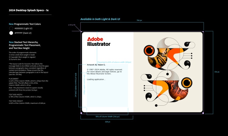
Alex and Gleren: Maintaining the right balance between artwork, artist credits, and programmatic copy (copyright information that introduces the software version and the names of the people who worked on it). In earlier versions of the splash screens, the artist’s name was nested within the programmatic text in the same size and color. Also, since our product engineers would have to implement these new splash screens programmatically, we needed to communicate the new specifications in the most straightforward way possible. We worked with the design engineering team to create a prototype of the launch sequence and splash screens. To be able to experience the guidelines, outlined in our design drawings, in a working prototype was immensely helpful.
How did the solution change the in-product experience?
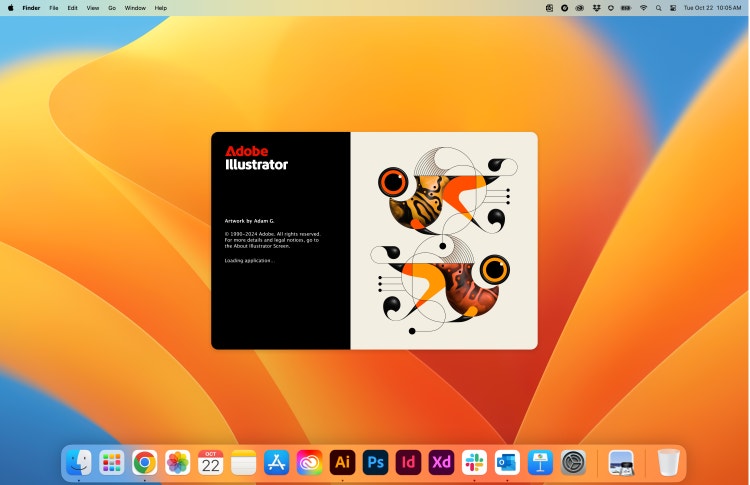
Alex and Gleren: The redesign incorporated existing elements, made them more modern, and returned the Adobe name and brand to a place of prominence alongside the work of a creative professional who used the product to make it. To tie back to some of Adobe’s original splash screens and put focus back on the Adobe brand, we replaced the app mnemonics with the Adobe wordmark in its signature red, and used black for the product name. Since the mnemonics are still a strong presence on the desktop, in the file types, and in the product itself, we used this space to emphasize the artist, the art… and Adobe.

By making the artwork significantly larger and flush with the frame we created a more immersive experience. To give even more pronounced recognition to the creators of the art, the new design puts much-needed space between the artist’s name and the programmatic copy and the artist’s name now appears prominently in bold type—before the remaining copy. And, as part of Spectrum 2, the update to Adobe’s design system, we also adjusted the corner radiuses, refreshed the color palette, and introduced light and dark background options.
What did you learn from this design process?
Alex and Gleren: The importance of collaboration. We worked with multiple teams across Adobe, and it showed us how much better our solutions can be when we combine our strengths. One of the things that a lot of people outside of Adobe don’t understand is the pride of ownership each of us feel toward our products. We felt a responsibility to make sure the redesign addressed the needs of these multiple teams without sacrificing the customer experience, our design approach, or each product’s unique identity. It took a lot of flexibility and attention to detail, but it reinforced the importance of collaboration.
What’s next?
Alex and Gleren: The new splash screens debuted just ahead of Adobe MAX 2024 and are now in our Creative Cloud and Substance 3D products. As Adobe’s brand continues to evolve, so will the experiences we provide through these touchpoints: Splash screens will continue to be an essential part of the user experience, a showcase of new artwork, a connection to the creative community, and a reflection of Adobe’s ongoing evolution.

A special thank you to the Adobe Design Brand team, including Shawn Cheris, Sonja Hernandez, Doroteea Ionascu Ispas, Ray McDonnell-Horita, and the individual product teams—Creative Cloud program managers, Behance, Spectrum, and Studio—for their invaluable collaboration throughout this process.