Behind the design: Simplifying animation in Adobe Express
From formidable to fun, a look at the design of our animation tools for a new generation of animators

When setting out to design the animation features in Adobe Express, the primary goal was clear: Empower people who can visualize movement but feel unsure about how to make it happen.
For the past two years, experience designer Raghav Byala has focused on making animation simple and enjoyable for a new generation of creative professionals—so they could feel excited about it rather than intimidated. As a designer for the animation workstream in Express, he explains how he worked toward addressing the question: “How can we simplify animation tools enough for non-pros and next-generation creatives, so they feel empowered when using them?”
What was the primary goal when you set out to design the animation features in Adobe Express?
Raghav Byala: Traditionally, animating in Adobe's professional tools—Adobe After Effects, Adobe Animate, or Adobe Premiere Pro—requires a lot of technical knowledge, so they can be quite challenging to learn.
Since tools shouldn’t stand in the way of creativity, we set out to make it easy for non-creative professionals and next-generation creatives to animate—even when they don’t have the technical skills to bring their ideas to life. The goal was to design an animation tool for Express that would help them turn their vision into reality, while also being quick, fun, and easy to use so they’ll be confident enough to use it again and again.
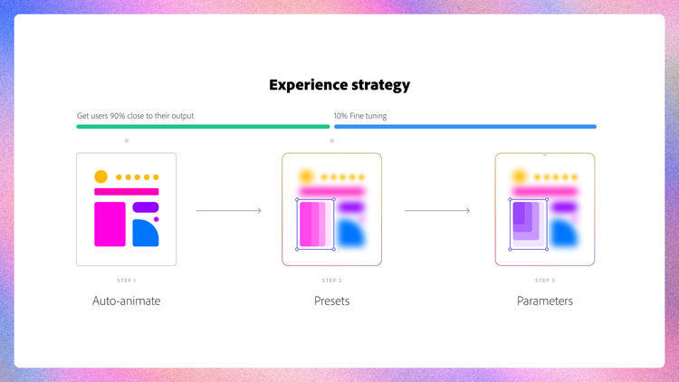
Our design goals depended on two questions: How do we make things simple? And, how do we give everyone the right amount of control? With the understanding that one of the biggest hurdles for users was figuring out how to animate, we knew that answering these questions would help people get closer to their animation goals.
What user insights did you leverage to help inform your design solution?
Raghav: Adobe Design’s Research & Strategy (ADRS) team discovered that users find animation intriguing. They’re eager to use it to differentiate their content and stand out on social media. Researcher Heather Loyd put it this way, "They use animation to add pizzazz and make their content pop, and they think adding it helps highlight their company’s personality." The problem was, they didn't know how to achieve the level of sophistication they wanted and worried that poorly executed animations might clash with their brand.
We also noticed that many users were becoming frustrated and dropping off before even selecting an animation due to the many clicks required across the layers of panels in our experience. But, although they wanted more simplicity in the tool, they also wanted to have some control over specific elements (like choosing the length of an animation, the direction from which something appears, or managing movement for words, lines, or characters). People also wanted presets to have specific functionalities, like being able to start animations from outside the canvas or being able to remove the built-in fade effect.
We jumped into simplifying the complexity of the animation process by considering how we could eliminate some of the repetitive trial and error it takes to get animations right, and the need to understand things like keyframing objects (controlling the start and end points of motion).
We began by thinking about the essential building blocks of animation and working toward gradually adding functionalities that would make the architecture clear, enable users to scan everything as quickly as possible, and to make animating as easy as a single click. Since we didn’t want to forget the people who enjoy getting into the nitty-gritty details, we also had to ensure that users would have single-click access to animation presets (scale and movement), and the properties for them (duration and speed), and that they would work well when people used them.
What was the most unique aspect of the design process?
Raghav: One of the most interesting parts of our process was testing and iteration. Understanding user needs can be a challenge, especially when it comes to animation. While the needs of the broader non-professional and next-generation audiences often lead us toward simpler design, as we shift our focus to include people in enterprise settings, who also are new to animation, it adds an entirely new level of complexity. It makes striking a balance between simplicity and control an adventure.
To create an experience like this, while also thinking ahead for scale, we often pondered the big question, "How much control is enough?," so we could avoid making things so complex that users would again find animating a struggle. Finding the right level of control involved creating prototypes and going through several design iterations. With the support of Adobe Design’s wonderful Prototyping team (George Stan, Lacra Ene, and Mihai-Catalin Botezatu) and ADRS we investigated the more detailed aspects of the experience, carefully analyzed user reactions, explored our options, then promptly integrated user feedback to fine tune the experience.
Testing helped us understand the specific cases where people wanted to use animations, so we could determine which functions were essential, and which are merely “good to have.” By backing our decisions through research, and extensive user feedback, we were able to minimize steep learning curves by focusing on functionality that met the needs of 95% of our users. Anything beyond that opened the door to complexity (If users could use another Adobe app for deeper edits, Express didn’t need the functionality). This method allowed us to balance control and simplicity, prioritize what was crucial for an MVP release, and determine what could be added later.
Additionally, it was invaluable to have Christina Cox and Romero Alves from the Content Design team focusing on animation presets—what parts of the animation users could control and how the presets would function, as well as envisioning presets for the future. They ensured that every preset produced high-quality animation results, that foundational presets aligned with essential user needs, and that they would set us up for success in every preset we developed moving forward. The reason our defaults need very few tweaks today is due to the significant effort put into refining them through rigorous testing. They also laid the groundwork for the set of Animate All presets we’d create and how they would function by thoroughly testing the performance of that feature to ensure that the Animate All presets we have today deliver fantastic, well-coordinated results, no matter the artwork or use case.
Finally, this work has entailed collaborating with partner design teams while designing for the very special use case of animation. In a product like Express, it’s important to adhere to the framework that keeps it consistent and easy to use, but that was difficult with animation because of all the functionality that was possible. In some cases, the animation workflows we designed toyed with breaking the framework we were working within:
- It's always a challenge to maintain the simplicity of an information architecture while continuously introducing new features. Every time we roll out a new functionality, discoverability becomes a significant focus. But, when everything is immediately discoverable it can feel overwhelming. Finding the right balance keeps panels simple and aligned with the rest of the features in Express.
- One of our most exciting features is enabling people to use three types of animations for a single object. This unique capability sets us apart, but it can feel very different from the usual experience of applying just one—which users are already familiar with. As a design team, we often brainstorm how to effectively communicate this feature to our users, clarify how a trio of animations can work in harmony, and inspire people to explore it.
What was the biggest design hurdle?
Raghav: One of the biggest challenges we faced was deciding when to wrap up the “discovery phase.” Animations are incredibly exciting, and the possibilities are boundless—every new feature can unlock an array of use cases. While diving into every option is a lot of fun, it’s important to be mindful of time and the complexity of the user experience—the last thing we wanted to do was to make animation feel overwhelming.
Simplifying experiences also involves building strong relationships with partner stakeholders and gently encouraging them to embrace a design vision of simplicity that will change users' mental models and help them overcome biases. While it can be challenging, user feedback is a great ally and guide.
How did the solution improve Express’s in-product animation experience?
Raghav: Some highlights of the work we did:
Redesigning the information architecture. We realized that our original experience, which required three clicks at different levels, made it a tricky for users to apply animations. To make things easier and more engaging, and to promote experimentation, we redesigned the interface to showcase all animation presets up front, so people could see their options from the start.
We designed carefully, not stopping until we removed everything unnecessary and eliminated all clutter from the user interface by organizing presets into neat categories and reducing the number of panels users had to navigate through to apply an animation. Primary functionality was consolidated on one screen while additional functionality was pushed into a handy pop-over menu, that included preset properties, so it wouldn’t complicate the first-mile experience.
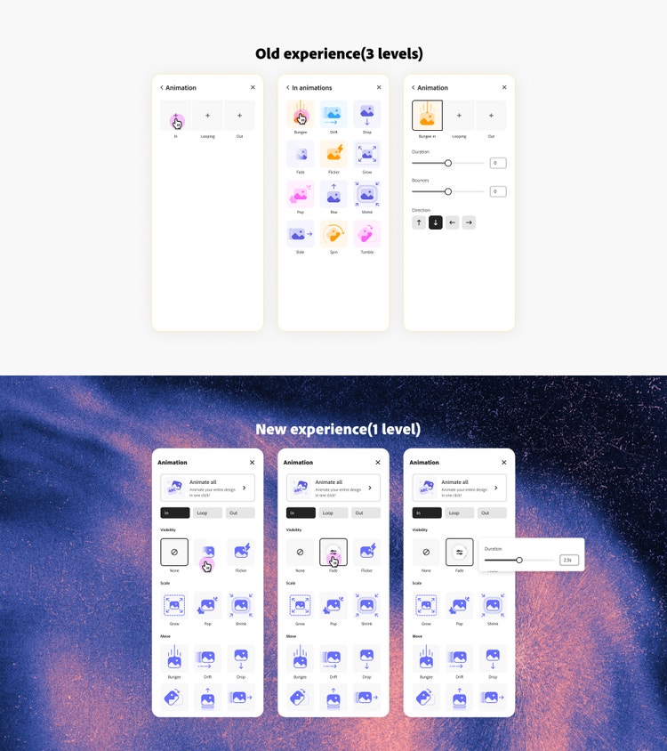
More controls were in a deeper level with the intention that only those who needed them would look for them. This meant users could achieve a balance between control and ease by relying on smart defaults and intuitive behaviors, and get everything right with minimal clicks. Next, we collaborated with our Brand team to simplify the animation thumbnails and their colors so they would be more cohesive and less distracting. All these changes not only enhanced user experience but also made applying animations easier and more intuitive (our efforts led to a remarkable 25% reduction in drop-offs).
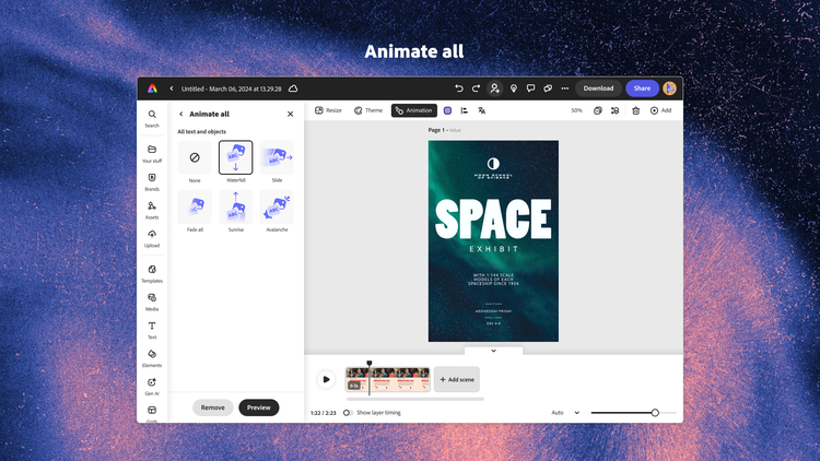
One-click animate all. Even after we had all the foundational elements for animation in place, we noticed that many users still weren't taking full advantage of them. So, with our Content Design team, we made applying animations easier for everyone by enabling users to animate their entire artwork with just one click. Users can just click a button to see all the objects in their artwork animate in a cohesive, choreographed way. If the animation doesn’t quite match their vision, they can easily explore other one-click animation options until they discover just the right fit. This feature not only enhances creativity but also saves users a great deal of time. The effort was worthwhile because we saw a noticeable increase in animation usage.
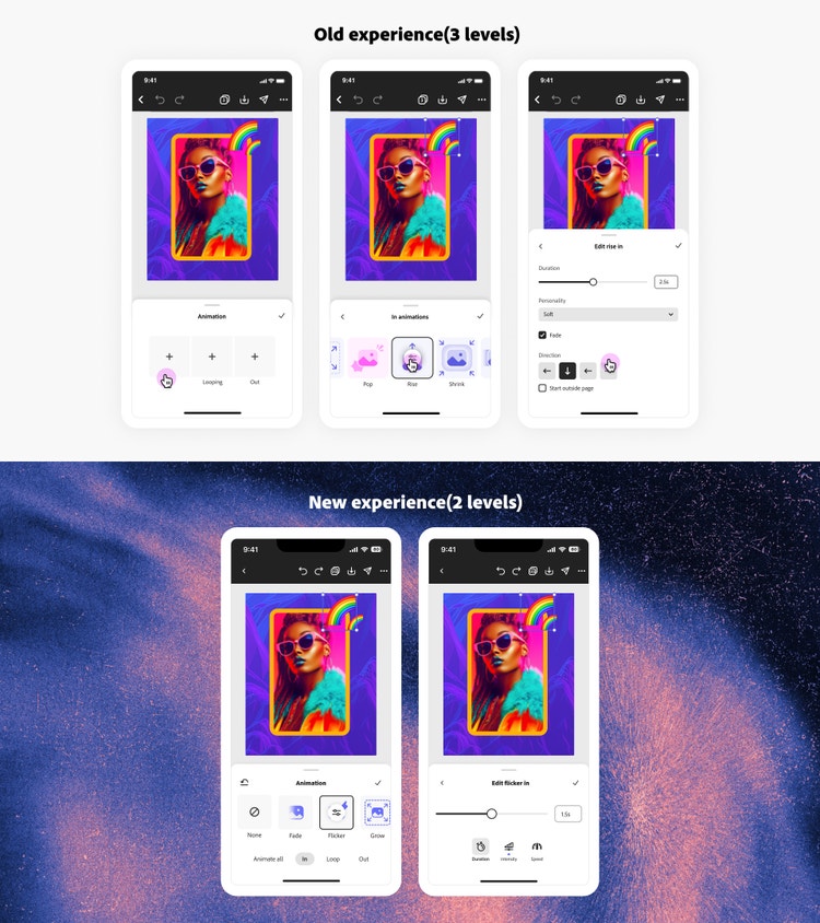
Animation on mobile. We’ve also made some exciting enhancements to our existing features on mobile. With the introduction of animations and transitions on mobile devices, along with new presets like the typewriter effect and unique filter-based presets, our talented motion design team outdid themselves. These powerful additions let users easily differentiate their content on mobile in just a few clicks. Instead of creating multiple levels and long scrolls, we merged everything into two views: one for preset browsing and the other for preset editing. We also added basic expected behaviors, like remembering the user's scroll position—a fundamental approach to reducing the time it takes to complete tasks.
What did you learn from this design process?
Raghav: That curiosity and resilience inspire us to discover the best solutions. Often, when we’re designing or trying to understand challenges, we might not see the solution right away. However, by embracing curiosity and staying resilient in our efforts to solve these problems, we can eventually find the light at the end of the tunnel. Exploring the question, “What if?” always leads us to think that we can enable an abundance of exciting and unique use cases for animation workflows with each feature we add.
I learned that approaching the design phase with so much possibility provided a fantastic opportunity for our team to share insights, gain a better understanding about how to tackle ideas, and to prioritize feature development. I also rediscovered the value of user research. Not only does it bring together different perspectives, but it can really be a helpful way to align diverse opinions and steer through uncertainty.
What’s next for animation in Express?
Raghav: This year, our efforts have truly delivered great value to animation enthusiasts. With these updates, we've seen a 54% increase in usage, a 90% rise in returning users, and nearly a 50% boost in exports throughout the year!
Now that we've built and refined a robust base of behaviors, we’re focusing on applying this simplified approach to the future. As more users join us and share feedback, we’ll prioritize scalable solutions while carefully balancing the unique charm of our product by always asking “Why?” before introducing any new UI or features. Our goal will continue to be enabling intelligent features while minimizing UI complexity so we can continue to wipe out any lingering intimidation about animating.
A special thanks to Abhishek Majumder, Anusha Shankar, Christina Cox, Eric Crissman, Hilary Nemer, Kath Nash, Nicole Lam, Romero Alves without whom building this product would not have been possible.