Turning insights into impact: How growth design and research partnerships drive real results
Best practices for forging a give-and-take relationship that benefits users

Illustration by Marina Muun
For us, that collaboration is the partnership between growth design and user research. When these disciplines work together early and often, they don’t just improve features—they unlock new ways to engage users, solve real problems, and drive meaningful outcomes.
One such partnership led to a feature that significantly boosted understanding of the creative potential of Adobe Express. It also helped define a set of best practices for insights-driven design collaboration.
Understanding growth design
Growth design is a relatively new design discipline that’s a blend of design thinking, experimentation, and data—all aimed at making meaningful changes to in-product experiences. It's agile. It uses data to guide decisions, then rapidly iterates designs based on real-world feedback.
The approach means growth designers are constantly running experiments, like A/B tests, to figure out what works and what doesn’t. The goal is to move fast, fail fast, and keep evolving until the perfect formula that drives usage is uncovered. It’s exciting because it requires staying ahead, adjusting quickly to changes, and always keeping users at the center. If something doesn’t work, we make a tweak and move forward.
Growth designers work alongside product, research, and data teams to build experiences that not only look good, but help bring in new users and encourage them to stick around.
The role of user research
Experience researchers help teams uncover user needs by exploring users’ motivations, behaviors, and mental models (their internal understanding of how software should work). These insights are essential for designing intuitive and effective experiences.
UX research typically involves two complementary approaches:
- Qualitative methods (interviews, observational studies, usability testing) explore the “why” behind user behavior. They help uncover pain points, expectations, and how users think about and interact with a product with questions like, “What barriers do you face when using this product?”
- Quantitative methods (surveys) gather data from a broad audience to answer questions about how different groups compare, like “What percentage of users come to the product for personal vs. work-related needs?” These methods are ideal for identifying trends, measuring attitudes, and validating patterns seen in qualitative research.
Qualitative and quantitative research are critical prior to the design process and during it:
- Foundational research uncovers barriers to product adoption, like what might be preventing users from achieving their goals, what problems they’re experiencing, and what their mental models are for functionality. This foundational understanding helps us understand any problems users are facing, what needs they have, and what problems must be solved during the design process. Without it, the design exploration process may completely miss the mark regarding user needs and concerns.
- Design iteration research may be necessary to understand whether proposed solutions align with user needs and to uncover barriers users face. It’s used to see how people interact with a design to determine whether it’s clear and easy to understand. Depending on the complexity of the experience, this phase may involve testing concepts or interactive prototypes to see real user interactions with them.
Commonly Built Together (CBT): A growth design case study
Our partnership with research began when we started exploring opportunities to deepen user engagement in Adobe Express. Foundational research revealed that many users, unaware of its broader creative potential, saw Express as a one-and-done tool. We felt we could increase awareness and spark creative output by showing people what was possible.
Research and a hypothesis
To test this idea, researchers conducted interviews with new users that ranged from creative professionals to practical communicators. These sessions uncovered several key insights:
- There were key moments in the user journey where timely, relevant recommendations could most inspire continued exploration and creation
- People were more likely to act when the call to action was clear and purposeful (and not seen only as informational)
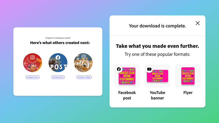
- People responded more positively to personalized previews of their own content than to generic icons
We hypothesized that a well-timed recommendation, delivered immediately after someone exported their first project, could encourage continued exploration and creation. Our goal was to create an experience to surface the breadth of Express content types when users were most open to inspiration: post-download.
An experiment and more testing
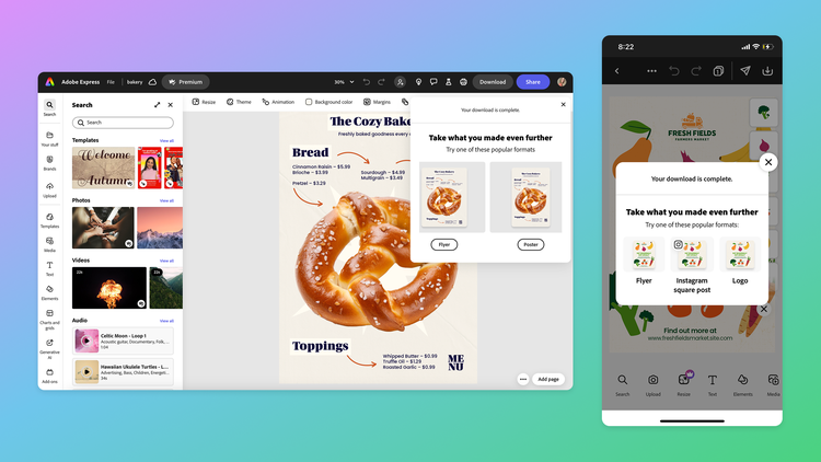
One of our first tests was a modal that suggested a “next project” to users immediately after they’d exported their first. Called Commonly Built Together (CBT), the concept was rooted in data suggesting that project recommendations, particularly after an export, could successfully reignite a creative spark. Analysis proved the experiment a success. The data showed that a well-timed and relevant recommendation could increase how many people started and exported new projects.
The design response
As we began working on the design, we faced a range of decisions across the UX flow, UI elements, motion, and copy. To ensure our decisions aligned with user expectations we partnered with research again to test our concepts:


The CBT modal was tested with a limited user group in early 2024 and the results were compelling: People who saw it were more likely to start and export more projects.
Best practices for integrating research and design
Integrating research and growth design isn’t just helpful, it's essential. When designers work closely with researchers, it creates a feedback loop that can refine ideas, test assumptions, and ultimately deliver better products and more user-centered experiences. Some practical steps can make the most of these partnerships.
Foster early and ongoing collaboration
- Integrate research early. Insights uncovered through foundational research help ensure problems are fully understood. Foundational interviews revealed that Express users were using it as a one-and-done tool. Those insights helped the team explore how to best surface more project possibilities.
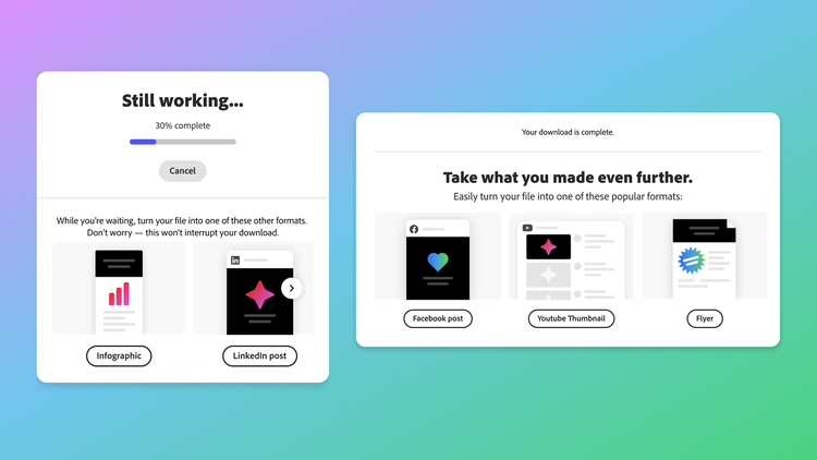
- Collaborate continuously. Designers and researchers should work together throughout the process—not just at the start—to refine the experience. As the modal design evolved, researchers tested different layouts with users, which eventually led to a split layout so users would understand their download wouldn’t be interrupted.
Create a culture of continuous feedback and iteration
- Test early and often: Early testing can uncover issues that lead to quick fixes and better user experience. For us, this early testing revealed that users hesitated to click on recommendations during downloads which led to our design decision to visually separate download progress from project suggestions.
- Incorporate feedback. Use what you learn from research to tweak user flows based on real-time insights. When research revealed that users were more likely to act with task-oriented messaging, we worked with content strategists to refine the language in the modal so it created an inviting call to action.
Align priorities between teams
- Have open conversations: Aligning early on key goals is essential. Our quick agreement on the goal of increasing project creation helped us prioritize features that encouraged continued exploration.
- Include cross-functional syncs: Regular check-ins with design, research, product, and engineering ensured everyone was on the same page. With support, the team had what they needed to test and iterate efficiently, even when technical constraints cropped up.
Turn research insights into meaningful design changes
- Create user-centered solutions: Through continuous research and iteration, CBT developed into a personalized experience that resonated with users. By offering timely project recommendations based on user behavior, the design team met users where they were—turning a potential drop-off point into a moment of re-engagement.
- Leverage research insights: Key research insights from qualitative methods (such as user interviews) were crucial in shaping the CBT experience design. When interviews showed that users were more likely to act on personalized content we swapped out generic illustrations with user content—a change that made the experience feel more personal and actionable.
As growth design continues to evolve, its partnership with research will be more essential than ever. Together, they build features and momentum. And when that momentum is rooted in user understanding, the results speak for themselves. The success of Commonly Built Together is a testament to what’s possible when research and design move synchronously. By grounding design decisions in real user insights, and validating them through rapid iteration, teams can create experiences that not only meet user needs but exceed their expectations.