Introducing Spectrum 2: Our vision for the future of Adobe experience design
A preview of the comprehensive update coming to Adobe's design system
Factors like the ground composition, the surrounding landscape, weather, materials, physics, and budget would require your team to adjust their plans. More rounds of adjustments would follow. In the end, the completed structure—the implementation of your collective design—will continue to be informed over time by real-world constraints, requiring repairs and modifications.
Eventually that first drawing will seem like a distant memory.
The same is true for designing software. But because drawings of digital products are shown on the same surface as the products they represent (and at equal fidelity, if not better), the gap between them can seem much narrower than it really is. All the same constraints and compromises involved in designing a house apply—as does the need for collaboration across disciplines.
Now, imagine you’re building not just one product, but many. And instead of dozens of collaborators, there are thousands or even tens of thousands. Without a unifying set of principles, components, and patterns, you could end up with duplicated work and a fragmented user experience. Even if you somehow managed to build a good and cohesive experience, any future update (and there will be updates) would require a tremendous (and costly) amount of planning and coordination.
Which brings me to design systems. Design systems provide the fundamental vision upon which those very principles, components, and patterns are built. Those building blocks are used by designers and engineers to craft consistent experiences at scale. They bridge the gap between pictures and implementations, create a common language between disciplines, and provide a pathway for synchronized future updates across multiple surfaces and frameworks.
Over the past few years, Adobe Design undertook a comprehensive update of Spectrum, our own design system. That project would eventually become Spectrum 2, a comprehensive update to the core building blocks of Adobe experiences, and a roadmap for the years (and changes) to come.
Where Spectrum began and why we’re updating it now
Spectrum, Adobe’s design system, was introduced over ten years ago. Much has changed since we first implemented it across our products and experiences. In 2013, the term “design systems” wasn’t yet being used to describe the unified user interfaces behind software. Google hadn’t yet shipped its Material Design system. Apple was still heavily invested in skeuomorphism. Digital experiences had nowhere near the polish that we see today.
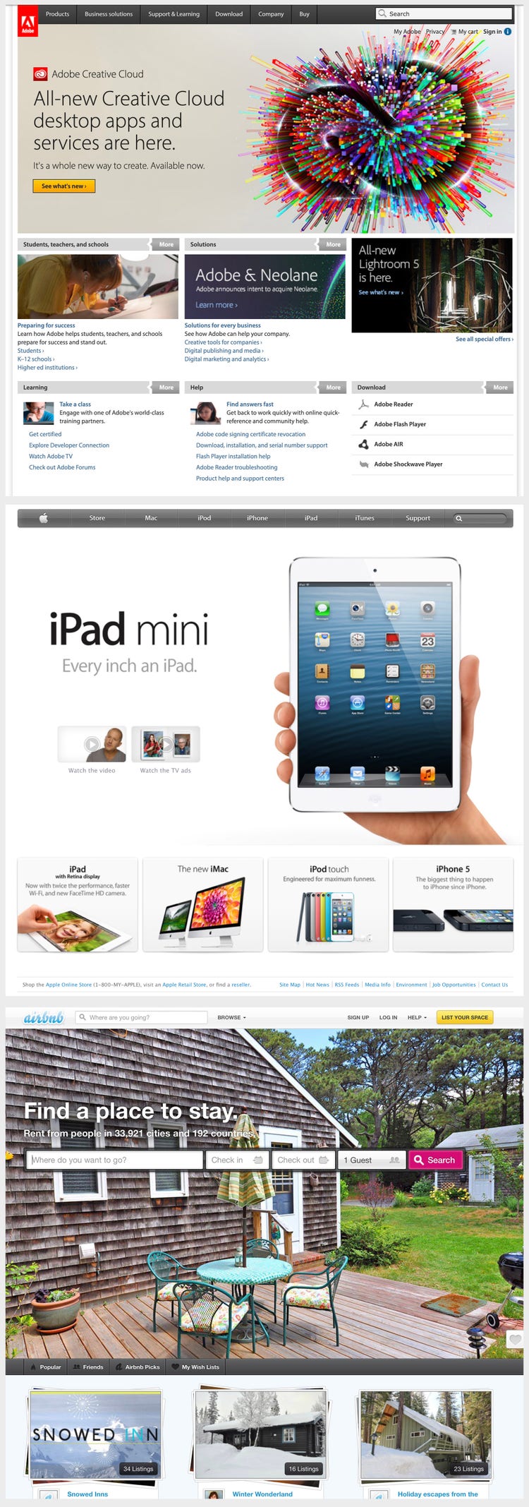
Meanwhile, a small team at Adobe had started to think about the future of our products. What if we could create some sort of language that could unify our product portfolio? That portfolio had just gone through some fundamental changes, the most significant of which was the shift from Creative Suite to Creative Cloud. Mobile devices were becoming powerful enough to support our products and building our tools on the web finally felt realistic. What would that future look like? It took years of hard work, collaboration, and perseverance by thousands of people, but Spectrum eventually made its way across our product line. Over the past decade, we’ve grown, we’ve iterated, and we’ve learned. A lot.
In the intervening years, visual trends have come and gone, design systems have grown from a niche emergent practice to a bedrock of product design, and the level of quality that users expect from digital experiences is higher than ever.
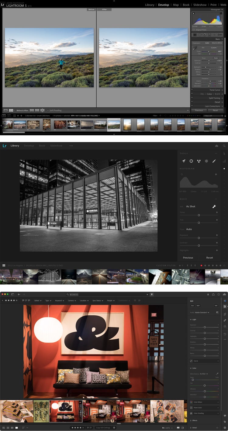
Things are different at Adobe, too. Creative Cloud has added new tools and shows up on a wider variety of platforms and surfaces, enterprise marketing products under the Experience Cloud umbrella have been introduced and expanded, Document Cloud has also grown and modernized Acrobat, and Adobe introduced Adobe Express. Some people spend entire days in our tools, while others use them sporadically for professional or personal projects. We’re serving a much broader audience than we were a decade ago. Adobe had evolved and our design system needed to as well.
In late 2021, we began plotting the future of Spectrum. This was no small task: Adobe’s product portfolio now spans more than 100 unique applications in dozens of languages, available on every major platform (web, desktop, mobile, and even mixed reality), implemented across a wide mix of engineering frameworks. It’s a huge, complex ecosystem and making sweeping changes would take years of work—but we were excited and more than up for the challenge.
Setting the vision for Spectrum 2
We gathered over 100 Adobe team members for brainstorming sessions. The participants included people with strong opinions and skills from every corner of design: designers, content strategists, engineers, prototypers, researchers, accessibility experts, and members of our Product Equity team.
After the first sessions, we broke into smaller teams to think deeply about specific subjects like iconography, typography, color, brand, illustration, accessibility, product equity, personalization, data visualization, and every other component we wanted to see represented in the future of Spectrum. When the teams presented their findings, we saw common ideas about what Spectrum 2 should accomplish:
- Every experience should “feel at home,” no matter where “home” is.
- Every experience should be accessible and inclusive.
- Every experience should be not only be functional, but joyful too.
With our vision defined, we were ready to begin building the next phase of Spectrum.
Feeling at home
Because Adobe has products that span platforms (including macOS, Windows, iOS, Android, and web), we’ve had to think a lot about the right balance between cross-platform consistency (where users can learn to use a tool on one platform, then transfer that knowledge to another) while also adhering to the conventions of each platform. When Spectrum was first designed, mobile platforms were evolving rapidly and the user experience from app to app varied wildly between operating systems, so we initially leaned into making Spectrum as consistent as we could across platforms. Today, every platform has strong conventions that we want to follow more closely, so Spectrum 2 needs to supply specific variants for each.
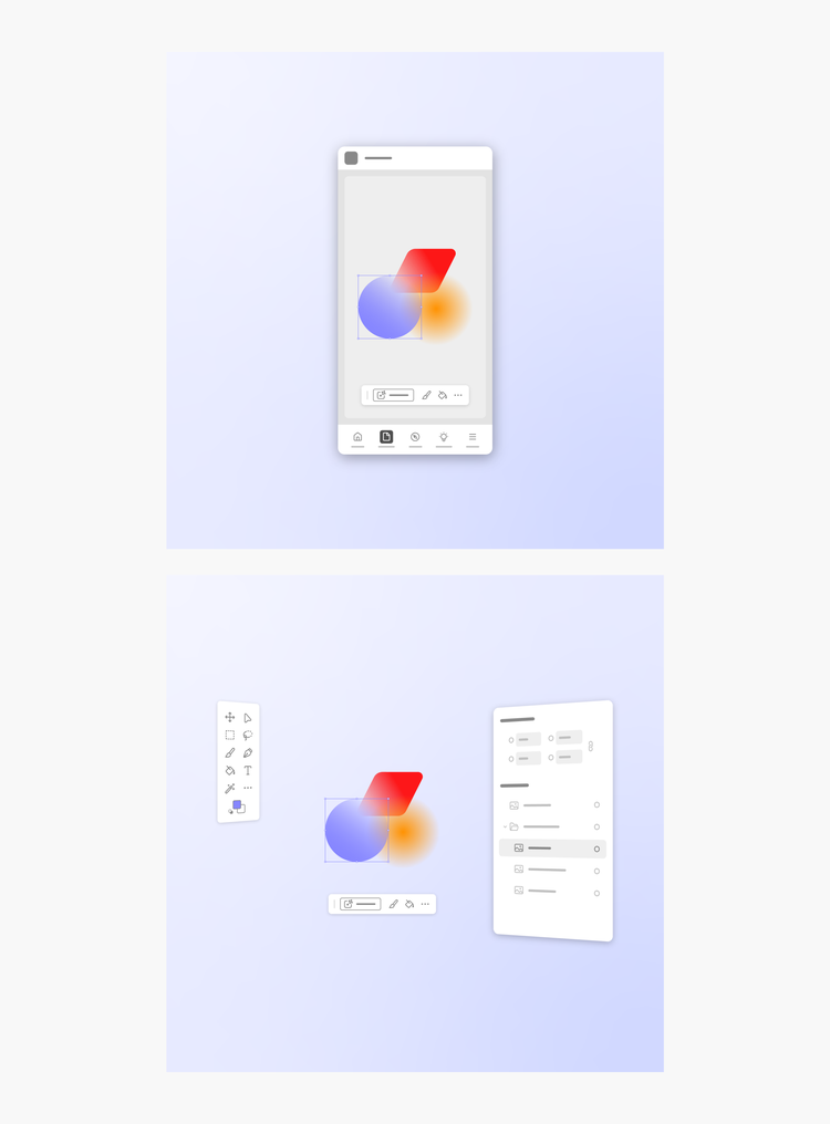
We further recognized that each Adobe product is unique, and we couldn’t approach Spectrum as a one-size-fits-all solution for Creative Cloud, Document Cloud, Experience Cloud, and Adobe Express. Instead, we wanted to enable the in-house experts in each product area to make decisions that would best suit their unique customer base. Spectrum 2 would flex and bend in a variety of ways to meet those needs, putting more power in the hands of the different groups of product designers tasked with implementing the system in the tools they oversee.
Inclusive and accessible
Spectrum 2 needed to meet a high bar for accessibility so the widest possible group of people can use Adobe tools. For web, the Web Content Accessibility Guidelines (WCAG) is the definitive starting place. Adobe has an entire team focused on this effort (we’re also contributors to the guidelines). Success in accessibility means many things: adequate contrast ratios of text and other controls and containers relative to their backgrounds, accessibility tags, keyboard controls, focus states, and other nuts-and-bolts execution details.
Meeting those fundamental accessibility requirements was a great first step, but we want to go further. Every person is different, and we want future Adobe products to flex and adapt to personal needs and preferences. Some of the areas we emphasized were:
- Dynamic contrast and brightness. Using adaptive palettes, we have the ability to generate accessible colors in real time and give users a choice about how they want their interface to look. Sometimes people work in a bright environment, sometimes in the dark. Sometimes people want maximum density and sometimes eyes are tired. Adobe interfaces should accommodate those needs.
- More accessible colors. We’ve spent a lot of time thinking about how to best support various color vision deficiencies and rationalized our color palettes accordingly. We’ve even overhauled the colors we use for data visualization, accounting for other factors such as “color name conflicts,” where two or more colors might be called the same thing (e.g. peach vs. orange vs. salmon). These challenges are multiplied when you consider the nuance of language.
- Attention hierarchy. To make experiences built in Spectrum 2 easier to parse we removed a lot of extraneous highlight color in common controls to reserve it for the most high-attention, high-action moments. We created separation between navigation and content zones and added depth and elevation. We used every tool at our disposal to create a more intentional hierarchy because when everything is important, nothing is important.
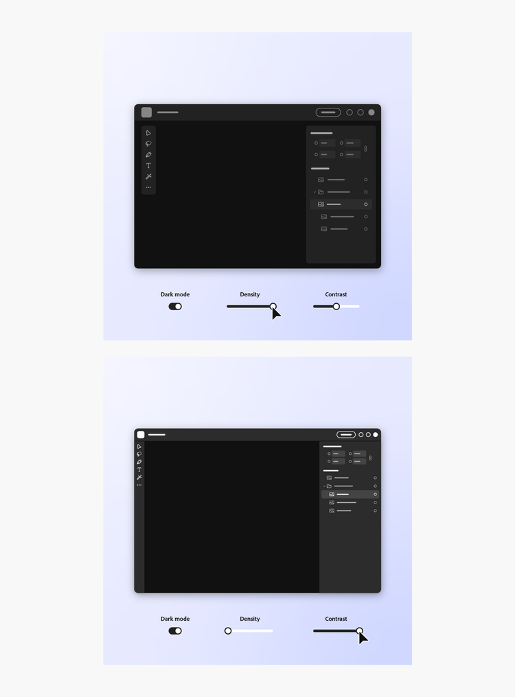
Our efforts dovetail with Adobe Design’s Product Equity practice, which further partners with design, product, and engineering teams to ensure that every person, regardless of human difference, can access and harness the full power of our products, without bias, harm, or limitation.
Functional and joyful
The first version of Spectrum was designed to be serious. Our logic was straightforward: Adobe makes professional tools that people use to do their jobs. Their creations and content should be the focus, we thought, so our early decisions (heavily inspired by industrial designer Dieter Rams) were meant to make Spectrum “as minimal as possible,” a line of thinking codified by Spectrum’s core principles.
Our gray system was designed to recede. Containers and icons were crisp, sharp, and felt very professional. While this approach worked in many contexts, it couldn’t readily support complex screens with multiple layers of hierarchy because the grays began to feel washed out and it could be challenging for people to figure out where to focus. And for people new to our applications, the brutalist approach was anything but welcoming.
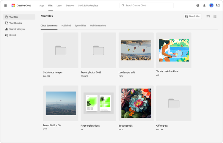
In 2019, we began working on what would become Adobe Express. We knew that Spectrum wouldn’t feel right in this new context (a creativity tool made for a broad, novice-and-professional audience) so in collaboration with the Express design team, we created a new UI theme. Spectrum for Adobe Express was lighter, bolder, and rounder. Icons and typography were more friendly, strokes were a bit thicker, colors were brighter, and in general, it was a lot more approachable. Under the hood it was still Spectrum, but multiple small changes made a big difference.
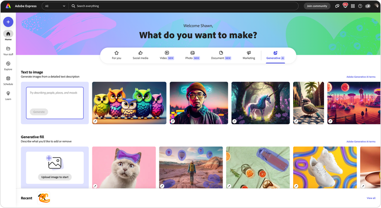
One of the main opportunities that surfaced during our Spectrum 2 brainstorms was that Adobe experiences could be more expressive and approachable (the work we’d done for Express had already pointed us in that direction). At the same time, we were putting more focus on cross-product workflows, which meant that we would need a unified visual language across all our products. It became clear that we should combine the foundational Spectrum design language with Spectrum for Adobe Express—which is how the Express theme became our starting point for Spectrum 2.
Reinventing Spectrum’s components
Building off our broad vision for Spectrum 2 and examining Spectrum for Adobe Express, we began to look at key components in the system:
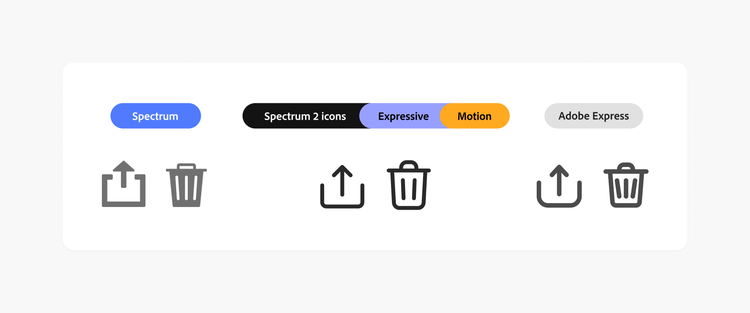
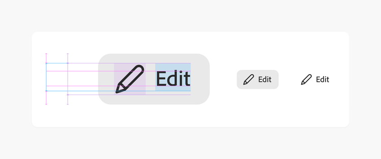
Icons. Our amazing Icons design team explored a wide range of ideas, settling on a style that balanced the sharp rationality of Spectrum's original icons with the thicker and more bubbly Adobe Express style. The strokes were adjusted to pair perfectly with Adobe Clean, our signature typeface.
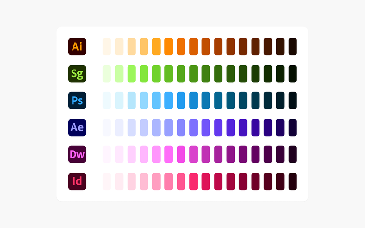
Color. We adjusted our gray system to provide more contrast and rebuilt our color system to use Adobe’s brand colors, laying the foundation for us to more organically integrate our brand into our product experiences.
Illustrations. Illustrations take many forms in Adobe experiences. They range from simple line work to more robust, full-color editorial styles with colors keyed to the brand color of the product they’re supporting.
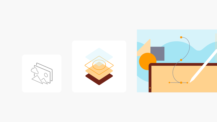
Shapes. The brand design team developed a new toolkit of geometric shapes that can be combined in infinite ways to create illustrations, banners, and other assets. Aligning Spectrum 2’s color system with brand colors makes it easier to harmonize interfaces across products.
When Spectrum 2 changes will show up in Adobe tools
The biggest difference between Spectrum and Spectrum 2 is, well, all the little things. We’ve made hundreds of adjustments to the system and when combined they’ll create a big and very noticeable shift for the people who use our tools. Adobe products will soon start feeling a little more fun, expressive, and approachable, and will better serve a much wider audience. Spectrum 2 will begin to appear in updates to some products later this year, with a larger rollout taking place in 2024.
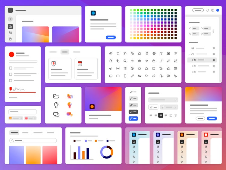
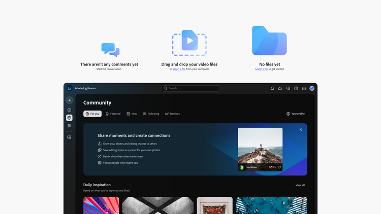
We don’t want to completely spoil the surprise but here are a few sneaks of what Spectrum 2 will look like on web, the platform we started with:
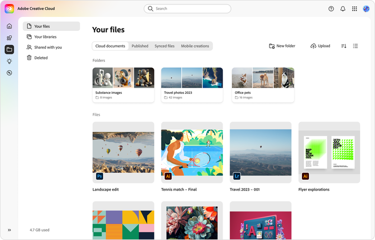
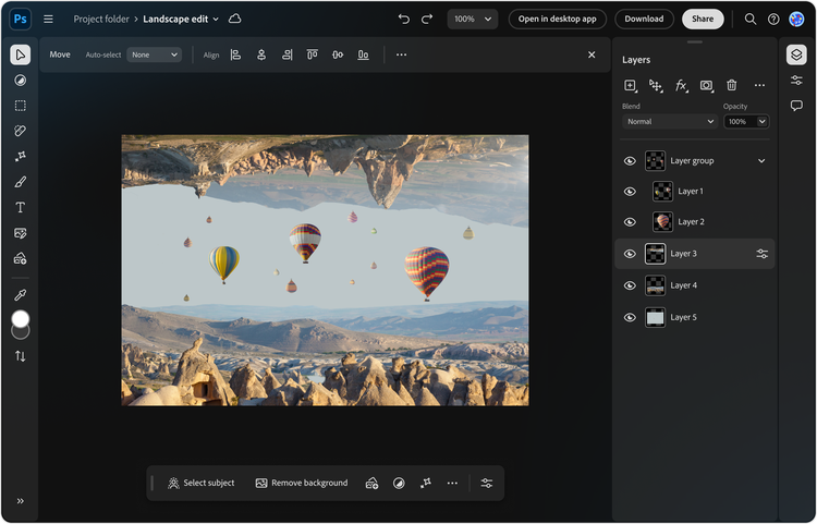
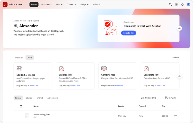
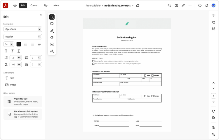
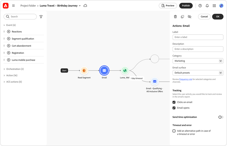
It's been a journey to bring Spectrum 2 from our original vision to reality, but we're only just getting started—like any design system, Spectrum is ever-changing. We’re currently hard at work developing the future direction of our desktop and mobile products, which will each get their own focused version of Spectrum. Visit the Spectrum 2 site for a closer look at the system and what’s to come.
Spectrum 2 was built by the community, and there are dozens of people who directly shaped it (and will continue to shape it), but I’d like to acknowledge the core team that's worked alongside me, driven this work with vision, persistence, and passion, and helped bring Spectrum 2 to life: Design: Lynn Hao, PJ Buddhari, Jess Sattell, Matt Knorr, Isabelle Hamlin, Lindsay Browne, Marco Mueller, and Alexis Gallisá. Engineering: Garth Braithwaite, and Patrick Fulton. Operations: Angelie Herreria-Tagle, Deanna Washington, and Veda Rosier.