Designing design systems: Constructing an icon system
A process for creating a unified brand experience through iconography

Graphic by Marco Mueller
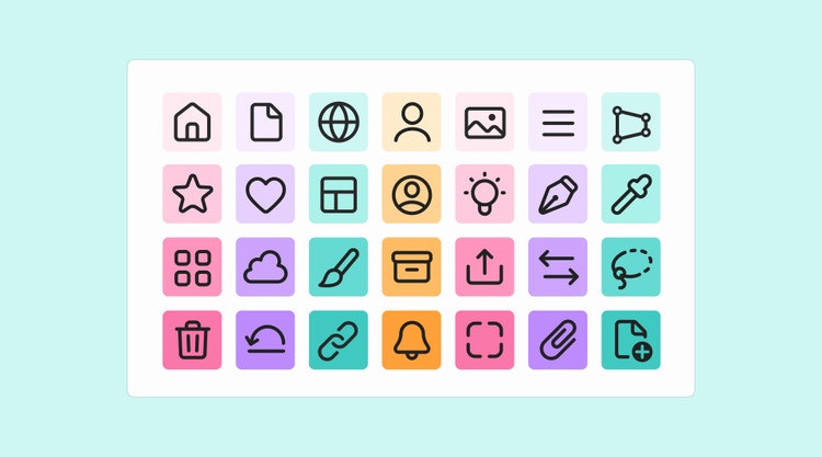
Part of the language that forms a digital product experience, an icon system can include workflow icons that people use to interact with and manipulate objects; UI icons, like chevrons, that indicate that interaction is possible; status badges that show states and processes; and cursor styles, the hands and arrows, that provide supporting context for the expected interactivity (like dragging or resizing) of a selected tool.
A design system’s iconography not only creates a unified brand experience across a product portfolio, it also signals familiarity through a consistent and cohesive combination of UI elements, colors, patterns, and metaphors that describe tools and topics as simply and accurately as possible. For a portfolio as extensive and complex as Adobe’s that’s invaluable.
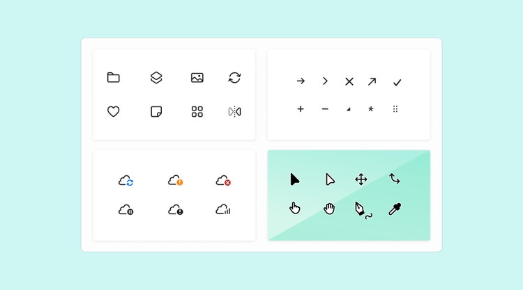
Spectrum, Adobe’s design system, already had a robust icon system, but the time had come for a redesign. Evolving a design system’s icons can involve updating and/or redesigning assets, improving how icons are maintained and served to the teams using them, and creating a solution for adding, updating, and deprecating design elements within it.
Months of discovery, exploration, reviews, and sharing laid the groundwork for the icon team’s three-phase process. It began with extensive design exploration and beta testing to confirm the needs of product teams, and ended with implementing suggestions for improving search, customization, and serving icons. It’s a method of inquiry, feedback, and refinement that other teams can apply to their work.
Phase 1: Create a checklist of principles to guide design exploration
Our initial explorations for a new set of icons followed earlier sessions with an internal community of advisors, put in place to help the Spectrum team define where the system was headed and to document the principles that would guide decision-making. From those early working sessions, the icon team inherited a high-level checklist of principles that would guide early design explorations.

Although nothing (from abstract ideas to intricate details) is off-limits during design exploration, a checklist provides a place to return to if anyone gets off track or the scope of work begins creeping. It should focus on those principles most important to the expression of your brand:
- Brand colors and aesthetics: Incorporating brand colors and aesthetics into illustration and iconography
- Adaptability to user needs: Allowing for more custom icon settings with the goal of enhancing user interaction and making products more accessible (by enabling users to set individual preferences for size, scale, color, and contrast)
- Duo-tones and gradients: Experimenting with color shades and gradients to enhance visual appeal
- Inclusion and connection: Adapting iconography for various screen sizes and resolutions and creating illustrations that establish connection by incorporating human representation
- Library exploration: Revisiting the existing icon and illustration asset library to avoid duplication and reinvention
- Motion, animation, and transitions: Investigating movement as part of the design language
- Icon style: Determining the in-product need for both lined and filled icons (using a line style for a default icon and a filled style for its selected state puts focus on a selected state)
- Multiple icon sets: Evaluating in-product icon use cases to define modification guidelines that would allow for customization of icons without creating inconsistent usage that could harm brand voice or cause confusion in cross-collaboration workflows
- Varied illustration needs: Designing a visual style that would take all icons into consideration but remain flexible enough to work for start screens, UI illustrations, banners, marketing, and tutorial content
- Expressiveness and personality in illustration style: Allowing for customization and personalized expression while supporting the entirety of a system’s icons
- 3D illustrations: Exploring the need for specific designs for 3D applications, interfaces, or functionality
- Illustration trends: Staying up to date with current illustration trends and incorporating them into designs
Some principles (like illustration, motion, and 3D) can be temporarily set aside to focus on what’s foundational to the launch of the system, but they should still be considered within the breadth of the work.
Instead of meeting as one large working group, consider sharing ideas back-and-forth between two smaller ones: one focused on workstream (comprised of experts from product and product marketing along with an icon and design system designer) and another on icon design (comprised of designers specifically focused on icon production work). Discussing ideas, feasibility, and logistics between two groups, each with a different focus, can uncover complications that could stall progress if they come up later in the process.
As most people know, even when meetings are small, they can easily get off-track and run long. Setting ground rules and confining topics to a set amount of time can help keep conversations brief and constructive, but icon design meetings are most productive with a few additional guidelines for presenters:
- Focus on the purpose (identify the primary meaning and function of each icon)
- Offer alternatives and suggestions (sharing variants and iterations can uncover new solutions)
- Balance subjective and objective feedback (share the design guidelines and stakeholder feedback that guided the work)
Phase 2: Uncover product team needs through beta testing with a basic icon library
During the tail end of design exploration, make time to work in parallel with beta testers from product design teams who will be using the design system. Create a basic icon library of explorations so testers can use them in mockups and provide feedback. It will begin a useful cycle of implementing tester feedback to refine icons that can be shared back with testers for additional feedback.
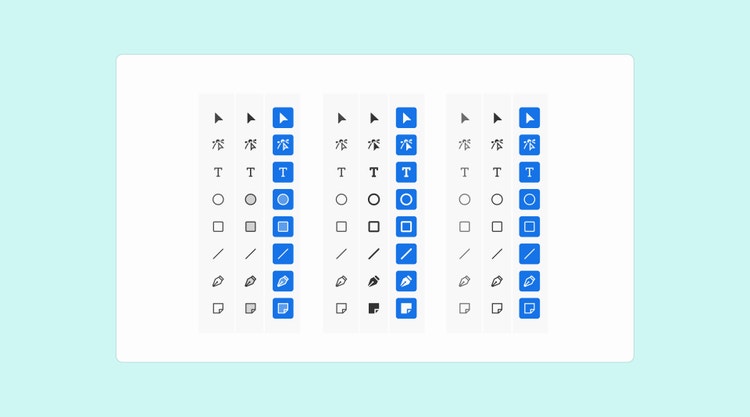
As beta testing continued, Spectrum designers used icons from the new style library to craft previews of interface elements (such as cards, action button states, and header and panel alignment) in combination with Adobe’s brand font. The interface elements were shared with testers, along with UI mockups that compared the existing and new versions of Spectrum. Having versions side-by-side simplifies evaluation and feedback for everyone.
Sessions with product designers can be pivotal in exploring how well icon visuals will work when placed within the context of specific interfaces. Conversations can uncover edge cases, some of which will require solutions before you can move forward with the broader design of the system. A new or refreshed understanding of product team needs, in conjunction with what you already know about your design system, will help inform the details behind new icon designs:
- Aesthetics (corner radius, stroke weight, gaps, key shapes): Naming and defining aesthetics provides guardrails for the team building the icons.
- Anticipate needs, platforms, and dependencies: Forecast future needs so solutions can be built in advance. For designers those can include accessible icon libraries, guidance on UI content and patterns, custom plugins to automate workflows, components with linked assets (to ensure they’re always up to date) and searchable tags (for ease across asset libraries). For engineering, tie icon components to a source of truth in a production repository to provide parity between the thousands of assets used in production code, design tokens, and daily mockups by hundreds of designers.
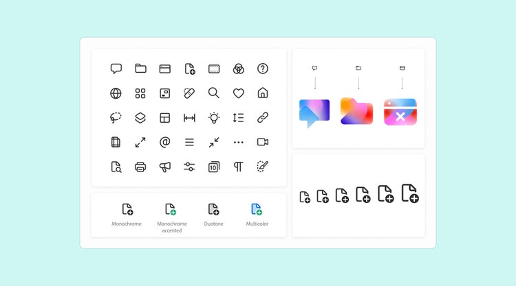
- Customization: Set up a system so teams can easily implement changes to icons depending on framework, platform, and product needs. Focus on serving engineers with optimized assets that will work for most products. We used single SVGs with CSS color variables. The format is minimal, efficient, and optimized for compatibility across platforms and allows for color variables (to make it easy to create multicolored icons, use gradients and animation, and to switch colors in UI themes and dark and light modes).
- Delightful motion: Explore icon animation and motion designs that will enrich the design system in the future.
- Empowerment: Determine how to better support designers around the globe in their daily work (by improving search options and adding tags to make assets in icon libraries widely and easily accessible).
- Typography and icons: Form perfect pairings of typeface and icon style by matching the visual appearance of icons and button designs.
- Expressions: Understand how icon shapes and metaphors might merge into richer illustrations on product and marketing pages to create brand expressions that are delightful, colorful, play to a product voice, and enhance the brand voice.
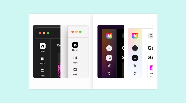
Most of the findings from beta testing confirmed our theories about where we should focus our design work. But “expressions” in this new design language would mean something different for every workstream and for every product. Designs for it could entail anything from adding gradients and animation to creating a stronger brand presence for illustrations based on the new iconography. Although not foundational to the launch, it's a great example of a finding that should be considered within the breadth of the design work so color variables, naming conventions, and metaphors would allow for these types of extended uses.
Phase 3: Define and finalize design details before production work begins
Design explorations and beta testing will resolve most design-related questions. But at the end of what can be a months-long process it’s time to finalize icon features. Although work can begin by looking at the solutions that are needed most (for Spectrum that was web and mobile), styles will eventually trickle into every product, so all final features must be ironed out before actual production work can begin. A list might include:
- Icon basics (strokes, caps, corner radius, size ranges)
- Basic icon sets (home, layers, invite, share, file, delete)
- Visual perception of keyshapes
- Button states
- Baselines & icon placement with text
- Duo-tones and expressive icons
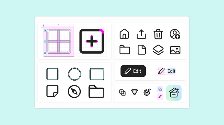
When working toward finalizing the specific features for icons, consider updating a new shared library. It can include streamlined workflows, accessibility, and, if needed, short-term solutions for transitioning between an existing and new version of your design system. Along with the shared library, provide an easy way for beta testers to comment on and rate design decisions.
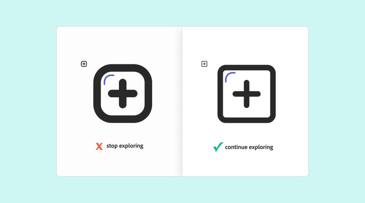
It’s not only a great way to garner honest feedback from an entire community of stakeholders, it can also help finalize solutions that will resonate between products and implementations, and provide concrete ideas for improvements. Fold those recommendations into design takeaways:
Incorporate a naming logic
If thousands of design assets don't follow a certain naming logic it makes it difficult for design, product, and marketing teams to use them consistently. Streamline access to assets in a way that two teams can apply the same icon metaphor to their specific brand voice, and still maintain visual consistency. Incorporate a naming logic so assets can be referenced correctly and used consistently.
For Spectrum, we based icon names on shared terms (simplified categories like learn, video, illustration, generative AI), the tool the icon represents (a noun like vector, device, file), and a secondary action (a verb like add, remove, select). A new name might be “VectorDrawAdd” and the icon metaphor a pen with a plus sign modifier.
Use tagging to improve search
For a system to be successful, people need to be able to search the icon library using terms. Some people use descriptions, others search for function or a category, while still others rely on what they know the icon looks like or is named (although they’re often mistaken).
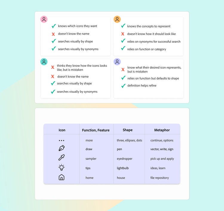
Descriptive tagging increases asset findability, supports consistency, and saves time. Work with content strategists, UX writers, or other experts to come up with an icon tagging system that supports the different ways people search. After creating a basic set of 3,000 tags, a search for terms like “draw,” “pen,” “vector,” or “write” all pull up the same pen icon.
Allow for customization
With every product launch, demand increases for varied icon usage. A “self-serve” assets builder—where designers can search, sample, recycle, and mix branded elements to customize icons based on their product needs—is a necessity. Think about the ways that content can be enriched depending on where, and at what size, it appears.
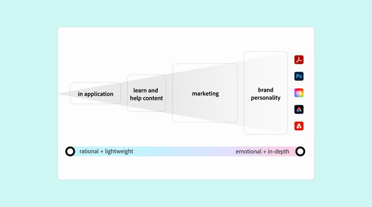
Do explorations for how different product teams might pull together the same elements for different expressions (by making them larger, adding colors, gradients, or animation). The same monochrome icon used in an application can be repurposed for marketing content, by allowing for varying degrees of customization and expressiveness (from rational to emotional).
Create guidelines for pairing icons with type
There will be many ideas about how to create colorful icons and customize them in a way that the font, the iconography, and the UI components make nice pairings. The goal is a balanced look and feel—simultaneously shaped, sharpened, and softened by honing the negative spaces around the shapes of the icons and the letters of the typeface—with all parts complementing each other. Spectrum designers worked with the Adobe Fonts & Type team to refine the details of the relationship between Adobe’s brand typeface and Spectrum iconography.

Offer multiple methods for serving icons
Because every team has unique dependencies and frameworks, offer multiple methods for displaying and implementing icons so teams can use the method that serves them best. SVG is an excellent native format. It serves all states in all color themes, provides a stable creation and export workflow in Adobe Illustrator, requires minimal effort to update color changes, and allows for app-specific custom colors. For Spectrum we also created SVG sprite sheets (a single SVG file containing every icon, along with a corresponding ID, that engineers can reference in their code).
This process of exploration, discovery, testing, and iteration can help lay the groundwork for the extensive icon production process that will follow—making it a more predictable and manageable part of the work.
Spectrum’s icons are being created by the Adobe Design Icons team, and there are many people who have helped, and continue to help, shape them, but I’d like to acknowledge the core team that's worked with vision, persistence, and passion to bring them to life: Spectrum leadership: Sonja Hernandez, Shawn Cheris; Spectrum core: Lynn Hao, Matt Knorr; Spectrum icons: Bettina Reinemann, Cristiana Costin, Julia Walter, Hinnerk Schmidt do Rego Silva, Gesine Grewoldt; Brand design: Marco Müller; Content strategy: Madeleine McGrath, Jess Sattell; Operations: Angelie Herreria-Tagle.